Tutorial: Create your first WPF application in Visual Studio 2019
This article shows you how to develop a Windows Presentation Foundation (WPF) desktop application that includes the elements that are common to most WPF applications: Extensible Application Markup Language (XAML) markup, code-behind, application definitions, controls, layout, data binding, and styles. To develop the application, you'll use Visual Studio.
Important
This article was written for .NET Framework. To get started with .NET 7, see Tutorial: Create a new WPF app (WPF .NET).
In this tutorial, you learn how to:
- Create a WPF project.
- Use XAML to design the appearance of the application's user interface (UI).
- Write code to build the application's behavior.
- Create an application definition to manage the application.
- Add controls and create the layout to compose the application UI.
- Create styles for a consistent appearance throughout the application's UI.
- Bind the UI to data, both to populate the UI from data and to keep the data and UI synchronized.
By the end of the tutorial, you'll have built a standalone Windows application that allows users to view expense reports for selected people. The application is composed of several WPF pages that are hosted in a browser-style window.
Tip
The sample code that is used in this tutorial is available for both Visual Basic and C# at Tutorial WPF App Sample Code.
You can toggle the code language of the sample code between C# and Visual Basic by using the language selector on top of this page.
Prerequisites
Visual Studio 2019 with the .NET desktop development workload installed.
For more information about installing the latest version of Visual Studio, see Install Visual Studio.
Create the application project
The first step is to create the application infrastructure, which includes an application definition, two pages, and an image.
Create a new WPF Application project in Visual Basic or Visual C# named
ExpenseIt:Open Visual Studio and select Create a new project under the Get started menu.
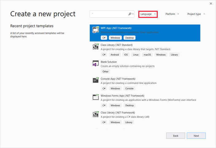
The Create a new project dialog opens.
In the Language dropdown, select either C# or Visual Basic.
Select the WPF App (.NET Framework) template and then select Next.
The Configure your new project dialog opens.
Enter the project name
ExpenseItand then select Create.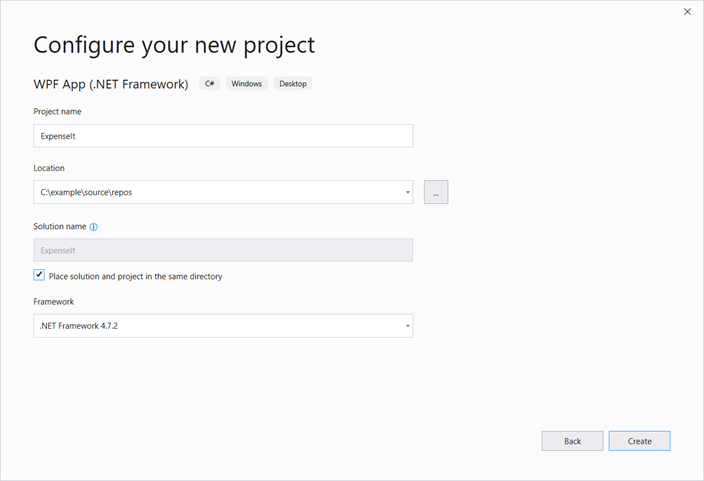
Visual Studio creates the project and opens the designer for the default application window named MainWindow.xaml.
Open Application.xaml (Visual Basic) or App.xaml (C#).
This XAML file defines a WPF application and any application resources. You also use this file to specify the UI, in this case MainWindow.xaml, that automatically shows when the application starts.
Your XAML should look like the following in Visual Basic:
<Application x:Class="Application"
    xmlns="http://schemas.microsoft.com/winfx/2006/xaml/presentation"
    xmlns:x="http://schemas.microsoft.com/winfx/2006/xaml"
    StartupUri="MainWindow.xaml">
    <Application.Resources>

    </Application.Resources>
</Application>
And like the following in C#:
<Application x:Class="ExpenseIt.App"
     xmlns="http://schemas.microsoft.com/winfx/2006/xaml/presentation"
     xmlns:x="http://schemas.microsoft.com/winfx/2006/xaml"
     StartupUri="MainWindow.xaml">
    <Application.Resources>

    </Application.Resources>
</Application>
Open MainWindow.xaml.
This XAML file is the main window of your application and displays content created in pages. The Window class defines the properties of a window, such as its title, size, or icon, and handles events, such as closing or hiding.
Change the Window element to a NavigationWindow, as shown in the following XAML:
<NavigationWindow x:Class="ExpenseIt.MainWindow"
     xmlns="http://schemas.microsoft.com/winfx/2006/xaml/presentation"
     xmlns:x="http://schemas.microsoft.com/winfx/2006/xaml"
     ...
</NavigationWindow>
This app navigates to different content depending on the user input. This is why the main Window needs to be changed to a NavigationWindow. NavigationWindow inherits all the properties of Window. The NavigationWindow element in the XAML file creates an instance of the NavigationWindow class. For more information, see Navigation overview.
Remove the Grid elements from between the NavigationWindow tags.
Change the following properties in the XAML code for the NavigationWindow element:
Set the Title property to "
ExpenseIt".Set the Height property to 350 pixels.
Set the Width property to 500 pixels.
Your XAML should look like the following for Visual Basic:
<NavigationWindow x:Class="MainWindow"
    xmlns="http://schemas.microsoft.com/winfx/2006/xaml/presentation"
    xmlns:x="http://schemas.microsoft.com/winfx/2006/xaml"
    Title="ExpenseIt" Height="350" Width="500">

</NavigationWindow>
And like the following for C#:
<NavigationWindow x:Class="ExpenseIt.MainWindow"
    xmlns="http://schemas.microsoft.com/winfx/2006/xaml/presentation"
    xmlns:x="http://schemas.microsoft.com/winfx/2006/xaml"
    Title="ExpenseIt" Height="350" Width="500">

</NavigationWindow>
Open MainWindow.xaml.vb or MainWindow.xaml.cs.
This file is a code-behind file that contains code to handle the events declared in MainWindow.xaml. This file contains a partial class for the window defined in XAML.
If you're using C#, change the
MainWindowclass to derive from NavigationWindow. (In Visual Basic, this happens automatically when you change the window in XAML.) Your C# code should now look like this:using System; using System.Collections.Generic; using System.Linq; using System.Text; using System.Windows; using System.Windows.Controls; using System.Windows.Data; using System.Windows.Documents; using System.Windows.Input; using System.Windows.Media; using System.Windows.Media.Imaging; using System.Windows.Navigation; using System.Windows.Shapes; namespace ExpenseIt { /// <summary> /// Interaction logic for MainWindow.xaml /// </summary> public partial class MainWindow : NavigationWindow { public MainWindow() { InitializeComponent(); } } }
Add files to the application
In this section, you'll add two pages and an image to the application.
Add a new page to the project, and name it
ExpenseItHome.xaml:In Solution Explorer, right-click on the
ExpenseItproject node and choose Add > Page.In the Add New Item dialog, the Page (WPF) template is already selected. Enter the name
ExpenseItHome, and then select Add.
This page is the first page that's displayed when the application is launched. It will show a list of people to select from, to show an expense report for.
Open
ExpenseItHome.xaml.Set the Title to "
ExpenseIt - Home".Set the
DesignHeightto 350 pixels and theDesignWidthto 500 pixels.The XAML now appears as follows for Visual Basic:
<Page x:Class="ExpenseItHome"
  xmlns="http://schemas.microsoft.com/winfx/2006/xaml/presentation"
  xmlns:x="http://schemas.microsoft.com/winfx/2006/xaml"
  xmlns:mc="http://schemas.openxmlformats.org/markup-compatibility/2006"
  xmlns:d="http://schemas.microsoft.com/expression/blend/2008"
  mc:Ignorable="d"
  d:DesignHeight="350" d:DesignWidth="500"
  Title="ExpenseIt - Home">
    <Grid>

    </Grid>
</Page>
And like the following for C#:
<Page x:Class="ExpenseIt.ExpenseItHome"
      xmlns="http://schemas.microsoft.com/winfx/2006/xaml/presentation"
      xmlns:x="http://schemas.microsoft.com/winfx/2006/xaml"
      xmlns:mc="http://schemas.openxmlformats.org/markup-compatibility/2006"
      xmlns:d="http://schemas.microsoft.com/expression/blend/2008"
      mc:Ignorable="d"
      d:DesignHeight="350" d:DesignWidth="500"
    Title="ExpenseIt - Home">

    <Grid>

    </Grid>
</Page>
Open MainWindow.xaml.
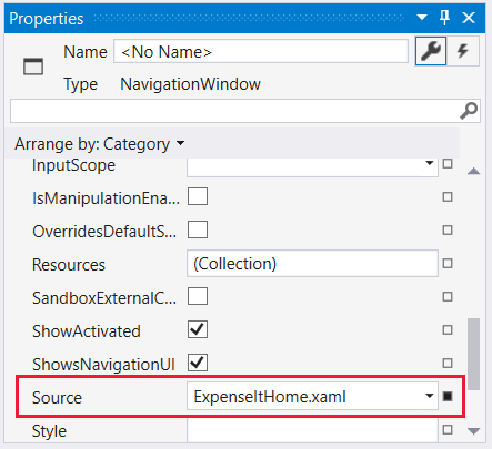
Add a Source property to the NavigationWindow element and set it to "
ExpenseItHome.xaml".This sets
ExpenseItHome.xamlto be the first page opened when the application starts.Example XAML in Visual Basic:
<NavigationWindow x:Class="MainWindow"
    xmlns="http://schemas.microsoft.com/winfx/2006/xaml/presentation"
    xmlns:x="http://schemas.microsoft.com/winfx/2006/xaml"
    Title="ExpenseIt" Height="350" Width="500" Source="ExpenseItHome.xaml">

</NavigationWindow>
And in C#:
<NavigationWindow x:Class="ExpenseIt.MainWindow"
    xmlns="http://schemas.microsoft.com/winfx/2006/xaml/presentation"
    xmlns:x="http://schemas.microsoft.com/winfx/2006/xaml"
    Title="ExpenseIt" Height="350" Width="500" Source="ExpenseItHome.xaml">

</NavigationWindow>
Tip
You can also set the Source property in the Miscellaneous category of the Properties window.
Add another new WPF page to the project, and name it ExpenseReportPage.xaml::
In Solution Explorer, right-click on the
ExpenseItproject node and choose Add > Page.In the Add New Item dialog, select the Page (WPF) template. Enter the name ExpenseReportPage, and then select Add.
This page will show the expense report for the person that is selected on the
ExpenseItHomepage.Open ExpenseReportPage.xaml.
Set the Title to "
ExpenseIt - View Expense".Set the
DesignHeightto 350 pixels and theDesignWidthto 500 pixels.ExpenseReportPage.xaml now looks like the following in Visual Basic:
<Page x:Class="ExpenseReportPage"
      xmlns="http://schemas.microsoft.com/winfx/2006/xaml/presentation"
      xmlns:x="http://schemas.microsoft.com/winfx/2006/xaml"
      xmlns:mc="http://schemas.openxmlformats.org/markup-compatibility/2006"
      xmlns:d="http://schemas.microsoft.com/expression/blend/2008"
      mc:Ignorable="d"
      d:DesignHeight="350" d:DesignWidth="500"
      Title="ExpenseIt - View Expense">
    <Grid>

    </Grid>
</Page>
And like the following in C#:
<Page x:Class="ExpenseIt.ExpenseReportPage"
      xmlns="http://schemas.microsoft.com/winfx/2006/xaml/presentation"
      xmlns:x="http://schemas.microsoft.com/winfx/2006/xaml"
      xmlns:mc="http://schemas.openxmlformats.org/markup-compatibility/2006"
      xmlns:d="http://schemas.microsoft.com/expression/blend/2008"
      mc:Ignorable="d"
      d:DesignHeight="350" d:DesignWidth="500"
    Title="ExpenseIt - View Expense">

    <Grid>

    </Grid>
</Page>
Open ExpenseItHome.xaml.vb and ExpenseReportPage.xaml.vb, or ExpenseItHome.xaml.cs and ExpenseReportPage.xaml.cs.
When you create a new Page file, Visual Studio automatically creates its code-behind file. These code-behind files handle the logic for responding to user input.
Your code should look like the following for
ExpenseItHome:using System; using System.Collections.Generic; using System.Linq; using System.Text; using System.Windows; using System.Windows.Controls; using System.Windows.Data; using System.Windows.Documents; using System.Windows.Input; using System.Windows.Media; using System.Windows.Media.Imaging; using System.Windows.Navigation; using System.Windows.Shapes; namespace ExpenseIt { /// <summary> /// Interaction logic for ExpenseItHome.xaml /// </summary> public partial class ExpenseItHome : Page { public ExpenseItHome() { InitializeComponent(); } } }Class ExpenseItHome End ClassAnd like the following for ExpenseReportPage:
using System;
using System.Collections.Generic;
using System.Linq;
using System.Text;
using System.Windows;
using System.Windows.Controls;
using System.Windows.Data;
using System.Windows.Documents;
using System.Windows.Input;
using System.Windows.Media;
using System.Windows.Media.Imaging;
using System.Windows.Navigation;
using System.Windows.Shapes;

namespace ExpenseIt
{
    /// <summary>
    /// Interaction logic for ExpenseReportPage.xaml
    /// </summary>
    public partial class ExpenseReportPage : Page
    {
        public ExpenseReportPage()
        {
            InitializeComponent();
        }
    }
}
Class ExpenseReportPage End ClassAdd an image named watermark.png to the project. You can create your own image, copy the file from the sample code, or get it from the microsoft/WPF-Samples GitHub repository.
Right-click on the project node and select Add > Existing Item, or press Shift+Alt+A.
In the Add Existing Item dialog, set the file filter to either All Files or Image Files, browse to the image file you want to use, and then select Add.
Select the image file in Solution Explorer, then in the Properties window, set Build Action to Resource.
Build and run the application
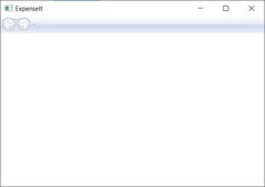
To build and run the application, press F5 or select Start Debugging from the Debug menu.
The following illustration shows the application with the NavigationWindow buttons:
Close the application to return to Visual Studio.
Create the layout
Layout provides an ordered way to place UI elements, and also manages the size and position of those elements when a UI is resized. You typically create a layout with one of the following layout controls:
- Canvas - Defines an area within which you can explicitly position child elements by using coordinates that are relative to the Canvas area.
- DockPanel - Defines an area where you can arrange child elements either horizontally or vertically, relative to each other.
- Grid - Defines a flexible grid area that consists of columns and rows.
- StackPanel - Arranges child elements into a single line that can be oriented horizontally or vertically.
- VirtualizingStackPanel - Arranges and virtualizes content on a single line that is oriented either horizontally or vertically.
- WrapPanel - Positions child elements in sequential position from left to right, breaking content to the next line at the edge of the containing box. Subsequent ordering happens sequentially from top to bottom or from right to left, depending on the value of the Orientation property.
Each of these layout controls supports a particular type of layout for its child elements. ExpenseIt pages can be resized, and each page has elements that are arranged horizontally and vertically alongside other elements. In this example, the Grid is used as layout element for the application.
Tip
For more information about Panel elements, see Panels overview. For more information about layout, see Layout.
In this section, you create a single-column table with three rows and a 10-pixel margin by adding column and row definitions to the Grid in ExpenseItHome.xaml.
In
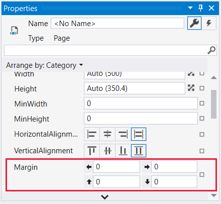
ExpenseItHome.xaml, set the Margin property on the Grid element to "10,0,10,10", which corresponds to left, top, right and bottom margins:<Grid Margin="10,0,10,10">Tip
You can also set the Margin values in the Properties window, under the Layout category:
Add the following XAML between the Grid tags to create the row and column definitions:
<Grid.ColumnDefinitions>
    <ColumnDefinition />
</Grid.ColumnDefinitions>
<Grid.RowDefinitions>
    <RowDefinition Height="Auto"/>
    <RowDefinition />
    <RowDefinition Height="Auto"/>
</Grid.RowDefinitions>
The Height of two rows is set to Auto, which means that the rows are sized based on the content in the rows. The default Height is Star sizing, which means that the row height is a weighted proportion of the available space. For example if two rows each have a Height of "*", they each have a height that is half of the available space.
Your Grid should now contain the following XAML:
<Grid Margin="10,0,10,10">
    <Grid.ColumnDefinitions>
        <ColumnDefinition />
    </Grid.ColumnDefinitions>
    <Grid.RowDefinitions>
        <RowDefinition Height="Auto"/>
        <RowDefinition />
        <RowDefinition Height="Auto"/>
    </Grid.RowDefinitions>
</Grid>
Add controls
In this section, you'll update the home page UI to show a list of people, where you select one person to display their expense report. Controls are UI objects that allow users to interact with your application. For more information, see Controls.
To create this UI, you'll add the following elements to ExpenseItHome.xaml:
- A ListBox (for the list of people).
- A Label (for the list header).
- A Button (to click to view the expense report for the person that is selected in the list).
Each control is placed in a row of the Grid by setting the Grid.Row attached property. For more information about attached properties, see Attached Properties Overview.
In
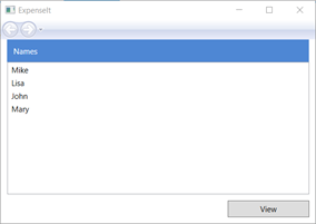
ExpenseItHome.xaml, add the following XAML somewhere between the Grid tags:<!-- People list --> <Border Grid.Column="0" Grid.Row="0" Height="35" Padding="5" Background="#4E87D4"> <Label VerticalAlignment="Center" Foreground="White">Names</Label> </Border> <ListBox Name="peopleListBox" Grid.Column="0" Grid.Row="1"> <ListBoxItem>Mike</ListBoxItem> <ListBoxItem>Lisa</ListBoxItem> <ListBoxItem>John</ListBoxItem> <ListBoxItem>Mary</ListBoxItem> </ListBox> <!-- View report button --> <Button Grid.Column="0" Grid.Row="2" Margin="0,10,0,10" Width="125" Height="25" HorizontalAlignment="Right">View</Button>Tip
You can also create the controls by dragging them from the Toolbox window onto the design window, and then setting their properties in the Properties window.
Build and run the application.
The following illustration shows the controls you created:
Add an image and a title
In this section, you'll update the home page UI with an image and a page title.
In
ExpenseItHome.xaml, add another column to the ColumnDefinitions with a fixed Width of 230 pixels:<Grid.ColumnDefinitions> <ColumnDefinition Width="230" /> <ColumnDefinition /> </Grid.ColumnDefinitions>Add another row to the RowDefinitions, for a total of four rows:
<Grid.RowDefinitions>
    <RowDefinition/>
    <RowDefinition Height="Auto"/>
    <RowDefinition />
    <RowDefinition Height="Auto"/>
</Grid.RowDefinitions>
Move the controls to the second column by setting the Grid.Column property to 1 in each of the three controls (Border, ListBox, and Button).
Move each control down a row by incrementing its Grid.Row value by 1 for each of the three controls (Border, ListBox, and Button) and for the Border element.
The XAML for the three controls now looks like the following:
  <Border Grid.Column="1" Grid.Row="1" Height="35" Padding="5" Background="#4E87D4">
      <Label VerticalAlignment="Center" Foreground="White">Names</Label>
  </Border>
  <ListBox Name="peopleListBox" Grid.Column="1" Grid.Row="2">
      <ListBoxItem>Mike</ListBoxItem>
      <ListBoxItem>Lisa</ListBoxItem>
      <ListBoxItem>John</ListBoxItem>
      <ListBoxItem>Mary</ListBoxItem>
  </ListBox>

  <!-- View report button -->
  <Button Grid.Column="1" Grid.Row="3" Margin="0,10,0,0" Width="125"
Height="25" HorizontalAlignment="Right">View</Button>
Set the Background property to the watermark.png image file, by adding the following XAML anywhere between the
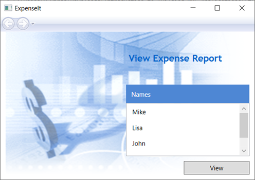
<Grid>and</Grid>tags:<Grid.Background> <ImageBrush ImageSource="watermark.png"/> </Grid.Background>Before the Border element, add a Label with the content "View Expense Report". This label is the title of the page.
<Label Grid.Column="1" VerticalAlignment="Center" FontFamily="Trebuchet MS"
        FontWeight="Bold" FontSize="18" Foreground="#0066cc">
    View Expense Report
</Label>
Build and run the application.
The following illustration shows the results of what you just added:
Add code to handle events
In
ExpenseItHome.xaml, add a Click event handler to the Button element. For more information, see How to: Create a simple event handler.<!-- View report button --> <Button Grid.Column="1" Grid.Row="3" Margin="0,10,0,0" Width="125" Height="25" HorizontalAlignment="Right" Click="Button_Click">View</Button>Open
ExpenseItHome.xaml.vborExpenseItHome.xaml.cs.Add the following code to the
ExpenseItHomeclass to add a button click event handler. The event handler opens the ExpenseReportPage page.private void Button_Click(object sender, RoutedEventArgs e) { // View Expense Report ExpenseReportPage expenseReportPage = new ExpenseReportPage(); this.NavigationService.Navigate(expenseReportPage); }Private Sub Button_Click(ByVal sender As Object, ByVal e As RoutedEventArgs) ' View Expense Report Dim expenseReportPage As New ExpenseReportPage() Me.NavigationService.Navigate(expenseReportPage) End Sub
Create the UI for ExpenseReportPage
ExpenseReportPage.xaml displays the expense report for the person that's selected on the ExpenseItHome page. In this section, you'll create the UI for ExpenseReportPage. You'll also add background and fill colors to the various UI elements.
Open ExpenseReportPage.xaml.
Add the following XAML between the Grid tags:
 <Grid.Background>
     <ImageBrush ImageSource="watermark.png" />
 </Grid.Background>
 <Grid.ColumnDefinitions>
     <ColumnDefinition Width="230" />
     <ColumnDefinition />
 </Grid.ColumnDefinitions>
 <Grid.RowDefinitions>
     <RowDefinition Height="Auto" />
     <RowDefinition />
 </Grid.RowDefinitions>


 <Label Grid.Column="1" VerticalAlignment="Center" FontFamily="Trebuchet MS"
 FontWeight="Bold" FontSize="18" Foreground="#0066cc">
     Expense Report For:
 </Label>
 <Grid Margin="10" Grid.Column="1" Grid.Row="1">

     <Grid.ColumnDefinitions>
         <ColumnDefinition />
         <ColumnDefinition />
     </Grid.ColumnDefinitions>
     <Grid.RowDefinitions>
         <RowDefinition Height="Auto" />
         <RowDefinition Height="Auto" />
         <RowDefinition />
     </Grid.RowDefinitions>

     <!-- Name -->
     <StackPanel Grid.Column="0" Grid.ColumnSpan="2" Grid.Row="0" Orientation="Horizontal">
         <Label Margin="0,0,0,5" FontWeight="Bold">Name:</Label>
         <Label Margin="0,0,0,5" FontWeight="Bold"></Label>
     </StackPanel>

     <!-- Department -->
     <StackPanel Grid.Column="0" Grid.ColumnSpan="2" Grid.Row="1" Orientation="Horizontal">
         <Label Margin="0,0,0,5" FontWeight="Bold">Department:</Label>
         <Label Margin="0,0,0,5" FontWeight="Bold"></Label>
     </StackPanel>

     <Grid Grid.Column="0" Grid.ColumnSpan="2" Grid.Row="2" VerticalAlignment="Top"
           HorizontalAlignment="Left">
         <!-- Expense type and Amount table -->
         <DataGrid  AutoGenerateColumns="False" RowHeaderWidth="0" >
             <DataGrid.ColumnHeaderStyle>
                 <Style TargetType="{x:Type DataGridColumnHeader}">
                     <Setter Property="Height" Value="35" />
                     <Setter Property="Padding" Value="5" />
                     <Setter Property="Background" Value="#4E87D4" />
                     <Setter Property="Foreground" Value="White" />
                 </Style>
             </DataGrid.ColumnHeaderStyle>
             <DataGrid.Columns>
                 <DataGridTextColumn Header="ExpenseType" />
                 <DataGridTextColumn Header="Amount"  />
             </DataGrid.Columns>
         </DataGrid>
     </Grid>
 </Grid>
This UI is similar to
ExpenseItHome.xaml, except the report data is displayed in a DataGrid.Build and run the application.
Select the View button.
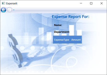
The expense report page appears. Also notice that the back navigation button is enabled.
The following illustration shows the UI elements added to ExpenseReportPage.xaml.
Style controls
The appearance of various elements is often the same for all elements of the same type in a UI. UI uses styles to make appearances reusable across multiple elements. The reusability of styles helps to simplify XAML creation and management. This section replaces the per-element attributes that were defined in previous steps with styles.
Open Application.xaml or App.xaml.
Add the following XAML between the Application.Resources tags:
<!-- Header text style -->
<Style x:Key="headerTextStyle">
    <Setter Property="Label.VerticalAlignment" Value="Center"></Setter>
    <Setter Property="Label.FontFamily" Value="Trebuchet MS"></Setter>
    <Setter Property="Label.FontWeight" Value="Bold"></Setter>
    <Setter Property="Label.FontSize" Value="18"></Setter>
    <Setter Property="Label.Foreground" Value="#0066cc"></Setter>
</Style>

<!-- Label style -->
<Style x:Key="labelStyle" TargetType="{x:Type Label}">
    <Setter Property="VerticalAlignment" Value="Top" />
    <Setter Property="HorizontalAlignment" Value="Left" />
    <Setter Property="FontWeight" Value="Bold" />
    <Setter Property="Margin" Value="0,0,0,5" />
</Style>

<!-- DataGrid header style -->
<Style x:Key="columnHeaderStyle" TargetType="{x:Type DataGridColumnHeader}">
    <Setter Property="Height" Value="35" />
    <Setter Property="Padding" Value="5" />
    <Setter Property="Background" Value="#4E87D4" />
    <Setter Property="Foreground" Value="White" />
</Style>

<!-- List header style -->
<Style x:Key="listHeaderStyle" TargetType="{x:Type Border}">
    <Setter Property="Height" Value="35" />
    <Setter Property="Padding" Value="5" />
    <Setter Property="Background" Value="#4E87D4" />
</Style>

<!-- List header text style -->
<Style x:Key="listHeaderTextStyle" TargetType="{x:Type Label}">
    <Setter Property="Foreground" Value="White" />
    <Setter Property="VerticalAlignment" Value="Center" />
    <Setter Property="HorizontalAlignment" Value="Left" />
</Style>

<!-- Button style -->
<Style x:Key="buttonStyle" TargetType="{x:Type Button}">
    <Setter Property="Width" Value="125" />
    <Setter Property="Height" Value="25" />
    <Setter Property="Margin" Value="0,10,0,0" />
    <Setter Property="HorizontalAlignment" Value="Right" />
</Style>
This XAML adds the following styles:
headerTextStyle: To format the page title Label.labelStyle: To format the Label controls.columnHeaderStyle: To format the DataGridColumnHeader.listHeaderStyle: To format the list header Border controls.listHeaderTextStyle: To format the list header Label.buttonStyle: To format the Button onExpenseItHome.xaml.
Notice that the styles are resources and children of the Application.Resources property element. In this location, the styles are applied to all the elements in an application. For an example of using resources in a .NET app, see Use Application Resources.
In
ExpenseItHome.xaml, replace everything between the Grid elements with the following XAML:<Grid.Background> <ImageBrush ImageSource="watermark.png" /> </Grid.Background> <Grid.ColumnDefinitions> <ColumnDefinition Width="230" /> <ColumnDefinition /> </Grid.ColumnDefinitions> <Grid.RowDefinitions> <RowDefinition/> <RowDefinition Height="Auto"/> <RowDefinition /> <RowDefinition Height="Auto"/> </Grid.RowDefinitions> <!-- People list --> <Label Grid.Column="1" Style="{StaticResource headerTextStyle}" > View Expense Report </Label> <Border Grid.Column="1" Grid.Row="1" Style="{StaticResource listHeaderStyle}"> <Label Style="{StaticResource listHeaderTextStyle}">Names</Label> </Border> <ListBox Name="peopleListBox" Grid.Column="1" Grid.Row="2"> <ListBoxItem>Mike</ListBoxItem> <ListBoxItem>Lisa</ListBoxItem> <ListBoxItem>John</ListBoxItem> <ListBoxItem>Mary</ListBoxItem> </ListBox> <!-- View report button --> <Button Grid.Column="1" Grid.Row="3" Click="Button_Click" Style="{StaticResource buttonStyle}">View</Button>The properties such as VerticalAlignment and FontFamily that define the look of each control are removed and replaced by applying the styles. For example, the
headerTextStyleis applied to the "View Expense Report" Label.Open ExpenseReportPage.xaml.
Replace everything between the Grid elements with the following XAML:
<Grid.Background> <ImageBrush ImageSource="watermark.png" /> </Grid.Background> <Grid.ColumnDefinitions> <ColumnDefinition Width="230" /> <ColumnDefinition /> </Grid.ColumnDefinitions> <Grid.RowDefinitions> <RowDefinition Height="Auto" /> <RowDefinition /> </Grid.RowDefinitions> <Label Grid.Column="1" Style="{StaticResource headerTextStyle}"> Expense Report For: </Label> <Grid Margin="10" Grid.Column="1" Grid.Row="1"> <Grid.ColumnDefinitions> <ColumnDefinition /> <ColumnDefinition /> </Grid.ColumnDefinitions> <Grid.RowDefinitions> <RowDefinition Height="Auto" /> <RowDefinition Height="Auto" /> <RowDefinition /> </Grid.RowDefinitions> <!-- Name --> <StackPanel Grid.Column="0" Grid.ColumnSpan="2" Grid.Row="0" Orientation="Horizontal"> <Label Style="{StaticResource labelStyle}">Name:</Label> <Label Style="{StaticResource labelStyle}"></Label> </StackPanel> <!-- Department --> <StackPanel Grid.Column="0" Grid.ColumnSpan="2" Grid.Row="1" Orientation="Horizontal"> <Label Style="{StaticResource labelStyle}">Department:</Label> <Label Style="{StaticResource labelStyle}"></Label> </StackPanel> <Grid Grid.Column="0" Grid.ColumnSpan="2" Grid.Row="2" VerticalAlignment="Top" HorizontalAlignment="Left"> <!-- Expense type and Amount table --> <DataGrid ColumnHeaderStyle="{StaticResource columnHeaderStyle}" AutoGenerateColumns="False" RowHeaderWidth="0" > <DataGrid.Columns> <DataGridTextColumn Header="ExpenseType" /> <DataGridTextColumn Header="Amount" /> </DataGrid.Columns> </DataGrid> </Grid> </Grid>Build and run the application. The window appearance is the same as previously.

Close the application to return to Visual Studio.
Bind data to a control
In this section, you'll create the XML data that is bound to various controls.
In
ExpenseItHome.xaml, after the opening Grid element, add the following XAML to create an XmlDataProvider that contains the data for each person:<Grid.Resources> <!-- Expense Report Data --> <XmlDataProvider x:Key="ExpenseDataSource" XPath="Expenses"> <x:XData> <Expenses xmlns=""> <Person Name="Mike" Department="Legal"> <Expense ExpenseType="Lunch" ExpenseAmount="50" /> <Expense ExpenseType="Transportation" ExpenseAmount="50" /> </Person> <Person Name="Lisa" Department="Marketing"> <Expense ExpenseType="Document printing" ExpenseAmount="50"/> <Expense ExpenseType="Gift" ExpenseAmount="125" /> </Person> <Person Name="John" Department="Engineering"> <Expense ExpenseType="Magazine subscription" ExpenseAmount="50"/> <Expense ExpenseType="New machine" ExpenseAmount="600" /> <Expense ExpenseType="Software" ExpenseAmount="500" /> </Person> <Person Name="Mary" Department="Finance"> <Expense ExpenseType="Dinner" ExpenseAmount="100" /> </Person> </Expenses> </x:XData> </XmlDataProvider> </Grid.Resources>The data is created as a Grid resource. Normally this data would be loaded as a file, but for simplicity the data is added inline.
Within the
<Grid.Resources>element, add the following<xref:System.Windows.DataTemplate>element, which defines how to display the data in the ListBox, after the<XmlDataProvider>element:<Grid.Resources> <!-- Name item template --> <DataTemplate x:Key="nameItemTemplate"> <Label Content="{Binding XPath=@Name}"/> </DataTemplate> </Grid.Resources>For more information about data templates, see Data templating overview.
Replace the existing ListBox with the following XAML:
<ListBox Name="peopleListBox" Grid.Column="1" Grid.Row="2"
         ItemsSource="{Binding Source={StaticResource ExpenseDataSource}, XPath=Person}"
         ItemTemplate="{StaticResource nameItemTemplate}">
</ListBox>
This XAML binds the ItemsSource property of the ListBox to the data source and applies the data template as the ItemTemplate.
Connect data to controls
Next, you'll add code to retrieve the name that's selected on the ExpenseItHome page and pass it to the constructor of ExpenseReportPage. ExpenseReportPage sets its data context with the passed item, which is what the controls defined in ExpenseReportPage.xaml bind to.
Open ExpenseReportPage.xaml.vb or ExpenseReportPage.xaml.cs.
Add a constructor that takes an object so you can pass the expense report data of the selected person.
public partial class ExpenseReportPage : Page
{
    public ExpenseReportPage()
    {
        InitializeComponent();
    }

    // Custom constructor to pass expense report data
    public ExpenseReportPage(object data):this()
    {
        // Bind to expense report data.
        this.DataContext = data;
    }
}
Partial Public Class ExpenseReportPage Inherits Page Public Sub New() InitializeComponent() End Sub ' Custom constructor to pass expense report data Public Sub New(ByVal data As Object) Me.New() ' Bind to expense report data. Me.DataContext = data End Sub End ClassOpen
ExpenseItHome.xaml.vborExpenseItHome.xaml.cs.Change the Click event handler to call the new constructor passing the expense report data of the selected person.
private void Button_Click(object sender, RoutedEventArgs e)
{
    // View Expense Report
    ExpenseReportPage expenseReportPage = new ExpenseReportPage(this.peopleListBox.SelectedItem);
    this.NavigationService.Navigate(expenseReportPage);
}
Private Sub Button_Click(ByVal sender As Object, ByVal e As RoutedEventArgs) ' View Expense Report Dim expenseReportPage As New ExpenseReportPage(Me.peopleListBox.SelectedItem) Me.NavigationService.Navigate(expenseReportPage) End Sub
Style data with data templates
In this section, you'll update the UI for each item in the data-bound lists by using data templates.
Open ExpenseReportPage.xaml.
Bind the content of the "Name" and "Department" Label elements to the appropriate data source property. For more information about data binding, see Data binding overview.
<!-- Name -->
<StackPanel Grid.Column="0" Grid.ColumnSpan="2" Grid.Row="0" Orientation="Horizontal">
    <Label Style="{StaticResource labelStyle}">Name:</Label>
    <Label Style="{StaticResource labelStyle}" Content="{Binding XPath=@Name}"></Label>
</StackPanel>

<!-- Department -->
<StackPanel Grid.Column="0" Grid.ColumnSpan="2" Grid.Row="1" Orientation="Horizontal">
    <Label Style="{StaticResource labelStyle}">Department:</Label>
    <Label Style="{StaticResource labelStyle}" Content="{Binding XPath=@Department}"></Label>
</StackPanel>
After the opening Grid element, add the following data templates, which define how to display the expense report data:
<!--Templates to display expense report data-->
<Grid.Resources>
    <!-- Reason item template -->
    <DataTemplate x:Key="typeItemTemplate">
        <Label Content="{Binding XPath=@ExpenseType}"/>
    </DataTemplate>
    <!-- Amount item template -->
    <DataTemplate x:Key="amountItemTemplate">
        <Label Content="{Binding XPath=@ExpenseAmount}"/>
    </DataTemplate>
</Grid.Resources>
Replace the DataGridTextColumn elements with DataGridTemplateColumn under the DataGrid element and apply the templates to them. Also, specify the
ItemsSourceattribute with its value in theDataGridElement.<!-- Expense type and Amount table --> <DataGrid ItemsSource="{Binding XPath=Expense}" ColumnHeaderStyle="{StaticResource columnHeaderStyle}" AutoGenerateColumns="False" RowHeaderWidth="0" > <DataGrid.Columns> <DataGridTemplateColumn Header="ExpenseType" CellTemplate="{StaticResource typeItemTemplate}" /> <DataGridTemplateColumn Header="Amount" CellTemplate="{StaticResource amountItemTemplate}" /> </DataGrid.Columns> </DataGrid>Build and run the application.
Select a person and then select the View button.
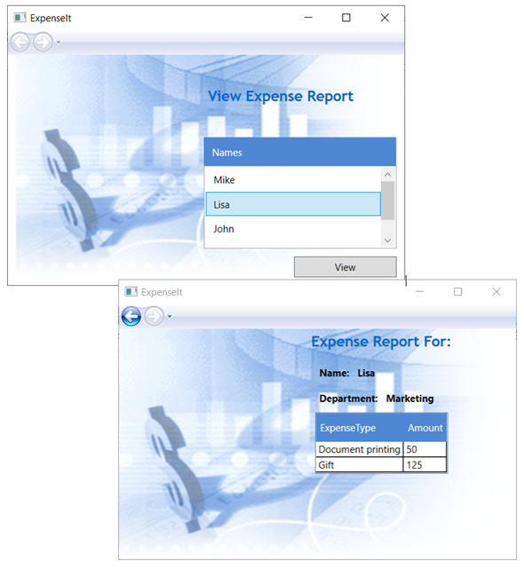
The following illustration shows both pages of the ExpenseIt application with controls, layout, styles, data binding, and data templates applied:
Note
This sample demonstrates a specific feature of WPF and doesn't follow all best practices for things like security, localization, and accessibility. For comprehensive coverage of WPF and the .NET app development best practices, see the following topics:
Next steps
In this walkthrough you learned a number of techniques for creating a UI using Windows Presentation Foundation (WPF). You should now have a basic understanding of the building blocks of a data-bound .NET app. For more information about the WPF architecture and programming models, see the following topics:
For more information about creating applications, see the following topics:
See also
.NET Desktop feedback
