Layout
This topic describes the Windows Presentation Foundation (WPF) layout system. Understanding how and when layout calculations occur is essential for creating user interfaces in WPF.
This topic contains the following sections:
Element Bounding Boxes
When thinking about layout in WPF, it is important to understand the bounding box that surrounds all elements. Each FrameworkElement consumed by the layout system can be thought of as a rectangle that is slotted into the layout. The LayoutInformation class returns the boundaries of an element's layout allocation, or slot. The size of the rectangle is determined by calculating the available screen space, the size of any constraints, layout-specific properties (such as margin and padding), and the individual behavior of the parent Panel element. Processing this data, the layout system is able to calculate the position of all the children of a particular Panel. It is important to remember that sizing characteristics defined on the parent element, such as a Border, affect its children.
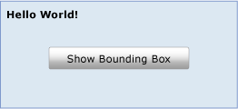
The following illustration shows a simple layout.

This layout can be achieved by using the following XAML.
<Grid Name="myGrid" Background="LightSteelBlue" Height="150">
  <Grid.ColumnDefinitions>
    <ColumnDefinition Width="250"/>
  </Grid.ColumnDefinitions>
  <Grid.RowDefinitions>
    <RowDefinition />
    <RowDefinition />
    <RowDefinition />
  </Grid.RowDefinitions>
  <TextBlock Name="txt1" Margin="5" FontSize="16" FontFamily="Verdana" Grid.Column="0" Grid.Row="0">Hello World!</TextBlock>
  <Button Click="getLayoutSlot1" Width="125" Height="25" Grid.Column="0" Grid.Row="1">Show Bounding Box</Button>
  <TextBlock Name="txt2" Grid.Column="1" Grid.Row="2"/>
</Grid>
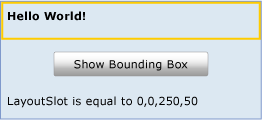
A single TextBlock element is hosted within a Grid. While the text fills only the upper-left corner of the first column, the allocated space for the TextBlock is actually much larger. The bounding box of any FrameworkElement can be retrieved by using the GetLayoutSlot method. The following illustration shows the bounding box for the TextBlock element.

As shown by the yellow rectangle, the allocated space for the TextBlock element is actually much larger than it appears. As additional elements are added to the Grid, this allocation could shrink or expand, depending on the type and size of elements that are added.
The layout slot of the TextBlock is translated into a Path by using the GetLayoutSlot method. This technique can be useful for displaying the bounding box of an element.
private void getLayoutSlot1(object sender, System.Windows.RoutedEventArgs e)
{
    RectangleGeometry myRectangleGeometry = new RectangleGeometry();
    myRectangleGeometry.Rect = LayoutInformation.GetLayoutSlot(txt1);
    Path myPath = new Path();
    myPath.Data = myRectangleGeometry;
    myPath.Stroke = Brushes.LightGoldenrodYellow;
    myPath.StrokeThickness = 5;
    Grid.SetColumn(myPath, 0);
    Grid.SetRow(myPath, 0);
    myGrid.Children.Add(myPath);
    txt2.Text = "LayoutSlot is equal to " + LayoutInformation.GetLayoutSlot(txt1).ToString();
}
Private Sub getLayoutSlot1(ByVal sender As Object, ByVal e As RoutedEventArgs)
    Dim myRectangleGeometry As New RectangleGeometry
    myRectangleGeometry.Rect = LayoutInformation.GetLayoutSlot(txt1)
    Dim myPath As New Path
    myPath.Data = myRectangleGeometry
    myPath.Stroke = Brushes.LightGoldenrodYellow
    myPath.StrokeThickness = 5
    Grid.SetColumn(myPath, 0)
    Grid.SetRow(myPath, 0)
    myGrid.Children.Add(myPath)
    txt2.Text = "LayoutSlot is equal to " + LayoutInformation.GetLayoutSlot(txt1).ToString()
End Sub
The Layout System
At its simplest, layout is a recursive system that leads to an element being sized, positioned, and drawn. More specifically, layout describes the process of measuring and arranging the members of a Panel element's Children collection. Layout is an intensive process. The larger the Children collection, the greater the number of calculations that must be made. Complexity can also be introduced based on the layout behavior defined by the Panel element that owns the collection. A relatively simple Panel, such as Canvas, can have significantly better performance than a more complex Panel, such as Grid.
Each time that a child UIElement changes its position, it has the potential to trigger a new pass by the layout system. Therefore, it is important to understand the events that can invoke the layout system, as unnecessary invocation can lead to poor application performance. The following describes the process that occurs when the layout system is invoked.
A child UIElement begins the layout process by first having its core properties measured.
Sizing properties defined on FrameworkElement are evaluated, such as Width, Height, and Margin.
Panel-specific logic is applied, such as Dock direction or stacking Orientation.
Content is arranged after all children have been measured.
The Children collection is drawn on the screen.
The process is invoked again if additional Children are added to the collection, a LayoutTransform is applied, or the UpdateLayout method is called.
This process and how it is invoked are defined in more detail in the following sections.
Measuring and Arranging Children
The layout system completes two passes for each member of the Children collection, a measure pass and an arrange pass. Each child Panel provides its own MeasureOverride and ArrangeOverride methods to achieve its own specific layout behavior.
During the measure pass, each member of the Children collection is evaluated. The process begins with a call to the Measure method. This method is called within the implementation of the parent Panel element, and does not have to be called explicitly for layout to occur.
First, native size properties of the UIElement are evaluated, such as Clip and Visibility. This generates a value named constraintSize that is passed to MeasureCore.
Secondly, framework properties defined on FrameworkElement are processed, which affects the value of constraintSize. These properties generally describe the sizing characteristics of the underlying UIElement, such as its Height, Width, Margin, and Style. Each of these properties can change the space that is necessary to display the element. MeasureOverride is then called with constraintSize as a parameter.
Note
There is a difference between the properties of Height and Width and ActualHeight and ActualWidth. For example, the ActualHeight property is a calculated value based on other height inputs and the layout system. The value is set by the layout system itself, based on an actual rendering pass, and may therefore lag slightly behind the set value of properties, such as Height, that are the basis of the input change.
Because ActualHeight is a calculated value, you should be aware that there could be multiple or incremental reported changes to it as a result of various operations by the layout system. The layout system may be calculating required measure space for child elements, constraints by the parent element, and so on.
The ultimate goal of the measure pass is for the child to determine its DesiredSize, which occurs during the MeasureCore call. The DesiredSize value is stored by Measure for use during the content arrange pass.
The arrange pass begins with a call to the Arrange method. During the arrange pass, the parent Panel element generates a rectangle that represents the bounds of the child. This value is passed to the ArrangeCore method for processing.
The ArrangeCore method evaluates the DesiredSize of the child and evaluates any additional margins that may affect the rendered size of the element. ArrangeCore generates an arrangeSize, which is passed to the ArrangeOverride method of the Panel as a parameter. ArrangeOverride generates the finalSize of the child. Finally, the ArrangeCore method does a final evaluation of offset properties, such as margin and alignment, and puts the child within its layout slot. The child does not have to (and frequently does not) fill the entire allocated space. Control is then returned to the parent Panel and the layout process is complete.
Panel Elements and Custom Layout Behaviors
WPF includes a group of elements that derive from Panel. These Panel elements enable many complex layouts. For example, stacking elements can easily be achieved by using the StackPanel element, while more complex and free flowing layouts are possible by using a Canvas.
The following table summarizes the available layout Panel elements.
| Panel name | Description |
|---|---|
| Canvas | Defines an area within which you can explicitly position child elements by coordinates relative to the Canvas area. |
| DockPanel | Defines an area within which you can arrange child elements either horizontally or vertically, relative to each other. |
| Grid | Defines a flexible grid area that consists of columns and rows. |
| StackPanel | Arranges child elements into a single line that can be oriented horizontally or vertically. |
| VirtualizingPanel | Provides a framework for Panel elements that virtualize their child data collection. This is an abstract class. |
| WrapPanel | Positions child elements in sequential position from left to right, breaking content to the next line at the edge of the containing box. Subsequent ordering occurs sequentially from top to bottom or right to left, depending on the value of the Orientation property. |
For applications that require a layout that is not possible by using any of the predefined Panel elements, custom layout behaviors can be achieved by inheriting from Panel and overriding the MeasureOverride and ArrangeOverride methods.
Layout Performance Considerations
Layout is a recursive process. Each child element in a Children collection gets processed during each invocation of the layout system. As a result, triggering the layout system should be avoided when it is not necessary. The following considerations can help you achieve better performance.
Be aware of which property value changes will force a recursive update by the layout system.
Dependency properties whose values can cause the layout system to be initialized are marked with public flags. AffectsMeasure and AffectsArrange provide useful clues as to which property value changes will force a recursive update by the layout system. In general, any property that can affect the size of an element's bounding box should have a AffectsMeasure flag set to true. For more information, see Dependency Properties Overview.
When possible, use a RenderTransform instead of a LayoutTransform.
A LayoutTransform can be a very useful way to affect the content of a user interface (UI). However, if the effect of the transform does not have to impact the position of other elements, it is best to use a RenderTransform instead, because RenderTransform does not invoke the layout system. LayoutTransform applies its transformation and forces a recursive layout update to account for the new position of the affected element.
Avoid unnecessary calls to UpdateLayout.
The UpdateLayout method forces a recursive layout update, and is frequently not necessary. Unless you are sure that a full update is required, rely on the layout system to call this method for you.
When working with a large Children collection, consider using a VirtualizingStackPanel instead of a regular StackPanel.
By virtualizing the child collection, the VirtualizingStackPanel only keeps objects in memory that are currently within the parent's ViewPort. As a result, performance is substantially improved in most scenarios.
Sub-pixel Rendering and Layout Rounding
The WPF graphics system uses device-independent units to enable resolution and device independence. Each device independent pixel automatically scales with the system's dots per inch (dpi) setting. This provides WPF applications proper scaling for different dpi settings and makes the application automatically dpi-aware.
However, this dpi independence can create irregular edge rendering because of anti-aliasing. These artifacts, typically seen as blurry or semi-transparent edges, can occur when the location of an edge falls in the middle of a device pixel instead of between device pixels. The layout system provides a way to adjust for this with layout rounding. Layout rounding is where the layout system rounds any non-integral pixel values during the layout pass.
Layout rounding is disabled by default. To enable layout rounding, set the UseLayoutRounding property to true on any FrameworkElement. Because it is a dependency property, the value will propagate to all the children in the visual tree. To enable layout rounding for the entire UI, set UseLayoutRounding to true on the root container. For an example, see UseLayoutRounding.
What's Next
Understanding how elements are measured and arranged is the first step in understanding layout. For more information about the available Panel elements, see Panels Overview. To better understand the various positioning properties that can affect layout, see Alignment, Margins, and Padding Overview. When you are ready to put it all together in a lightweight application, see Walkthrough: My first WPF desktop application.
See also
.NET Desktop feedback
