Panels Overview
Panel elements are components that control the rendering of elements—their size and dimensions, their position, and the arrangement of their child content. The Windows Presentation Foundation (WPF) provides a number of predefined Panel elements as well as the ability to construct custom Panel elements.
This topic contains the following sections.
The Panel Class
Panel is the base class for all elements that provide layout support in Windows Presentation Foundation (WPF). Derived Panel elements are used to position and arrange elements in Extensible Application Markup Language (XAML) and code.
The WPF includes a comprehensive suite of derived panel implementations that enable many complex layouts. These derived classes expose properties and methods that enable most standard user interface (UI) scenarios. Developers who are unable to find a child arrangement behavior that meets their needs can create new layouts by overriding the ArrangeOverride and MeasureOverride methods. For more information on custom layout behaviors, see Custom Panel Elements.
Panel Common Members
All Panel elements support the base sizing and positioning properties defined by FrameworkElement, including Height, Width, HorizontalAlignment, VerticalAlignment, Margin, and LayoutTransform. For additional information on positioning properties defined by FrameworkElement, see Alignment, Margins, and Padding Overview.
Panel exposes additional properties that are of critical importance in understanding and using layout. The Background property is used to fill the area between the boundaries of a derived panel element with a Brush. Children represents the child collection of elements that the Panel is comprised of. InternalChildren represents the content of the Children collection plus those members generated by data binding. Both consist of a UIElementCollection of child elements hosted within the parent Panel.
Panel also exposes a Panel.ZIndex attached property that can be used to achieve layered order in a derived Panel. Members of a panel's Children collection with a higher Panel.ZIndex value appear in front of those with a lower Panel.ZIndex value. This is particularly useful for panels such as Canvas and Grid which allow children to share the same coordinate space.
Panel also defines the OnRender method, which can be used to override the default presentation behavior of a Panel.
Attached Properties
Derived panel elements make extensive use of attached properties. An attached property is a specialized form of dependency property that does not have the conventional common language runtime (CLR) property "wrapper". Attached properties have a specialized syntax in Extensible Application Markup Language (XAML), which can be seen in several of the examples that follow.
One purpose of an attached property is to allow child elements to store unique values of a property that is actually defined by a parent element. An application of this functionality is having child elements inform the parent how they wish to be presented in the user interface (UI), which is extremely useful for application layout. For more information, see Attached Properties Overview.
Derived Panel Elements
Many objects derive from Panel, but not all of them are intended for use as root layout providers. There are six defined panel classes (Canvas, DockPanel, Grid, StackPanel, VirtualizingStackPanel, and WrapPanel) that are designed specifically for creating application UI.
Each panel element encapsulates its own special functionality, as seen in the following table.
| Element Name | UI Panel? | Description |
|---|---|---|
| Canvas | Yes | Defines an area within which you can explicitly position child elements by coordinates relative to the Canvas area. |
| DockPanel | Yes | Defines an area within which you can arrange child elements either horizontally or vertically, relative to each other. |
| Grid | Yes | Defines a flexible grid area consisting of columns and rows. Child elements of a Grid can be positioned precisely using the Margin property. |
| StackPanel | Yes | Arranges child elements into a single line that can be oriented horizontally or vertically. |
| TabPanel | No | Handles the layout of tab buttons in a TabControl. |
| ToolBarOverflowPanel | No | Arranges content within a ToolBar control. |
| UniformGrid | No | UniformGrid is used to arrange children in a grid with all equal cell sizes. |
| VirtualizingPanel | No | Provides a base class for panels that can "virtualize" their children collection. |
| VirtualizingStackPanel | Yes | Arranges and virtualizes content on a single line oriented horizontally or vertically. |
| WrapPanel | Yes | WrapPanel positions child elements in sequential position from left to right, breaking content to the next line at the edge of the containing box. Subsequent ordering happens sequentially from top to bottom or right to left, depending on the value of the Orientation property. |
User Interface Panels
There are six panel classes available in WPF that are optimized to support UI scenarios: Canvas, DockPanel, Grid, StackPanel, VirtualizingStackPanel, and WrapPanel. These panel elements are easy to use, versatile, and extensible enough for most applications.
Each derived Panel element treats sizing constraints differently. Understanding how a Panel handles constraints in either the horizontal or vertical direction can make layout more predictable.
| Panel Name | x-Dimension | y-Dimension |
|---|---|---|
| Canvas | Constrained to content | Constrained to content |
| DockPanel | Constrained | Constrained |
| StackPanel (Vertical Orientation) | Constrained | Constrained to content |
| StackPanel (Horizontal Orientation) | Constrained to content | Constrained |
| Grid | Constrained | Constrained, except in cases where Auto apply to rows and columns |
| WrapPanel | Constrained to content | Constrained to content |
More detailed descriptions and usage examples of each of these elements can be found below.
Canvas
The Canvas element enables positioning of content according to absolute x- and y- coordinates. Elements can be drawn in a unique location; or, if elements occupy the same coordinates, the order in which they appear in markup determines the order in which the elements are drawn.
Canvas provides the most flexible layout support of any Panel. Height and Width properties are used to define the area of the canvas, and elements inside are assigned absolute coordinates relative to the area of the parent Canvas. Four attached properties, Canvas.Left, Canvas.Top, Canvas.Right and Canvas.Bottom, allow fine control of object placement within a Canvas, allowing the developer to position and arrange elements precisely on the screen.
ClipToBounds Within a Canvas
Canvas can position child elements at any position on the screen, even at coordinates that are outside of its own defined Height and Width. Furthermore, Canvas is not affected by the size of its children. As a result, it is possible for a child element to overdraw other elements outside the bounding rectangle of the parent Canvas. The default behavior of a Canvas is to allow children to be drawn outside the bounds of the parent Canvas. If this behavior is undesirable, the ClipToBounds property can be set to true. This causes Canvas to clip to its own size. Canvas is the only layout element that allows children to be drawn outside its bounds.
This behavior is graphically illustrated in the Width Properties Comparison Sample.
Defining and Using a Canvas
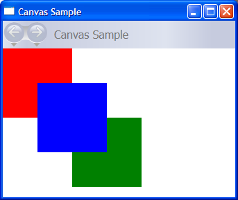
A Canvas can be instantiated simply by using Extensible Application Markup Language (XAML) or code. The following example demonstrates how to use Canvas to absolutely position content. This code produces three 100-pixel squares. The first square is red, and its top-left (x, y) position is specified as (0, 0). The second square is green, and its top-left position is (100, 100), just below and to the right of the first square. The third square is blue, and its top-left position is (50, 50), thus encompassing the lower-right quadrant of the first square and the upper-left quadrant of the second. Because the third square is laid out last, it appears to be on top of the other two squares—that is, the overlapping portions assume the color of the third box.
// Create the application's main window
mainWindow = new Window ();
mainWindow.Title = "Canvas Sample";

// Create the Canvas
myParentCanvas = new Canvas();
myParentCanvas.Width = 400;
myParentCanvas.Height = 400;

// Define child Canvas elements
myCanvas1 = new Canvas();
myCanvas1.Background = Brushes.Red;
myCanvas1.Height = 100;
myCanvas1.Width = 100;
Canvas.SetTop(myCanvas1, 0);
Canvas.SetLeft(myCanvas1, 0);

myCanvas2 = new Canvas();
myCanvas2.Background = Brushes.Green;
myCanvas2.Height = 100;
myCanvas2.Width = 100;
Canvas.SetTop(myCanvas2, 100);
Canvas.SetLeft(myCanvas2, 100);

myCanvas3 = new Canvas();
myCanvas3.Background = Brushes.Blue;
myCanvas3.Height = 100;
myCanvas3.Width = 100;
Canvas.SetTop(myCanvas3, 50);
Canvas.SetLeft(myCanvas3, 50);

// Add child elements to the Canvas' Children collection
myParentCanvas.Children.Add(myCanvas1);
myParentCanvas.Children.Add(myCanvas2);
myParentCanvas.Children.Add(myCanvas3);

// Add the parent Canvas as the Content of the Window Object
mainWindow.Content = myParentCanvas;
mainWindow.Show ();
WindowTitle = "Canvas Sample"
'Create a Canvas as the root Panel
Dim myParentCanvas As New Canvas()
myParentCanvas.Width = 400
myParentCanvas.Height = 400

' Define child Canvas elements
Dim myCanvas1 As New Canvas()
myCanvas1.Background = Brushes.Red
myCanvas1.Height = 100
myCanvas1.Width = 100
Canvas.SetTop(myCanvas1, 0)
Canvas.SetLeft(myCanvas1, 0)

Dim myCanvas2 As New Canvas()
myCanvas2.Background = Brushes.Green
myCanvas2.Height = 100
myCanvas2.Width = 100
Canvas.SetTop(myCanvas2, 100)
Canvas.SetLeft(myCanvas2, 100)

Dim myCanvas3 As New Canvas()
myCanvas3.Background = Brushes.Blue
myCanvas3.Height = 100
myCanvas3.Width = 100
Canvas.SetTop(myCanvas3, 50)
Canvas.SetLeft(myCanvas3, 50)

' Add child elements to the Canvas' Children collection
myParentCanvas.Children.Add(myCanvas1)
myParentCanvas.Children.Add(myCanvas2)
myParentCanvas.Children.Add(myCanvas3)

' Add the parent Canvas as the Content of the Window Object
Me.Content = myParentCanvas
<Page WindowTitle="Canvas Sample" xmlns="http://schemas.microsoft.com/winfx/2006/xaml/presentation">
  <Canvas Height="400" Width="400">
    <Canvas Height="100" Width="100" Top="0" Left="0" Background="Red"/>
    <Canvas Height="100" Width="100" Top="100" Left="100" Background="Green"/>
    <Canvas Height="100" Width="100" Top="50" Left="50" Background="Blue"/>
  </Canvas>
</Page>
The compiled application yields a new UI that looks like this.
DockPanel
The DockPanel element uses the DockPanel.Dock attached property as set in child content elements to position content along the edges of a container. When DockPanel.Dock is set to Top or Bottom, it positions child elements above or below each other. When DockPanel.Dock is set to Left or Right, it positions child elements to the left or right of each other. The LastChildFill property determines the position of the final element added as a child of a DockPanel.
You can use DockPanel to position a group of related controls, such as a set of buttons. Alternately, you can use it to create a "paned" UI, similar to that found in Microsoft Outlook.
Sizing to Content
If its Height and Width properties are not specified, DockPanel sizes to its content. The size can increase or decrease to accommodate the size of its child elements. However, when these properties are specified and there is no longer room for the next specified child element, DockPanel does not display that child element or subsequent child elements and does not measure subsequent child elements.
LastChildFill
By default, the last child of a DockPanel element will "fill" the remaining, unallocated space. If this behavior is not desired, set the LastChildFill property to false.
Defining and Using a DockPanel
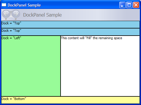
The following example demonstrates how to partition space using a DockPanel. Five Border elements are added as children of a parent DockPanel. Each uses a different positioning property of a DockPanel to partition space. The final element "fills" the remaining, unallocated space.
// Create the application's main window
mainWindow = gcnew Window();
mainWindow->Title = "DockPanel Sample";

// Create the DockPanel
DockPanel^ myDockPanel = gcnew DockPanel();
myDockPanel->LastChildFill = true;

// Define the child content
Border^ myBorder1 = gcnew Border();
myBorder1->Height = 25;
myBorder1->Background = Brushes::SkyBlue;
myBorder1->BorderBrush = Brushes::Black;
myBorder1->BorderThickness = Thickness(1);
DockPanel::SetDock(myBorder1, Dock::Top);
TextBlock^ myTextBlock1 = gcnew TextBlock();
myTextBlock1->Foreground = Brushes::Black;
myTextBlock1->Text = "Dock = Top";
myBorder1->Child = myTextBlock1;

Border^ myBorder2 = gcnew Border();
myBorder2->Height = 25;
myBorder2->Background = Brushes::SkyBlue;
myBorder2->BorderBrush = Brushes::Black;
myBorder2->BorderThickness = Thickness(1);
DockPanel::SetDock(myBorder2, Dock::Top);
TextBlock^ myTextBlock2 = gcnew TextBlock();
myTextBlock2->Foreground = Brushes::Black;
myTextBlock2->Text = "Dock = Top";
myBorder2->Child = myTextBlock2;

Border^ myBorder3 = gcnew Border();
myBorder3->Height = 25;
myBorder3->Background = Brushes::LemonChiffon;
myBorder3->BorderBrush = Brushes::Black;
myBorder3->BorderThickness = Thickness(1);
DockPanel::SetDock(myBorder3, Dock::Bottom);
TextBlock^ myTextBlock3 = gcnew TextBlock();
myTextBlock3->Foreground = Brushes::Black;
myTextBlock3->Text = "Dock = Bottom";
myBorder3->Child = myTextBlock3;

Border^ myBorder4 = gcnew Border();
myBorder4->Width = 200;
myBorder4->Background = Brushes::PaleGreen;
myBorder4->BorderBrush = Brushes::Black;
myBorder4->BorderThickness = Thickness(1);
DockPanel::SetDock(myBorder4, Dock::Left);
TextBlock^ myTextBlock4 = gcnew TextBlock();
myTextBlock4->Foreground = Brushes::Black;
myTextBlock4->Text = "Dock = Left";
myBorder4->Child = myTextBlock4;

Border^ myBorder5 = gcnew Border();
myBorder5->Background = Brushes::White;
myBorder5->BorderBrush = Brushes::Black;
myBorder5->BorderThickness = Thickness(1);
TextBlock^ myTextBlock5 = gcnew TextBlock();
myTextBlock5->Foreground = Brushes::Black;
myTextBlock5->Text = "This content will Fill the remaining space";
myBorder5->Child = myTextBlock5;

// Add child elements to the DockPanel Children collection
myDockPanel->Children->Add(myBorder1);
myDockPanel->Children->Add(myBorder2);
myDockPanel->Children->Add(myBorder3);
myDockPanel->Children->Add(myBorder4);
myDockPanel->Children->Add(myBorder5);

// Add the parent Canvas as the Content of the Window Object
mainWindow->Content = myDockPanel;
mainWindow->Show();
// Create the application's main window
mainWindow = new Window ();
mainWindow.Title = "DockPanel Sample";

// Create the DockPanel
DockPanel myDockPanel = new DockPanel();
myDockPanel.LastChildFill = true;

// Define the child content
Border myBorder1 = new Border();
myBorder1.Height = 25;
myBorder1.Background = Brushes.SkyBlue;
myBorder1.BorderBrush = Brushes.Black;
myBorder1.BorderThickness = new Thickness(1);
DockPanel.SetDock(myBorder1, Dock.Top);
TextBlock myTextBlock1 = new TextBlock();
myTextBlock1.Foreground = Brushes.Black;
myTextBlock1.Text = "Dock = Top";
myBorder1.Child = myTextBlock1;

Border myBorder2 = new Border();
myBorder2.Height = 25;
myBorder2.Background = Brushes.SkyBlue;
myBorder2.BorderBrush = Brushes.Black;
myBorder2.BorderThickness = new Thickness(1);
DockPanel.SetDock(myBorder2, Dock.Top);
TextBlock myTextBlock2 = new TextBlock();
myTextBlock2.Foreground = Brushes.Black;
myTextBlock2.Text = "Dock = Top";
myBorder2.Child = myTextBlock2;

Border myBorder3 = new Border();
myBorder3.Height = 25;
myBorder3.Background = Brushes.LemonChiffon;
myBorder3.BorderBrush = Brushes.Black;
myBorder3.BorderThickness = new Thickness(1);
DockPanel.SetDock(myBorder3, Dock.Bottom);
TextBlock myTextBlock3 = new TextBlock();
myTextBlock3.Foreground = Brushes.Black;
myTextBlock3.Text = "Dock = Bottom";
myBorder3.Child = myTextBlock3;

Border myBorder4 = new Border();
myBorder4.Width = 200;
myBorder4.Background = Brushes.PaleGreen;
myBorder4.BorderBrush = Brushes.Black;
myBorder4.BorderThickness = new Thickness(1);
DockPanel.SetDock(myBorder4, Dock.Left);
TextBlock myTextBlock4 = new TextBlock();
myTextBlock4.Foreground = Brushes.Black;
myTextBlock4.Text = "Dock = Left";
myBorder4.Child = myTextBlock4;

Border myBorder5 = new Border();
myBorder5.Background = Brushes.White;
myBorder5.BorderBrush = Brushes.Black;
myBorder5.BorderThickness = new Thickness(1);
TextBlock myTextBlock5 = new TextBlock();
myTextBlock5.Foreground = Brushes.Black;
myTextBlock5.Text = "This content will Fill the remaining space";
myBorder5.Child = myTextBlock5;

// Add child elements to the DockPanel Children collection
myDockPanel.Children.Add(myBorder1);
myDockPanel.Children.Add(myBorder2);
myDockPanel.Children.Add(myBorder3);
myDockPanel.Children.Add(myBorder4);
myDockPanel.Children.Add(myBorder5);

// Add the parent Canvas as the Content of the Window Object
mainWindow.Content = myDockPanel;
mainWindow.Show ();
WindowTitle = "DockPanel Sample"
'Create a DockPanel as the root Panel
Dim myDockPanel As New DockPanel()
myDockPanel.LastChildFill = True

' Define the child content
Dim myBorder1 As New Border()
myBorder1.Height = 25
myBorder1.Background = Brushes.SkyBlue
myBorder1.BorderBrush = Brushes.Black
myBorder1.BorderThickness = New Thickness(1)
DockPanel.SetDock(myBorder1, Dock.Top)
Dim myTextBlock1 As New TextBlock()
myTextBlock1.Foreground = Brushes.Black
myTextBlock1.Text = "Dock = Top"
myBorder1.Child = myTextBlock1

Dim myBorder2 As New Border()
myBorder2.Height = 25
myBorder2.Background = Brushes.SkyBlue
myBorder2.BorderBrush = Brushes.Black
myBorder2.BorderThickness = New Thickness(1)
DockPanel.SetDock(myBorder2, Dock.Top)
Dim myTextBlock2 As New TextBlock()
myTextBlock2.Foreground = Brushes.Black
myTextBlock2.Text = "Dock = Top"
myBorder2.Child = myTextBlock2

Dim myBorder3 As New Border()
myBorder3.Height = 25
myBorder3.Background = Brushes.LemonChiffon
myBorder3.BorderBrush = Brushes.Black
myBorder3.BorderThickness = New Thickness(1)
DockPanel.SetDock(myBorder3, Dock.Bottom)
Dim myTextBlock3 As New TextBlock()
myTextBlock3.Foreground = Brushes.Black
myTextBlock3.Text = "Dock = Bottom"
myBorder3.Child = myTextBlock3

Dim myBorder4 As New Border()
myBorder4.Width = 200
myBorder4.Background = Brushes.PaleGreen
myBorder4.BorderBrush = Brushes.Black
myBorder4.BorderThickness = New Thickness(1)
DockPanel.SetDock(myBorder4, Dock.Left)
Dim myTextBlock4 As New TextBlock()
myTextBlock4.Foreground = Brushes.Black
myTextBlock4.Text = "Dock = Left"
myBorder4.Child = myTextBlock4

Dim myBorder5 As New Border()
myBorder5.Background = Brushes.White
myBorder5.BorderBrush = Brushes.Black
myBorder5.BorderThickness = New Thickness(1)
Dim myTextBlock5 As New TextBlock()
myTextBlock5.Foreground = Brushes.Black
myTextBlock5.Text = "This content will Fill the remaining space"
myBorder5.Child = myTextBlock5

' Add child elements to the DockPanel Children collection
myDockPanel.Children.Add(myBorder1)
myDockPanel.Children.Add(myBorder2)
myDockPanel.Children.Add(myBorder3)
myDockPanel.Children.Add(myBorder4)
myDockPanel.Children.Add(myBorder5)
Me.Content = myDockPanel
<Page xmlns="http://schemas.microsoft.com/winfx/2006/xaml/presentation" WindowTitle="DockPanel Sample">
  <DockPanel LastChildFill="True">
    <Border Height="25" Background="SkyBlue" BorderBrush="Black" BorderThickness="1" DockPanel.Dock="Top">
      <TextBlock Foreground="Black">Dock = "Top"</TextBlock>
    </Border>
    <Border Height="25" Background="SkyBlue" BorderBrush="Black" BorderThickness="1" DockPanel.Dock="Top">
      <TextBlock Foreground="Black">Dock = "Top"</TextBlock>
    </Border>
    <Border Height="25" Background="LemonChiffon" BorderBrush="Black" BorderThickness="1" DockPanel.Dock="Bottom">
      <TextBlock Foreground="Black">Dock = "Bottom"</TextBlock>
    </Border>
    <Border Width="200" Background="PaleGreen" BorderBrush="Black" BorderThickness="1" DockPanel.Dock="Left">
      <TextBlock Foreground="Black">Dock = "Left"</TextBlock>
    </Border>
    <Border Background="White" BorderBrush="Black" BorderThickness="1">
      <TextBlock Foreground="Black">This content will "Fill" the remaining space</TextBlock>
    </Border>
  </DockPanel>
</Page>
The compiled application yields a new UI that looks like this.
Grid
The Grid element merges the functionality of an absolute positioning and tabular data control. A Grid enables you to easily position and style elements. Grid allows you to define flexible row and column groupings, and even provides a mechanism to share sizing information between multiple Grid elements.
How is Grid Different from Table
Table and Grid share some common functionality, but each is best suited for different scenarios. A Table is designed for use within flow content (see Flow Document Overview for more information on flow content). Grids are best used inside of forms (basically anywhere outside of flow content). Within a FlowDocument, Table supports flow content behaviors like pagination, column reflow, and content selection while a Grid does not. A Grid on the other hand is best used outside of a FlowDocument for many reasons including Grid adds elements based on a row and column index, Table does not. The Grid element allows layering of child content, allowing more than one element to exist within a single "cell." Table does not support layering. Child elements of a Grid can be absolutely positioned relative to the area of their "cell" boundaries. Table does not support this feature. Finally, a Grid is lighter weight than a Table.
Sizing Behavior of Columns and Rows
Columns and rows defined within a Grid can take advantage of Star sizing in order to distribute remaining space proportionally. When Star is selected as the Height or Width of a row or column, that column or row receives a weighted proportion of remaining available space. This is in contrast to Auto, which will distribute space evenly based on the size of the content within a column or row. This value is expressed as * or 2* when using Extensible Application Markup Language (XAML). In the first case, the row or column would receive one times the available space, in the second case, two times, and so on. By combining this technique to proportionally distribute space with a HorizontalAlignment and VerticalAlignment value of Stretch it is possible to partition layout space by percentage of screen space. Grid is the only layout panel that can distribute space in this manner.
Defining and Using a Grid
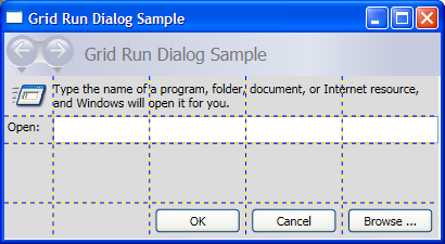
The following example demonstrates how to build a UI similar to that found on the Run dialog available on the Windows Start menu.
// Create the Grid.
grid1 = new Grid ();
grid1.Background = Brushes.Gainsboro;
grid1.HorizontalAlignment = HorizontalAlignment.Left;
grid1.VerticalAlignment = VerticalAlignment.Top;
grid1.ShowGridLines = true;
grid1.Width = 425;
grid1.Height = 165;

// Define the Columns.
colDef1 = new ColumnDefinition();
colDef1.Width = new GridLength(1, GridUnitType.Auto);
colDef2 = new ColumnDefinition();
colDef2.Width = new GridLength(1, GridUnitType.Star);
colDef3 = new ColumnDefinition();
colDef3.Width = new GridLength(1, GridUnitType.Star);
colDef4 = new ColumnDefinition();
colDef4.Width = new GridLength(1, GridUnitType.Star);
colDef5 = new ColumnDefinition();
colDef5.Width = new GridLength(1, GridUnitType.Star);
grid1.ColumnDefinitions.Add(colDef1);
grid1.ColumnDefinitions.Add(colDef2);
grid1.ColumnDefinitions.Add(colDef3);
grid1.ColumnDefinitions.Add(colDef4);
grid1.ColumnDefinitions.Add(colDef5);

// Define the Rows.
rowDef1 = new RowDefinition();
rowDef1.Height = new GridLength(1, GridUnitType.Auto);
rowDef2 = new RowDefinition();
rowDef2.Height = new GridLength(1, GridUnitType.Auto);
rowDef3 = new RowDefinition();
rowDef3.Height = new GridLength(1, GridUnitType.Star);
rowDef4 = new RowDefinition();
rowDef4.Height = new GridLength(1, GridUnitType.Auto);
grid1.RowDefinitions.Add(rowDef1);
grid1.RowDefinitions.Add(rowDef2);
grid1.RowDefinitions.Add(rowDef3);
grid1.RowDefinitions.Add(rowDef4);

// Add the Image.
img1 = new Image();
img1.Source = new System.Windows.Media.Imaging.BitmapImage(new Uri("runicon.png", UriKind.Relative));
Grid.SetRow(img1, 0);
Grid.SetColumn(img1, 0);

// Add the main application dialog.
txt1 = new TextBlock();
txt1.Text = "Type the name of a program, folder, document, or Internet resource, and Windows will open it for you.";
txt1.TextWrapping = TextWrapping.Wrap;
Grid.SetColumnSpan(txt1, 4);
Grid.SetRow(txt1, 0);
Grid.SetColumn(txt1, 1);

// Add the second text cell to the Grid.
txt2 = new TextBlock();
txt2.Text = "Open:";
Grid.SetRow(txt2, 1);
Grid.SetColumn(txt2, 0);

// Add the TextBox control.
tb1 = new TextBox();
Grid.SetRow(tb1, 1);
Grid.SetColumn(tb1, 1);
Grid.SetColumnSpan(tb1, 5);

// Add the buttons.
button1 = new Button();
button2 = new Button();
button3 = new Button();
button1.Content = "OK";
button2.Content = "Cancel";
button3.Content = "Browse ...";
Grid.SetRow(button1, 3);
Grid.SetColumn(button1, 2);
button1.Margin = new Thickness(10, 0, 10, 15);
button2.Margin = new Thickness(10, 0, 10, 15);
button3.Margin = new Thickness(10, 0, 10, 15);
Grid.SetRow(button2, 3);
Grid.SetColumn(button2, 3);
Grid.SetRow(button3, 3);
Grid.SetColumn(button3, 4);

grid1.Children.Add(img1);
grid1.Children.Add(txt1);
grid1.Children.Add(txt2);
grid1.Children.Add(tb1);
grid1.Children.Add(button1);
grid1.Children.Add(button2);
grid1.Children.Add(button3);

mainWindow.Content = grid1;
'Create a Grid as the root Panel element.
Dim myGrid As New Grid()
myGrid.Height = 165
myGrid.Width = 425
myGrid.Background = Brushes.Gainsboro
myGrid.ShowGridLines = True
myGrid.HorizontalAlignment = Windows.HorizontalAlignment.Left
myGrid.VerticalAlignment = Windows.VerticalAlignment.Top

' Define and Add the Rows and Columns.
Dim colDef1 As New ColumnDefinition
colDef1.Width = New GridLength(1, GridUnitType.Auto)
Dim colDef2 As New ColumnDefinition
colDef2.Width = New GridLength(1, GridUnitType.Star)
Dim colDef3 As New ColumnDefinition
colDef3.Width = New GridLength(1, GridUnitType.Star)
Dim colDef4 As New ColumnDefinition
colDef4.Width = New GridLength(1, GridUnitType.Star)
Dim colDef5 As New ColumnDefinition
colDef5.Width = New GridLength(1, GridUnitType.Star)
myGrid.ColumnDefinitions.Add(colDef1)
myGrid.ColumnDefinitions.Add(colDef2)
myGrid.ColumnDefinitions.Add(colDef3)
myGrid.ColumnDefinitions.Add(colDef4)
myGrid.ColumnDefinitions.Add(colDef5)

Dim rowDef1 As New RowDefinition
rowDef1.Height = New GridLength(1, GridUnitType.Auto)
Dim rowDef2 As New RowDefinition
rowDef2.Height = New GridLength(1, GridUnitType.Auto)
Dim rowDef3 As New Controls.RowDefinition
rowDef3.Height = New GridLength(1, GridUnitType.Star)
Dim rowDef4 As New RowDefinition
rowDef4.Height = New GridLength(1, GridUnitType.Auto)
myGrid.RowDefinitions.Add(rowDef1)
myGrid.RowDefinitions.Add(rowDef2)
myGrid.RowDefinitions.Add(rowDef3)
myGrid.RowDefinitions.Add(rowDef4)

' Add the Image.
Dim img1 As New Image
img1.Source = New System.Windows.Media.Imaging.BitmapImage(New Uri("runicon.png", UriKind.Relative))
Grid.SetRow(img1, 0)
Grid.SetColumn(img1, 0)
myGrid.Children.Add(img1)

' Add the main application dialog.
Dim txt1 As New TextBlock
txt1.Text = "Type the name of a program, document, or Internet resource, and Windows will open it for you."
txt1.TextWrapping = TextWrapping.Wrap
Grid.SetColumnSpan(txt1, 4)
Grid.SetRow(txt1, 0)
Grid.SetColumn(txt1, 1)
myGrid.Children.Add(txt1)

' Add the second TextBlock Cell to the Grid.
Dim txt2 As New TextBlock
txt2.Text = "Open:"
Grid.SetRow(txt2, 1)
Grid.SetColumn(txt2, 0)
myGrid.Children.Add(txt2)

' Add the TextBox control.
Dim tb1 As New TextBox
Grid.SetRow(tb1, 1)
Grid.SetColumn(tb1, 1)
Grid.SetColumnSpan(tb1, 5)
myGrid.Children.Add(tb1)

' Add the Button controls.
Dim button1 As New Button
Dim button2 As New Button
Dim button3 As New Button
button1.Content = "OK"
button1.Margin = New Thickness(10, 0, 10, 15)
button2.Content = "Cancel"
button2.Margin = New Thickness(10, 0, 10, 15)
button3.Content = "Browse ..."
button3.Margin = New Thickness(10, 0, 10, 15)

Grid.SetRow(button1, 3)
Grid.SetColumn(button1, 2)
Grid.SetRow(button2, 3)
Grid.SetColumn(button2, 3)
Grid.SetRow(button3, 3)
Grid.SetColumn(button3, 4)
myGrid.Children.Add(button1)
myGrid.Children.Add(button2)
myGrid.Children.Add(button3)

Me.Content = myGrid
The compiled application yields a new UI that looks like this.
StackPanel
A StackPanel enables you to "stack" elements in an assigned direction. The default stack direction is vertical. The Orientation property can be used to control content flow.
StackPanel vs. DockPanel
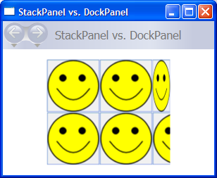
Although DockPanel can also "stack" child elements, DockPanel and StackPanel do not produce analogous results in some usage scenarios. For example, the order of child elements can affect their size in a DockPanel but not in a StackPanel. This is because StackPanel measures in the direction of stacking at PositiveInfinity, whereas DockPanel measures only the available size.
The following example demonstrates this key difference.
// Create the application's main window
mainWindow = gcnew Window();
mainWindow->Title = "StackPanel vs. DockPanel";

// Add root Grid
myGrid = gcnew Grid();
myGrid->Width = 175;
myGrid->Height = 150;
RowDefinition^ myRowDef1 = gcnew RowDefinition();
RowDefinition^ myRowDef2 = gcnew RowDefinition();
myGrid->RowDefinitions->Add(myRowDef1);
myGrid->RowDefinitions->Add(myRowDef2);

// Define the DockPanel
myDockPanel = gcnew DockPanel();
Grid::SetRow(myDockPanel, 0);

//Define an Image and Source
Image^ myImage = gcnew Image();
BitmapImage^ bi = gcnew BitmapImage();
bi->BeginInit();
bi->UriSource = gcnew System::Uri("smiley_stackpanel.png", UriKind::Relative);
bi->EndInit();
myImage->Source = bi;

Image^ myImage2 = gcnew Image();
BitmapImage^ bi2 = gcnew BitmapImage();
bi2->BeginInit();
bi2->UriSource = gcnew System::Uri("smiley_stackpanel.png", UriKind::Relative);
bi2->EndInit();
myImage2->Source = bi2;

Image^ myImage3 = gcnew Image();
BitmapImage^ bi3 = gcnew BitmapImage();
bi3->BeginInit();
bi3->UriSource = gcnew System::Uri("smiley_stackpanel.PNG", UriKind::Relative);
bi3->EndInit();
myImage3->Stretch = Stretch::Fill;
myImage3->Source = bi3;

// Add the images to the parent DockPanel
myDockPanel->Children->Add(myImage);
myDockPanel->Children->Add(myImage2);
myDockPanel->Children->Add(myImage3);

//Define a StackPanel
myStackPanel = gcnew StackPanel();
myStackPanel->Orientation = Orientation::Horizontal;
Grid::SetRow(myStackPanel, 1);

Image^ myImage4 = gcnew Image();
BitmapImage^ bi4 = gcnew BitmapImage();
bi4->BeginInit();
bi4->UriSource = gcnew System::Uri("smiley_stackpanel.png", UriKind::Relative);
bi4->EndInit();
myImage4->Source = bi4;

Image^ myImage5 = gcnew Image();
BitmapImage^ bi5 = gcnew BitmapImage();
bi5->BeginInit();
bi5->UriSource = gcnew System::Uri("smiley_stackpanel.png", UriKind::Relative);
bi5->EndInit();
myImage5->Source = bi5;

Image^ myImage6 = gcnew Image();
BitmapImage^ bi6 = gcnew BitmapImage();
bi6->BeginInit();
bi6->UriSource = gcnew System::Uri("smiley_stackpanel.PNG", UriKind::Relative);
bi6->EndInit();
myImage6->Stretch = Stretch::Fill;
myImage6->Source = bi6;

// Add the images to the parent StackPanel
myStackPanel->Children->Add(myImage4);
myStackPanel->Children->Add(myImage5);
myStackPanel->Children->Add(myImage6);

// Add the layout panels as children of the Grid
myGrid->Children->Add(myDockPanel);
myGrid->Children->Add(myStackPanel);

// Add the Grid as the Content of the Parent Window Object
mainWindow->Content = myGrid;
mainWindow->Show();
// Create the application's main window
mainWindow = new Window ();
mainWindow.Title = "StackPanel vs. DockPanel";

// Add root Grid
myGrid = new Grid();
myGrid.Width = 175;
myGrid.Height = 150;
RowDefinition myRowDef1 = new RowDefinition();
RowDefinition myRowDef2 = new RowDefinition();
myGrid.RowDefinitions.Add(myRowDef1);
myGrid.RowDefinitions.Add(myRowDef2);

// Define the DockPanel
myDockPanel = new DockPanel();
Grid.SetRow(myDockPanel, 0);

//Define an Image and Source
Image myImage = new Image();
BitmapImage bi = new BitmapImage();
bi.BeginInit();
bi.UriSource = new Uri("smiley_stackpanel.png", UriKind.Relative);
bi.EndInit();
myImage.Source = bi;

Image myImage2 = new Image();
BitmapImage bi2 = new BitmapImage();
bi2.BeginInit();
bi2.UriSource = new Uri("smiley_stackpanel.png", UriKind.Relative);
bi2.EndInit();
myImage2.Source = bi2;

Image myImage3 = new Image();
BitmapImage bi3 = new BitmapImage();
bi3.BeginInit();
bi3.UriSource = new Uri("smiley_stackpanel.PNG", UriKind.Relative);
bi3.EndInit();
myImage3.Stretch = Stretch.Fill;
myImage3.Source = bi3;

// Add the images to the parent DockPanel
myDockPanel.Children.Add(myImage);
myDockPanel.Children.Add(myImage2);
myDockPanel.Children.Add(myImage3);

//Define a StackPanel
myStackPanel = new StackPanel();
myStackPanel.Orientation = Orientation.Horizontal;
Grid.SetRow(myStackPanel, 1);

Image myImage4 = new Image();
BitmapImage bi4 = new BitmapImage();
bi4.BeginInit();
bi4.UriSource = new Uri("smiley_stackpanel.png", UriKind.Relative);
bi4.EndInit();
myImage4.Source = bi4;

Image myImage5 = new Image();
BitmapImage bi5 = new BitmapImage();
bi5.BeginInit();
bi5.UriSource = new Uri("smiley_stackpanel.png", UriKind.Relative);
bi5.EndInit();
myImage5.Source = bi5;

Image myImage6 = new Image();
BitmapImage bi6 = new BitmapImage();
bi6.BeginInit();
bi6.UriSource = new Uri("smiley_stackpanel.PNG", UriKind.Relative);
bi6.EndInit();
myImage6.Stretch = Stretch.Fill;
myImage6.Source = bi6;

// Add the images to the parent StackPanel
myStackPanel.Children.Add(myImage4);
myStackPanel.Children.Add(myImage5);
myStackPanel.Children.Add(myImage6);

// Add the layout panels as children of the Grid
myGrid.Children.Add(myDockPanel);
myGrid.Children.Add(myStackPanel);

// Add the Grid as the Content of the Parent Window Object
mainWindow.Content = myGrid;
mainWindow.Show ();
'Add root Grid
Dim myGrid As New Grid
myGrid.Width = 175
myGrid.Height = 150
Dim myRowDef1 As New RowDefinition
Dim myRowDef2 As New RowDefinition
myGrid.RowDefinitions.Add(myRowDef1)
myGrid.RowDefinitions.Add(myRowDef2)

'Define the DockPanel
Dim myDockPanel As New DockPanel
Grid.SetRow(myDockPanel, 0)

'Define an Image and Source.
Dim myImage As New Image
Dim bi As New BitmapImage
bi.BeginInit()
bi.UriSource = New Uri("smiley_stackpanel.png", UriKind.Relative)
bi.EndInit()
myImage.Source = bi

Dim myImage2 As New Image
Dim bi2 As New BitmapImage
bi2.BeginInit()
bi2.UriSource = New Uri("smiley_stackpanel.png", UriKind.Relative)
bi2.EndInit()
myImage2.Source = bi2

Dim myImage3 As New Image
Dim bi3 As New BitmapImage
bi3.BeginInit()
bi3.UriSource = New Uri("smiley_stackpanel.PNG", UriKind.Relative)
bi3.EndInit()
myImage3.Stretch = Stretch.Fill
myImage3.Source = bi3

'Add the images to the parent DockPanel.
myDockPanel.Children.Add(myImage)
myDockPanel.Children.Add(myImage2)
myDockPanel.Children.Add(myImage3)

'Define a StackPanel.
Dim myStackPanel As New StackPanel
myStackPanel.Orientation = Orientation.Horizontal
Grid.SetRow(myStackPanel, 1)

Dim myImage4 As New Image
Dim bi4 As New BitmapImage
bi4.BeginInit()
bi4.UriSource = New Uri("smiley_stackpanel.png", UriKind.Relative)
bi4.EndInit()
myImage4.Source = bi4

Dim myImage5 As New Image
Dim bi5 As New BitmapImage
bi5.BeginInit()
bi5.UriSource = New Uri("smiley_stackpanel.png", UriKind.Relative)
bi5.EndInit()
myImage5.Source = bi5

Dim myImage6 As New Image
Dim bi6 As New BitmapImage
bi6.BeginInit()
bi6.UriSource = New Uri("smiley_stackpanel.PNG", UriKind.Relative)
bi6.EndInit()
myImage6.Stretch = Stretch.Fill
myImage6.Source = bi6

'Add the images to the parent StackPanel.
myStackPanel.Children.Add(myImage4)
myStackPanel.Children.Add(myImage5)
myStackPanel.Children.Add(myImage6)

'Add the layout panels as children of the Grid
myGrid.Children.Add(myDockPanel)
myGrid.Children.Add(myStackPanel)
<Page xmlns="http://schemas.microsoft.com/winfx/2006/xaml/presentation"
      WindowTitle="StackPanel vs. DockPanel">
  <Grid Width="175" Height="150">
    <Grid.ColumnDefinitions>
      <ColumnDefinition />
    </Grid.ColumnDefinitions>
    <Grid.RowDefinitions>
      <RowDefinition />
      <RowDefinition />
    </Grid.RowDefinitions>

    <DockPanel Grid.Column="0" Grid.Row="0">
      <Image Source="smiley_stackpanel.png" />
      <Image Source="smiley_stackpanel.png" />
      <Image Source="smiley_stackpanel.png" Stretch="Fill"/>
    </DockPanel>

    <StackPanel Grid.Column="0" Grid.Row="1"  Orientation="Horizontal">
      <Image Source="smiley_stackpanel.png" />
      <Image Source="smiley_stackpanel.png" />
      <Image Source="smiley_stackpanel.png" Stretch="Fill"/>
    </StackPanel>
    </Grid>
</Page>
The difference in rendering behavior can be seen in this image.
Defining and Using a StackPanel
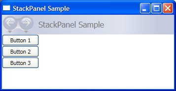
The following example demonstrates how to use a StackPanel to create a set of vertically-positioned buttons. For horizontal positioning, set the Orientation property to Horizontal.
// Create the application's main window
mainWindow = new Window ();
mainWindow.Title = "StackPanel Sample";

// Define the StackPanel
myStackPanel = new StackPanel();
myStackPanel.HorizontalAlignment = HorizontalAlignment.Left;
myStackPanel.VerticalAlignment = VerticalAlignment.Top;

// Define child content
Button myButton1 = new Button();
myButton1.Content = "Button 1";
Button myButton2 = new Button();
myButton2.Content = "Button 2";
Button myButton3 = new Button();
myButton3.Content = "Button 3";

// Add child elements to the parent StackPanel
myStackPanel.Children.Add(myButton1);
myStackPanel.Children.Add(myButton2);
myStackPanel.Children.Add(myButton3);

// Add the StackPanel as the Content of the Parent Window Object
mainWindow.Content = myStackPanel;
mainWindow.Show ();
WindowTitle = "StackPanel Sample"
' Define the StackPanel
Dim myStackPanel As New StackPanel()
myStackPanel.HorizontalAlignment = Windows.HorizontalAlignment.Left
myStackPanel.VerticalAlignment = Windows.VerticalAlignment.Top

' Define child content
Dim myButton1 As New Button()
myButton1.Content = "Button 1"
Dim myButton2 As New Button()
myButton2.Content = "Button 2"
Dim myButton3 As New Button()
myButton3.Content = "Button 3"

' Add child elements to the parent StackPanel
myStackPanel.Children.Add(myButton1)
myStackPanel.Children.Add(myButton2)
myStackPanel.Children.Add(myButton3)

Me.Content = myStackPanel
The compiled application yields a new UI that looks like this.
VirtualizingStackPanel
WPF also provides a variation of the StackPanel element that automatically "virtualizes" data-bound child content. In this context, the word virtualize refers to a technique by which a subset of elements are generated from a larger number of data items based upon which items are visible on-screen. It is intensive, both in terms of memory and processor, to generate a large number of UI elements when only a few may be on the screen at a given time. VirtualizingStackPanel (through functionality provided by VirtualizingPanel) calculates visible items and works with the ItemContainerGenerator from an ItemsControl (such as ListBox or ListView) to only create elements for visible items.
The VirtualizingStackPanel element is automatically set as the items host for controls such as the ListBox. When hosting a data bound collection, content is automatically virtualized, as long as the content is within the bounds of a ScrollViewer. This greatly improves performance when hosting many child items.
The following markup demonstrates how to use a VirtualizingStackPanel as an items host. The VirtualizingStackPanel.IsVirtualizingProperty attached property must be set to true (default) for virtualization to occur.
<StackPanel DataContext="{Binding Source={StaticResource Leagues}}">
    <TextBlock Text="{Binding XPath=@name}" FontFamily="Arial" FontSize="18" Foreground="Black"/>
        <ListBox VirtualizingStackPanel.IsVirtualizing="True"
                 ItemsSource="{Binding XPath=Team}"
                 ItemTemplate="{DynamicResource NameDataStyle}"/>
</StackPanel>
WrapPanel
WrapPanel is used to position child elements in sequential position from left to right, breaking content to the next line when it reaches the edge of its parent container. Content can be oriented horizontally or vertically. WrapPanel is useful for simple flowing user interface (UI) scenarios. It can also be used to apply uniform sizing to all of its child elements.
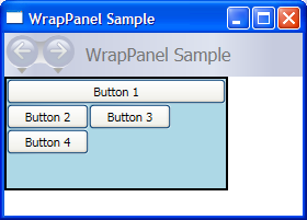
The following example demonstrates how to create a WrapPanel to display Button controls that wrap when they reach the edge of their container.
// Create the application's main window
mainWindow = gcnew System::Windows::Window();
mainWindow->Title = "WrapPanel Sample";


// Instantiate a new WrapPanel and set properties
myWrapPanel = gcnew WrapPanel();
myWrapPanel->Background = Brushes::Azure;
myWrapPanel->Orientation = Orientation::Horizontal;
myWrapPanel->ItemHeight = 25;

myWrapPanel->ItemWidth = 75;
myWrapPanel->Width = 150;
myWrapPanel->HorizontalAlignment = HorizontalAlignment::Left;
myWrapPanel->VerticalAlignment = VerticalAlignment::Top;

// Define 3 button elements. Each button is sized at width of 75, so the third button wraps to the next line.
btn1 = gcnew Button();
btn1->Content = "Button 1";
btn2 = gcnew Button();
btn2->Content = "Button 2";
btn3 = gcnew Button();
btn3->Content = "Button 3";

// Add the buttons to the parent WrapPanel using the Children.Add method.
myWrapPanel->Children->Add(btn1);
myWrapPanel->Children->Add(btn2);
myWrapPanel->Children->Add(btn3);

// Add the WrapPanel to the MainWindow as Content
mainWindow->Content = myWrapPanel;
mainWindow->Show();
// Create the application's main window
mainWindow = new System.Windows.Window();
mainWindow.Title = "WrapPanel Sample";


// Instantiate a new WrapPanel and set properties
myWrapPanel = new WrapPanel();
myWrapPanel.Background = System.Windows.Media.Brushes.Azure;
myWrapPanel.Orientation = Orientation.Horizontal;
myWrapPanel.Width = 200;
myWrapPanel.HorizontalAlignment = HorizontalAlignment.Left;
myWrapPanel.VerticalAlignment = VerticalAlignment.Top;

// Define 3 button elements. The last three buttons are sized at width
// of 75, so the forth button wraps to the next line.
btn1 = new Button();
btn1.Content = "Button 1";
btn1.Width = 200;
btn2 = new Button();
btn2.Content = "Button 2";
btn2.Width = 75;
btn3 = new Button();
btn3.Content = "Button 3";
btn3.Width = 75;
btn4 = new Button();
btn4.Content = "Button 4";
btn4.Width = 75;

// Add the buttons to the parent WrapPanel using the Children.Add method.
myWrapPanel.Children.Add(btn1);
myWrapPanel.Children.Add(btn2);
myWrapPanel.Children.Add(btn3);
myWrapPanel.Children.Add(btn4);

// Add the WrapPanel to the MainWindow as Content
mainWindow.Content = myWrapPanel;
mainWindow.Show();
WindowTitle = "WrapPanel Sample"

' Instantiate a new WrapPanel and set properties
Dim myWrapPanel As New WrapPanel()
myWrapPanel.Background = Brushes.Azure
myWrapPanel.Orientation = Orientation.Horizontal

myWrapPanel.Width = 200
myWrapPanel.HorizontalAlignment = Windows.HorizontalAlignment.Left
myWrapPanel.VerticalAlignment = Windows.VerticalAlignment.Top

' Define 3 button elements. The last three buttons are sized at width
' of 75, so the forth button wraps to the next line.
Dim btn1 As New Button()
btn1.Content = "Button 1"
btn1.Width = 200
Dim btn2 As New Button()
btn2.Content = "Button 2"
btn2.Width = 75
Dim btn3 As New Button()
btn3.Content = "Button 3"
btn3.Width = 75
Dim btn4 As New Button()
btn4.Content = "Button 4"
btn4.Width = 75

' Add the buttons to the parent WrapPanel using the Children.Add method.
myWrapPanel.Children.Add(btn1)
myWrapPanel.Children.Add(btn2)
myWrapPanel.Children.Add(btn3)
myWrapPanel.Children.Add(btn4)

' Add the WrapPanel to the Page as Content
Me.Content = myWrapPanel
<Page xmlns="http://schemas.microsoft.com/winfx/2006/xaml/presentation" WindowTitle="WrapPanel Sample">
  <Border HorizontalAlignment="Left" VerticalAlignment="Top" BorderBrush="Black" BorderThickness="2">
        <WrapPanel Background="LightBlue" Width="200" Height="100">
            <Button Width="200">Button 1</Button>
            <Button>Button 2</Button>
            <Button>Button 3</Button>
            <Button>Button 4</Button>
        </WrapPanel>
  </Border>
</Page>
The compiled application yields a new UI that looks like this.
Nested Panel Elements
Panel elements can be nested within each other in order to produce complex layouts. This can prove very useful in situations where one Panel is ideal for a portion of a UI, but may not meet the needs of a different portion of the UI.
There is no practical limit to the amount of nesting that your application can support, however, it is generally best to limit your application to only use those panels that are actually necessary for your desired layout. In many cases, a Grid element can be used instead of nested panels due to its flexibility as a layout container. This can increase performance in your application by keeping unnecessary elements out of the tree.
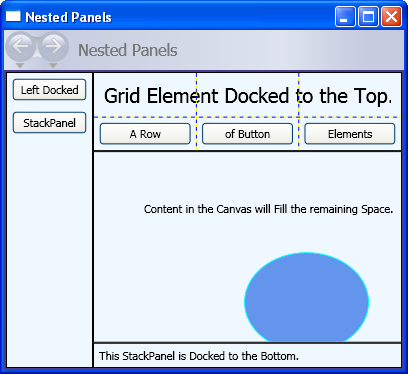
The following example demonstrates how to create a UI that takes advantage of nested Panel elements in order to achieve a specific layout. In this particular case, a DockPanel element is used to provide UI structure, and nested StackPanel elements, a Grid, and a Canvas are used to position child elements precisely within the parent DockPanel.
// Define the DockPanel.
myDockPanel = new DockPanel();

// Add the Left Docked StackPanel
Border myBorder2 = new Border();
myBorder2.BorderThickness = new Thickness(1);
myBorder2.BorderBrush = Brushes.Black;
DockPanel.SetDock(myBorder2, Dock.Left);
StackPanel myStackPanel = new StackPanel();
Button myButton1 = new Button();
myButton1.Content = "Left Docked";
myButton1.Margin = new Thickness(5);
Button myButton2 = new Button();
myButton2.Content = "StackPanel";
myButton2.Margin = new Thickness(5);
myStackPanel.Children.Add(myButton1);
myStackPanel.Children.Add(myButton2);
myBorder2.Child = myStackPanel;

// Add the Top Docked Grid.
Border myBorder3 = new Border();
myBorder3.BorderThickness = new Thickness(1);
myBorder3.BorderBrush = Brushes.Black;
DockPanel.SetDock(myBorder3, Dock.Top);
Grid myGrid = new Grid();
myGrid.ShowGridLines = true;
RowDefinition myRowDef1 = new RowDefinition();
RowDefinition myRowDef2 = new RowDefinition();
ColumnDefinition myColDef1 = new ColumnDefinition();
ColumnDefinition myColDef2 = new ColumnDefinition();
ColumnDefinition myColDef3 = new ColumnDefinition();
myGrid.ColumnDefinitions.Add(myColDef1);
myGrid.ColumnDefinitions.Add(myColDef2);
myGrid.ColumnDefinitions.Add(myColDef3);
myGrid.RowDefinitions.Add(myRowDef1);
myGrid.RowDefinitions.Add(myRowDef2);
TextBlock myTextBlock1 = new TextBlock();
myTextBlock1.FontSize = 20;
myTextBlock1.Margin = new Thickness(10);
myTextBlock1.Text = "Grid Element Docked at the Top";
Grid.SetRow(myTextBlock1, 0);
Grid.SetColumnSpan(myTextBlock1, 3);
Button myButton3 = new Button();
myButton3.Margin = new Thickness(5);
myButton3.Content = "A Row";
Grid.SetColumn(myButton3, 0);
Grid.SetRow(myButton3, 1);
Button myButton4 = new Button();
myButton4.Margin = new Thickness(5);
myButton4.Content = "of Button";
Grid.SetColumn(myButton4, 1);
Grid.SetRow(myButton4, 1);
Button myButton5 = new Button();
myButton5.Margin = new Thickness(5);
myButton5.Content = "Elements";
Grid.SetColumn(myButton5, 2);
Grid.SetRow(myButton5, 1);
myGrid.Children.Add(myTextBlock1);
myGrid.Children.Add(myButton3);
myGrid.Children.Add(myButton4);
myGrid.Children.Add(myButton5);
myBorder3.Child = myGrid;

// Add the Bottom Docked StackPanel.
Border myBorder4 = new Border();
myBorder4.BorderBrush = Brushes.Black;
myBorder4.BorderThickness = new Thickness(1);
DockPanel.SetDock(myBorder4, Dock.Bottom);
StackPanel myStackPanel2 = new StackPanel();
myStackPanel2.Orientation = Orientation.Horizontal;
TextBlock myTextBlock2 = new TextBlock();
myTextBlock2.Text = "This StackPanel is Docked to the Bottom";
myTextBlock2.Margin = new Thickness(5);
myStackPanel2.Children.Add(myTextBlock2);
myBorder4.Child = myStackPanel2;

// Add the Canvas, that fills remaining space.
Border myBorder5 = new Border();
myBorder4.BorderBrush = Brushes.Black;
myBorder5.BorderThickness = new Thickness(1);
Canvas myCanvas = new Canvas();
myCanvas.ClipToBounds = true;
TextBlock myTextBlock3 = new TextBlock();
myTextBlock3.Text = "Content in the Canvas will Fill the remaining space.";
Canvas.SetTop(myTextBlock3, 50);
Canvas.SetLeft(myTextBlock3, 50);
Ellipse myEllipse = new Ellipse();
myEllipse.Height = 100;
myEllipse.Width = 125;
myEllipse.Fill = Brushes.CornflowerBlue;
myEllipse.Stroke = Brushes.Aqua;
Canvas.SetTop(myEllipse, 100);
Canvas.SetLeft(myEllipse, 150);
myCanvas.Children.Add(myTextBlock3);
myCanvas.Children.Add(myEllipse);
myBorder5.Child = myCanvas;

// Add child elements to the parent DockPanel.
myDockPanel.Children.Add(myBorder2);
myDockPanel.Children.Add(myBorder3);
myDockPanel.Children.Add(myBorder4);
myDockPanel.Children.Add(myBorder5);
Dim myDockPanel As New DockPanel()

Dim myBorder2 As New Border()
myBorder2.BorderThickness = New Thickness(1)
myBorder2.BorderBrush = Brushes.Black
DockPanel.SetDock(myBorder2, Dock.Left)
Dim myStackPanel As New StackPanel()
Dim myButton1 As New Button()
myButton1.Content = "Left Docked"
myButton1.Margin = New Thickness(5)
Dim myButton2 As New Button()
myButton2.Content = "StackPanel"
myButton2.Margin = New Thickness(5)
myStackPanel.Children.Add(myButton1)
myStackPanel.Children.Add(myButton2)
myBorder2.Child = myStackPanel

Dim myBorder3 As New Border()
myBorder3.BorderThickness = New Thickness(1)
myBorder3.BorderBrush = Brushes.Black
DockPanel.SetDock(myBorder3, Dock.Top)
Dim myGrid As New Grid()
myGrid.ShowGridLines = True
Dim myRowDef1 As New RowDefinition()
Dim myRowDef2 As New RowDefinition()
Dim myColDef1 As New ColumnDefinition()
Dim myColDef2 As New ColumnDefinition()
Dim myColDef3 As New ColumnDefinition()
myGrid.ColumnDefinitions.Add(myColDef1)
myGrid.ColumnDefinitions.Add(myColDef2)
myGrid.ColumnDefinitions.Add(myColDef3)
myGrid.RowDefinitions.Add(myRowDef1)
myGrid.RowDefinitions.Add(myRowDef2)
Dim myTextBlock1 As New TextBlock()
myTextBlock1.FontSize = 20
myTextBlock1.Margin = New Thickness(10)
myTextBlock1.Text = "Grid Element Docked at the Top"
Grid.SetRow(myTextBlock1, 0)
Grid.SetColumnSpan(myTextBlock1, 3)
Dim myButton3 As New Button()
myButton3.Margin = New Thickness(5)
myButton3.Content = "A Row"
Grid.SetColumn(myButton3, 0)
Grid.SetRow(myButton3, 1)
Dim myButton4 As New Button()
myButton4.Margin = New Thickness(5)
myButton4.Content = "of Button"
Grid.SetColumn(myButton4, 1)
Grid.SetRow(myButton4, 1)
Dim myButton5 As New Button()
myButton5.Margin = New Thickness(5)
myButton5.Content = "Elements"
Grid.SetColumn(myButton5, 2)
Grid.SetRow(myButton5, 1)
myGrid.Children.Add(myTextBlock1)
myGrid.Children.Add(myButton3)
myGrid.Children.Add(myButton4)
myGrid.Children.Add(myButton5)
myBorder3.Child = myGrid

Dim myBorder4 As New Border()
myBorder4.BorderBrush = Brushes.Black
myBorder4.BorderThickness = New Thickness(1)
DockPanel.SetDock(myBorder4, Dock.Bottom)
Dim myStackPanel2 As New StackPanel()
myStackPanel2.Orientation = Orientation.Horizontal
Dim myTextBlock2 As New TextBlock()
myTextBlock2.Text = "This StackPanel is Docked to the Bottom"
myTextBlock2.Margin = New Thickness(5)
myStackPanel2.Children.Add(myTextBlock2)
myBorder4.Child = myStackPanel2

Dim myBorder5 As New Border()
myBorder5.BorderBrush = Brushes.Black
myBorder5.BorderThickness = New Thickness(1)
Dim myCanvas As New Canvas()
myCanvas.ClipToBounds = True
Dim myTextBlock3 As New TextBlock()
myTextBlock3.Text = "Content in the Canvas will Fill the remaining space."
Canvas.SetTop(myTextBlock3, 50)
Canvas.SetLeft(myTextBlock3, 50)
Dim myEllipse As New Ellipse()
myEllipse.Height = 100
myEllipse.Width = 125
myEllipse.Fill = Brushes.CornflowerBlue
myEllipse.Stroke = Brushes.Aqua
Canvas.SetTop(myEllipse, 100)
Canvas.SetLeft(myEllipse, 150)
myCanvas.Children.Add(myTextBlock3)
myCanvas.Children.Add(myEllipse)
myBorder5.Child = myCanvas

myDockPanel.Children.Add(myBorder2)
myDockPanel.Children.Add(myBorder3)
myDockPanel.Children.Add(myBorder4)
myDockPanel.Children.Add(myBorder5)
The compiled application yields a new UI that looks like this.
Custom Panel Elements
While WPF provides an array of flexible layout controls, custom layout behaviors can also be achieved by overriding the ArrangeOverride and MeasureOverride methods. Custom sizing and positioning can be accomplished by defining new positioning behaviors within these override methods.
Similarly, custom layout behaviors based on derived classes (such as Canvas or Grid) can be defined by overriding their ArrangeOverride and MeasureOverride methods.
The following markup demonstrates how to create a custom Panel element. This new Panel, defined as PlotPanel, supports the positioning of child elements through the use of hard-coded x- and y- coordinates. In this example, a Rectangle element (not shown) is positioned at plot point 50 (x), and 50 (y).
public:
   ref class PlotPanel : Panel {

   public:
      PlotPanel () {};

   protected:
      // Override the default Measure method of Panel
      virtual Size MeasureOverride(Size availableSize) override
      {
          Size^ panelDesiredSize = gcnew Size();

          // In our example, we just have one child.
          // Report that our panel requires just the size of its only child.
          for each (UIElement^ child in InternalChildren)
          {
              child->Measure(availableSize);
              panelDesiredSize = child->DesiredSize;
          }
          return *panelDesiredSize ;
      }

   protected:
      virtual System::Windows::Size ArrangeOverride (Size finalSize) override
      {
         for each (UIElement^ child in InternalChildren)
         {
            double x = 50;
            double y = 50;
            child->Arrange(Rect(Point(x, y), child->DesiredSize));
         }
         return finalSize;
      };
   };
public class PlotPanel : Panel
{
    // Default public constructor
    public PlotPanel()
        : base()
    {
    }

    // Override the default Measure method of Panel
    protected override Size MeasureOverride(Size availableSize)
    {
        Size panelDesiredSize = new Size();

        // In our example, we just have one child.
        // Report that our panel requires just the size of its only child.
        foreach (UIElement child in InternalChildren)
        {
            child.Measure(availableSize);
            panelDesiredSize = child.DesiredSize;
        }

        return panelDesiredSize ;
    }
    protected override Size ArrangeOverride(Size finalSize)
    {
        foreach (UIElement child in InternalChildren)
        {
            double x = 50;
            double y = 50;

            child.Arrange(new Rect(new Point(x, y), child.DesiredSize));
        }
        return finalSize; // Returns the final Arranged size
    }
}
Public Class PlotPanel
    Inherits Panel
    'Override the default Measure method of Panel.

    Protected Overrides Function MeasureOverride(ByVal availableSize As System.Windows.Size) As System.Windows.Size
        Dim panelDesiredSize As Size = New Size()
        ' In our example, we just have one child.
        ' Report that our panel requires just the size of its only child.
        For Each child As UIElement In InternalChildren
            child.Measure(availableSize)
            panelDesiredSize = child.DesiredSize
        Next
        Return panelDesiredSize
    End Function
    Protected Overrides Function ArrangeOverride(ByVal finalSize As System.Windows.Size) As System.Windows.Size
        For Each child As UIElement In InternalChildren
            Dim x As Double = 50
            Dim y As Double = 50
            child.Arrange(New Rect(New System.Windows.Point(x, y), child.DesiredSize))
        Next
        Return finalSize
    End Function
End Class
To view a more complex custom panel implementation, see Create a Custom Content-Wrapping Panel Sample.
Localization/Globalization Support
WPF supports a number of features that assist in the creation of localizable UI.
All panel elements natively support the FlowDirection property, which can be used to dynamically re-flow content based on a user's locale or language settings. For more information, see FlowDirection.
The SizeToContent property provides a mechanism that enables application developers to anticipate the needs of localized UI. Using the WidthAndHeight value of this property, a parent Window always sizes dynamically to fit content and is not constrained by artificial height or width restrictions.
DockPanel, Grid, and StackPanel are all good choices for localizable UI. Canvas is not a good choice, however, because it positions content absolutely, making it difficult to localize.
For additional information on creating WPF applications with localizable user interfaces (UIs)s, see the Use Automatic Layout Overview.
See also
.NET Desktop feedback
