Styles and templates in WPF
Windows Presentation Foundation (WPF) styling and templating refer to a suite of features that let developers and designers create visually compelling effects and a consistent appearance for their product. When customizing the appearance of an app, you want a strong styling and templating model that enables maintenance and sharing of appearance within and among apps. WPF provides that model.
Another feature of the WPF styling model is the separation of presentation and logic. Designers can work on the appearance of an app by using only XAML at the same time that developers work on the programming logic by using C# or Visual Basic.
This overview focuses on the styling and templating aspects of the app and doesn't discuss any data-binding concepts. For information about data binding, see Data Binding Overview.
It's important to understand resources, which are what enable styles and templates to be reused. For more information about resources, see XAML Resources.
Sample
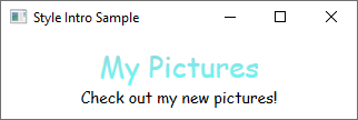
The sample code provided in this overview is based on a simple photo browsing application shown in the following illustration.

This simple photo sample uses styling and templating to create a visually compelling user experience. The sample has two TextBlock elements and a ListBox control that is bound to a list of images.
For the complete sample, see Introduction to Styling and Templating Sample.
Styles
You can think of a Style as a convenient way to apply a set of property values to multiple elements. You can use a style on any element that derives from FrameworkElement or FrameworkContentElement such as a Window or a Button.
The most common way to declare a style is as a resource in the Resources section in a XAML file. Because styles are resources, they obey the same scoping rules that apply to all resources. Put simply, where you declare a style affects where the style can be applied. For example, if you declare the style in the root element of your app definition XAML file, the style can be used anywhere in your app.
For example, the following XAML code declares two styles for a TextBlock, one automatically applied to all TextBlock elements, and another that must be explicitly referenced.
<Window.Resources>
    <!-- .... other resources .... -->

    <!--A Style that affects all TextBlocks-->
    <Style TargetType="TextBlock">
        <Setter Property="HorizontalAlignment" Value="Center" />
        <Setter Property="FontFamily" Value="Comic Sans MS"/>
        <Setter Property="FontSize" Value="14"/>
    </Style>

    <!--A Style that extends the previous TextBlock Style with an x:Key of TitleText-->
    <Style BasedOn="{StaticResource {x:Type TextBlock}}"
           TargetType="TextBlock"
           x:Key="TitleText">
        <Setter Property="FontSize" Value="26"/>
        <Setter Property="Foreground">
            <Setter.Value>
                <LinearGradientBrush StartPoint="0.5,0" EndPoint="0.5,1">
                    <LinearGradientBrush.GradientStops>
                        <GradientStop Offset="0.0" Color="#90DDDD" />
                        <GradientStop Offset="1.0" Color="#5BFFFF" />
                    </LinearGradientBrush.GradientStops>
                </LinearGradientBrush>
            </Setter.Value>
        </Setter>
    </Style>
</Window.Resources>
Here is an example of the styles declared above being used.
<StackPanel>
    <TextBlock Style="{StaticResource TitleText}" Name="textblock1">My Pictures</TextBlock>
    <TextBlock>Check out my new pictures!</TextBlock>
</StackPanel>

ControlTemplates
In WPF, the ControlTemplate of a control defines the appearance of the control. You can change the structure and appearance of a control by defining a new ControlTemplate and assigning it to a control. In many cases, templates give you enough flexibility so that you do not have to write your own custom controls.
Each control has a default template assigned to the Control.Template property. The template connects the visual presentation of the control with the control's capabilities. Because you define a template in XAML, you can change the control's appearance without writing any code. Each template is designed for a specific control, such as a Button.
Commonly you declare a template as a resource on the Resources section of a XAML file. As with all resources, scoping rules apply.
Control templates are a lot more involved than a style. This is because the control template rewrites the visual appearance of the entire control, while a style simply applies property changes to the existing control. However, since the template of a control is applied by setting the Control.Template property, you can use a style to define or set a template.
Designers generally allow you to create a copy of an existing template and modify it. For example, in the Visual Studio WPF designer, select a CheckBox control, and then right-click and select Edit template > Create a copy. This command generates a style that defines a template.
<Style x:Key="CheckBoxStyle1" TargetType="{x:Type CheckBox}">
    <Setter Property="FocusVisualStyle" Value="{StaticResource FocusVisual1}"/>
    <Setter Property="Background" Value="{StaticResource OptionMark.Static.Background1}"/>
    <Setter Property="BorderBrush" Value="{StaticResource OptionMark.Static.Border1}"/>
    <Setter Property="Foreground" Value="{DynamicResource {x:Static SystemColors.ControlTextBrushKey}}"/>
    <Setter Property="BorderThickness" Value="1"/>
    <Setter Property="Template">
        <Setter.Value>
            <ControlTemplate TargetType="{x:Type CheckBox}">
                <Grid x:Name="templateRoot" Background="Transparent" SnapsToDevicePixels="True">
                    <Grid.ColumnDefinitions>
                        <ColumnDefinition Width="Auto"/>
                        <ColumnDefinition Width="*"/>
                    </Grid.ColumnDefinitions>
                    <Border x:Name="checkBoxBorder" Background="{TemplateBinding Background}" BorderThickness="{TemplateBinding BorderThickness}" BorderBrush="{TemplateBinding BorderBrush}" HorizontalAlignment="{TemplateBinding HorizontalContentAlignment}" Margin="1" VerticalAlignment="{TemplateBinding VerticalContentAlignment}">
                        <Grid x:Name="markGrid">
                            <Path x:Name="optionMark" Data="F1 M 9.97498,1.22334L 4.6983,9.09834L 4.52164,9.09834L 0,5.19331L 1.27664,3.52165L 4.255,6.08833L 8.33331,1.52588e-005L 9.97498,1.22334 Z " Fill="{StaticResource OptionMark.Static.Glyph1}" Margin="1" Opacity="0" Stretch="None"/>
                            <Rectangle x:Name="indeterminateMark" Fill="{StaticResource OptionMark.Static.Glyph1}" Margin="2" Opacity="0"/>
                        </Grid>
                    </Border>
                    <ContentPresenter x:Name="contentPresenter" Grid.Column="1" Focusable="False" HorizontalAlignment="{TemplateBinding HorizontalContentAlignment}" Margin="{TemplateBinding Padding}" RecognizesAccessKey="True" SnapsToDevicePixels="{TemplateBinding SnapsToDevicePixels}" VerticalAlignment="{TemplateBinding VerticalContentAlignment}"/>
                </Grid>
                <ControlTemplate.Triggers>
                    <Trigger Property="HasContent" Value="true">
                        <Setter Property="FocusVisualStyle" Value="{StaticResource OptionMarkFocusVisual1}"/>
                        <Setter Property="Padding" Value="4,-1,0,0"/>

... content removed to save space ...
Editing a copy of a template is a great way to learn how templates work. Instead of creating a new blank template, it's easier to edit a copy and change a few aspects of the visual presentation.
For an example, see Create a template for a control.
TemplateBinding
You may have noticed that the template resource defined in the previous section uses the TemplateBinding Markup Extension. A TemplateBinding is an optimized form of a binding for template scenarios, analogous to a binding constructed with {Binding RelativeSource={RelativeSource TemplatedParent}}. TemplateBinding is useful for binding parts of the template to properties of the control. For example, each control has a BorderThickness property. Use a TemplateBinding to manage which element in the template is affected by this control setting.
ContentControl and ItemsControl
If a ContentPresenter is declared in the ControlTemplate of a ContentControl, the ContentPresenter will automatically bind to the ContentTemplate and Content properties. Likewise, an ItemsPresenter that is in the ControlTemplate of an ItemsControl will automatically bind to the ItemTemplate and Items properties.
DataTemplates
In this sample app, there is a ListBox control that is bound to a list of photos.
<ListBox ItemsSource="{Binding Source={StaticResource MyPhotos}}"
         Background="Silver" Width="600" Margin="10" SelectedIndex="0"/>
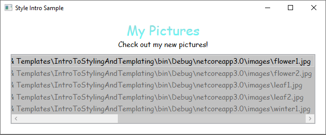
This ListBox currently looks like the following.

Most controls have some type of content, and that content often comes from data that you are binding to. In this sample, the data is the list of photos. In WPF, you use a DataTemplate to define the visual representation of data. Basically, what you put into a DataTemplate determines what the data looks like in the rendered app.
In our sample app, each custom Photo object has a Source property of type string that specifies the file path of the image. Currently, the photo objects appear as file paths.
public class Photo
{
    public Photo(string path)
    {
        Source = path;
    }

    public string Source { get; }

    public override string ToString() => Source;
}
Public Class Photo
    Sub New(ByVal path As String)
        Source = path
    End Sub

    Public ReadOnly Property Source As String

    Public Overrides Function ToString() As String
        Return Source
    End Function
End Class
For the photos to appear as images, you create a DataTemplate as a resource.
<Window.Resources>
    <!-- .... other resources .... -->

    <!--DataTemplate to display Photos as images
    instead of text strings of Paths-->
    <DataTemplate DataType="{x:Type local:Photo}">
        <Border Margin="3">
            <Image Source="{Binding Source}"/>
        </Border>
    </DataTemplate>
</Window.Resources>
Notice that the DataType property is similar to the TargetType property of the Style. If your DataTemplate is in the resources section, when you specify the DataType property to a type and omit an x:Key, the DataTemplate is applied whenever that type appears. You always have the option to assign the DataTemplate with an x:Key and then set it as a StaticResource for properties that take DataTemplate types, such as the ItemTemplate property or the ContentTemplate property.
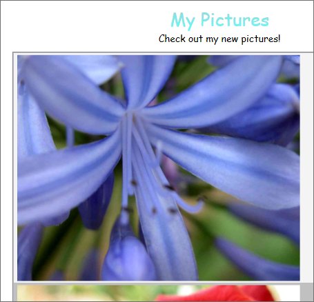
Essentially, the DataTemplate in the above example defines that whenever there is a Photo object, it should appear as an Image within a Border. With this DataTemplate, our app now looks like this.

The data templating model provides other features. For example, if you are displaying collection data that contains other collections using a HeaderedItemsControl type such as a Menu or a TreeView, there is the HierarchicalDataTemplate. Another data templating feature is the DataTemplateSelector, which allows you to choose a DataTemplate to use based on custom logic. For more information, see Data Templating Overview, which provides a more in-depth discussion of the different data templating features.
Triggers
A trigger sets properties or starts actions, such as an animation, when a property value changes or when an event is raised. Style, ControlTemplate, and DataTemplate all have a Triggers property that can contain a set of triggers. There are several types of triggers.
PropertyTriggers
A Trigger that sets property values or starts actions based on the value of a property is called a property trigger.
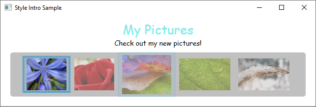
To demonstrate how to use property triggers, you can make each ListBoxItem partially transparent unless it is selected. The following style sets the Opacity value of a ListBoxItem to 0.5. When the IsSelected property is true, however, the Opacity is set to 1.0.
<Window.Resources>
    <!-- .... other resources .... -->

    <Style TargetType="ListBoxItem">
        <Setter Property="Opacity" Value="0.5" />
        <Setter Property="MaxHeight" Value="75" />
        <Style.Triggers>
            <Trigger Property="IsSelected" Value="True">
                <Trigger.Setters>
                    <Setter Property="Opacity" Value="1.0" />
                </Trigger.Setters>
            </Trigger>
        </Style.Triggers>
    </Style>
</Window.Resources>
This example uses a Trigger to set a property value, but note that the Trigger class also has the EnterActions and ExitActions properties that enable a trigger to perform actions.
Notice that the MaxHeight property of the ListBoxItem is set to 75. In the following illustration, the third item is the selected item.

EventTriggers and Storyboards
Another type of trigger is the EventTrigger, which starts a set of actions based on the occurrence of an event. For example, the following EventTrigger objects specify that when the mouse pointer enters the ListBoxItem, the MaxHeight property animates to a value of 90 over a 0.2 second period. When the mouse moves away from the item, the property returns to the original value over a period of 1 second. Note how it is not necessary to specify a To value for the MouseLeave animation. This is because the animation is able to keep track of the original value.
<Style.Triggers>
    <Trigger Property="IsSelected" Value="True">
        <Trigger.Setters>
            <Setter Property="Opacity" Value="1.0" />
        </Trigger.Setters>
    </Trigger>
    <EventTrigger RoutedEvent="Mouse.MouseEnter">
        <EventTrigger.Actions>
            <BeginStoryboard>
                <Storyboard>
                    <DoubleAnimation
                        Duration="0:0:0.2"
                        Storyboard.TargetProperty="MaxHeight"
                        To="90"  />
                </Storyboard>
            </BeginStoryboard>
        </EventTrigger.Actions>
    </EventTrigger>
    <EventTrigger RoutedEvent="Mouse.MouseLeave">
        <EventTrigger.Actions>
            <BeginStoryboard>
                <Storyboard>
                    <DoubleAnimation
                        Duration="0:0:1"
                        Storyboard.TargetProperty="MaxHeight"  />
                </Storyboard>
            </BeginStoryboard>
        </EventTrigger.Actions>
    </EventTrigger>
</Style.Triggers>
For more information, see the Storyboards overview.
In the following illustration, the mouse is pointing to the third item.

MultiTriggers, DataTriggers, and MultiDataTriggers
In addition to Trigger and EventTrigger, there are other types of triggers. MultiTrigger allows you to set property values based on multiple conditions. You use DataTrigger and MultiDataTrigger when the property of your condition is data-bound.
Visual States
Controls are always in a specific state. For example, when the mouse moves over the surface of a control, the control is considered to be in a common state of MouseOver. A control without a specific state is considered to be in the common Normal state. States are broken into groups, and the previously mentioned states are part of the state group CommonStates. Most controls have two state groups: CommonStates and FocusStates. Of each state group applied to a control, a control is always in one state of each group, such as CommonStates.MouseOver and FocusStates.Unfocused. However, a control can't be in two different states within the same group, such as CommonStates.Normal and CommonStates.Disabled. Here is a table of states most controls recognize and use.
| VisualState Name | VisualStateGroup Name | Description |
|---|---|---|
Normal |
CommonStates |
The default state. |
MouseOver |
CommonStates |
The mouse pointer is positioned over the control. |
Pressed |
CommonStates |
The control is pressed. |
Disabled |
CommonStates |
The control is disabled. |
Focused |
FocusStates |
The control has focus. |
Unfocused |
FocusStates |
The control does not have focus. |
By defining a System.Windows.VisualStateManager on the root element of a control template, you can trigger animations when a control enters a specific state. The VisualStateManager declares which combinations of VisualStateGroup and VisualState to watch. When the control enters a watched state, the animation defined by the VisualStateManager is started.
For example, the following XAML code watches the CommonStates.MouseOver state to animate the fill color of the element named backgroundElement. When the control returns to the CommonStates.Normal state, the fill color of the element named backgroundElement is restored.
<ControlTemplate x:Key="roundbutton" TargetType="Button">
    <Grid>
        <VisualStateManager.VisualStateGroups>
            <VisualStateGroup Name="CommonStates">
                <VisualState Name="Normal">
                    <ColorAnimation Storyboard.TargetName="backgroundElement"
                                    Storyboard.TargetProperty="(Shape.Fill).(SolidColorBrush.Color)"
                                    To="{TemplateBinding Background}"
                                    Duration="0:0:0.3"/>
                </VisualState>
                <VisualState Name="MouseOver">
                    <ColorAnimation Storyboard.TargetName="backgroundElement"
                                    Storyboard.TargetProperty="(Shape.Fill).(SolidColorBrush.Color)"
                                    To="Yellow"
                                    Duration="0:0:0.3"/>
                </VisualState>
            </VisualStateGroup>
        </VisualStateManager.VisualStateGroups>

        ...
For more information about storyboards, see Storyboards Overview.
Shared resources and themes
A typical WPF app might have multiple UI resources that are applied throughout the app. Collectively, this set of resources can be considered the theme for the app. WPF provides support for packaging UI resources as a theme by using a resource dictionary that is encapsulated as the ResourceDictionary class.
WPF themes are defined by using the styling and templating mechanism that WPF exposes for customizing the visuals of any element.
WPF theme resources are stored in embedded resource dictionaries. These resource dictionaries must be embedded within a signed assembly, and can either be embedded in the same assembly as the code itself or in a side-by-side assembly. For PresentationFramework.dll, the assembly that contains WPF controls, theme resources are in a series of side-by-side assemblies.
The theme becomes the last place to look when searching for the style of an element. Typically, the search will begin by walking up the element tree searching for an appropriate resource, then look in the app resource collection and finally query the system. This gives app developers a chance to redefine the style for any object at the tree or app level before reaching the theme.
You can define resource dictionaries as individual files that enable you to reuse a theme across multiple apps. You can also create swappable themes by defining multiple resource dictionaries that provide the same types of resources but with different values. Redefining these styles or other resources at the app level is the recommended approach for skinning an app.
To share a set of resources, including styles and templates, across apps, you can create a XAML file and define a ResourceDictionary that includes reference to a shared.xaml file.
<ResourceDictionary.MergedDictionaries>
  <ResourceDictionary Source="Shared.xaml" />
</ResourceDictionary.MergedDictionaries>
It is the sharing of shared.xaml, which itself defines a ResourceDictionary that contains a set of style and brush resources, that enables the controls in an app to have a consistent look.
For more information, see Merged resource dictionaries.
If you are creating a theme for your custom control, see the Defining resources at the theme level section of the Control authoring overview.
See also
.NET Desktop feedback
