บทช่วยสอน: สร้างแผนภูมิแท่ง
บทช่วยสอนนี้จะแสดงวิธีการพัฒนาวิชวล Power BI ที่แสดงข้อมูลในรูปแบบของแผนภูมิแท่งแบบง่าย วิชวลนี้สนับสนุนการกําหนดเองจํานวนน้อยที่สุด หน้าอื่น ๆ ของเอกสารนี้อธิบายวิธีการเพิ่มการกําหนดค่าเพิ่มเติม เช่น เมนูบริบท เคล็ดลับเครื่องมือ และอื่น ๆ
ในบทช่วยสอนนี้ คุณจะเรียนรู้วิธีการ:
- กําหนดความสามารถของวิชวลของคุณ
- ทําความเข้าใจรหัสแหล่งที่มาที่ใช้ในการสร้างวิชวล
- แสดงวิชวล
- เพิ่มวัตถุลงในบานหน้าต่างคุณสมบัติ
- แพคเกจวิชวล
ตั้งค่าสภาพแวดล้อมของคุณ
ก่อนที่คุณจะเริ่มพัฒนาวิชวล Power BI ของคุณ ให้ตรวจสอบว่าคุณมีทุกอย่างที่แสดงอยู่ในส่วนนี้
บัญชี Power BI Pro หรือ Premium Per User (PPU) ถ้าคุณยังไม่มี ลงทะเบียน สําหรับรุ่นทดลองใช้ฟรี
รหัส Visual Studio (VS Code) VS Code คือสภาพแวดล้อมการพัฒนาแบบบูรณาการที่เหมาะสม (IDE) สําหรับการพัฒนาแอปพลิเคชัน JavaScript และ TypeScript
Windows PowerShell เวอร์ชัน 4 หรือใหม่กว่า (สําหรับ Windows) Terminal (สําหรับ Mac)
สภาพแวดล้อมที่พร้อมสําหรับการพัฒนาวิชวล Power BI ตั้งค่าสภาพแวดล้อมของคุณสําหรับการพัฒนาวิชวล Power BI
บทช่วยสอนนี้ใช้รายงาน การวิเคราะห์การขายของสหรัฐอเมริกา คุณสามารถดาวน์โหลดรายงานนี้และอัปโหลดไปยังบริการของ Power BI หรือใช้รายงานของคุณเอง ถ้าคุณต้องการข้อมูลเพิ่มเติมเกี่ยวกับบริการของ Power BI และการอัปโหลดไฟล์ โปรดดูที่ เริ่มต้นใช้งานที่สร้างในบทช่วยสอน บริการของ Power BI
หมายเหตุ
ถ้าไม่ได้ติดตั้งไลบรารี JavaScript D3 เป็นส่วนหนึ่งของการตั้งค่าของคุณ ให้ติดตั้งเดี๋ยวนี้ จาก PowerShell เรียกใช้ npm i d3@latest --save
การสร้างวิชวลแผนภูมิแท่งเกี่ยวข้องกับขั้นตอนต่อไปนี้:
- สร้างโครงการใหม่
-
กําหนดไฟล์ความสามารถ -
capabilities.json - สร้าง API ของวิชวล
- แพคเกจวิ ชวลของคุณ -pbiviz.json
สร้างโครงการใหม่
วัตถุประสงค์ของบทช่วยสอนนี้ช่วยให้คุณเข้าใจว่าวิชวลมีโครงสร้างและการเขียนอย่างไร คุณสามารถทําตามคําแนะนําเหล่านี้เพื่อสร้างวิชวลบาร์โค้ดตั้งแต่เริ่มต้น หรือคุณสามารถ โคลนที่เก็บ โค้ดต้นฉบับและใช้เพื่อทําตามโดยไม่ต้องสร้างวิชวลของคุณเอง
เปิด PowerShell และนําทางไปยังโฟลเดอร์ที่คุณต้องการสร้างโครงการของคุณ
ป้อนคําสั่งต่อไปนี้:
pbiviz new BarChartตอนนี้คุณควรมีโฟลเดอร์ชื่อ BarChart ที่มีไฟล์ของวิชวล
ใน รหัส VS เปิดไฟล์ [tsconfig.json] (visual-project-structure.md#tsconfigjson) และเปลี่ยนชื่อของ "ไฟล์" เป็น "src/barChart.ts"
"files": [
"src/barChart.ts"
]
วัตถุ "ไฟล์" tsconfig.json ชี้ไปยังไฟล์ที่มีระดับชั้นหลักของวิชวลอยู่
ไฟล์ package.json มีรายการของการขึ้นต่อกันของโครงการ แทนที่ไฟล์ package.json ของคุณด้วยไฟล์นี้
ตอนนี้คุณควรมีโฟลเดอร์ใหม่สําหรับวิชวลของคุณด้วยแฟ้มและโฟลเดอร์ต่อไปนี้:
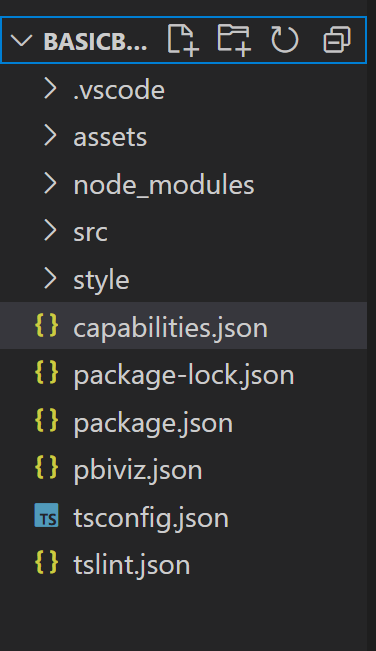
สําหรับคําอธิบายโดยละเอียดของการทํางานของแต่ละไฟล์เหล่านี้ ดู โครงสร้างโครงการวิชวล Power BI
ไฟล์สองไฟล์ที่เรามุ่งเน้นในบทช่วยสอนนี้คือ ไฟล์ capabilities.json ซึ่งอธิบายวิชวลไปยังโฮสต์ และ ไฟล์ src/barchart.ts ซึ่งประกอบด้วย API ของวิชวล
กําหนดความสามารถ
ไฟล์ capabilities.json คือตําแหน่งที่เราผูกข้อมูลกับโฮสต์ เราอธิบายชนิดของเขตข้อมูลที่ยอมรับและคุณลักษณะที่วิชวลควรมี
กําหนดบทบาทข้อมูล
ตัวแปรจะถูกกําหนดและผูกไว้ใน dataRoles ส่วน ของไฟล์ความสามารถ เราต้องการให้แผนภูมิแท่งของเรายอมรับตัวแปรสองชนิด:
- ข้อมูลจัดกลุ่ม ที่แสดงด้วยแถบที่แตกต่างกันบนแผนภูมิ
- ข้อมูลตัวเลขหรือข้อมูลที่วัดซึ่งแสดงด้วยความสูงของแต่ละแถบ
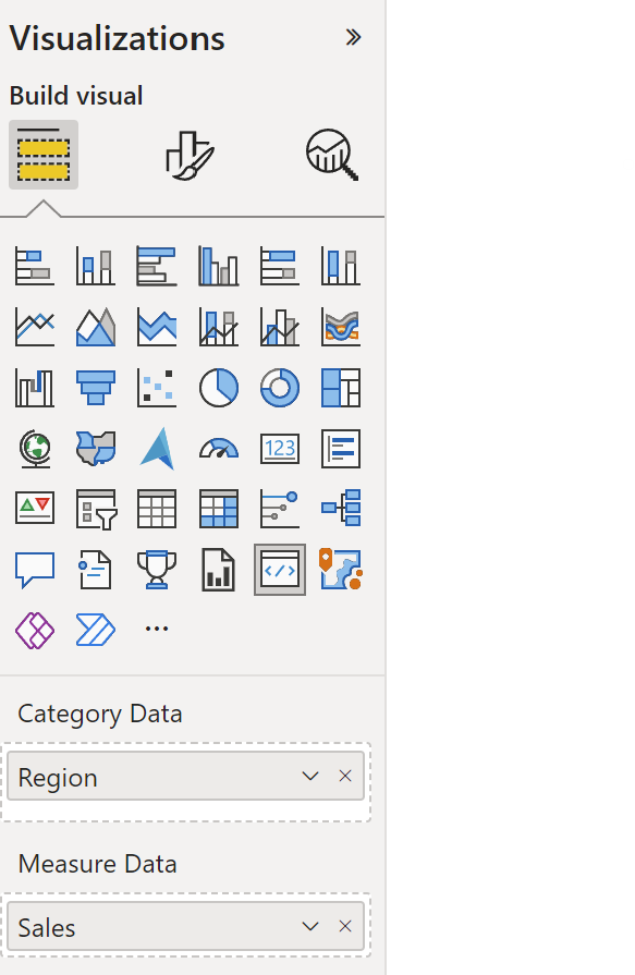
ใน Visual Studio Code ใน ไฟล์ capabilities.json ให้ยืนยันว่าส่วนย่อย JSON ต่อไปนี้ปรากฏในวัตถุที่มีป้ายชื่อ "dataRoles"
    "dataRoles": [
        {
            "displayName": "Category Data",
            "name": "category",
            "kind": "Grouping"
        },
        {
            "displayName": "Measure Data",
            "name": "measure",
            "kind": "Measure"
        }
    ],
การแมปข้อมูล
ถัดไป เพิ่ม การแมป ข้อมูลเพื่อบอกโฮสต์ว่าจะทําอย่างไรกับตัวแปรเหล่านี้:
แทนที่เนื้อหาของวัตถุ "dataViewMappings" ด้วยโค้ดต่อไปนี้:
"dataViewMappings": [
        {
            "conditions": [
                {
                    "category": {
                        "max": 1
                    },
                    "measure": {
                        "max": 1
                    }
                }
            ],
            "categorical": {
                "categories": {
                    "for": {
                        "in": "category"
                    }
                },
                "values": {
                    "select": [
                        {
                            "bind": {
                                "to": "measure"
                            }
                        }
                    ]
                }
            }
        }
    ],
โค้ดด้านบนจะสร้าง "เงื่อนไข" ที่แต่ละวัตถุบทบาทข้อมูลสามารถเก็บเขตข้อมูลได้ครั้งละหนึ่งเขตข้อมูลเท่านั้น โปรดสังเกตว่าเราใช้ภายใน name ของบทบาทข้อมูลเพื่ออ้างอิงถึงแต่ละเขตข้อมูล
นอกจากนี้ยังตั้งค่าการ แมป ข้อมูลจัดกลุ่มเพื่อให้แต่ละเขตข้อมูลถูกแมปไปยังตัวแปรที่ถูกต้อง
กําหนดวัตถุสําหรับบานหน้าต่างคุณสมบัติ
ส่วน "วัตถุ" ของไฟล์ความสามารถคือที่ที่เรากําหนดคุณลักษณะที่สามารถปรับแต่งได้ที่ควรปรากฏในบานหน้าต่างรูปแบบ คุณลักษณะเหล่านี้ไม่มีผลต่อเนื้อหาของแผนภูมิ แต่สามารถเปลี่ยนลักษณะที่แสดงได้
สําหรับข้อมูลเพิ่มเติมเกี่ยวกับวัตถุและวิธีการทํางานของวัตถุ ให้ดู วัตถุ
วัตถุต่อไปนี้เป็นทางเลือก เพิ่มพารามิเตอร์ถ้าคุณต้องการไปตามส่วนตัวเลือกของบทช่วยสอนนี้เพื่อเพิ่มสีและแสดงแกน X
แทนที่เนื้อหาของส่วน "ออบเจ็กต์" ด้วยโค้ดต่อไปนี้:
     "objects": {
        "enableAxis": {
            "properties": {
                "show": {
                    "type": {
                        "bool": true
                    }
                },
                "fill": {
                    "type": {
                        "fill": {
                            "solid": {
                                "color": true
                            }
                        }
                    }
                }
            }
        },
        "colorSelector": {
            "properties": {
                "fill": {
                    "type": {
                        "fill": {
                            "solid": {
                                "color": true
                            }
                        }
                    }
                }
            }
        }
     },
บันทึกไฟล์ capabilities.json
ไฟล์ความสามารถสุดท้ายของคุณควรมีลักษณะเหมือนในตัวอย่างนี้
API ของวิชวล
วิชวลทั้งหมดเริ่มต้นด้วยคลาสที่ใช้ IVisual อินเทอร์เฟซ ไฟล์ src/visual.ts เป็นไฟล์เริ่มต้นที่มีคลาสนี้
ในบทช่วยสอนนี้ เราเรียกไฟล์ของเรา IVisual barChart.ts
ดาวน์โหลดไฟล์ และบันทึกไปยัง โฟลเดอร์ /src หากคุณยังไม่ได้ทําเช่นนั้น ในส่วนนี้เราจะไปดูไฟล์นี้โดยละเอียดและอธิบายส่วนต่าง ๆ
การนำเข้า
ส่วนแรกของไฟล์จะนําเข้าโมดูลที่จําเป็นสําหรับวิชวลนี้ โปรดสังเกตว่า นอกเหนือจากมอดูลวิชวล Power BI เรายังนําเข้า ไลบรารี d3 ด้วย
โมดูลต่อไปนี้จะถูกนําเข้าไปยังไฟล์ barChart.ts ของคุณ:
import {
    BaseType,
    select as d3Select,
    Selection as d3Selection
} from "d3-selection";
import {
    ScaleBand,
    ScaleLinear,
    scaleBand,
    scaleLinear
} from "d3-scale";
import "./../style/visual.less";

import { Axis, axisBottom } from "d3-axis";

import powerbi from "powerbi-visuals-api";

type Selection<T extends BaseType> = d3Selection<T, any, any, any>;

// powerbi.visuals
import DataViewCategoryColumn = powerbi.DataViewCategoryColumn;
import Fill = powerbi.Fill;
import ISandboxExtendedColorPalette = powerbi.extensibility.ISandboxExtendedColorPalette;
import ISelectionId = powerbi.visuals.ISelectionId;
import IVisual = powerbi.extensibility.IVisual;
import IVisualHost = powerbi.extensibility.visual.IVisualHost;
import PrimitiveValue = powerbi.PrimitiveValue;
import VisualUpdateOptions = powerbi.extensibility.visual.VisualUpdateOptions;
import VisualConstructorOptions = powerbi.extensibility.visual.VisualConstructorOptions;
import DataViewObjectPropertyIdentifier = powerbi.DataViewObjectPropertyIdentifier;

import { textMeasurementService } from "powerbi-visuals-utils-formattingutils";
import { FormattingSettingsService } from "powerbi-visuals-utils-formattingmodel";

import { BarChartSettingsModel } from "./barChartSettingsModel";
import { dataViewObjects} from "powerbi-visuals-utils-dataviewutils";
อินเทอร์เฟซ
ถัดไป เรากําหนดอินเทอร์เฟซวิชวล อินเทอร์เฟซต่อไปนี้ใช้เพื่ออธิบายวิชวลแผนภูมิแท่งของเรา:
- BarChartDataPoint
อินเทอร์เฟซนี้ถูกกําหนดดังนี้:
/**
 * Interface for BarChart data points.
 *
 * @interface
 * @property {PrimitiveValue} value     - Data value for point.
 * @property {string} category          - Corresponding category of data value.
 * @property {string} color             - Color corresponding to data point.
 * @property {string} strokeColor       - Stroke color for data point column.
 * @property {number} strokeWidth       - Stroke width for data point column.
 * @property {ISelectionId} selectionId - Id assigned to data point for cross filtering
 *                                        and visual interaction.
 */
interface BarChartDataPoint {
    value: PrimitiveValue;
    category: string;
    color: string;
    strokeColor: string;
    strokeWidth: number;
    selectionId: ISelectionId;
}
การแปลงวิชวล
ตอนนี้มีการกําหนดโครงสร้างข้อมูลแล้ว เราจําเป็นต้องแมปข้อมูลลงในโครงสร้างข้อมูลโดยใช้ createSelectorDataPoints ฟังก์ชัน ฟังก์ชันนี้รับข้อมูลจากมุมมองข้อมูลและแปลงเป็นรูปแบบที่วิชวลสามารถใช้ได้ ในกรณีนี้ จะส่งกลับอินเทอร์เฟซที่ BarChartDataPoint[] อธิบายไว้ในส่วนก่อนหน้า
ประกอบด้วย DataView ข้อมูลที่จะแสดงผลด้วยภาพ ข้อมูลนี้สามารถอยู่ในฟอร์มที่แตกต่างกัน เช่น ตามประเภทหรือแบบตาราง หากต้องการสร้างวิชวลแบบจัดกลุ่มเช่นแผนภูมิแท่ง ให้ใช้คุณสมบัติประเภทบนDataView
ฟังก์ชันนี้ถูกเรียกเมื่อใดก็ตามที่วิชวลได้รับการอัปเดต
/**
 * Function that converts queried data into a viewmodel that will be used by the visual.
 *
 * @function
 * @param {VisualUpdateOptions} options - Contains references to the size of the container
 *                                        and the dataView which contains all the data
 *                                        the visual had queried.
 * @param {IVisualHost} host            - Contains references to the host which contains services
 */
function createSelectorDataPoints(options: VisualUpdateOptions, host: IVisualHost): BarChartDataPoint[] {
    const barChartDataPoints: BarChartDataPoint[] = []
    const dataViews = options.dataViews;

    if (!dataViews
        || !dataViews[0]
        || !dataViews[0].categorical
        || !dataViews[0].categorical.categories
        || !dataViews[0].categorical.categories[0].source
        || !dataViews[0].categorical.values
    ) {
        return barChartDataPoints;
    }

    const categorical = dataViews[0].categorical;
    const category = categorical.categories[0];
    const dataValue = categorical.values[0];

    const colorPalette: ISandboxExtendedColorPalette = host.colorPalette;

    const strokeColor: string = getColumnStrokeColor(colorPalette);

    const strokeWidth: number = getColumnStrokeWidth(colorPalette.isHighContrast);

    for (let i = 0, len = Math.max(category.values.length, dataValue.values.length); i < len; i++) {
        const color: string = getColumnColorByIndex(category, i, colorPalette);

        const selectionId: ISelectionId = host.createSelectionIdBuilder()
            .withCategory(category, i)
            .createSelectionId();

        barChartDataPoints.push({
            color,
            strokeColor,
            strokeWidth,
            selectionId,
            value: dataValue.values[i],
            category: `${category.values[i]}`,
        });
    }

    return barChartDataPoints;
}
หมายเหตุ
ฟังก์ชันสองสามฟังก์ชันถัดไปใน ไฟล์ barChart.ts จัดการกับสีและสร้างแกน X ซึ่งเป็นตัวเลือกและจะกล่าวถึงต่อไปในบทช่วยสอนนี้ บทช่วยสอนนี้จะดําเนินการต่อจาก IVisual ฟังก์ชัน
แสดงวิชวล
เมื่อกําหนดข้อมูลแล้ว เราจะแสดงวิชวลโดยใช้คลาส BarChart ที่ใช้IVisual อินเทอร์เฟซ มีการIVisualอธิบายอินเทอร์เฟซบนหน้า API ของวิชวล ซึ่งประกอบด้วย constructor เมธอด ที่สร้างวิชวลและ update เมธอดที่ถูกเรียกแต่ละครั้งที่มีการโหลดวิชวลใหม่
ก่อนที่จะแสดงภาพ เราต้องประกาศสมาชิกของคลาส:
export class BarChart implements IVisual {
    private svg: Selection<SVGSVGElement>;
    private host: IVisualHost;
    private barContainer: Selection<SVGElement>;
    private xAxis: Selection<SVGGElement>;
    private barDataPoints: BarChartDataPoint[];
    private formattingSettings: BarChartSettingsModel;
    private formattingSettingsService: FormattingSettingsService;

    private barSelection: Selection<BaseType>;

    static Config = {
        xScalePadding: 0.1,
        solidOpacity: 1,
        transparentOpacity: 1,
        margins: {
            top: 0,
            right: 0,
            bottom: 25,
            left: 30,
        },
        xAxisFontMultiplier: 0.04,
    };
}
สร้างวิชวล
ฟังก์ชันคอนสตรักเตอร์จะถูกเรียกเพียงครั้งเดียว เมื่อมีการแสดงวิชวลเป็นครั้งแรก ซึ่งจะสร้างคอนเทนเนอร์ SVG ที่ว่างเปล่าสําหรับแผนภูมิแท่งและแกน X โปรดสังเกตว่าใช้ไลบรารี d3 เพื่อแสดง SVG
/**
     * Creates instance of BarChart. This method is only called once.
     *
     * @constructor
     * @param {VisualConstructorOptions} options - Contains references to the element that will
     *                                             contain the visual and a reference to the host
     *                                             which contains services.
     */
    constructor(options: VisualConstructorOptions) {
        this.host = options.host;
        //Creating the formatting settings service.
        const localizationManager = this.host.createLocalizationManager();
        this.formattingSettingsService = new FormattingSettingsService(localizationManager);

        this.svg = d3Select(options.element)
            .append('svg')
            .classed('barChart', true);

        this.barContainer = this.svg
            .append('g')
            .classed('barContainer', true);

        this.xAxis = this.svg
            .append('g')
            .classed('xAxis', true);
    }
อัปเดตวิชวล
มีการ เรียกใช้วิธีการ อัปเดตทุกครั้งที่ขนาดของวิชวลหรือค่าใดค่าหนึ่งมีการเปลี่ยนแปลง
การปรับมาตราส่วน
เราจําเป็นต้องปรับขนาดวิชวลเพื่อให้จํานวนของแถบและค่าปัจจุบันพอดีกับขีดจํากัดความกว้างและความสูงที่กําหนดของวิชวล ซึ่งคล้ายกับ วิธีอัปเดตในบทช่วยสอนการ์ดวงกลม
เมื่อต้องการคํานวณมาตราส่วน เราใช้ scaleLinear วิธีการ และ scaleBand ที่นําเข้าก่อนหน้านี้จาก d3-scale ไลบรารี
ค่า options.dataViews[0].categorical.values[0].maxLocal เก็บค่าที่มากที่สุดของจุดข้อมูลปัจจุบันทั้งหมด ค่านี้ใช้เพื่อกําหนดความสูงของแกน y การปรับมาตราส่วนของความกว้างของแกน x จะถูกกําหนดโดยจํานวนของประเภทที่ผูกไว้กับวิชวลใน barchartdatapoint อินเทอร์เฟซ
สําหรับกรณีที่มีการแสดงแกน X วิชวลนี้ยังจัดการกับตัวแบ่งคําในกรณีที่ไม่มีพื้นที่เพียงพอที่จะเขียนชื่อทั้งหมดบนแกน X
ฟีเจอร์การอัปเดตอื่น ๆ
นอกเหนือจากการปรับมาตราส่วนแล้ว วิธีการอัปเดตยังจัดการการเลือกและสีอีกด้วย คุณลักษณะเหล่านี้เป็นทางเลือก และจะกล่าวถึงในภายหลัง:
   /**
     * Updates the state of the visual. Every sequential databinding and resize will call update.
     *
     * @function
     * @param {VisualUpdateOptions} options - Contains references to the size of the container
     *                                        and the dataView which contains all the data
     *                                        the visual had queried.
     */
    public update(options: VisualUpdateOptions) {
        this.formattingSettings = this.formattingSettingsService.populateFormattingSettingsModel(BarChartSettingsModel, options.dataViews?.[0]);
        this.barDataPoints = createSelectorDataPoints(options, this.host);
        this.formattingSettings.populateColorSelector(this.barDataPoints);

        const width = options.viewport.width;
        let height = options.viewport.height;

        this.svg
            .attr("width", width)
            .attr("height", height);

        if (this.formattingSettings.enableAxis.show.value) {
            const margins = BarChart.Config.margins;
            height -= margins.bottom;
        }

        this.xAxis
            .style("font-size", Math.min(height, width) * BarChart.Config.xAxisFontMultiplier)
            .style("fill", this.formattingSettings.enableAxis.fill.value.value);

        const yScale: ScaleLinear<number, number> = scaleLinear()
            .domain([0, <number>options.dataViews[0].categorical.values[0].maxLocal])
            .range([height, 0]);

        const xScale: ScaleBand<string> = scaleBand()
            .domain(this.barDataPoints.map(d => d.category))
            .rangeRound([0, width])
            .padding(0.2);

        const xAxis: Axis<string> = axisBottom(xScale);

        this.xAxis.attr('transform', 'translate(0, ' + height + ')')
            .call(xAxis)
            .attr("color", this.formattingSettings.enableAxis.fill.value.value);

        const textNodes: Selection<SVGElement> = this.xAxis.selectAll("text");
        BarChart.wordBreak(textNodes, xScale.bandwidth(), height);

        this.barSelection = this.barContainer
            .selectAll('.bar')
            .data(this.barDataPoints);

        const barSelectionMerged = this.barSelection
            .enter()
            .append('rect')
            .merge(<any>this.barSelection);

        barSelectionMerged.classed('bar', true);

        barSelectionMerged
            .attr("width", xScale.bandwidth())
            .attr("height", (dataPoint: BarChartDataPoint) => height - yScale(<number>dataPoint.value))
            .attr("y", (dataPoint: BarChartDataPoint) => yScale(<number>dataPoint.value))
            .attr("x", (dataPoint: BarChartDataPoint) => xScale(dataPoint.category))
            .style("fill", (dataPoint: BarChartDataPoint) => dataPoint.color)
            .style("stroke", (dataPoint: BarChartDataPoint) => dataPoint.strokeColor)
            .style("stroke-width", (dataPoint: BarChartDataPoint) => `${dataPoint.strokeWidth}px`);

        this.barSelection
            .exit()
            .remove();
    }

    private static wordBreak(
        textNodes: Selection<SVGElement>,
        allowedWidth: number,
        maxHeight: number
    ) {
        textNodes.each(function () {
            textMeasurementService.wordBreak(
                this,
                allowedWidth,
                maxHeight);
        });
    }
เติมบานหน้าต่างคุณสมบัติโดยใช้ Utils แบบจําลองการจัดรูปแบบ
วิธีการสุดท้ายในIVisualฟังก์ชัน คือgetFormattingModel วิธีนี้สร้างและแสดงออบเจ็กต์แบบจําลองการจัดรูปแบบบานหน้าต่างการจัดรูปแบบที่ทันสมัยที่มีคอมโพเนนต์และคุณสมบัติของบานหน้าต่างรูปแบบทั้งหมด จากนั้นจะวางวัตถุภายในบานหน้าต่าง รูปแบบ ในกรณีของเรา เราสร้างการ์ดรูปแบบสําหรับ enableAxis และ colorSelectorรวมถึงคุณสมบัติการจัดรูปแบบสําหรับ show และ fillตาม "วัตถุ" ในไฟล์ capabilities.json เมื่อต้องการเพิ่มตัวเลือกสีสําหรับแต่ละประเภทในบานหน้าต่าง คุณสมบัติ ให้เพิ่ม การวนรอบ barDataPoints สําหรับแต่ละรายการ ให้เพิ่มคุณสมบัติรูปแบบตัวเลือกสีใหม่ไปยังแบบจําลองการจัดรูปแบบ
ในการสร้างแบบจําลองการจัดรูปแบบ นักพัฒนาควรคุ้นเคยกับคอมโพเนนต์ทั้งหมด ตรวจสอบคอมโพเนนต์ของบานหน้าต่างรูปแบบในFormat Pane ตรวจสอบ getFormattingModel API ของ FormattingModel utils ใน ที่เก็บข้อมูลยูทิลิตี้แบบจําลองการจัดรูปแบบ
ดาวน์โหลดไฟล์ และบันทึกไปยังโฟลเดอร์ /src ประกาศคุณสมบัติการจัดรูปแบบและค่าต่างๆ ในคลาสการตั้งค่าการจัดรูปแบบ:
import { formattingSettings } from "powerbi-visuals-utils-formattingmodel";
import { BarChartDataPoint } from "./barChart";

import Card = formattingSettings.SimpleCard;
import Model = formattingSettings.Model;
import Slice = formattingSettings.Slice;
import ColorPicker = formattingSettings.ColorPicker;
import ToggleSwitch = formattingSettings.ToggleSwitch;

/**
 * Enable Axis Formatting Card
 */
class EnableAxisCardSettings extends Card {
    show = new ToggleSwitch({
        name: "show",
        displayName: undefined,
        value: false,
    });

    fill = new ColorPicker({
        name: "fill",
        displayName: "Color",
        value: { value: "#000000" }
    });
    topLevelSlice: ToggleSwitch = this.show;
    name: string = "enableAxis";
    displayName: string = "Enable Axis";
    slices: Slice[] = [this.fill];
}

/**
 * Color Selector Formatting Card
 */
class ColorSelectorCardSettings extends Card {
    name: string = "colorSelector";
    displayName: string = "Data Colors";

    // slices will be populated in barChart settings model `populateColorSelector` method
    slices: Slice[] = [];
}

/**
* BarChart formatting settings model class
*/
export class BarChartSettingsModel extends Model {
    // Create formatting settings model formatting cards
    enableAxis = new EnableAxisCardSettings();
    colorSelector = new ColorSelectorCardSettings();
    cards: Card[] = [this.enableAxis, this.colorSelector];

    /**
     * populate colorSelector object categories formatting properties
     * @param dataPoints
     */
    populateColorSelector(dataPoints: BarChartDataPoint[]) {
        const slices: Slice[] = this.colorSelector.slices;
        if (dataPoints) {
            dataPoints.forEach(dataPoint => {
                slices.push(new ColorPicker({
                    name: "fill",
                    displayName: dataPoint.category,
                    value: { value: dataPoint.color },
                    selector: dataPoint.selectionId.getSelector(),
                }));
            });
        }
    }
}
สร้างและสร้างแบบจําลองบริการการตั้งค่าการจัดรูปแบบในวิธีการสร้างของวิชวล บริการการตั้งค่าการจัดรูปแบบได้รับการตั้งค่ารูปแบบ barChart และแปลงเป็นวัตถุ FormatModel ที่ส่งกลับใน getFormattingModel API
หากต้องการใช้คุณลักษณะการแปลเป็นภาษาท้องถิ่น ให้เพิ่มตัวจัดการการแปลเป็นภาษาท้องถิ่นในบริการการตั้งค่าการจัดรูปแบบ
    import { FormattingSettingsService } from "powerbi-visuals-utils-formattingmodel";

    // ...
    // declare utils formatting settings service
    private formattingSettingsService: FormattingSettingsService;
    //...

    constructor(options: VisualConstructorOptions) {
        this.host = options.host;
        const localizationManager = this.host.createLocalizationManager();
        this.formattingSettingsService = new FormattingSettingsService(localizationManager);

        // Add here rest of your custom visual constructor code
    }
อัปเดตแบบจําลองการตั้งค่าการจัดรูปแบบโดยใช้ API การอัปเดต เรียกใช้อัปเดต API ทุกครั้งที่มีการเปลี่ยนแปลงคุณสมบัติการจัดรูปแบบในบานหน้าต่างคุณสมบัติ สร้างจุดข้อมูลของตัวเลือกแผนภูมิแท่งและกรอกข้อมูลในรูปแบบการตั้งค่าการจัดรูปแบบ:
    // declare formatting settings model for bar chart
    private formattingSettings: BarChartSettingsModel;

    // ...

    public update(options: VisualUpdateOptions) {
        this.formattingSettings = this.formattingSettingsService.populateFormattingSettingsModel(BarChartSettingsModel, options.dataViews[0]);
        this.barDataPoints = createSelectorDataPoints(options, this.host);
        this.formattingSettings.populateColorSelector(this.barDataPoints);

        // Add the rest of your custom visual update API code here

    }
สุดท้าย API getFormattingModel ใหม่คือบรรทัดง่าย ๆ ของโค้ดโดยใช้บริการการตั้งค่าการจัดรูปแบบและแบบจําลองการตั้งค่าการจัดรูปแบบปัจจุบันที่สร้างขึ้นใน API การอัปเดต ด้านบน
    public getFormattingModel(): powerbi.visuals.FormattingModel {
        return this.formattingSettingsService.buildFormattingModel(this.formattingSettings);
    }
(ไม่บังคับ) แสดงแกน X (ออบเจ็กต์แบบคงที่)
คุณสามารถเพิ่มวัตถุลงในบานหน้าต่าง คุณสมบัติ เพื่อปรับแต่งวิชวลได้ การกําหนดเองเหล่านี้อาจเป็นการเปลี่ยนแปลงส่วนติดต่อผู้ใช้ หรือการเปลี่ยนแปลงที่เกี่ยวข้องกับข้อมูลที่มีคิวรี
คุณสามารถสลับเปิดวัตถุเหล่านี้หรือปิดในบานหน้าต่าง คุณสมบัติ
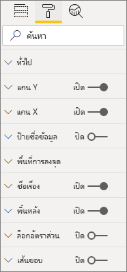
ตัวอย่างนี้แสดงแกน X บนแผนภูมิแท่งเป็นวัตถุแบบคงที่
เราได้เพิ่ม enableAxis คุณสมบัติไปยัง ไฟล์ความสามารถ และอินเทอร์เฟซ barChartSettings แล้ว
(ไม่บังคับ) เพิ่มสี (ออบเจ็กต์ที่ผูกกับข้อมูล)
วัตถุที่ผูกกับข้อมูลจะคล้ายกับวัตถุคงที่ แต่โดยทั่วไปแล้วจะจัดการกับการเลือกข้อมูล ตัวอย่างเช่น คุณสามารถใช้วัตถุที่ผูกกับข้อมูลเพื่อเลือกสีที่เชื่อมโยงกับแต่ละจุดข้อมูลได้
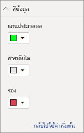
เราได้กําหนด colorSelector วัตถุใน ไฟล์ความสามารถ แล้ว
แต่ละจุดข้อมูลจะแสดงด้วยสีที่แตกต่างกัน เรารวมสีในอินเทอร์เฟซ BarChartDataPoint และกําหนดสีเริ่มต้นให้กับแต่ละจุดข้อมูลเมื่อถูกกําหนดในIVisualHost
function getColumnColorByIndex(
    category: DataViewCategoryColumn,
    index: number,
    colorPalette: ISandboxExtendedColorPalette,
): string {
    if (colorPalette.isHighContrast) {
        return colorPalette.background.value;
    }

    const defaultColor: Fill = {
        solid: {
            color: colorPalette.getColor(`${category.values[index]}`).value,
        }
    };

    const prop: DataViewObjectPropertyIdentifier = {
        objectName: "colorSelector",
        propertyName: "fill"
    };

    let colorFromObjects: Fill;
    if(category.objects?.[index]){
        colorFromObjects = dataViewObjects.getValue(category?.objects[index], prop);
    }

    return colorFromObjects?.solid.color ?? defaultColor.solid.color;
}

function getColumnStrokeColor(colorPalette: ISandboxExtendedColorPalette): string {
    return colorPalette.isHighContrast
        ? colorPalette.foreground.value
        : null;
}

function getColumnStrokeWidth(isHighContrast: boolean): number {
    return isHighContrast
        ? 2
        : 0;
}
colorPaletteบริการ ในฟังก์ชัน จะcreateSelectorDataPointsจัดการสีเหล่านี้ เนื่องจาก createSelectorDataPoints การทําซ้ําผ่านแต่ละจุดข้อมูล จึงเป็นสถานที่ที่เหมาะที่จะกําหนดวัตถุประเภทเช่นสี
สําหรับคําแนะนําโดยละเอียดเพิ่มเติมเกี่ยวกับวิธีการเพิ่มสีลงในแผนภูมิแท่งของคุณ ให้ไปที่ เพิ่มสีลงในวิชวล Power BI ของคุณ
หมายเหตุ
ตรวจสอบว่าไฟล์ barChart.ts สุดท้ายของคุณมีลักษณะเหมือนโค้ดต้นฉบับ barChart.ts นี้ หรือดาวน์โหลดโค้ดต้นฉบับ barChart.ts และใช้เพื่อแทนที่ไฟล์ของคุณ
ทดสอบวิชวล
เรียกใช้วิชวลใน เซิร์ฟเวอร์ Power BI เพื่อดูลักษณะที่ปรากฏ:
ใน PowerShell ให้นําทางไปยังโฟลเดอร์ของโครงการและเริ่มแอปการพัฒนา
pbiviz startขณะนี้วิชวลของคุณกําลังทํางานอยู่ในขณะที่โฮสต์บนคอมพิวเตอร์ของคุณ
สำคัญ
อย่าปิดหน้าต่าง PowerShell จนกว่าจะถึงตอนท้ายของบทช่วยสอน เมื่อต้องการหยุดวิชวลไม่ให้ทํางาน ให้ป้อน Ctrl+C และถ้าได้รับพร้อมท์ให้สิ้นสุดชุดงาน ให้ป้อน Y แล้วป้อน
ดูวิชวลในบริการของ Power BI โดยการเลือกวิชวลนักพัฒนา จากบานหน้าต่างการแสดงภาพ
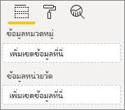
เพิ่มข้อมูลลงในวิชวล
ลากขอบของภาพเพื่อเปลี่ยนขนาดและสังเกตว่ามาตราส่วนปรับอย่างไร
สลับการเปิดและปิดแกน X

เปลี่ยนสีของประเภทต่าง ๆ
เพิ่มคุณลักษณะอื่น ๆ
คุณสามารถปรับแต่งวิชวลของคุณเพิ่มเติมได้โดยการเพิ่มคุณลักษณะเพิ่มเติม คุณสามารถเพิ่มคุณลักษณะที่เพิ่มฟังก์ชันการทํางานของวิชวล ปรับปรุงรูปลักษณ์และความรู้สึก ของวิชวล หรือให้ผู้ใช้ควบคุมลักษณะที่ปรากฏได้มากขึ้น ตัวอย่างเช่น คุณสามารถ:
- เพิ่มการเลือกและการโต้ตอบกับวิชวลอื่น ๆ
- เพิ่มแถบเลื่อนบานหน้าต่างคุณสมบัติที่ควบคุมความทึบ
- เพิ่มการสนับสนุนสําหรับคําแนะนําเครื่องมือ
- เพิ่มหน้าเริ่มต้น
- เพิ่มการรองรับภาษาท้องถิ่น
แพคเกจวิชวล
ก่อนที่คุณสามารถโหลดวิชวลของคุณลงใน Power BI Desktop หรือแชร์กับชุมชนใน แกลเลอรีวิชวลของ Power BI คุณต้องแพคเกจ
ในการเตรียมวิชวลสําหรับการแชร์ ให้ทําตามคําแนะนําใน แพคเกจวิชวล Power BI
หมายเหตุ
สําหรับรหัสแหล่งที่มาแบบเต็มของแผนภูมิแท่งที่มีคุณลักษณะเพิ่มเติม รวมถึง เคล็ดลับ เครื่องมือและ เมนูบริบท ดู แผนภูมิแท่งตัวอย่างของวิชวล Power BI