Shapes and Basic Drawing in WPF Overview
This topic gives an overview of how to draw with Shape objects. A Shape is a type of UIElement that enables you to draw a shape to the screen. Because they are UI elements, Shape objects can be used inside Panel elements and most controls.
Windows Presentation Foundation (WPF) offers several layers of access to graphics and rendering services. At the top layer, Shape objects are easy to use and provide many useful features, such as layout and participation in the Windows Presentation Foundation (WPF) event system.
Shape-related types are in the Windows.Shapes namespace. Geometry-related types are in the System.Windows.Media namespace.
Shape Objects
WPF provides a number of ready-to-use Shape objects. All shape objects inherit from the Shape class. Available shape objects include Ellipse, Line, Path, Polygon, Polyline, and Rectangle. Shape objects share the following common properties.
Stroke: Describes how the shape's outline is painted.
StrokeThickness: Describes the thickness of the shape's outline.
Fill: Describes how the interior of the shape is painted.
Data properties to specify coordinates and vertices, measured in device-independent pixels.
Because they derive from UIElement, shape objects can be used inside panels and most controls. The Canvas panel is a particularly good choice for creating complex drawings because it supports absolute positioning of its child objects.
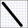
The Line class enables you to draw a line between two points. The following example shows several ways to specify line coordinates and stroke properties.
<Canvas Height="300" Width="300">

  <!-- Draws a diagonal line from (10,10) to (50,50). -->
  <Line
    X1="10" Y1="10"
    X2="50" Y2="50"
    Stroke="Black"
    StrokeThickness="4" />

  <!-- Draws a diagonal line from (10,10) to (50,50)
       and moves it 100 pixels to the right. -->
  <Line
    X1="10" Y1="10"
    X2="50" Y2="50"
    StrokeThickness="4"
    Canvas.Left="100">
    <Line.Stroke>
      <RadialGradientBrush GradientOrigin="0.5,0.5" Center="0.5,0.5" RadiusX="0.5" RadiusY="0.5">
        <RadialGradientBrush.GradientStops>
          <GradientStop Color="Red" Offset="0" />
          <GradientStop Color="Blue" Offset="0.25" />
        </RadialGradientBrush.GradientStops>
      </RadialGradientBrush>
    </Line.Stroke>
  </Line>

  <!-- Draws a horizontal line from (10,60) to (150,60). -->
  <Line
     X1="10" Y1="60"
     X2="150" Y2="60"
     Stroke="Black"
     StrokeThickness="4"/>

</Canvas>
// Add a Line Element
myLine = gcnew Line();
myLine->Stroke = Brushes::LightSteelBlue;
myLine->X1 = 1;
myLine->X2 = 50;
myLine->Y1 = 1;
myLine->Y2 = 50;
myLine->HorizontalAlignment = HorizontalAlignment::Left;
myLine->VerticalAlignment = VerticalAlignment::Center;
myLine->StrokeThickness = 2;
myGrid->Children->Add(myLine);
// Add a Line Element
myLine = new Line();
myLine.Stroke = System.Windows.Media.Brushes.LightSteelBlue;
myLine.X1 = 1;
myLine.X2 = 50;
myLine.Y1 = 1;
myLine.Y2 = 50;
myLine.HorizontalAlignment = HorizontalAlignment.Left;
myLine.VerticalAlignment = VerticalAlignment.Center;
myLine.StrokeThickness = 2;
myGrid.Children.Add(myLine);
' Add a Line Element
Dim myLine As New Line()
myLine.Stroke = Brushes.LightSteelBlue
myLine.X1 = 1
myLine.X2 = 50
myLine.Y1 = 1
myLine.Y2 = 50
myLine.HorizontalAlignment = HorizontalAlignment.Left
myLine.VerticalAlignment = VerticalAlignment.Center
myLine.StrokeThickness = 2
myGrid.Children.Add(myLine)
The following image shows the rendered Line.
Although the Line class does provide a Fill property, setting it has no effect because a Line has no area.
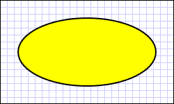
Another common shape is the Ellipse. Create an Ellipse by defining the shape's Width and Height properties. To draw a circle, specify an Ellipse whose Width and Height values are equal.
<Ellipse
Fill="Yellow"
Height="100"
Width="200"
StrokeThickness="2"
Stroke="Black"/>
using System;
using System.Windows;
using System.Windows.Controls;
using System.Windows.Media;
using System.Windows.Shapes;

namespace SDKSample
{
    public partial class SetBackgroundColorOfShapeExample : Page
    {
        public SetBackgroundColorOfShapeExample()
        {
            // Create a StackPanel to contain the shape.
            StackPanel myStackPanel = new StackPanel();

            // Create a red Ellipse.
            Ellipse myEllipse = new Ellipse();

            // Create a SolidColorBrush with a red color to fill the
            // Ellipse with.
            SolidColorBrush mySolidColorBrush = new SolidColorBrush();

            // Describes the brush's color using RGB values.
            // Each value has a range of 0-255.
            mySolidColorBrush.Color = Color.FromArgb(255, 255, 255, 0);
            myEllipse.Fill = mySolidColorBrush;
            myEllipse.StrokeThickness = 2;
            myEllipse.Stroke = Brushes.Black;

            // Set the width and height of the Ellipse.
            myEllipse.Width = 200;
            myEllipse.Height = 100;

            // Add the Ellipse to the StackPanel.
            myStackPanel.Children.Add(myEllipse);

            this.Content = myStackPanel;
        }
    }
}
Imports System.Windows
Imports System.Windows.Controls
Imports System.Windows.Media
Imports System.Windows.Shapes

Namespace SDKSample
    Partial Public Class SetBackgroundColorOfShapeExample
        Inherits Page
        Public Sub New()
            ' Create a StackPanel to contain the shape.
            Dim myStackPanel As New StackPanel()

            ' Create a red Ellipse.
            Dim myEllipse As New Ellipse()

            ' Create a SolidColorBrush with a red color to fill the
            ' Ellipse with.
            Dim mySolidColorBrush As New SolidColorBrush()

            ' Describes the brush's color using RGB values.
            ' Each value has a range of 0-255.
            mySolidColorBrush.Color = Color.FromArgb(255, 255, 255, 0)
            myEllipse.Fill = mySolidColorBrush
            myEllipse.StrokeThickness = 2
            myEllipse.Stroke = Brushes.Black

            ' Set the width and height of the Ellipse.
            myEllipse.Width = 200
            myEllipse.Height = 100

            ' Add the Ellipse to the StackPanel.
            myStackPanel.Children.Add(myEllipse)

            Me.Content = myStackPanel
        End Sub

    End Class
End Namespace
The following image shows an example of a rendered Ellipse.
Using Paths and Geometries
The Path class enables you to draw curves and complex shapes. These curves and shapes are described using Geometry objects. To use a Path, you create a Geometry and use it to set the Path object's Data property.
There are a variety of Geometry objects to choose from. The LineGeometry, RectangleGeometry, and EllipseGeometry classes describe relatively simple shapes. To create more complex shapes or create curves, use a PathGeometry.
PathGeometry and PathSegments
PathGeometry objects are comprised of one or more PathFigure objects; each PathFigure represents a different "figure" or shape. Each PathFigure is itself comprised of one or more PathSegment objects, each representing a connected portion of the figure or shape. Segment types include the following: LineSegment, BezierSegment, and ArcSegment.
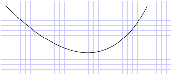
In the following example, a Path is used to draw a quadratic Bezier curve.
<Path Stroke="Black" StrokeThickness="1">
  <Path.Data>
    <PathGeometry>
      <PathGeometry.Figures>
        <PathFigureCollection>
          <PathFigure StartPoint="10,100">
            <PathFigure.Segments>
              <PathSegmentCollection>
                <QuadraticBezierSegment Point1="200,200" Point2="300,100" />
              </PathSegmentCollection>
            </PathFigure.Segments>
          </PathFigure>
        </PathFigureCollection>
      </PathGeometry.Figures>
    </PathGeometry>
  </Path.Data>
</Path>
The following image shows the rendered shape.
For more information about PathGeometry and the other Geometry classes, see the Geometry Overview.
XAML Abbreviated Syntax
In Extensible Application Markup Language (XAML), you may also use a special abbreviated syntax to describe a Path. In the following example, abbreviated syntax is used to draw a complex shape.
      <Path Stroke="DarkGoldenRod" StrokeThickness="3"
Data="M 100,200 C 100,25 400,350 400,175 H 280" />
The following image shows a rendered Path.
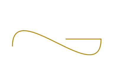
The Data attribute string begins with the "moveto" command, indicated by M, which establishes a start point for the path in the coordinate system of the Canvas. Path data parameters are case-sensitive. The capital M indicates an absolute location for the new current point. A lowercase m would indicate relative coordinates. The first segment is a cubic Bezier curve beginning at (100,200) and ending at (400,175), drawn using the two control points (100,25) and (400,350). This segment is indicated by the C command in the Data attribute string. Again, the capital C indicates an absolute path; the lowercase c would indicate a relative path.
The second segment begins with an absolute horizontal "lineto" command H, which specifies a line drawn from the preceding subpath's endpoint (400,175) to a new endpoint (280,175). Because it is a horizontal "lineto" command, the value specified is an x-coordinate.
For the complete path syntax, see the Data reference and Create a Shape by Using a PathGeometry.
Painting Shapes
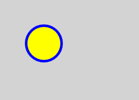
Brush objects are used to paint a shape's Stroke and Fill. In the following example, the stroke and fill of an Ellipse are specified. Note that valid input for brush properties can be either a keyword or hexadecimal color value. For more information about available color keywords, see properties of the Colors class in the System.Windows.Media namespace.
<Canvas Background="LightGray">
   <Ellipse
      Canvas.Top="50"
      Canvas.Left="50"
      Fill="#FFFFFF00"
      Height="75"
      Width="75"
      StrokeThickness="5"
      Stroke="#FF0000FF"/>
</Canvas>
The following image shows the rendered Ellipse.
Alternatively, you can use property element syntax to explicitly create a SolidColorBrush object to paint the shape with a solid color.
<!-- This polygon shape uses pre-defined color values for its Stroke and
     Fill properties.
     The SolidColorBrush's Opacity property affects the fill color in
     this case by making it slightly transparent (opacity of 0.4) so
     that it blends with any underlying color. -->

<Polygon
    Points="300,200 400,125 400,275 300,200"
    Stroke="Purple"
    StrokeThickness="2">
    <Polygon.Fill>
       <SolidColorBrush Color="Blue" Opacity="0.4"/>
    </Polygon.Fill>
</Polygon>
The following illustration shows the rendered shape.

You can also paint a shape's stroke or fill with gradients, images, patterns, and more. For more information, see the Painting with Solid Colors and Gradients Overview.
Stretchable Shapes
The Line, Path, Polygon, Polyline, and Rectangle classes all have a Stretch property. This property determines how a Shape object's contents (the shape to be drawn) is stretched to fill the Shape object's layout space. A Shape object's layout space is the amount of space the Shape is allocated by the layout system, because of either an explicit Width and Height setting or because of its HorizontalAlignment and VerticalAlignment settings. For additional information on layout in Windows Presentation Foundation, see Layout overview.
The Stretch property takes one of the following values:
Fill: The Shape object's contents are stretched to fill its layout space. Aspect ratio is not preserved.
Uniform: The Shape object's contents are stretched as much as possible to fill its layout space while preserving its original aspect ratio.
UniformToFill: The Shape object's contents are stretched to completely fill its layout space while preserving its original aspect ratio.
Note that, when a Shape object's contents are stretched, the Shape object's outline is painted after the stretching.
In the following example, a Polygon is used to draw a very small triangle from (0,0) to (0,1) to (1,1). The Polygon object's Width and Height are set to 100, and its stretch property is set to Fill. As a result, the Polygon object's contents (the triangle) are stretched to fill the larger space.
<Polygon
  Points="0,0 0,1 1,1"
  Fill="Blue"
  Width="100"
  Height="100"
  Stretch="Fill"
  Stroke="Black"
  StrokeThickness="2" />
PointCollection myPointCollection = new PointCollection();
myPointCollection.Add(new Point(0,0));
myPointCollection.Add(new Point(0,1));
myPointCollection.Add(new Point(1,1));

Polygon myPolygon = new Polygon();
myPolygon.Points = myPointCollection;
myPolygon.Fill = Brushes.Blue;
myPolygon.Width = 100;
myPolygon.Height = 100;
myPolygon.Stretch = Stretch.Fill;
myPolygon.Stroke = Brushes.Black;
myPolygon.StrokeThickness = 2;
Transforming Shapes
The Transform class provides the means to transform shapes in a two-dimensional plane. The different types of transformation include rotation (RotateTransform), scale (ScaleTransform), skew (SkewTransform), and translation (TranslateTransform).
A common transform to apply to a shape is a rotation. To rotate a shape, create a RotateTransform and specify its Angle. An Angle of 45 rotates the element 45 degrees clockwise; an angle of 90 rotates the element 90 degrees clockwise; and so on. Set the CenterX and CenterY properties if you want to control the point about which the element is rotated. These property values are expressed in the coordinate space of the element being transformed. CenterX and CenterY have default values of zero. Finally, apply the RotateTransform to the element. If you don't want the transform to affect layout, set the shape's RenderTransform property.
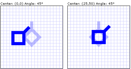
In the following example, a RotateTransform is used to rotate a shape 45 degrees about the shape's top left corner (0,0).
<!-- Rotates the Polyline 45 degrees about the point (0,0). -->
<Polyline Points="25,25 0,50 25,75 50,50 25,25 25,0"
  Stroke="Blue" StrokeThickness="10"
  Canvas.Left="75" Canvas.Top="50">
  <Polyline.RenderTransform>
    <RotateTransform CenterX="0" CenterY="0" Angle="45" />
  </Polyline.RenderTransform>
</Polyline>
In the next example, another shape is rotated 45 degrees, but this time it's rotated about the point (25,50).
<!-- Rotates the Polyline 45 degrees about its center. -->
<Polyline
  Points="25,25 0,50 25,75 50,50 25,25 25,0"
  Stroke="Blue" StrokeThickness="10"
  Canvas.Left="75" Canvas.Top="50"
  RenderTransformOrigin="0.5,0.5">
  <Polyline.RenderTransform>
    <RotateTransform Angle="45" />
  </Polyline.RenderTransform>
</Polyline>
The following illustration shows the results of applying the two transforms.
In the previous examples, a single transform was applied to each shape object. To apply multiple transforms to a shape (or any other UI element), use a TransformGroup.
See also
.NET Desktop feedback
