Layout for Visual Studio
Note
This article applies to Visual Studio 2015. If you're looking for the latest Visual Studio documentation, see Visual Studio documentation. We recommend upgrading to the latest version of Visual Studio. Download it here
The majority of Visual Studio dialogs are Utility dialog layout, which are the unthemed dialogs that follow standard Windows Desktop dialog layout principles. As Visual Studio moves to refresh its UI, some of the more prominent dialogs have a new design that establishes them as product-defining experiences. These Themed dialog layout have a themed appearance.
Utility dialog layout
All controls within a utility dialog should start at the top/left and flow downward.
Never center controls on a dialog to fill a large area.
Use the environment font for all dialog text. When writing a visual spec, specify the environment font instead of selecting a particular font and size. See The environment font.
Use consistent control spacing and placement to support the goal for quality in craftsmanship.
Dialogs can become more complex from a larger number of controls, a unique juxtaposition of controls, or both. For those complex situations, allow adequate space between control groupings to give the user a logical flow to parse.
Utility dialog layout examples
All dimensions are expressed as pixels.
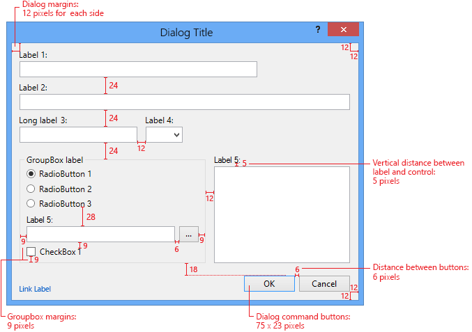
Figure 08.01-a: Spacing guidelines for utility dialogs with labels above controls
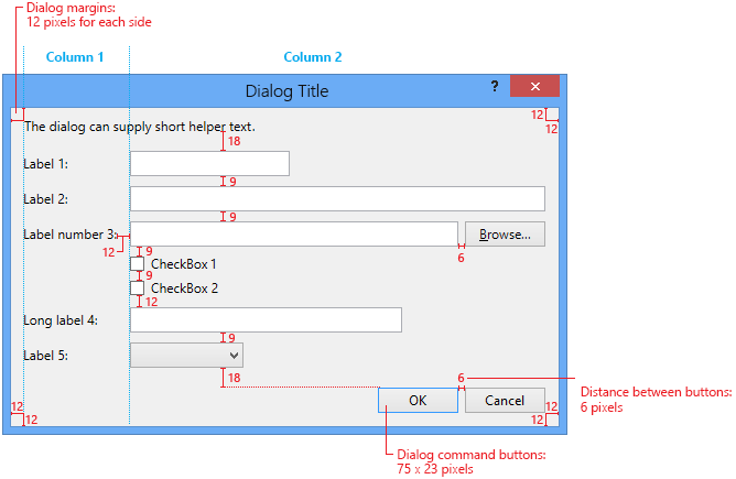
Figure 08.01-b: Spacing guidelines for utility dialogs with labels to the left of controls
Layout details
Margins
All dialogs should have a 12-pixel border around all edges.
Margins within a group frame should be 9 pixels from the edge of the frame.
Margins within a tab control should be 6 pixels from the edge of the tab control.
Command buttons
Command buttons operate on the dialog frame, not on the content. They should be placed at the bottom right and should have enough variable space above to set the buttons distinctly separate.
If there are horizontal buttons that operate within the dialog, the alternate command button configuration is a vertical stack at the upper right. See Interior command buttons below.
The space to the left of the command buttons (lower left/center of the dialog) is considered part of the “band” of dialog operation controls. The only thing that should intrude on that space is a Help link that is relevant to the overall task or dialog.
Command buttons should be 75x23 pixels.
Command buttons should be 6 pixels apart.
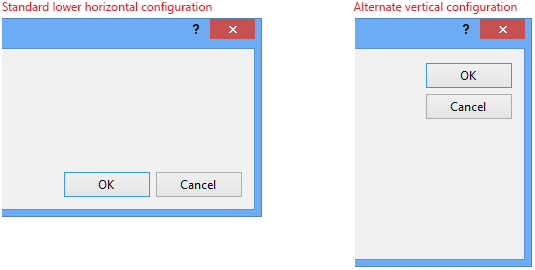
Figure 08.01-c: Basic button alignment
Labels
Left-align all labels.
For labels that sit above a control, they should left-align precisely with the control below it and the bottom of the label should be 5 pixels above the top of the other control (for example, a combo box).
For labels that sit to the left of controls, the minimum width between the label and the input control is 10 pixels. An implied second column should be established for aligning the text boxes, combo boxes, or other controls.
Labels are sentence case and are followed by a colon. See Text style.
Distance between controls
Stack controls reasonably. There is no absolute guideline for the spacing between stacked controls. The tightness between the controls may vary slightly between dialogs. The recommended spacing is 20 pixels for vertical control/label pairs, and 9 pixels for horizontal control/label pairs. The minimum control spacing for horizontal pairs is 6 pixels.
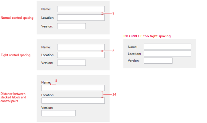
Figure 08.01-d: Recommendations for distance between controls
Control indentation
When controls are nested, align inner controls horizontally with the left edge of the control above, usually the label.
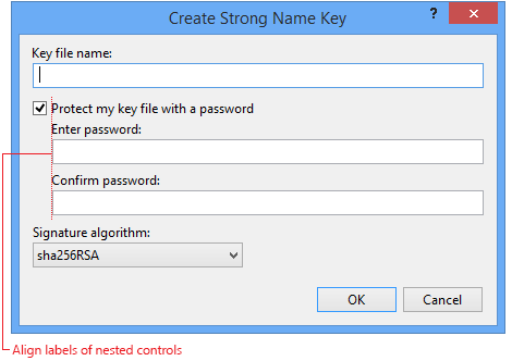
Figure 08.01-e: Nested control alignment
Control width
The width of a text box or other similar controls should be no longer than the average input for the field. The average English word is five characters. For example, a text box that requires a long path name should be as long as the horizontal layout allows, while a dropdown for platform names should only be a length that allows for the longest entry.
Helper text
A dialog can display helper text that provides more information about the purpose of the dialog. This typically sits at the top and can be 1-2 sentences.
The line length should be a comfortable width for a user to parse and read. A medium dialog should be no more than 550 pixels wide.
Interior command buttons
In more complex dialogs, an internal control might have its own related buttons, which might affect where the dialog’s commit buttons are located.
Use a vertical alignment (column) of interior buttons when OK/Cancel are horizontally oriented in the lower right corner.
Use a horizontal alignment (row) of interior buttons when OK/Cancel are vertically oriented in the upper right corner. This situation is less common.
Interior button size should target the standard button size of 75x23 pixels, matching the size of OK/Cancel buttons when possible. If a button label makes the button exceed the standard button size, the other buttons in that set should align with that wider size.
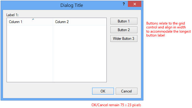
Figure 08.01-f: Vertical Interior buttons with horizontal OK/Cancel
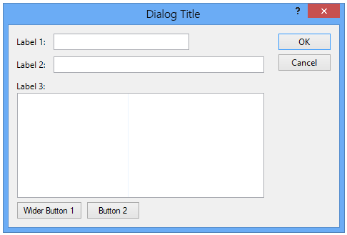
Figure 08.01-g: Horizontal interior buttons with vertical OK/Cancel
[Browse…] button
[Browse…] buttons that follow a text box should spell out "Browse…" in full, including the ellipsis. If space is tight or there are multiple [Browse…] buttons on the screen, the button can be reduced to just the ellipsis.
Themed dialog layout
Themed dialogs in Visual Studio have a lighter appearance and offer more white space. Typography provides more emphasis and interest, offering more open line spacing and a variation of font sizes and weights. Where possible, chrome and title bars have been reduced or removed. The layout of these dialogs should follow this basic pattern:
The background of the dialog is white.
There is a 1-pixel rule border in a mid-value gray.
The dialog title no longer sits in a title bar, but provides visual interest and emphasis in a larger point size. (See the font size section in Text style.)
Labels coupled with additional text, such as a description, should be Environment font + Bold.
Interior columns are separated by a 1-pixel rule in light gray.
Default links have no underscore. Hover and pressed states have a color change plus underscore.
Commit buttons (like OK/Cancel) sit in the lower right corner.
Themed dialog layout examples
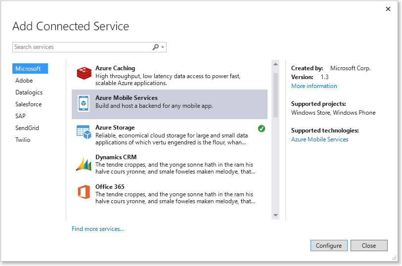
Figure 08.01-h: Themed dialog
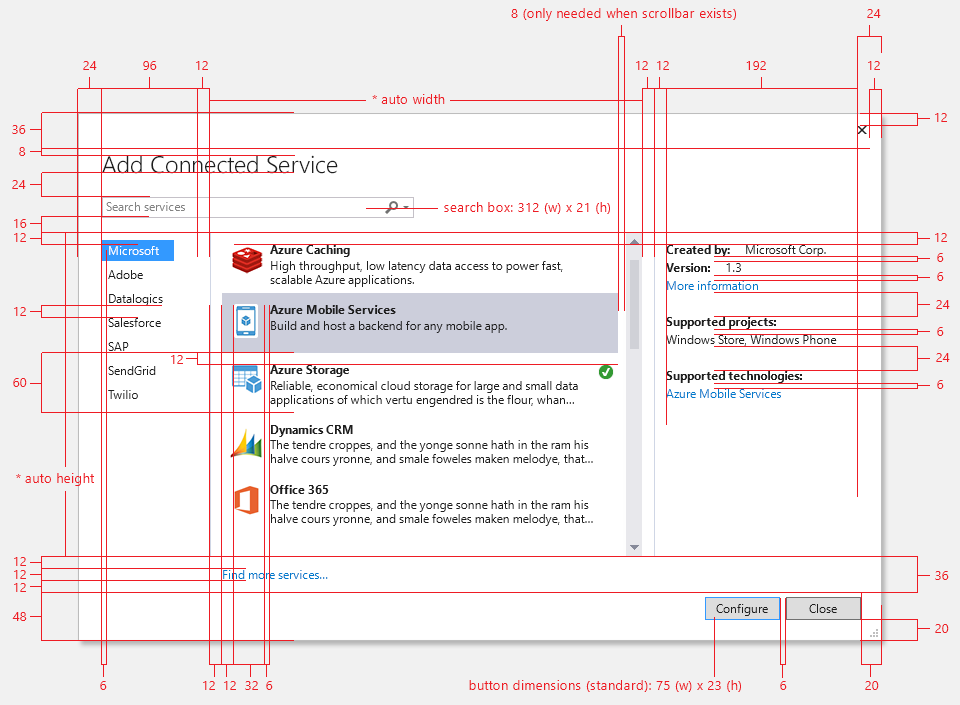
Figure 08.01-i: Themed dialog – Dimensions
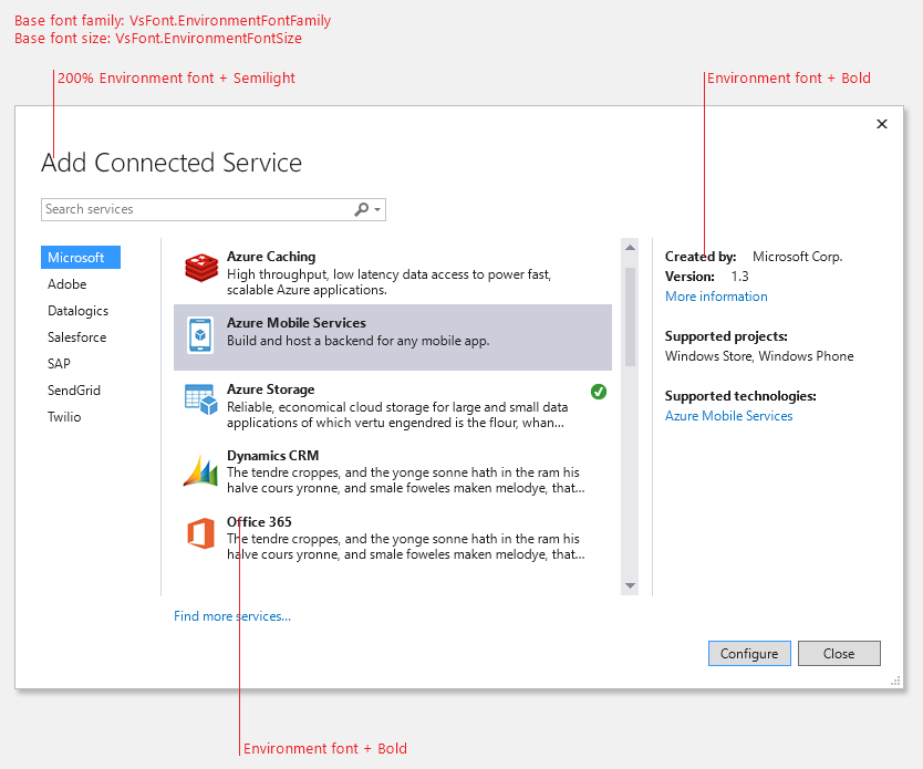
Figure 08.01-j: Themed dialog – Fonts

Figure 08.01-k: Themed dialog – Colors
See Also
Application Patterns for Visual Studio Controls (Windows) Dialog Boxes (Windows)