Fonts and Formatting for Visual Studio
Note
This article applies to Visual Studio 2015. If you're looking for the latest Visual Studio documentation, see Visual Studio documentation. We recommend upgrading to the latest version of Visual Studio. Download it here
The environment font
All fonts within Visual Studio must be exposed to the user for customization. This is primarily done through the Fonts and Colors page in the Tools > Options dialog. The three main categories of font settings are:
Environment font — the primary font for the IDE (integrated development environment), used for all interface elements, including dialogs, menus, tool windows, and document windows. By default, the environment font is tied to a system font that appears as 9 pt Segoe UI in current versions of Windows. Using one font for all interface elements helps ensure a consistent font appearance throughout the IDE.
Text editor — elements that surface in code and other text-based editors can be customized in the Text Editor page in Tools > Options.
Specific collections — designer windows that offer user customization of their interface elements may expose fonts specific to their design surface in their own settings page in Tools > Options.
Editor font customization and resizing
Users often will enlarge or zoom the size and/or color of text in the editor according to their preference, independent of the general user interface. Because the environment font is used on elements that might appear within or as part of an editor/designer, it is important to note the expected behavior when one of these font classifications is changed.
When creating UI elements that appear in the editor but are not part of the content, it is important to use the environment font and not the text font so that elements resize in a predictable way.
For code text in the editor, resize with the code text font setting and respond to the editor text's zoom level.
All other elements of the interface should be tied to the environment font setting and respond to any global changes in the environment. This includes (but is not limited to):
Text in context menus
Text in an editor adornment, such as light bulb menu text, quick find editor pane, and navigate to pane
Label text in dialog boxes, such as Find in Files or Refactor
Accessing the environment font
In Native or WinForms code, the environment font can be accessed by calling the method IUIHostLocale::GetDialogFont after querying the interface from the SID_SUIHostLocale service.
For Windows Presentation Foundation (WPF), derive your dialog window class from the shell's DialogWindow class instead of WPF's Window class.
In XAML, the code looks like this:
<ui:DialogWindow
    x:Class"MyNameSpace.MyWindow"
    xmlns="https://schemas.microsoft.com/winfx/2006/xaml/presentation"
    xmlns:s="https://schemas.microsoft.com/winfx/2006/xaml"
    xmlns:ui="clr-namespace:Microsoft.VisualStudio.PlatformUI;assembly=Microsoft.VisualStudio.Shell.11.0"
    ShowInTaskbar="False"
    WindowStartupLocation="CenterOwner"
    Title="My Dialog">
</ui:DialogWindow>

code behind:

internal partial class WebConfigModificationWindow : DialogWindow
{
}
(Replace Microsoft.VisualStudio.Shell.11.0 with the current version of the MPF dll.)
To display the dialog, call "ShowModal()" on the class over ShowDialog(). ShowModal() sets the correct modal state in the shell, ensures the dialog is centered in the parent window, and so on.
The code is as follows:
MyWindow window = new MyWindow();
window.ShowModal()
ShowModal returns a bool? (nullable Boolean) with the DialogResult, which can be used if needed. The return value is true if the dialog was closed with OK.
If you need to display some WPF UI that is not a dialog and is hosted in its own HwndSource, such as a popup window or a WPF child window of a Win32/WinForms parent window window, you will need to set the FontFamily and FontSize on the root element of the WPF element. (The shell sets the properties on the main window, but they will not be inherited past a HWND). The shell provides resources to which the properties can be bound, like this:
<Setter property="FontFamily" Value="{DynamicResource VsFont.EnvironmentFontFamily}" />
<Setter property="FontSize" Value="{DynamicResource VsFont.EnvironmentFontSize}" />
Formatting (scaling/bolding) reference
Some dialogs require particular text to be bold or a size other than the environment font. Previously, fonts larger than the environment font were coded as “environment font +2” or similar. Using the provided code snippets will support high-DPI monitors and ensure that display text always appears at the correct size and weight (such as Light or Semilight).
Note: Before you apply formatting, ensure you are following the guidance found in Text style.
To scale the environment font, set the style of the TextBlock or Label as indicated. Each of these code snippets, properly used, will generate the correct font, including the appropriate size and weight variations.
Where "vsui" is a reference to the namespace Microsoft.VisualStudio.Shell:
xmlns:vsui="clr-namespace:Microsoft.VisualStudio.Shell;assembly=Microsoft.VisualStudio.Shell.14.0"
375% Environment font + Light
Appears as: 34 pt Segoe UI Light
Use for: (rare) unique branded UI, such as in the Start Page
Procedural code: Where “textBlock” is a previously defined TextBlock and “label” is a previously defined Label.
textBlock.SetResourceReference(TextBlock.StyleProperty,
        VsResourceKeys.TextBlockEnvironment375PercentFontSizeStyleKey);
label.SetResourceReference(Label.StyleProperty,
        VsResourceKeys.LabelEnvironment375PercentFontSizeStyleKey);
XAML: Set the style of the TextBlock or Label as shown.
<TextBlock Style="{DynamicResource {x:Static vsui:VsResourceKeys.TextBlockEnvironment375PercentFontSizeStyleKey}}">TextBlock: 375 Percent Scaling</TextBlock>
<Label Style="{DynamicResource {x:Static vsui:VsResourceKeys.LabelEnvironment375PercentFontSizeStyleKey}}">Label: 375 Percent Scaling</Label>
310% Environment font + Light
Appears as: 28 pt Segoe UI Light
Use for: large signature dialog titles, main heading in reports
Procedural code: Where “textBlock” is a previously defined TextBlock and “label” is a previously defined Label.
textBlock.SetResourceReference(TextBlock.StyleProperty,
        VsResourceKeys.TextBlockEnvironment310PercentFontSizeStyleKey);
label.SetResourceReference(Label.StyleProperty,
        VsResourceKeys.LabelEnvironment310PercentFontSizeStyleKey);
XAML: Set the style of the TextBlock or Label as shown.
<TextBlock Style="{DynamicResource {x:Static vsui:VsResourceKeys.TextBlockEnvironment310PercentFontSizeStyleKey}}">TextBlock: 310 Percent Scaling</TextBlock>
<Label Style="{DynamicResource {x:Static vsui:VsResourceKeys.LabelEnvironment310PercentFontSizeStyleKey}}">Label: 310 Percent Scaling</Label>
200% Environment font + Semilight
Appears as: 18 pt Segoe UI Semilight
Use for: subheadings, titles in small and medium dialogs
Procedural code: Where “textBlock” is a previously defined TextBlock and “label” is a previously defined Label.
textBlock.SetResourceReference(TextBlock.StyleProperty,
        VsResourceKeys.TextBlockEnvironment200PercentFontSizeStyleKey);
label.SetResourceReference(Label.StyleProperty,
        VsResourceKeys.LabelEnvironment200PercentFontSizeStyleKey);
XAML: Set the style of the TextBlock or Label as shown.
<TextBlock Style="{DynamicResource {x:Static vsui:VsResourceKeys.TextBlockEnvironment200PercentFontSizeStyleKey}}">TextBlock: 200 Percent Scaling</TextBlock>
<Label Style="{DynamicResource {x:Static vsui:VsResourceKeys.LabelEnvironment200PercentFontSizeStyleKey}}">Label: 200 Percent Scaling</Label>
155% Environment font
Appears as: 14 pt Segoe UI
Use for: section headings in document well UI or reports
Procedural code: Where “textBlock” is a previously defined TextBlock and “label” is a previously defined Label.
textBlock.SetResourceReference(TextBlock.StyleProperty,
        VsResourceKeys.TextBlockEnvironment155PercentFontSizeStyleKey);
label.SetResourceReference(Label.StyleProperty,
        VsResourceKeys.LabelEnvironment155PercentFontSizeStyleKey);
XAML: Set the style of the TextBlock or Label as shown.
<TextBlock Style="{DynamicResource {x:Static vsui:VsResourceKeys.TextBlockEnvironment155PercentFontSizeStyleKey}}">TextBlock: 155 Percent Scaling</TextBlock>
<Label Style="{DynamicResource {x:Static vsui:VsResourceKeys.LabelEnvironment155PercentFontSizeStyleKey}}">Label: 155 Percent Scaling</Label>
133% Environment font
Appears as: 12 pt Segoe UI
Use for: smaller subheadings in signature dialogs and document well UI
Procedural code: Where “textBlock” is a previously defined TextBlock and “label” is a previously defined Label.
textBlock.SetResourceReference(TextBlock.StyleProperty,
        VsResourceKeys.TextBlockEnvironment133PercentFontSizeStyleKey);
label.SetResourceReference(Label.StyleProperty,
        VsResourceKeys.LabelEnvironment133PercentFontSizeStyleKey);
XAML: Set the style of the TextBlock or Label as shown.
<TextBlock Style="{DynamicResource {x:Static vsui:VsResourceKeys.TextBlockEnvironment133PercentFontSizeStyleKey}}">TextBlock: 133 Percent Scaling</TextBlock>
<Label Style="{DynamicResource {x:Static vsui:VsResourceKeys.LabelEnvironment133PercentFontSizeStyleKey}}">Label: 133 Percent Scaling</Label>
122% Environment font
Appears as: 11 pt Segoe UI
Use for: section headings in signature dialogs, top nodes in tree view, vertical tab navigation
Procedural code: Where “textBlock” is a previously defined TextBlock and “label” is a previously defined Label.
textBlock.SetResourceReference(TextBlock.StyleProperty,
        VsResourceKeys.TextBlockEnvironment122PercentFontSizeStyleKey);
label.SetResourceReference(Label.StyleProperty,
        VsResourceKeys.LabelEnvironment122PercentFontSizeStyleKey);
XAML: Set the style of the TextBlock or Label as shown.
<TextBlock Style="{DynamicResource {x:Static vsui:VsResourceKeys.TextBlockEnvironment122PercentFontSizeStyleKey}}">TextBlock: 122 Percent Scaling</TextBlock>
<Label Style="{DynamicResource {x:Static vsui:VsResourceKeys.LabelEnvironment122PercentFontSizeStyleKey}}">Label: 122 Percent Scaling</Label>
Environment font + bold
Appears as: bolded 9 pt Segoe UI
Use for: labels and subheads in signature dialogs, reports, and document well UI
Procedural code: Where “textBlock” is a previously defined TextBlock and “label” is a previously defined Label.
textBlock.SetResourceReference(TextBlock.StyleProperty,
        VsResourceKeys.TextBlockEnvironmentBoldStyleKey);
label.SetResourceReference(Label.StyleProperty,
        VsResourceKeys.LabelEnvironmentBoldStyleKey);
XAML: Set the style of the TextBlock or Label as shown.
<TextBlock Style="{DynamicResource {x:Static vsui:VsResourceKeys.TextBlockEnvironmentBoldStyleKey}}"> Bold TextBlock</TextBlock>
<Label Style="{DynamicResource {x:Static vsui:VsResourceKeys.LabelEnvironmentBoldStyleKey}}"> Bold Label</Label>
Localizable styles
In some instances, localizers will need to modify font styles for different locales, such as removing bolding from text for East Asian languages. To make the localization of font styles possible, those styles must be within the .resx file. The best way to accomplish this and still edit font styles in the Visual Studio form designer is to explicitly set the font styles at design time. Although this creates a full font object and might seem to break the inheritance of parent fonts, only the FontStyle property is used to set the font.
The solution is to hook the dialog form's FontChanged event. In the FontChanged event, walk all controls and check if their font is set. If it is set, change it to a new font based on the form's font and the control's previous font style. An example of this in code is:
private void Form1_FontChanged(object sender, System.EventArgs e)
{
          SetFontStyles();
}

/// <summary>
/// SetFontStyles - This function will iterate all controls on a page
/// and recreate their font with the desired fontstyle.
/// It should be called in the OnFontChanged handler (and also in the constructor
/// in case the IUIService is not available so OnFontChange doesn't fire).
/// This way, when the VS shell font is given to us the controls that have
/// a different style for the font (bolded for example) will recreate their font
/// and use the VS shell font but with a style variation (bolded ...).
/// </summary>
protected void SetFontStyles()
{
     SetFontStyles(this, this, this.Font);
}

protected static void SetFontStyles(Control topControl, Control parent, Font referenceFont)
{
     foreach(Control c in parent.Controls)
     {
          if (c.Controls != null && c.Controls.Count > 0) {
               SetFontStyles(topControl, c, referenceFont);
          }
          if (c.Font != topControl.Font) {
               c.Font = new Font(referenceFont, c.Font.Style);
          }
     }
}
Using this code guarantees that when the form's font is updated, the fonts of controls will update as well. This method should also be called from the form's constructor, because the dialog might fail to get an instance of IUIService and the FontChanged event will never fire. Hooking FontChanged will allow dialogs to dynamically pick up the new font even if the dialog is already open.
Testing the environment font
To ensure that your UI is using the environment font and respects the size settings, open Tools > Options > Environment > Fonts and Colors and select "Environment Font" under the "Show settings for:" dropdown menu.
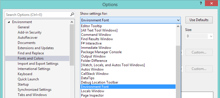
Fonts and Colors settings in the Tools > Options dialog
Set the font to something very different than the default. To make it obvious which UI does not update, choose a font with serifs (such as "Times New Roman") and set a very large size. Then test your UI to ensure it respects the environment. Here is an example using the license dialog:
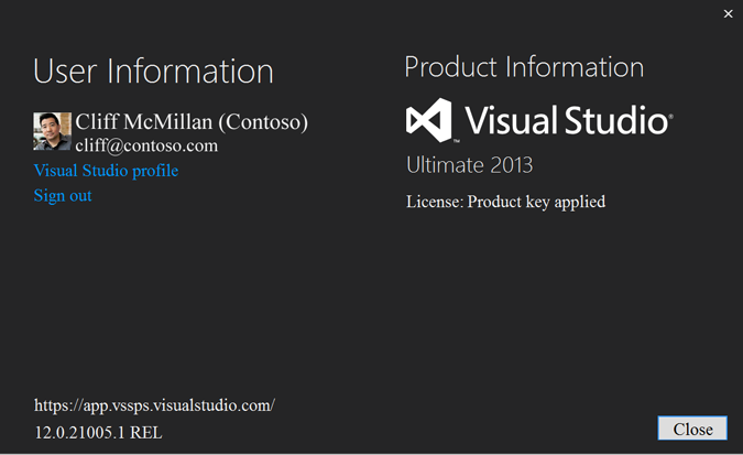
Example of UI text that does not respect the environment font
In this case, "User Information" and "Product Information" are not respecting the font. In some cases this might be an explicit design choice, but it can be a bug if the explicit font is not specified as a part of the redline specifications.
To reset the font, click "Use Defaults" under Tools > Options > Environment > Fonts and Colors.
Text style
Text style refers to font size, weight, and casing. For implementation guidance, see The environment font.
Text casing
All caps
Do not use all caps for titles or labels in Visual Studio.
All lowercase
Do not use all lowercase for titles or labels in Visual Studio.
Sentence and title case
Text in Visual Studio should use either title case or sentence case, depending on the situation.
| Use title case for: | Use sentence case for: |
|---|---|
| Dialog titles | Labels |
| Group boxes | Check boxes |
| Menu items | Radio buttons |
| Context menu items | List box items |
| Buttons | Status bars |
| Table labels | |
| Column headers | |
| Tooltips |
Title case
Title case is a style in which the first letters of most or all of the words within a phrase are capitalized. In Visual Studio, title case is used for many items, including:
Tooltips. Example: “Preview Selected Items”
Column headers. Example: “System Response”
Menu items. Example: “Save All”
When using title case, these are the guidelines for when to capitalize words and when to leave them lowercase:
| Uppercase | Comments and examples |
|---|---|
| All nouns | |
| All verbs | Including “Is” and other forms of “to be” |
| All adverbs | Including “Than” and “When” |
| All adjectives | Including “This” and “That” |
| All pronouns | Including the possessive “Its” as well as “It’s,” a contraction of the pronoun “it” and the verb “is” |
| First and last words, regardless of parts of speech | |
| Prepositions that are part of a verb phrase | “Closing Out All Windows” or “Shutting Down the System” |
| All letters of an acronym | HTML, XML, URL, IDE, RGB |
| The second word in a compound word if it is a noun or proper adjective, or if the words have equal weight | Cross-Reference, Pre-Microsoft Software, Read/Write Access, Run-Time |
| Lowercase | Examples |
|---|---|
| The second word in a compound word if it is another part of speech or a participle modifying the first word | How-to, Take-off |
| Articles, unless one is the first word in the title | a, an, the |
| Coordinate conjunctions | and, but, for, nor, or |
| Prepositions with words of four or fewer letters outside of a verb phrase | into, onto, as for, out of, on top of |
| “To” when used in an infinitive phrase | “How to Format Your Hard Disk” |
Sentence case
Sentence case is the standard capitalization method for writing in which only the first word of the sentence is capitalized, along with any proper nouns and the pronoun "I." In general, sentence case is easier for a worldwide audience to read, especially when the content will be translated by a machine. Use sentence case for:
Status bar messages. These are simple, short, and provide only status information. Example: “Loading project file”
All other UI elements, including labels, check boxes, radio buttons, and list box items. Example: “Select all items in list”
Text formatting
Default text formatting in Visual Studio 2013 is controlled by an The environment font. This service helps ensure a consistent font appearance throughout the IDE (integrated development environment), and you must use it to guarantee a consistent experience for your users.
The default size used by the Visual Studio font service comes from Windows and appears as 9 pt.
You can apply formatting to the environment font. This topic covers how and where to use styles. For implementation information, refer to The environment font.
Bold text
Bold text is used sparingly in Visual Studio and should be reserved for:
question labels in wizards
designating the active project in Solution Explorer
overridden values in the Properties tool window
certain events in the Visual Basic editor dropdown lists
server-generated content in the document outline for web pages
section headers in complex dialog or designer UI
Italics
Visual Studio does not use either italic or bolded italic text.
Color
Blue is reserved for hyperlinks (navigation and commanding) and should never be used for orientation.
Larger headings (environment font x 155% or greater) can be colored for these purposes:
To provide visual appeal to signature Visual Studio UI
To call attention to a specific area
To offer relief from the standard dark gray/black environment text color
Color in headings should leverage existing Visual Studio brand colors, primarily the main purple, #FF68217A.
When using color in headings, you must adhere to the Windows color guidelines, including contrast ratio and other accessibility considerations.
Font size
Visual Studio UI design features a lighter appearance with more white space. Where possible, chrome and title bars have been reduced or removed. While information density is a requirement in Visual Studio, typography continues to be important, with an emphasis on more open line spacing and a variation of font sizes and weights.
The tables below includes design details and visual examples for the display fonts used in Visual Studio. Some display font variations have both the size and weight, such as Semilight or Light, coded into their appearance.
Implementation code snippets for all display fonts can be found in Formatting (scaling/bolding) reference.
375% Environment font + Light
| Usage | Appearance |
|---|---|
| Usage: Rare. Unique branded UI only. Do: - Use sentence case - Always use Light weight Do not: - Use for UI other than signature UI such as Start Page - Bold, italic, or bold italic - Use for body text - Use in tool windows |
Appears as: 34 pt Segoe UI Light Visual example: Currently not used. May be used in the Start Page. |
310% Environment font + Light
| Usage | Appearance |
|---|---|
| Usage: - Larger heading in signature dialogs - Main report heading Do: - Use sentence case - Always use Light weight Do not: - Use for UI other than signature UI such as Start Page - Bold, italic, or bold italic - Use for body text - Use in tool windows |
Appears as: 28 pt Segoe UI Light Visual example: 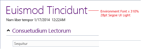 |
200% Environment font + Semilight
| Usage | Appearance |
|---|---|
| Usage: - Subheadings - Titles in small and medium dialogs Do: - Use sentence case - Always use Semilight weight Do not: - Bold, italic, or bold italic - Use for body text - Use in tool windows |
Appears as: 18 pt Segoe UI Semillight Visual example: 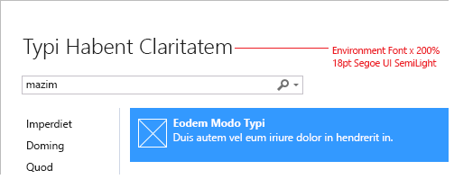 |
155% Environment font
| Usage | Appearance |
|---|---|
| Usage: - Section headings in document well UI - Reports Do: Use sentence case Do not: - Bold, italic, or bold italic - Use for body text - Use in standard Visual Studio controls - Use in tool windows |
Appears as: 14 pt Segoe UI Visual example: 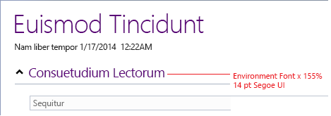 |
133% Environment font
| Usage | Appearance |
|---|---|
| Usage: - Smaller subheadings in signature dialogs - Smaller subheadings in document well UI Do: Use sentence case Do not: - Bold, italic, or bold italic - Use for body text - Use in standard Visual Studio controls - Use in tool windows |
Appears as: 12 pt Segoe UI Visual example: 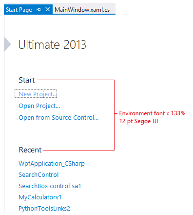 |
122% Environment font
| Usage | Appearance |
|---|---|
| Usage: - Section headings in signature dialogs - Top nodes in tree view - Vertical tab navigation Do: Use sentence case Do not: - Bold, italic, or bold italic - Use for body text - Use in standard Visual Studio controls - Use in tool windows |
Appears as: 11 pt Segoe UI Visual example: 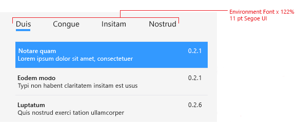 |
Environment font + bold
| Usage | Appearance |
|---|---|
| Usage: - Labels and subheads in signature dialogs - Labels and subheads in reports - Labels and subheads in document well UI Do: - Use sentence case - Use bold weight Do not: - Italic or bold italic - Use for body text - Use in standard Visual Studio controls - Use in tool windows |
Appears as: bolded 9 pt Segoe UI Visual example: 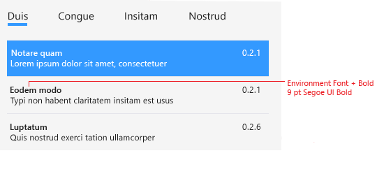 |
Environment font
| Usage | Appearance |
|---|---|
| Usage: All other text Do: Use sentence case Do not: Italic or bold italic |
Appears as: 9 pt Segoe UI Visual example: 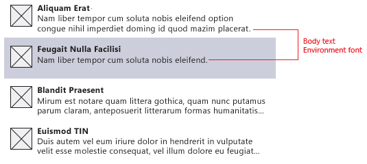 |
Padding and spacing
Headings require space around them to give them the appropriate emphasis. This space varies depending on point size and what else is near the heading, such as a horizontal rule or a line of text in the environment font.
The ideal padding for a heading by itself should be 90% of the capital character height space. For example, a 28 pt Segoe UI Light heading has a cap height of 26 pt, and the padding should be approximately 23 pt, or about 31 pixels.
The minimum space around a heading should be 50% of the capital character height. Less space may be used when a heading is accompanied by a rule or other tight-fitting element.
Bolded environment font text should follow default line height spacing and padding.