Extended canvas design pattern
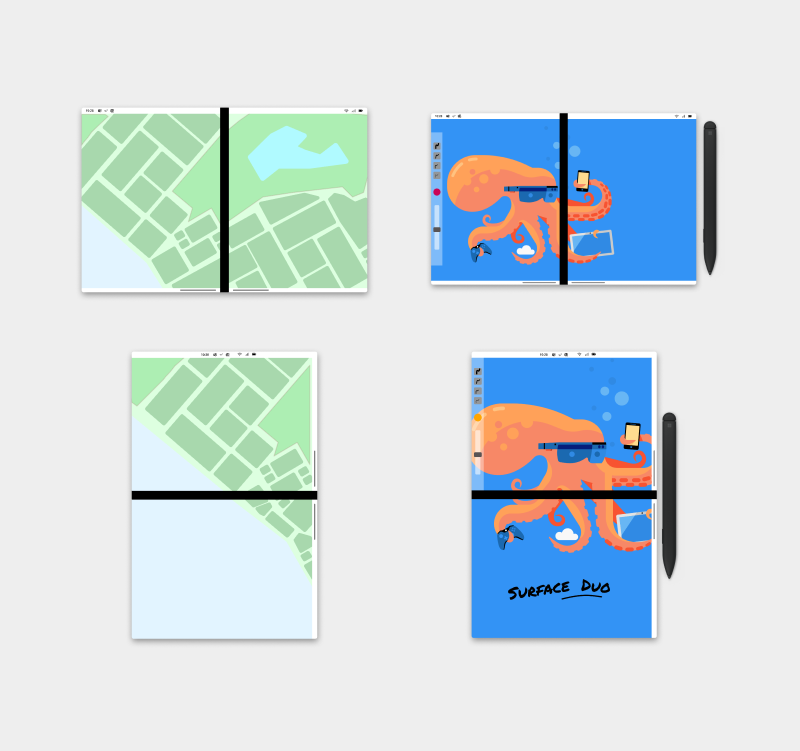
The extended canvas pattern is the simplest dual-screen pattern, but it's powerful. You may consider this pattern if you need a bigger canvas for a task such as drawing. If your app has a free-flowing canvas, the user can freely scroll if the seam obscures some important content. This pattern provides the benefit of giving your app more screen real-estate, rather than constricting it to one screen or another.
Extending the canvas allows users to take advantage of the larger screen real-estate provided by dual-screen devices.
Best practices
Here are some scenarios to help guide you when applying this design pattern:
| Do | Don't |
|---|---|
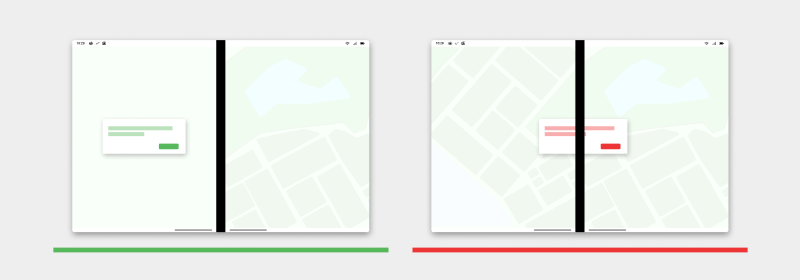
| Use either the left or the right screen to display a dialog. | Don’t display the dialog passing through the hinge positioned centered. |
| Do | Don't |
|---|---|
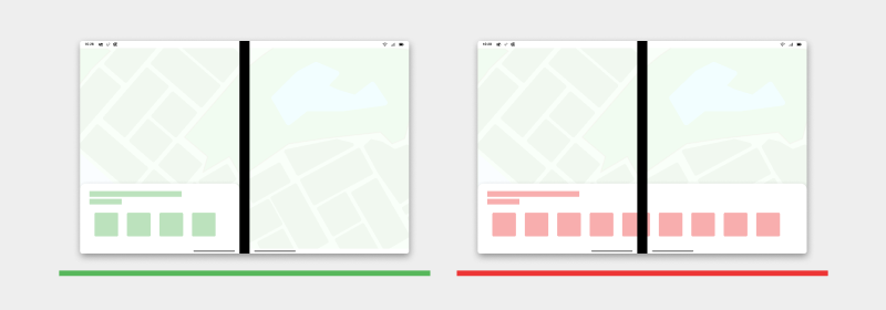
| Use either left or right screen to display bottom sheets. | Don’t display the bottom sheet passing through the hinge. |
| Do | Don't |
|---|---|
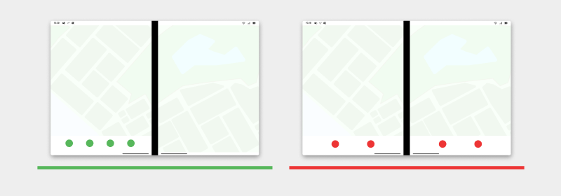
| Display the bottom menu navigation on the left side of the screen. | Don’t split the bottom menu navigation across the two screens. |
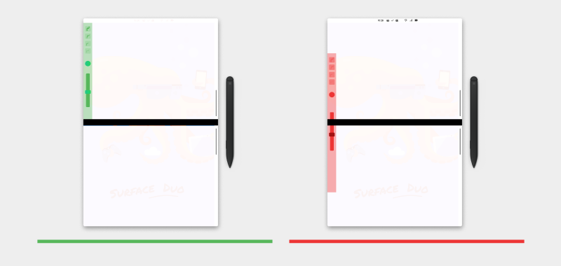
| Do | Don't |
|---|---|
| Display the toolbar menu on the left side for right-handed pen users. | Don’t allow the toolbar menu to pass through the hinge. |
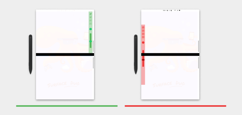
| Do | Don't |
|---|---|
| Display the toolbar menu on the right side for left-handed pen users. | Don't allow the toolbar menu to pass through the hinge. |
Types of apps that may benefit from this pattern
- Map apps
- Drawing canvas apps
Code examples
These projects show a simple implementation of the extended canvas design pattern that you can use in your apps:
Next steps
Consider these other design patterns: