Companion pane design pattern
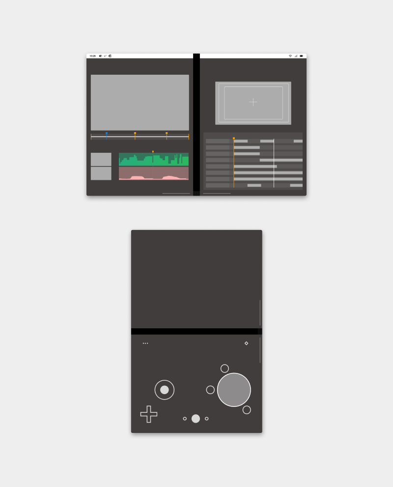
The companion pane pattern is a great opportunity to take advantage of added screen real-estate by taking second-level surfaces that are otherwise hidden and exposing them when the app is spanned.
You can also take advantage of two screens by placing the app canvas on one screen and using the other to hold tools that manipulate the content of the canvas. When using the companion pane for a tooling scenario, due to the ergonomics, it is likely better suited for tools to be on the right or bottom. Test your app to see what works best for your app.
Show complementary context to augment users' tasks, usually with a primary/secondary relationship, by elevating to the surface previously buried level 2 functionalities for quicker access.
Separating content for consumption from tools for interactions makes it easier for users to parse and focus on the content. It provides a more ergonomic experience by having tools closer to the hands, especially in dual-landscape postures.

Best practices
Here are some scenarios to help guide you when applying this design pattern:

| Do | Don't |
|---|---|
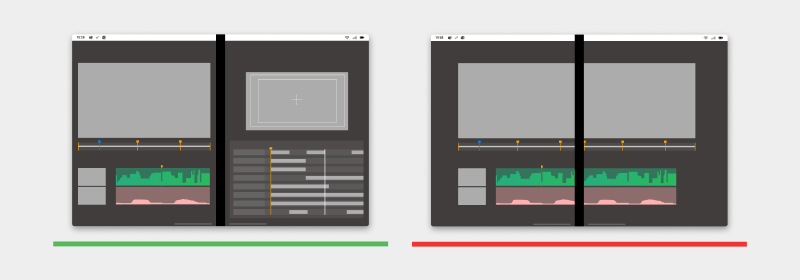
| Use the second screen to act as a companion pane or tool to manipulate content on the first screen. | Don’t display the content across both the screens passing through the hinge. |

| Do | Don't |
|---|---|
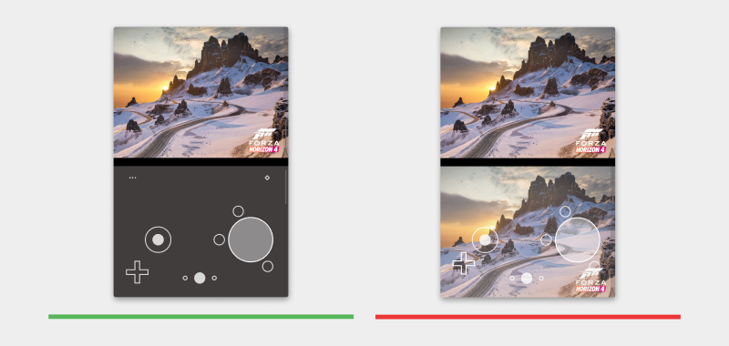
| Use the second screen as a controller for running games on the first screen. | Don't duplicate the game content on the second screen with the controller overlaying above it. |
Types of apps that may benefit from this pattern
- Productivity apps that may want supplemental information appearing next to the main content
- Creative tools like image drawing apps
- Music or video editing apps
- Gaming apps
Code examples
These projects show a simple implementation of the companion pane design pattern that you can use in your apps:
Next steps
Consider these other design patterns: