Interactive buttons - a better way using CSS
My inaugural blog post is a tutorial that I promised to create for an Expression Web user a long (too long!) while ago. I promised to show him how easy it is to use CSS instead of the Interactive Buttons feature he relies on in Expression Web. The Interactive Buttons feature generates simple button images and JavaScript for you, and lets you select the font properties, size, color, and interactive behavior of your buttons. But why bother with images and all that script when you can get the same results with HTML and CSS?
Using HTML and CSS instead of the Interactive Buttons feature has many advantages, including:
- More control over and options for the appearance of your buttons
- Browsers don't need to download images for each button and button state
- Easily reuse the buttons throughout an entire website by attaching a single CSS file to each page
- Easily change the appearance of your buttons by editing that one CSS file
- The markup has semantic value (https://www.alistapart.com/articles/grokwebstandards/)
If you're new to CSS or to using Expression Web, this tutorial should be useful. Please let me know what you think and if you encounter any problems. If you're not new to CSS, I'd love to hear from you too...what do you think of the CSS I'm using? If you don't want to follow all the steps and just want the final results, you can see the final markup at the end of the tutorial.
Here's what we're going to create:
Start by creating a bulleted list for your menu.
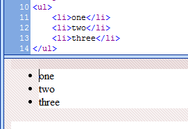
Display the Style toolbar: View > Toolbars > Style. The Style toolbar provides an easy way to both create and assign classes and ids to elements in your page or apply existing classes and ids to elements.

With your cursor in your bulleted list, click the <ul> tag in the quick tag selector bar that lies along the top of your page. This ensures the ID that we assign in the next step is applied to the entire list instead of to only a single list item.

In the Style toolbar, in the ID text box, type a name for your menu, and press Enter. I typed nav_menu. The ID should now be applied to the selected list (i.e. to the ul tag).


On the Format menu, click New Style. (You can also select this command by clicking the New Style button on either the Apply Styles task pane or the Manage Styles task pane, or in the CSS Properties task pane by right-clicking in a blank area in the Applied Rules area.)
In the New Style dialog box, delete everything in the Selector text box, and then type a # sign and then the name that you gave your list in step 4, followed by a space and the tag li. For my example, I typed #nav_menu li in the Selector text box. By using this selector, the style we create will affect any li tag (the tag for a single list item) that is within an element that uses the ID nav_menu but won't affect any list items that are elsewhere on the page.

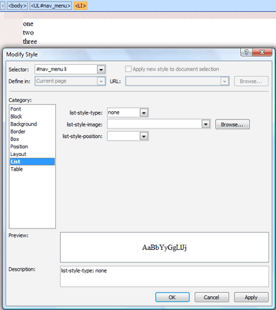
In the New Style dialog box, under Category, select List. On the right, set list-style-type to none, and then click Apply to see the results in your page but without leaving the dialog. By setting the list-style-type to none, we get rid of the bullets next to each list item.
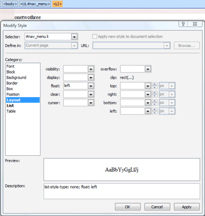
To make the navigation menu lie horizontally instead of vertically, under Category, select Layout, and then on the right, set float to left. Click Apply to see the results. You'll notice that the list items have no space between them now, but we'll fix that next.
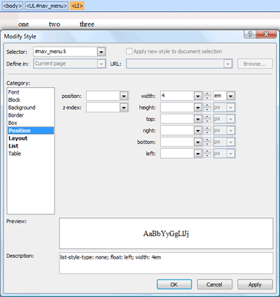
Under Category, select Position. On the right, set width to the desired width for your buttons. I set the value to 4 and the units to em. I used em for units so that if a user changes the text size in their browser, the buttons will expand in size along with the text. Click Apply to see the results.
Time to give the buttons some color and jazz things up...
Under Category, select Background, and then set background-color to the color you want your buttons to be. I set the color to a purple hue: #800080. Click Apply to see the results.
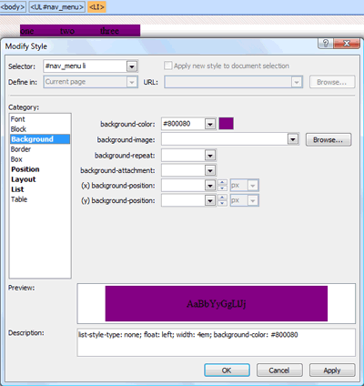
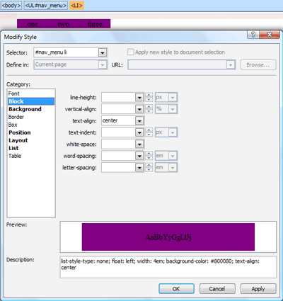
Next, we'll make the text appear centered within each button.
Under Category, select Block. On the right, set text-align to center.
If you want space between your buttons, in the Box category, next to margin, clear the box next to Same for all, and then set right and left to the values you want. I set each value to 1 and the units to px. Click Apply to see the results.

If you want a border around the buttons, select the Border category on the left, and set the properties you want on the right. I set border-style to solid, border-width to 2px, and border-color to #000000.
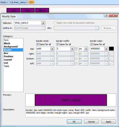
We're done with that style, so click OK to close the dialog box.
Next, we'll make hyperlinks out of the buttons.
Select the text of one of your buttons, press CTRL+K to open the Insert Hyperlink dialog box, enter the URL you want in the Address text box, and click OK. Repeat for each button in your navigation menu. Now your text probably looks pretty horrible like mine...we'll fix that next.

On the Format menu, click New Style.
In the New Style dialog box, in the Selector text box, type # and the ID of your navigation menu (named in step 4), followed by a space and the letter a (i.e. for the anchor tag.) For example, I entered #nav_menu a. With this selector, our style will affect hyperlinks that are within an element with the id nav_menu and won't affect hyperlinks anywhere else in the page.
Under Category, select Font, and then set all the properties you want on the right. I set font-family to Arial, Helvetica, sans-serif, color to #FFFFFF, and then so the text in my menu isn't underlined, I set text-decoration to none.
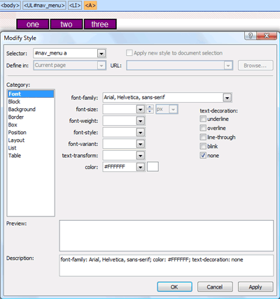
Click OK.
Now it's time to create a hover effect so when someone puts their pointer over one of the buttons, the button changes color.
On the Format menu, click New Style.
In the New Style dialog box, next to Selector, type # and the ID of your navigation menu, followed by a space and then li:hover. In my example, I typed #nav_menu li:hover. With this selector, the style we create affects any list item (i.e. the li tag) the visitor's pointer is hovering over but only if the list item is in an element that uses the ID "nav_menu". Any other list items on the page aren't affected.
Select the Background category, and set the background-color to a different color than the background color of your buttons. I set the background-color to a pink hue: #FF0066. You can set other properties too if you want them to change when someone hovers over a button, such as the text color or font.
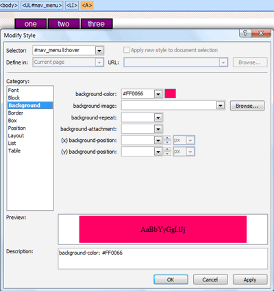
Click OK.
Let's test this in the browser and see what we have...
Either click the Preview in Browser button in the toolbar or press F12. If you're prompted to save your page, click Yes to save it. (Here's a bonus tip: if you want to prevent that dialog prompt from appearing and want to automatically save your page whenever you click the Preview in Browser button, then choose File > Preview in Browser > Edit Browser List. In the Edit Browser List dialog box, select the option Automatically save page before previewing and click OK.)
In your browser, notice that when you put your pointer over any of your buttons, the background color changes no matter where your pointer is on the button...this is by design, BUT you can't click the hyperlink unless your pointer is directly over text in a button. We'll fix that next...
Open the CSS Properties task pane. Put your cursor in one of your buttons in your page, and then in the CSS Properties task pane, under Applied Rules, click the style you created in step 16-17. In my example, the style is #nav_menu a.

In the CSS Properties task pane, locate the property named display and then set its value to block.

Save your changes and preview your page in the browser. Each button should now respond as a hyperlink no matter where your pointer is on the button.
Here's the final markup from this tutorial:
 <!DOCTYPE html PUBLIC "-//W3C//DTD XHTML 1.0 Transitional//EN"
"https://www.w3.org/TR/xhtml1/DTD/xhtml1-transitional.dtd">
<html>
<head>
<meta http-equiv="Content-Language" content="en-us" />
<meta http-equiv="Content-Type" content="text/html; charset=utf-8" />
<title>Untitled 1</title>
<style type="text/css">
#nav_menu li {
 border: 2px solid #000000;
 list-style-type: none;
 float: left;
 width: 4em;
 background-color: #800080;
 text-align: center;
 margin-right: 1px;
 margin-left: 1px;
}
#nav_menu a {
 font-family: Arial, Helvetica, sans-serif;
 color: #FFFFFF;
 text-decoration: none;
 display: block;
}
#nav_menu li:hover {
 background-color: #FF0066;
}
</style>
</head>
<body>
<ul id="nav_menu">
  <li> <a target="_blank" href="https://blogs.msdn.com/anna">one</a></li>
  <li> <a target="_blank" href="https://blogs.msdn.com/anna">two</a></li>
  <li> <a target="_blank" href="https://blogs.msdn.com/anna">three</a></li>
</ul>
</body>
</html>
Comments
- Anonymous
February 18, 2008
PingBack from http://www.biosensorab.org/2008/02/18/interactive-buttons-a-better-way-using-css/ - Anonymous
September 23, 2011
I am new to CSS and like this tutorial very much. One question: how do you call this on another page?