本文演示如何开发包含对大多数 WPF 应用程序通用的元素的 Windows Presentation Foundation (WPF) 桌面应用程序:Extensible Application Markup Language (XAML) 标记、代码隐藏、应用程序定义、控件、布局、数据绑定和样式。 若要开发该应用程序,需要使用 Visual Studio。
重要
本文专为 .NET Framework 而撰写。 若要开始使用 .NET 7,请参阅教程:创建新的 WPF 应用 (WPF .NET)。
本教程介绍如何执行下列操作:
- 创建 WPF 项目。
- 使用 XAML 设计应用程序用户界面 (UI) 的外观。
- 编写代码以生成应用程序的行为。
- 创建应用程序定义以管理应用程序。
- 添加控件和创建布局以构成应用程序 UI。
- 创建样式以在整个应用程序 UI 中实现一致的外观。
- 将 UI 绑定到数据,以使用数据填充 UI 并使数据和 UI 保持同步。
在本教程结束时,将生成独立的 Windows 应用程序,该应用程序允许用户查看所选人员的费用报表。 该应用程序由托管在浏览器样式的窗口中的几个 WPF 页面组成。
提示
本教程中使用的示例代码适用于教程 WPF 应用示例代码中的 Visual Basic 和 C#。
可以使用此页面顶部的语言选择器在 C# 与 Visual Basic 之间切换示例代码的代码语言。
先决条件
已安装“.NET 桌面开发”工作负载的 Visual Studio 2019。
有关安装最新版本的 Visual Studio 的详细信息,请参阅安装 Visual Studio。
创建应用程序项目
第一步是创建包含应用程序定义、两个页面以及图像的应用程序基础结构。
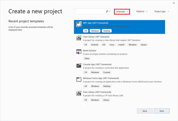
使用 Visual Basic 或 Visual C# 创建名为
ExpenseIt的新 WPF 应用程序项目:打开 Visual Studio,然后在“开始”菜单下选择“创建新项目”。
“创建新项目”对话框随即打开。
在“语言”下拉列表中,选择“C#”或“Visual Basic”。
然后选择“WPF 应用(.NET Framework)”模板,然后选择“下一步”。
“配置新项目”对话框随即打开。
输入项目名称
ExpenseIt,然后选择“创建”。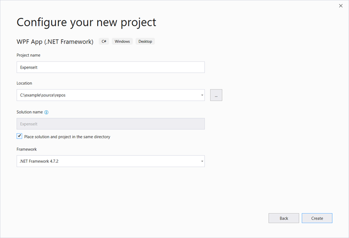
Visual Studio 将创建该项目,并打开名为 MainWindow.xaml 的默认应用程序窗口的设计器。
打开 Application.xaml (Visual Basic) 或 App.xaml (C#)。
此 XAML 文件定义 WPF 应用程序以及任意应用程序资源。 还可以使用此文件指定在应用程序启动时自动显示的 UI(在本例中是 MainWindow.xaml)。
XAML 在 Visual Basic 中应如下所示:
<Application x:Class="Application"
    xmlns="http://schemas.microsoft.com/winfx/2006/xaml/presentation"
    xmlns:x="http://schemas.microsoft.com/winfx/2006/xaml"
    StartupUri="MainWindow.xaml">
    <Application.Resources>

    </Application.Resources>
</Application>
在 C# 中如下所示:
<Application x:Class="ExpenseIt.App"
     xmlns="http://schemas.microsoft.com/winfx/2006/xaml/presentation"
     xmlns:x="http://schemas.microsoft.com/winfx/2006/xaml"
     StartupUri="MainWindow.xaml">
    <Application.Resources>

    </Application.Resources>
</Application>
打开 MainWindow.xaml。
此 XAML 文件是应用程序的主窗口,显示在页面中创建的内容。 Window 类定义窗口属性(例如标题、大小或图标),并处理事件(例如关闭或隐藏)。
将 Window 元素更改为 NavigationWindow,如以下 XAML 所示:
<NavigationWindow x:Class="ExpenseIt.MainWindow"
     xmlns="http://schemas.microsoft.com/winfx/2006/xaml/presentation"
     xmlns:x="http://schemas.microsoft.com/winfx/2006/xaml"
     ...
</NavigationWindow>
此应用根据用户输入导航到不同的内容。 这便是为什么主 Window 需要更改为 NavigationWindow。 NavigationWindow 会继承 Window 的所有属性。 XAML 文件中的 NavigationWindow 元素会创建 NavigationWindow 类的实例。 有关详细信息,请参阅导航概述。
从 NavigationWindow 标记之间移除 Grid 元素。
在 XAML 代码中为 NavigationWindow 元素更改以下属性:
XAML 在 Visual Basic 中应如下所示:
<NavigationWindow x:Class="MainWindow"
    xmlns="http://schemas.microsoft.com/winfx/2006/xaml/presentation"
    xmlns:x="http://schemas.microsoft.com/winfx/2006/xaml"
    Title="ExpenseIt" Height="350" Width="500">

</NavigationWindow>
在 C# 中如下所示:
<NavigationWindow x:Class="ExpenseIt.MainWindow"
    xmlns="http://schemas.microsoft.com/winfx/2006/xaml/presentation"
    xmlns:x="http://schemas.microsoft.com/winfx/2006/xaml"
    Title="ExpenseIt" Height="350" Width="500">

</NavigationWindow>
打开 MainWindow.xaml.vb 或 MainWindow.xaml.cs。
此文件是代码隐藏文件,包含用于处理在 MainWindow.xaml 中声明的事件的代码。 此文件包含在 XAML 中定义的窗口的分部类。
如果使用 C#,请将
MainWindow类更改为派生自 NavigationWindow。 (在 Visual Basic 中,当在 XAML 中更改窗口时,这种情况会自动发生。)C# 代码现在应如下所示:using System; using System.Collections.Generic; using System.Linq; using System.Text; using System.Windows; using System.Windows.Controls; using System.Windows.Data; using System.Windows.Documents; using System.Windows.Input; using System.Windows.Media; using System.Windows.Media.Imaging; using System.Windows.Navigation; using System.Windows.Shapes; namespace ExpenseIt { /// <summary> /// Interaction logic for MainWindow.xaml /// </summary> public partial class MainWindow : NavigationWindow { public MainWindow() { InitializeComponent(); } } }
将文件添加到应用程序
本部分将向应用程序添加两个页面和一个图像。
向项目添加新页,并将它命名为
ExpenseItHome.xaml:在“解决方案资源管理器”中右键单击
ExpenseIt项目节点,然后选择“添加”>“页”。在“添加新项”对话框中,已选择“页(WPF)”模板。 输入名称
ExpenseItHome,然后选择“添加”。
此页是应用程序启动时显示的第一个页面。 它将显示一个人员列表,可从中选择某个人员以显示其费用报表。
打开
ExpenseItHome.xaml。将 Title 设置为“
ExpenseIt - Home”。将
DesignHeight设置为 350 像素,将DesignWidth设置为 500 像素。现在,XAML 在 Visual Basic 中如下所示:
<Page x:Class="ExpenseItHome"
  xmlns="http://schemas.microsoft.com/winfx/2006/xaml/presentation"
  xmlns:x="http://schemas.microsoft.com/winfx/2006/xaml"
  xmlns:mc="http://schemas.openxmlformats.org/markup-compatibility/2006"
  xmlns:d="http://schemas.microsoft.com/expression/blend/2008"
  mc:Ignorable="d"
  d:DesignHeight="350" d:DesignWidth="500"
  Title="ExpenseIt - Home">
    <Grid>

    </Grid>
</Page>
在 C# 中如下所示:
<Page x:Class="ExpenseIt.ExpenseItHome"
      xmlns="http://schemas.microsoft.com/winfx/2006/xaml/presentation"
      xmlns:x="http://schemas.microsoft.com/winfx/2006/xaml"
      xmlns:mc="http://schemas.openxmlformats.org/markup-compatibility/2006"
      xmlns:d="http://schemas.microsoft.com/expression/blend/2008"
      mc:Ignorable="d"
      d:DesignHeight="350" d:DesignWidth="500"
    Title="ExpenseIt - Home">

    <Grid>

    </Grid>
</Page>
打开 MainWindow.xaml。
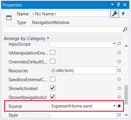
将 Source 属性添加到 NavigationWindow 元素并将它设置为“
ExpenseItHome.xaml”。这将
ExpenseItHome.xaml设置为应用程序启动时打开的第一个页面。Visual Basic 中的示例 XAML:
<NavigationWindow x:Class="MainWindow"
    xmlns="http://schemas.microsoft.com/winfx/2006/xaml/presentation"
    xmlns:x="http://schemas.microsoft.com/winfx/2006/xaml"
    Title="ExpenseIt" Height="350" Width="500" Source="ExpenseItHome.xaml">

</NavigationWindow>
C# 中:
<NavigationWindow x:Class="ExpenseIt.MainWindow"
    xmlns="http://schemas.microsoft.com/winfx/2006/xaml/presentation"
    xmlns:x="http://schemas.microsoft.com/winfx/2006/xaml"
    Title="ExpenseIt" Height="350" Width="500" Source="ExpenseItHome.xaml">

</NavigationWindow>
提示
还可以在“属性”窗口的“杂项”类别中设置“源”属性。
将另一个新 WPF 页添加到项目,并将它命名为 ExpenseReportPage.xaml:
在“解决方案资源管理器”中右键单击
ExpenseIt项目节点,然后选择“添加”>“页”。在“添加新项”对话框中,选择“页(WPF)”模板。 输入名称 ExpenseReportPage,然后选择“添加”。
此页将显示在
ExpenseItHome页上选择的人员的费用报表。打开 ExpenseReportPage.xaml。
将 Title 设置为“
ExpenseIt - View Expense”。将
DesignHeight设置为 350 像素,将DesignWidth设置为 500 像素。现在,ExpenseReportPage.xaml 在 Visual Basic 中如下所示:
<Page x:Class="ExpenseReportPage"
      xmlns="http://schemas.microsoft.com/winfx/2006/xaml/presentation"
      xmlns:x="http://schemas.microsoft.com/winfx/2006/xaml"
      xmlns:mc="http://schemas.openxmlformats.org/markup-compatibility/2006"
      xmlns:d="http://schemas.microsoft.com/expression/blend/2008"
      mc:Ignorable="d"
      d:DesignHeight="350" d:DesignWidth="500"
      Title="ExpenseIt - View Expense">
    <Grid>

    </Grid>
</Page>
在 C# 中如下所示:
<Page x:Class="ExpenseIt.ExpenseReportPage"
      xmlns="http://schemas.microsoft.com/winfx/2006/xaml/presentation"
      xmlns:x="http://schemas.microsoft.com/winfx/2006/xaml"
      xmlns:mc="http://schemas.openxmlformats.org/markup-compatibility/2006"
      xmlns:d="http://schemas.microsoft.com/expression/blend/2008"
      mc:Ignorable="d"
      d:DesignHeight="350" d:DesignWidth="500"
    Title="ExpenseIt - View Expense">

    <Grid>

    </Grid>
</Page>
打开 ExpenseItHome.xaml.vb 和 ExpenseReportPage.xaml.vb,或者 ExpenseItHome.xaml.cs 和 ExpenseReportPage.xaml.cs。
创建新页面文件时,Visual Studio 将自动创建其代码隐藏文件。 这些代码隐藏文件处理响应用户输入的逻辑。
对于
ExpenseItHome,你的代码应如下所示:using System; using System.Collections.Generic; using System.Linq; using System.Text; using System.Windows; using System.Windows.Controls; using System.Windows.Data; using System.Windows.Documents; using System.Windows.Input; using System.Windows.Media; using System.Windows.Media.Imaging; using System.Windows.Navigation; using System.Windows.Shapes; namespace ExpenseIt { /// <summary> /// Interaction logic for ExpenseItHome.xaml /// </summary> public partial class ExpenseItHome : Page { public ExpenseItHome() { InitializeComponent(); } } }Class ExpenseItHome End Class对于 ExpenseReportPage,如下所示:
using System;
using System.Collections.Generic;
using System.Linq;
using System.Text;
using System.Windows;
using System.Windows.Controls;
using System.Windows.Data;
using System.Windows.Documents;
using System.Windows.Input;
using System.Windows.Media;
using System.Windows.Media.Imaging;
using System.Windows.Navigation;
using System.Windows.Shapes;

namespace ExpenseIt
{
    /// <summary>
    /// Interaction logic for ExpenseReportPage.xaml
    /// </summary>
    public partial class ExpenseReportPage : Page
    {
        public ExpenseReportPage()
        {
            InitializeComponent();
        }
    }
}
Class ExpenseReportPage End Class将名为 watermark.png 的图像添加至项目。 可以创建自己的图像、从示例代码复制文件或是从 microsoft/WPF-Samples GitHub 存储库获取它。
右键单击项目节点并选择“添加”>“现有项”,或按 Shift+Alt+A。
在“添加现有项”对话框中,将文件筛选器设置为“所有文件”或“图像文件”,浏览到要使用的图像文件,然后选择“添加”。
在“解决方案资源管理器”中选择图像文件,然后在“属性”窗口中,将“生成操作”设置为“资源”。
编译和运行应用程序
若要生成并运行应用程序,请按 F5 或从“调试”菜单中选择“开始调试”。
下图显示具有 NavigationWindow 按钮的应用程序:
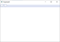
关闭应用程序以返回到 Visual Studio。
创建布局
布局提供一种有序方式来放置 UI 元素,还可在重设 UI 大小时管理这些元素的大小和位置。 通常使用以下布局控件之一来创建布局:
- Canvas - 定义一个区域,可在其中使用相对于画布区域的坐标以显式方式来定位子元素。
- DockPanel - 定义一个区域,从中可以按相对位置水平或垂直排列各个子元素。
- Grid - 定义由列和行组成的灵活的网格区域。
- StackPanel - 将子元素排列成水平或垂直的一行。
- VirtualizingStackPanel - 在水平或垂直的一行中排列并显示内容。
- WrapPanel - 按从左到右的顺序位置定位子元素,在包含框的边缘处将内容切换到下一行。 后续排序按照从上至下或从右至左的顺序进行,具体取决于方向属性的值。
每个布局控件都为子元素支持特定类型的布局。 ExpenseIt 页可重设大小,并且每个页均有与其他元素水平或垂直排列的元素。 在此示例中,Grid 用作应用程序的布局元素。
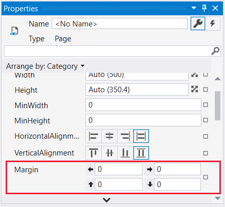
在本部分中,通过将列和行定义添加到 ExpenseItHome.xaml 中的 Grid,可创建三行一列的表,边距为 10 像素。
在
ExpenseItHome.xaml中,将 Grid 元素上的 Margin 属性设置为“10,0,10,10”,它们分别对应左边距、上边距、右边距和下边距:<Grid Margin="10,0,10,10">提示
还可以在“属性”窗口中的“布局”类别下设置“边距”值:
在 Grid 标记之间添加以下 XAML 代码以创建行和列定义:
<Grid.ColumnDefinitions>
    <ColumnDefinition />
</Grid.ColumnDefinitions>
<Grid.RowDefinitions>
    <RowDefinition Height="Auto"/>
    <RowDefinition />
    <RowDefinition Height="Auto"/>
</Grid.RowDefinitions>
两行的 Height 设置为 Auto,这意味着行大小将根据行中内容进行调整。 默认 Height 是 Star 大小调整,这意味着行高度会占据可用空间的加权部分。 例如,如果两行的 Height 各自为“*”,则它们各自的高度将会是可用空间的一半。
Grid 现在应包含以下 XAML:
<Grid Margin="10,0,10,10">
    <Grid.ColumnDefinitions>
        <ColumnDefinition />
    </Grid.ColumnDefinitions>
    <Grid.RowDefinitions>
        <RowDefinition Height="Auto"/>
        <RowDefinition />
        <RowDefinition Height="Auto"/>
    </Grid.RowDefinitions>
</Grid>
添加控件
在本部分中,你将更新主页 UI 以显示人员列表,在其中可选择一个人员以显示其费用报表。 控件是允许用户与应用程序交互的 UI 对象。 有关详细信息,请参阅 控件。
若要创建此 UI,需将以下元素添加到 ExpenseItHome.xaml:
通过设置 Grid.Row 附加属性将每个控件放置在 Grid 的行中。 有关附加属性的详细信息,请参阅附加属性概述。
在
ExpenseItHome.xaml中,在 Grid 标记之间的某处添加以下 XAML:<!-- People list --> <Border Grid.Column="0" Grid.Row="0" Height="35" Padding="5" Background="#4E87D4"> <Label VerticalAlignment="Center" Foreground="White">Names</Label> </Border> <ListBox Name="peopleListBox" Grid.Column="0" Grid.Row="1"> <ListBoxItem>Mike</ListBoxItem> <ListBoxItem>Lisa</ListBoxItem> <ListBoxItem>John</ListBoxItem> <ListBoxItem>Mary</ListBoxItem> </ListBox> <!-- View report button --> <Button Grid.Column="0" Grid.Row="2" Margin="0,10,0,10" Width="125" Height="25" HorizontalAlignment="Right">View</Button>提示
你也可以通过将控件从“工具箱”窗口拖到设计窗口,然后在“属性”窗口设置其属性来创建控件。
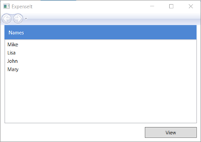
生成并运行应用程序。
下图显示了你创建的控件:
添加图像和标题
在本部分中,将更新主页 UI 的图像和页面标题。
在
ExpenseItHome.xaml中,将另一列添加到 ColumnDefinitions(具有 230 像素的固定 Width):<Grid.ColumnDefinitions> <ColumnDefinition Width="230" /> <ColumnDefinition /> </Grid.ColumnDefinitions>将另一行添加到 RowDefinitions(总共四行):
<Grid.RowDefinitions>
    <RowDefinition/>
    <RowDefinition Height="Auto"/>
    <RowDefinition />
    <RowDefinition Height="Auto"/>
</Grid.RowDefinitions>
通过在所有三个控件(边框、列表框和按钮)中将 Grid.Column 属性设置为 1,将控件移动到第二列。
通过为所有三个控件(边框、列表框和按钮)以及 Border 元素将 Grid.Row 值增加 1,将每个控件下移一行。
三个控件的 XAML 现在如下所示:
  <Border Grid.Column="1" Grid.Row="1" Height="35" Padding="5" Background="#4E87D4">
      <Label VerticalAlignment="Center" Foreground="White">Names</Label>
  </Border>
  <ListBox Name="peopleListBox" Grid.Column="1" Grid.Row="2">
      <ListBoxItem>Mike</ListBoxItem>
      <ListBoxItem>Lisa</ListBoxItem>
      <ListBoxItem>John</ListBoxItem>
      <ListBoxItem>Mary</ListBoxItem>
  </ListBox>

  <!-- View report button -->
  <Button Grid.Column="1" Grid.Row="3" Margin="0,10,0,0" Width="125"
Height="25" HorizontalAlignment="Right">View</Button>
通过在
<Grid>和</Grid>标记之间的任意位置添加以下 XAML,将 Background 属性设置为 watermark.png 图像文件:<Grid.Background> <ImageBrush ImageSource="watermark.png"/> </Grid.Background>在 Border 元素之前,添加内容为“View Expense Report”的 Label。 此标签是页面的标题。
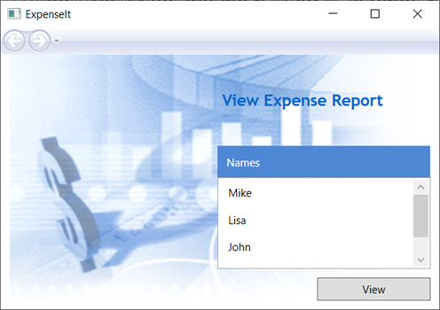
<Label Grid.Column="1" VerticalAlignment="Center" FontFamily="Trebuchet MS"
        FontWeight="Bold" FontSize="18" Foreground="#0066cc">
    View Expense Report
</Label>
生成并运行应用程序。
下图显示刚添加到内容的结果:
代码处理事件的代码
在
ExpenseItHome.xaml中,将 Click 事件处理程序添加到 Button 元素。 有关详细信息,请参阅如何:创建简单的事件处理程序。<!-- View report button --> <Button Grid.Column="1" Grid.Row="3" Margin="0,10,0,0" Width="125" Height="25" HorizontalAlignment="Right" Click="Button_Click">View</Button>打开
ExpenseItHome.xaml.vb或ExpenseItHome.xaml.cs。将以下代码添加到
ExpenseItHome类以添加按钮单击事件处理程序。 该事件处理程序会打开 ExpenseReportPage 页。private void Button_Click(object sender, RoutedEventArgs e) { // View Expense Report ExpenseReportPage expenseReportPage = new ExpenseReportPage(); this.NavigationService.Navigate(expenseReportPage); }Private Sub Button_Click(ByVal sender As Object, ByVal e As RoutedEventArgs) ' View Expense Report Dim expenseReportPage As New ExpenseReportPage() Me.NavigationService.Navigate(expenseReportPage) End Sub
为 ExpenseReportPage 创建 UI
ExpenseReportPage.xaml 显示在 ExpenseItHome 页中选择的人员的费用报表。 在本部分中,你将为 ExpenseReportPage 创建 UI。 你还会向各种 UI 元素添加背景色和填充色。
打开 ExpenseReportPage.xaml。
在 Grid 标记之间添加以下 XAML:
 <Grid.Background>
     <ImageBrush ImageSource="watermark.png" />
 </Grid.Background>
 <Grid.ColumnDefinitions>
     <ColumnDefinition Width="230" />
     <ColumnDefinition />
 </Grid.ColumnDefinitions>
 <Grid.RowDefinitions>
     <RowDefinition Height="Auto" />
     <RowDefinition />
 </Grid.RowDefinitions>


 <Label Grid.Column="1" VerticalAlignment="Center" FontFamily="Trebuchet MS"
 FontWeight="Bold" FontSize="18" Foreground="#0066cc">
     Expense Report For:
 </Label>
 <Grid Margin="10" Grid.Column="1" Grid.Row="1">

     <Grid.ColumnDefinitions>
         <ColumnDefinition />
         <ColumnDefinition />
     </Grid.ColumnDefinitions>
     <Grid.RowDefinitions>
         <RowDefinition Height="Auto" />
         <RowDefinition Height="Auto" />
         <RowDefinition />
     </Grid.RowDefinitions>

     <!-- Name -->
     <StackPanel Grid.Column="0" Grid.ColumnSpan="2" Grid.Row="0" Orientation="Horizontal">
         <Label Margin="0,0,0,5" FontWeight="Bold">Name:</Label>
         <Label Margin="0,0,0,5" FontWeight="Bold"></Label>
     </StackPanel>

     <!-- Department -->
     <StackPanel Grid.Column="0" Grid.ColumnSpan="2" Grid.Row="1" Orientation="Horizontal">
         <Label Margin="0,0,0,5" FontWeight="Bold">Department:</Label>
         <Label Margin="0,0,0,5" FontWeight="Bold"></Label>
     </StackPanel>

     <Grid Grid.Column="0" Grid.ColumnSpan="2" Grid.Row="2" VerticalAlignment="Top"
           HorizontalAlignment="Left">
         <!-- Expense type and Amount table -->
         <DataGrid  AutoGenerateColumns="False" RowHeaderWidth="0" >
             <DataGrid.ColumnHeaderStyle>
                 <Style TargetType="{x:Type DataGridColumnHeader}">
                     <Setter Property="Height" Value="35" />
                     <Setter Property="Padding" Value="5" />
                     <Setter Property="Background" Value="#4E87D4" />
                     <Setter Property="Foreground" Value="White" />
                 </Style>
             </DataGrid.ColumnHeaderStyle>
             <DataGrid.Columns>
                 <DataGridTextColumn Header="ExpenseType" />
                 <DataGridTextColumn Header="Amount"  />
             </DataGrid.Columns>
         </DataGrid>
     </Grid>
 </Grid>
此 UI 类似于
ExpenseItHome.xaml,只不过报表数据在 DataGrid 中显示。生成并运行应用程序。
选择“查看”按钮。
出现费用报告页。 另请注意,向后导航按钮已启用。
下图显示添加到 ExpenseReportPage.xaml 的 UI 元素。
样式控件
对于 UI 中相同类型的所有元素,各种元素的外观通常相同。 UI 使用样式使外观可在多个元素上重复使用。 重复使用样式有助于简化 XAML 的创建和管理。 本部分替换在以前步骤中通过样式定义的按元素划分的属性。
打开 Application.xaml 或 App.xaml。
在 Application.Resources 标记之间添加以下 XAML:
<!-- Header text style -->
<Style x:Key="headerTextStyle">
    <Setter Property="Label.VerticalAlignment" Value="Center"></Setter>
    <Setter Property="Label.FontFamily" Value="Trebuchet MS"></Setter>
    <Setter Property="Label.FontWeight" Value="Bold"></Setter>
    <Setter Property="Label.FontSize" Value="18"></Setter>
    <Setter Property="Label.Foreground" Value="#0066cc"></Setter>
</Style>

<!-- Label style -->
<Style x:Key="labelStyle" TargetType="{x:Type Label}">
    <Setter Property="VerticalAlignment" Value="Top" />
    <Setter Property="HorizontalAlignment" Value="Left" />
    <Setter Property="FontWeight" Value="Bold" />
    <Setter Property="Margin" Value="0,0,0,5" />
</Style>

<!-- DataGrid header style -->
<Style x:Key="columnHeaderStyle" TargetType="{x:Type DataGridColumnHeader}">
    <Setter Property="Height" Value="35" />
    <Setter Property="Padding" Value="5" />
    <Setter Property="Background" Value="#4E87D4" />
    <Setter Property="Foreground" Value="White" />
</Style>

<!-- List header style -->
<Style x:Key="listHeaderStyle" TargetType="{x:Type Border}">
    <Setter Property="Height" Value="35" />
    <Setter Property="Padding" Value="5" />
    <Setter Property="Background" Value="#4E87D4" />
</Style>

<!-- List header text style -->
<Style x:Key="listHeaderTextStyle" TargetType="{x:Type Label}">
    <Setter Property="Foreground" Value="White" />
    <Setter Property="VerticalAlignment" Value="Center" />
    <Setter Property="HorizontalAlignment" Value="Left" />
</Style>

<!-- Button style -->
<Style x:Key="buttonStyle" TargetType="{x:Type Button}">
    <Setter Property="Width" Value="125" />
    <Setter Property="Height" Value="25" />
    <Setter Property="Margin" Value="0,10,0,0" />
    <Setter Property="HorizontalAlignment" Value="Right" />
</Style>
此 XAML 将添加以下样式:
headerTextStyle:可设置页标题 Label的格式。labelStyle:可设置 Label 控件的格式。columnHeaderStyle:可设置 DataGridColumnHeader的格式。listHeaderStyle:可设置列表标头 Border 控件的格式。listHeaderTextStyle:可设置列表标题 Label 的格式。buttonStyle:可设置ExpenseItHome.xaml上的 Button 的格式。
请注意,这些样式是 Application.Resources 属性元素的资源和子级。 在此位置中,这些样式将应用到应用程序中的所有元素。 有关在 .NET 应用中使用资源的示例,请参阅使用应用程序资源。
在
ExpenseItHome.xaml中,使用以下 XAML 替换 Grid 元素之间的所有内容:<Grid.Background> <ImageBrush ImageSource="watermark.png" /> </Grid.Background> <Grid.ColumnDefinitions> <ColumnDefinition Width="230" /> <ColumnDefinition /> </Grid.ColumnDefinitions> <Grid.RowDefinitions> <RowDefinition/> <RowDefinition Height="Auto"/> <RowDefinition /> <RowDefinition Height="Auto"/> </Grid.RowDefinitions> <!-- People list --> <Label Grid.Column="1" Style="{StaticResource headerTextStyle}" > View Expense Report </Label> <Border Grid.Column="1" Grid.Row="1" Style="{StaticResource listHeaderStyle}"> <Label Style="{StaticResource listHeaderTextStyle}">Names</Label> </Border> <ListBox Name="peopleListBox" Grid.Column="1" Grid.Row="2"> <ListBoxItem>Mike</ListBoxItem> <ListBoxItem>Lisa</ListBoxItem> <ListBoxItem>John</ListBoxItem> <ListBoxItem>Mary</ListBoxItem> </ListBox> <!-- View report button --> <Button Grid.Column="1" Grid.Row="3" Click="Button_Click" Style="{StaticResource buttonStyle}">View</Button>应用样式会删除和替换定义每个控件外观的属性(如 VerticalAlignment 和 FontFamily 。 例如,
headerTextStyle应用于“View Expense Report”Label。打开 ExpenseReportPage.xaml。
使用以下 XAML 替换 Grid 元素之间的所有内容:
<Grid.Background> <ImageBrush ImageSource="watermark.png" /> </Grid.Background> <Grid.ColumnDefinitions> <ColumnDefinition Width="230" /> <ColumnDefinition /> </Grid.ColumnDefinitions> <Grid.RowDefinitions> <RowDefinition Height="Auto" /> <RowDefinition /> </Grid.RowDefinitions> <Label Grid.Column="1" Style="{StaticResource headerTextStyle}"> Expense Report For: </Label> <Grid Margin="10" Grid.Column="1" Grid.Row="1"> <Grid.ColumnDefinitions> <ColumnDefinition /> <ColumnDefinition /> </Grid.ColumnDefinitions> <Grid.RowDefinitions> <RowDefinition Height="Auto" /> <RowDefinition Height="Auto" /> <RowDefinition /> </Grid.RowDefinitions> <!-- Name --> <StackPanel Grid.Column="0" Grid.ColumnSpan="2" Grid.Row="0" Orientation="Horizontal"> <Label Style="{StaticResource labelStyle}">Name:</Label> <Label Style="{StaticResource labelStyle}"></Label> </StackPanel> <!-- Department --> <StackPanel Grid.Column="0" Grid.ColumnSpan="2" Grid.Row="1" Orientation="Horizontal"> <Label Style="{StaticResource labelStyle}">Department:</Label> <Label Style="{StaticResource labelStyle}"></Label> </StackPanel> <Grid Grid.Column="0" Grid.ColumnSpan="2" Grid.Row="2" VerticalAlignment="Top" HorizontalAlignment="Left"> <!-- Expense type and Amount table --> <DataGrid ColumnHeaderStyle="{StaticResource columnHeaderStyle}" AutoGenerateColumns="False" RowHeaderWidth="0" > <DataGrid.Columns> <DataGridTextColumn Header="ExpenseType" /> <DataGridTextColumn Header="Amount" /> </DataGrid.Columns> </DataGrid> </Grid> </Grid>生成并运行应用程序。 窗口外观与之前的外观相同。
关闭应用程序以返回到 Visual Studio。
将数据绑定到控件
在本部分中,将创建绑定到各种控件的 XML 数据。
在
ExpenseItHome.xaml中的开始 Grid 元素后,添加以下 XAML 以创建包含每个人员的数据的 XmlDataProvider:<Grid.Resources> <!-- Expense Report Data --> <XmlDataProvider x:Key="ExpenseDataSource" XPath="Expenses"> <x:XData> <Expenses xmlns=""> <Person Name="Mike" Department="Legal"> <Expense ExpenseType="Lunch" ExpenseAmount="50" /> <Expense ExpenseType="Transportation" ExpenseAmount="50" /> </Person> <Person Name="Lisa" Department="Marketing"> <Expense ExpenseType="Document printing" ExpenseAmount="50"/> <Expense ExpenseType="Gift" ExpenseAmount="125" /> </Person> <Person Name="John" Department="Engineering"> <Expense ExpenseType="Magazine subscription" ExpenseAmount="50"/> <Expense ExpenseType="New machine" ExpenseAmount="600" /> <Expense ExpenseType="Software" ExpenseAmount="500" /> </Person> <Person Name="Mary" Department="Finance"> <Expense ExpenseType="Dinner" ExpenseAmount="100" /> </Person> </Expenses> </x:XData> </XmlDataProvider> </Grid.Resources>数据会创建为 Grid 资源。 此数据通常会作为文件加载,但为简单起见数据以内联方式添加。
在
<Grid.Resources>元素中,添加以下<xref:System.Windows.DataTemplate>元素,它们定义如何在<XmlDataProvider>元素后面的 ListBox 中显示数据:<Grid.Resources> <!-- Name item template --> <DataTemplate x:Key="nameItemTemplate"> <Label Content="{Binding XPath=@Name}"/> </DataTemplate> </Grid.Resources>有关数据模板的详细信息,请参阅数据模板化概述。
将现有 ListBox 替换为以下 XAML:
<ListBox Name="peopleListBox" Grid.Column="1" Grid.Row="2"
         ItemsSource="{Binding Source={StaticResource ExpenseDataSource}, XPath=Person}"
         ItemTemplate="{StaticResource nameItemTemplate}">
</ListBox>
此 XAML 将 ListBox 的 ItemsSource 属性绑定到数据源并应用数据模板作为 ItemTemplate。
将数据连接到控件
接下来,添加代码以检索在 ExpenseItHome 页面选择的姓名,并将它传递给 ExpenseReportPage 的构造函数。 ExpenseReportPage 通过传递项设置数据上下文,该项是在 ExpenseReportPage.xaml 中定义的控件要绑定到的内容。
打开 ExpenseReportPage.xaml.vb 或 ExpenseReportPage.xaml.cs。
添加获取对象的构造函数,以便传递所选人员的费用报表数据。
public partial class ExpenseReportPage : Page
{
    public ExpenseReportPage()
    {
        InitializeComponent();
    }

    // Custom constructor to pass expense report data
    public ExpenseReportPage(object data):this()
    {
        // Bind to expense report data.
        this.DataContext = data;
    }
}
Partial Public Class ExpenseReportPage Inherits Page Public Sub New() InitializeComponent() End Sub ' Custom constructor to pass expense report data Public Sub New(ByVal data As Object) Me.New() ' Bind to expense report data. Me.DataContext = data End Sub End Class打开
ExpenseItHome.xaml.vb或ExpenseItHome.xaml.cs。更改 Click 事件处理程序,以调用传递所选人员的费用报表数据的新构造函数。
private void Button_Click(object sender, RoutedEventArgs e)
{
    // View Expense Report
    ExpenseReportPage expenseReportPage = new ExpenseReportPage(this.peopleListBox.SelectedItem);
    this.NavigationService.Navigate(expenseReportPage);
}
Private Sub Button_Click(ByVal sender As Object, ByVal e As RoutedEventArgs) ' View Expense Report Dim expenseReportPage As New ExpenseReportPage(Me.peopleListBox.SelectedItem) Me.NavigationService.Navigate(expenseReportPage) End Sub
使用数据模板设置数据样式
在本部分中,使用数据模板为数据绑定列表中的每个项更新 UI。
打开 ExpenseReportPage.xaml。
将“姓名”和“部门”Label 元素中的内容绑定到相应的数据源属性。 有关数据绑定的详细信息,请参阅数据绑定概述。
<!-- Name -->
<StackPanel Grid.Column="0" Grid.ColumnSpan="2" Grid.Row="0" Orientation="Horizontal">
    <Label Style="{StaticResource labelStyle}">Name:</Label>
    <Label Style="{StaticResource labelStyle}" Content="{Binding XPath=@Name}"></Label>
</StackPanel>

<!-- Department -->
<StackPanel Grid.Column="0" Grid.ColumnSpan="2" Grid.Row="1" Orientation="Horizontal">
    <Label Style="{StaticResource labelStyle}">Department:</Label>
    <Label Style="{StaticResource labelStyle}" Content="{Binding XPath=@Department}"></Label>
</StackPanel>
在开始 Grid 元素后,添加以下定义如何显示费用报表数据的数据模板:
<!--Templates to display expense report data-->
<Grid.Resources>
    <!-- Reason item template -->
    <DataTemplate x:Key="typeItemTemplate">
        <Label Content="{Binding XPath=@ExpenseType}"/>
    </DataTemplate>
    <!-- Amount item template -->
    <DataTemplate x:Key="amountItemTemplate">
        <Label Content="{Binding XPath=@ExpenseAmount}"/>
    </DataTemplate>
</Grid.Resources>
在 DataGrid 元素下,将 DataGridTextColumn 元素替换为 DataGridTemplateColumn,并向其应用模板。 此外,在
DataGrid元素中使用其值指定ItemsSource属性。<!-- Expense type and Amount table --> <DataGrid ItemsSource="{Binding XPath=Expense}" ColumnHeaderStyle="{StaticResource columnHeaderStyle}" AutoGenerateColumns="False" RowHeaderWidth="0" > <DataGrid.Columns> <DataGridTemplateColumn Header="ExpenseType" CellTemplate="{StaticResource typeItemTemplate}" /> <DataGridTemplateColumn Header="Amount" CellTemplate="{StaticResource amountItemTemplate}" /> </DataGrid.Columns> </DataGrid>生成并运行应用程序。
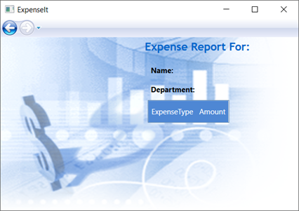
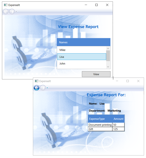
选择某个人员,然后选择“查看”按钮。
下图显示应用了控件、布局、样式、数据绑定和数据模板的 ExpenseIt 应用程序的两个页面:
注意
此示例演示了 WPF 的特定功能,未遵循安全性、本地化和辅助功能等方面的所有最佳做法。 有关 WPF 和 .NET 应用开发最佳做法的全面介绍,请参阅以下主题:
后续步骤
在本演练中,你了解了许多使用 Windows Presentation Foundation (WPF) 创建 UI 的技术。 你现在应该基本了解数据绑定 .NET 应用的构建基块。 有关 WPF 体系结构和编程模型的详细信息,请参阅以下主题:
有关创建应用程序的详细信息,请参阅以下主题: