Reports Overview
This article will break down the metrics that appear in each dashboard application.
For steps on how to set up the dashboard reports and start seeing the performance metrics, see our Quick Start Guide: Set up Power BI Reports.
Signals Dashboard
The Signals Dashboard is a Power BI report that is used to understand and evaluate the volume and quality of the input data (that is, signals) as the data is critical to producing relevant recommendations.
From a closer examination of the input data, you may achieve a better understanding of whether the data needs to be fixed or modified before retrying modeling and comparing results.
![NOTE:]
Throughout this dashboard, signals refer to interactions data. For simplicity, this doc may refer to interactions signals as purchases.
Terminology
Within the dashboard, some of the data is grouped by basket or by user.
Here's an explanation of the difference between the two:
| Terminology | Description |
|---|---|
| By Basket | A Basket represents a grouping of products and is commonly expressed as the "shopper’s current cart", session, or interaction. In the interaction schema, By Basket == By InteractionGroupingId. |
| By User | Grouping by user shows on average, how many items a user has and how many users have interacted with a particular item. In the interaction schema, By User == By UserId. |
For more information, see the interaction data entity documentation.
Key Terms
There are also some key terms important for understanding the dashboard. These terms are explained in the table below. An interaction can come from various sources, such as purchases, views, or select.
| Terminology | Description |
|---|---|
| Informative | A data point that provides useful information for modeling. |
| Basket | Baskets represent a shopper’s current cart, session, or interaction. It's a group of items together. |
| Seed item | An item that a user interacts with or select on. |
| Candidate | An item that has been recommended to a user. |
| Candidate quantity | Overall purchases of the candidate. |
| Overlap | Number of times the candidate was bought together with the seed |
| Probability of candidate given seed | Probability of purchasing the candidate given the seed item was already purchased |
| Probability of seed given candidate | Probability of purchasing the seed given the candidate item was already purchased |
| Signals | Customer interactions. A single row in the interactions file. |
| Sampled data | The data used for item modeling. |
Tabs
The signals dashboard has seven tabs: Overview, Collaborative Analysis, Users, Baskets, Items, Popular Items, and Direct Associations Analysis. Each of these tabs will be explained in the table below.
| Tab Name | Description | Visual |
|---|---|---|
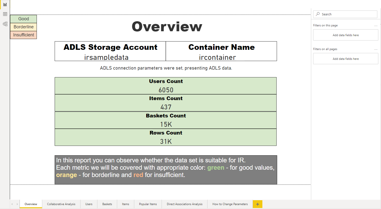
| Overview | The overview tab shows how many users, items, baskets, and rows are within the data. The data is color coded to show how formative the signals are. Ideally, the values are green, which means the data is suitable for Intelligent Recommendations. Otherwise, orange values mean the data is borderline and red means that there isn't enough data for that statistic. If the dashboard is mostly orange and red, consider whether it is worth bringing the data to production, and if the data is correct. |
 |
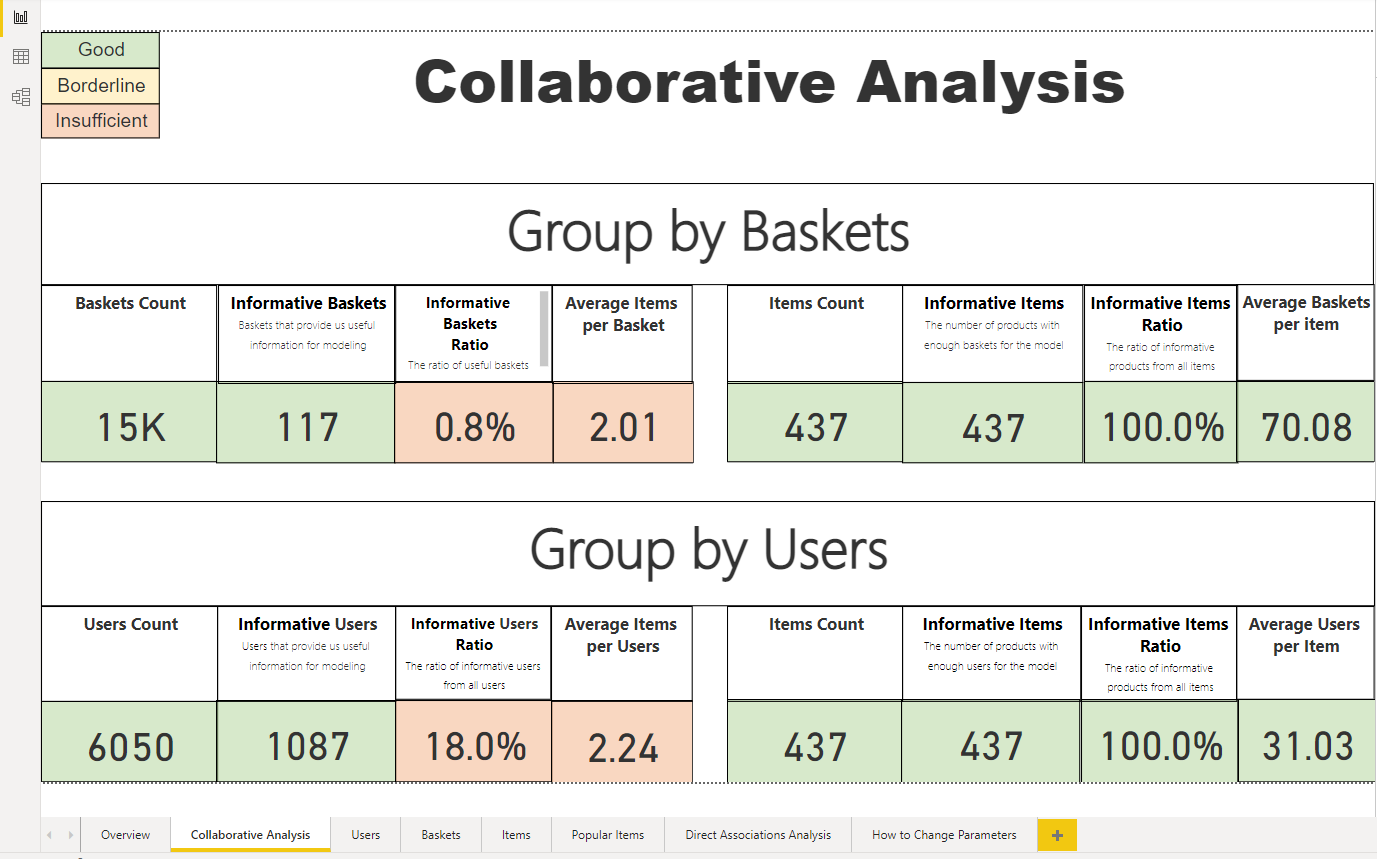
| Collaborative Analysis | The Collaborative Analysis tab shows items based on items grouped by basket or items grouped by user. Items grouped by basket are also known as the shopper’s current cart. In this section, one can learn about how informative their baskets are, meaning how useful the baskets are for modeling. There's also information about the number of items in the basket, which is the shopper’s cart size; the average number of baskets per item; and how informative the items are. Items grouped by users show how informative the users are, how informative the items are, and how many items a user has. |
 |
| Users | The users tab shows the number of users and the number of new and returning users over time. Additionally, the report will show the average number of baskets and items a user has. | 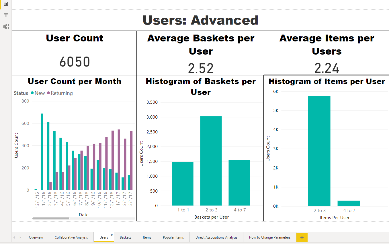 |
| Baskets | The baskets tab shows how many baskets there are over time and on average, how many items are in a basket. | 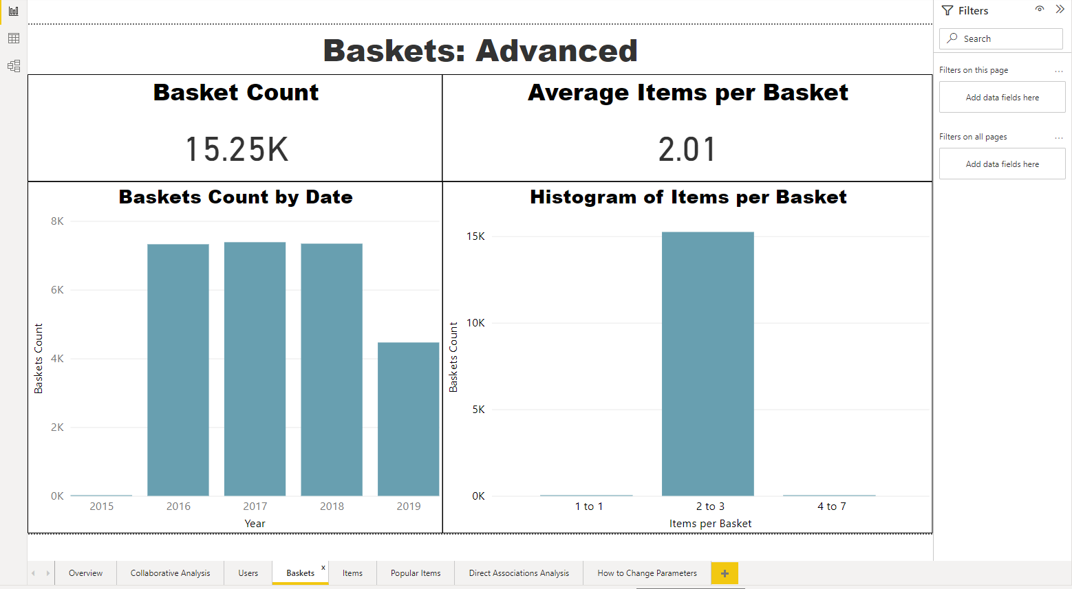 |
| Items | The items tab shows information about all the items in the catalog. You can see how the number of items has changed over time and information about how many users interacted with an item. | 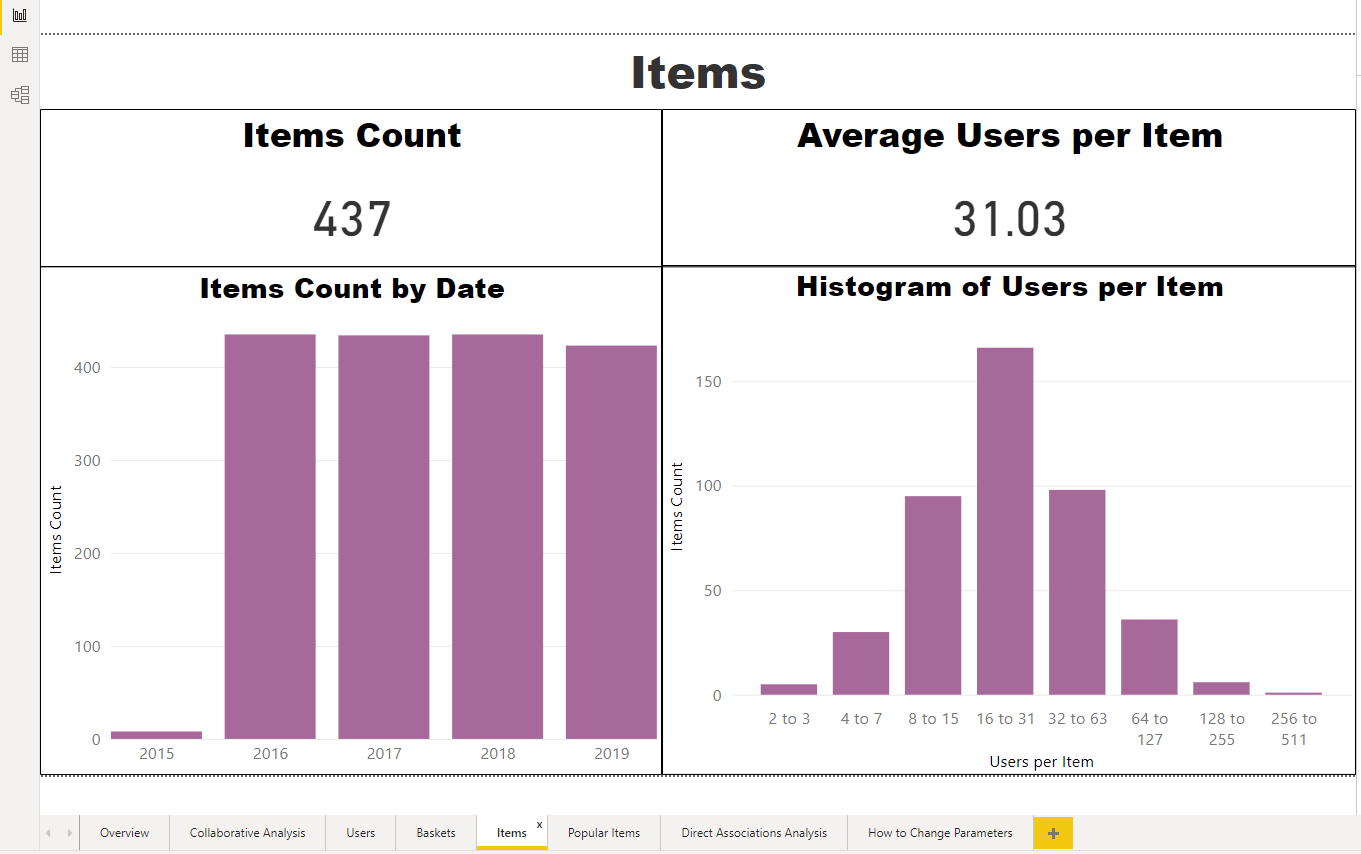 |
| Popular Items | The popular items tab highlights which items were interacted with the most and the number of baskets over time. For a meaningful experience, have a minimal catalog with titles in your input to IR. | 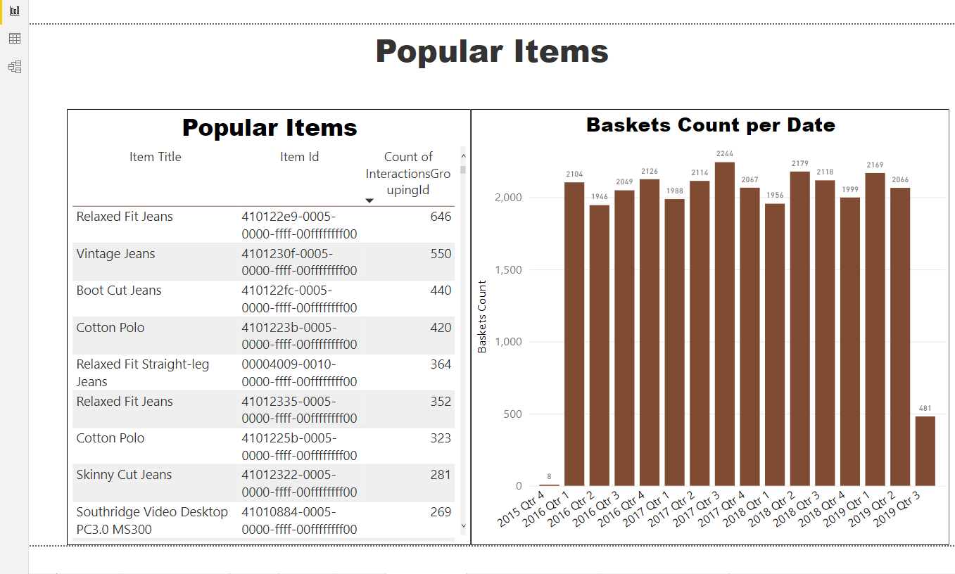 |
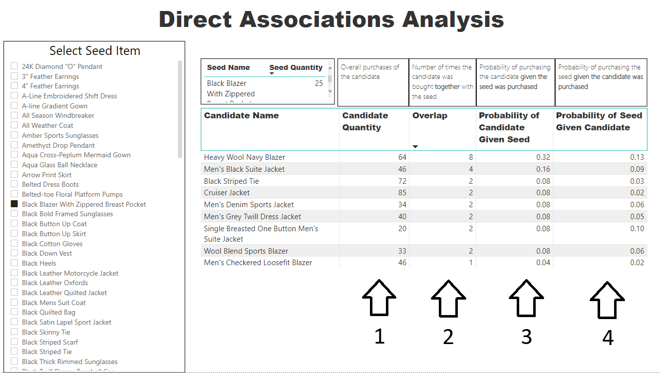
| Direct Associations Analysis | All previous tabs show aggregated data about the signals. In the Direct Associations Analysis tab, the data is based on a chosen seed item, or an item a user might select on. This information is helpful for Next Best Action models, as you can learn about what items are most associated with together. Learn how to use this tool in the section below. |
 |
How to use the Direct Associations Analysis Tool
To see related items for a specific product, select on a seed item from the list on the left. Then, the following data will populate into the report:
- The number of times the recommended item was purchased
- The number of times the recommended item was purchased together with the seed item
- The probability that the recommended item was purchased, given that the seed item was already purchased
- The probability that the seed item was purchased, given that the recommended item was already purchased
 For a meaningful experience, have a minimal catalog with titles in your input to IR.
Intelligent Recommendations Dashboard
Overview
The Intelligent Recommendations Dashboard provides statistics that help evaluate the performance of the model, by determining whether relevant items are appearing towards the top of the list.
Tabs
| Tab Name | Description | Image |
|---|---|---|
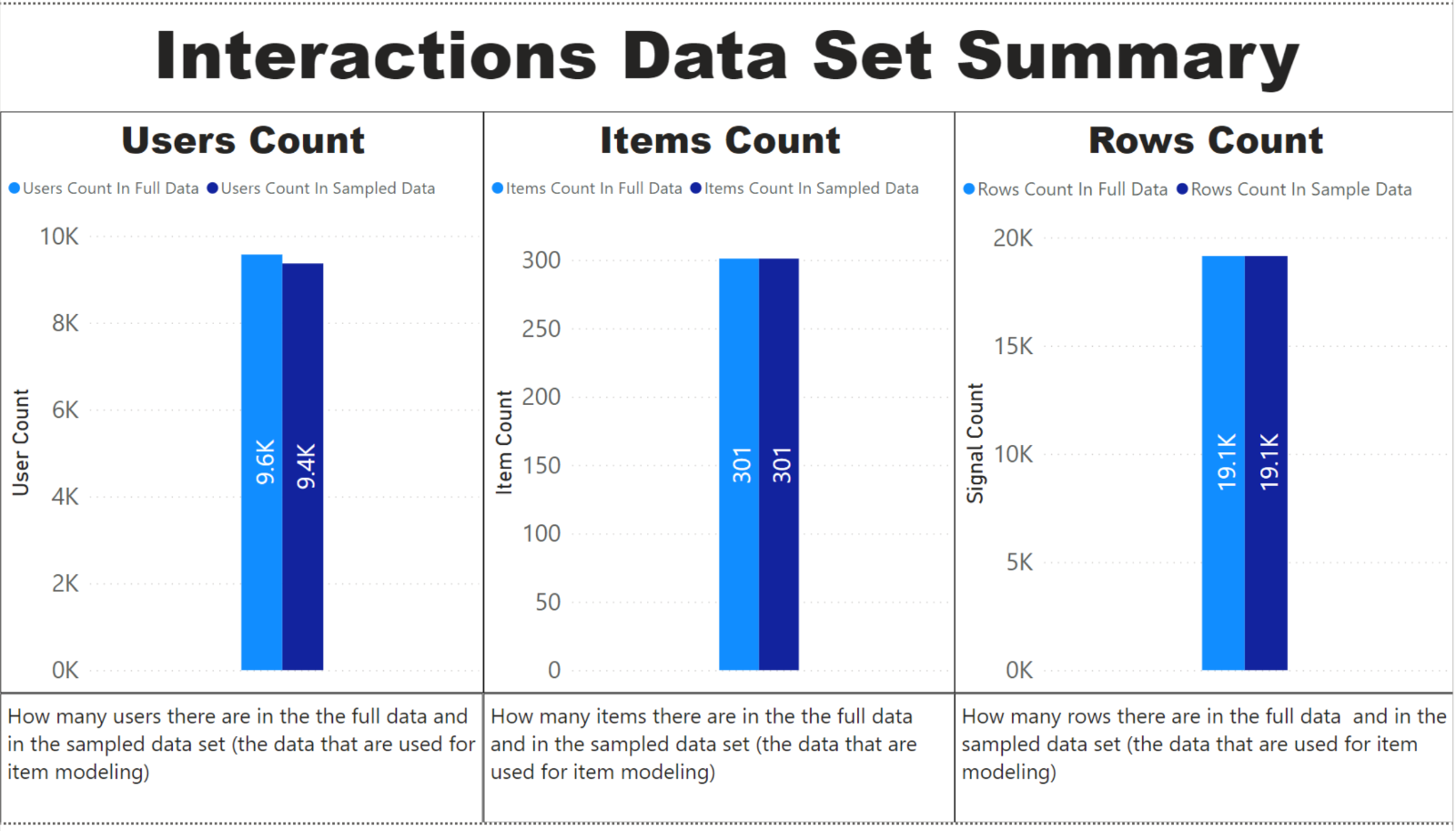
| Interactions Data Set Summary | In the Interactions Data Set Summary tab, there's information about the users, items, and rows count of the data. In the IR Dashboard, “Users” are actually “Baskets” represented by the InteractionGroupingId. This model uses the ItemModel with InteractionGroupingId, and therefore, doesn't use the UserId. The user count shows how many users are in the full and sampled data, where sample data is the data used in item modeling. The items count is how many items are in the full and sampled data set. Finally, the rows count is how many rows, which represent the number of signals, that are in the full and sampled data sets. |
 |
| PAL Coverage | The PAL Coverage Tab evaluates the People Also Like model to see how much of the interactions data the service can provide recommendations for. A higher percentage means that more of the seeds can get People Also Like recommendations. | 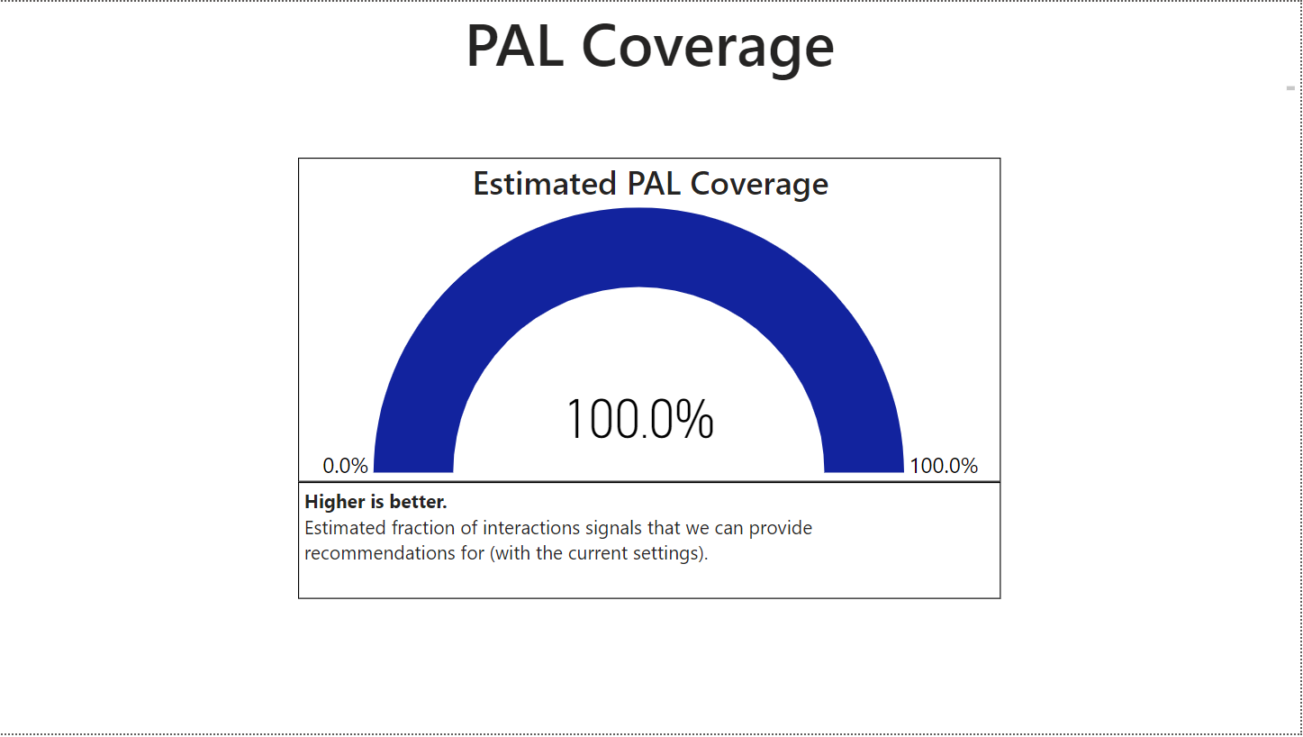 |
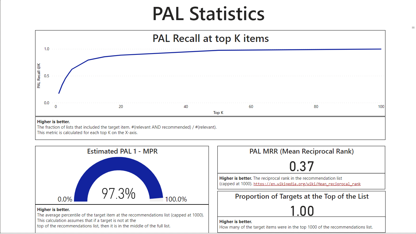
| Picks Statistics | In the Picks Statistics tab, there are statistics to help evaluate the performance of the Picks for You model. There are statistics such as picks recall, estimated picks 1 – MPR, picks MRR, and proportion of targets at the top of the list, which are described further below in the key metrics section. For the Picks model, the service samples users, and for each user, leaves one of the items the user purchased out and labels that as the target. The service then models the user as if they didn't purchase that item, calls Picks on the user, and checks if the item that was left out was recommended. This item’s rank in the user’s list of recommendations is then used to calculate the metrics. |
 |
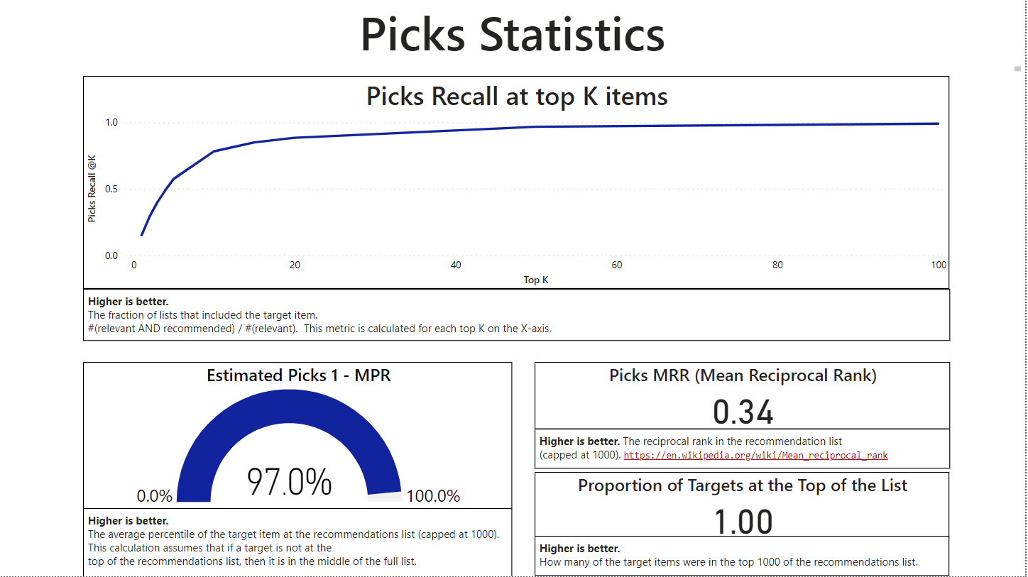
| PAL Statistics | The PAL Statistics tab is used to evaluate the People Also Like model. This tab includes all the same metrics from the Picks Statistics tab, which are described in the section below. The service samples only purchases of pairs of items, calls PAL on one of them, and checks to see if the second was recommended. |
 |
Key Metrics
Within the tabs mentioned above, there are a few key metrics that are displayed. Those metrics are further explained in the table below.
| Metric | Definition | Visual |
|---|---|---|
| PAL Coverage | The percentage of interaction signals that the service can provide recommendations for with the People Also Like model. A higher percentage means that more of the seeds can get People Also Like recommendations. | 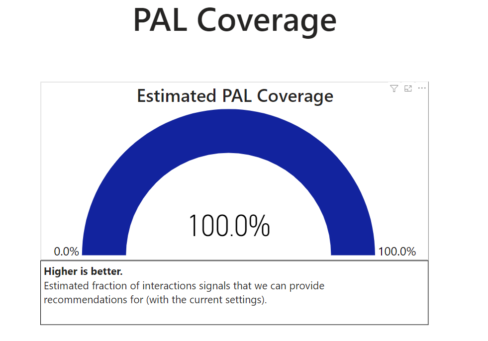 |
| Recall at Top K Items | The fraction of relevant items that appeared in the top K of the list. A higher number represents that a higher percentage was at the top K of the list. The results per user are binary – either the result is 0 if the item wasn't in the top K looked at, or it's 1 if it's there. Recall is calculated across all the users the service sampled. For example, if the service sampled 1000 users, and for 500 of them the target item appeared in the top 10 results, then Recall at 10 will be 0.5. |
 |
| 1 - MPR | MPR shows the average percentile where the item is situated in the list. For example, 1-MPR of 80% means that on average, the target recommendation was within the top 20% of the results. The dashboard is presented in 1-MPR, meaning higher is better. In the calculation, there's a cap of 1000 items, so the result must be of the top 1000 items. | 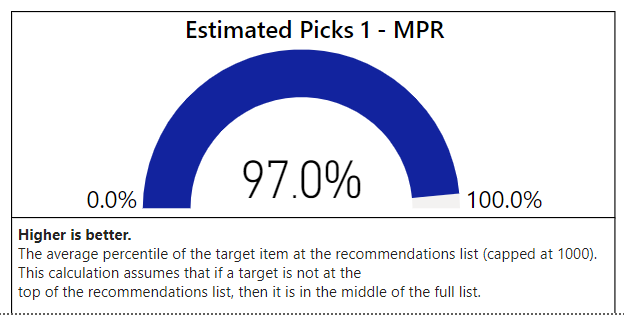 |
| MRR (Mean Reciprocal Rank) | The reciprocal of the ranks of relevant items within the list. A higher reciprocal rank means that more relevant items appear towards the top of the list. |  |
| Proportion of targets at the top of the list | The fraction of relevant items that are in the top 1000 of the list. A higher proportion means that more relevant items are being shown to the user at the top of the list. |  |
See Also
Quick Start Guide:Set up Power BI Reports.
Quick start guide: Set up and run Intelligent Recommendations with sample data
Data Contract Overview
Error Logs