Using Windows accessibility features to change the OneNote UI
Last week I showed how you change some global Windows font and color selections to make changes to the way OneNote displays. I also explained why you probably don't want to do this. Then over the weekend, I saw this question on the discussion group:
"How do I change the background colour of a page to black?"
A short answer that I gave is to change Windows to use black as the window color. This means that most applications (unless they handle their own colors) would start to use black. Notepad is a great example. While this is by itself not bad, unless you remember to change the font color, you will wind up with black on black. This is clearly not ideal.
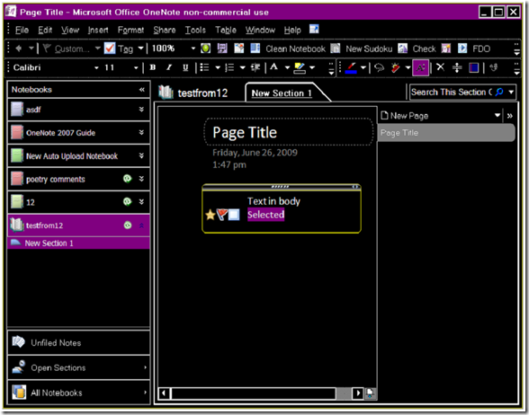
Instead, you can take advantage of a feature we have tested - Windows Accessibility. Depending on which version of Windows you have, you can change to one of several different Accessible modes that use high contrast colors to make reading the screen easier. For instance, you can change to High Contrast (Black) and this is what OneNote will look like:
You get the black page color, but a whole lot more functionality as well. The page title tab gets changed to gray, the font becomes white and even the selected text gets highlighted in purple. This is a much better choice compared to finding and tweaking all these colors yourself. Notice all the powertoy icons do not have their background color set to transparent? This is not a OneNote bug, but looks like the powertoys could use some updating if the UI for them is critical. The powertoys that use text labels instead of icons work as expected, though. Yay for plain text!
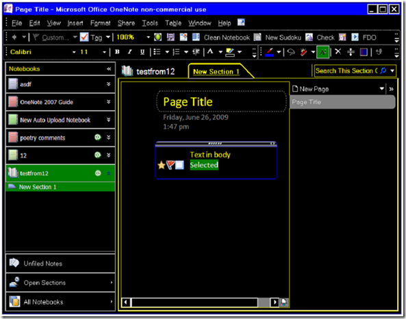
The default high contrast theme on Windows XP is very similar:
You get green highlights and the you can change is yellow.
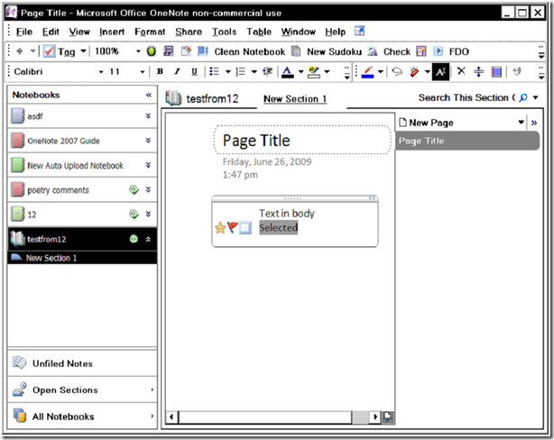
The white theme is not quite the "reverse" of the black:
The section name here shows as a link, but otherwise the change is fairly obvious.
So what I'm going to do, since I brought these modes up, is to use the high contrast black theme on my tablet. I like the dark background, and since the ink color is set to white in this mode by default, it's like writing on a chalkboard.
I'll also track down the bug in the UI shown above. Can you find it?
Questions, comments, concerns and criticisms always welcome,
John
Comments
Anonymous
June 29, 2009
Wow really cool information I think I will try it out.Anonymous
July 01, 2009
Hey John, I've been trying to find a way to change the color of the theme in OneNote 2007, and it seems as though I'm not the only one from my searches. Some don't seem to enjoy the blue around the menus and toolbars. Unfortunately, it doesn't seem possible. I tried your suggestion in changing colors in the classic appearance dialog, but I can't find the one for the blue. Can you help me with this at all? Thanks.Anonymous
July 01, 2009
That is an office theme setting. Click Tools, Options , and change the color Scheme to something else. Office 2007 had blue, olive and silver as the different office themes b default, and you may be able to find more on the internet.Anonymous
July 01, 2009
Thanks John, My Word, Excel, Outlook, etc (2007), are all set to Black, but OneNote never changes, no matter which of the three I pick. Thanks for taking the time to reply though...Anonymous
July 28, 2009
Onenote is not effected by the color changes that you can bring about in other office apps like Word 2007. You can go to file, page setup, and change the color there on the right menu that pops up. That will change the txt background color, though sadly the onenote team thought users would hate actual colors and only provide shades. Hopefully someone creates a powertool that provides real color changes. Thanks for the great blog.Anonymous
July 29, 2009
I am not a huge fan of the "shades" either. One thing I noticed early on is that the "gamma" setting of my LCD monitor makes a HUGE difference. I turned it down about 40% and the colors are much more crisp. If your driver supports that setting, try changing it. It literally makes the shades into colors. JohnAnonymous
January 28, 2010
if you are currently using windows xp, i suggest you using of Microsoft Zune theme. this is an official and completely free of charge theme for Winxp. try this and you'll be free of those annoying blue shades. Download Microsoft Zune Theme: http://go.microsoft.com/fwlink/?LinkID=75078Anonymous
January 28, 2010
I tried with ON2010 - looks great. Office 2007 options doesn't work 100% with this theme. Some of the control edges (buttons, text boxes) are very hard to see, but that may also be my monitor. I'm trying this for a few days on my ON 2010 machine.Anonymous
September 15, 2011
Will this use less power when you're running your machine? I'm a college student and I do pretty much all of my copious readings on my laptop. I'm trying to maximize the battery life, and it seems like this photo-negative version of One Note would use less power to light up.Anonymous
September 15, 2011
Good question. I don't know the answer, though. I can't imagine very much difference at all, unless this lets you run with a more dimmed screen. You can also look in file options advanced and change the OneNote setting to maximize battery life. This will make a positive difference.


