You probably don’t want to do this to OneNote, but here’s how
I saw this question on the Outlook Newsgroup a few days ago:
"Is there anyway to change the font size in the main outlook screen ( inbox...)? [I] want to keep the system font size..."
And one of the replies said there was no way to change the font in the folder list of Outlook. I had looked at this a while back from a OneNote question which was similar (the person wanted the change the section name font along the top of the page) and I hesitated about explaining how this is possible since it can lead to odd behavior across all applications in Windows but I finally decided to point out how to make changes like this. I want to show you how you can change these font settings the application doesn't expose. Then I can show why I don't recommend doing this.
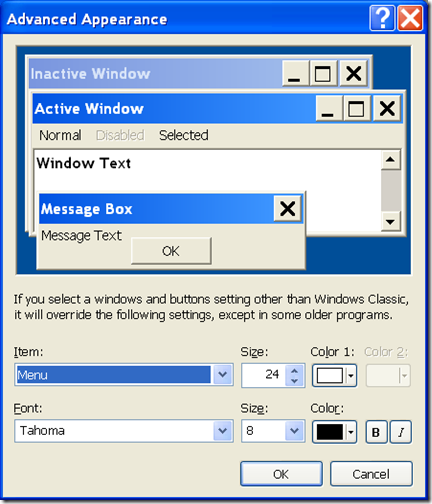
Windows has settings which let you control which font is used for the UI. You can see which fonts Windows is set to use by opening the display properties | Advanced dialog. This is what it looks like on Windows XP:
On this particular system, the Menus in Windows applications use the Tahoma font at an 8 point size. It just so happens that this is the font (the Menu font, that is) used by Outlook for the folder list. I found this out by “black box testing” also know as trial and error. If you want, you can change it to use any installed font, but be careful. I changed it to 24 point and this is now what Outlook looks like:
So the font in the folder list changed along with the menus. It also looks like the command bars use the Menu font. The Search address books control uses a separate font, and the font in the view is controlled by Outlook view settings (View \ Arrange By \ Customize Current View gets you to those font settings). To my eyes, this doesn't scale well and since it will change the menus in all applications on the system (well, those that let Windows handle the fonts, at least), I'd need to go through all applications to see if they are still usable.
One thing I did notice is that the Office theming overrides the font color so I always get black fonts with the blue color scheme. That makes sense to me - if I change the font to a color that I'm using in Office as a background, the font would be invisible. The little previewer Windows shows helps prevent that, but since the background in Office is set via a theme instead of the Windows setting, it becomes incumbent on us to help make the font visible.
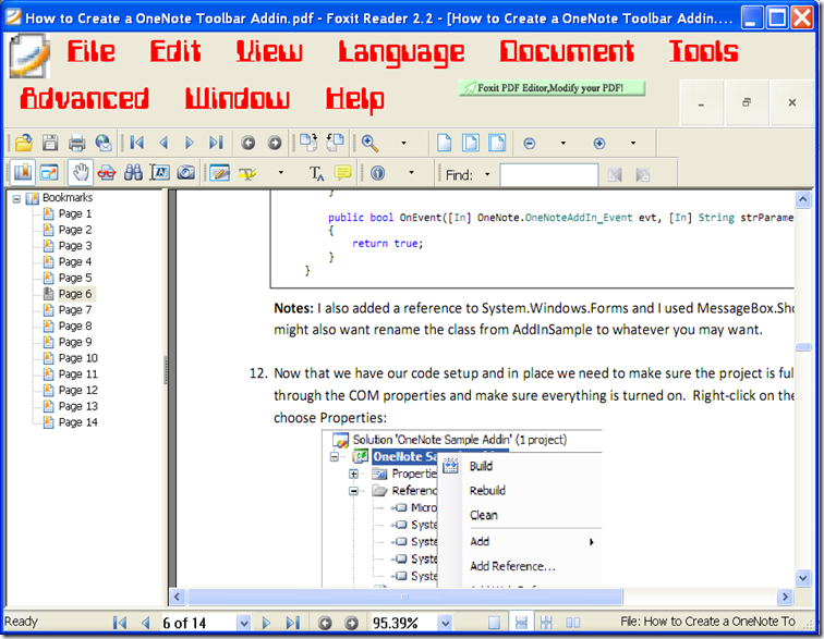
Then for fun, I installed a 1970s era computer font, changed it to red and 24 point and looked at it with a PDF viewer (Foxit):
They use the color I specified but notice the large Close, Minimize and Maximize buttons in their command bar. If you look very closely at them, you can even see the background color for those buttons is not the same as the background of the command bar any longer. And if I really wanted to get picky (which I do want to do, since I am a tester), I could point out the icon to the left of the File command gets pixilated when I change the system menu font to 24 point.
So that's why I don't recommend changing these settings. What may look good in one application can cause odd problems in another. If you really want the large fonts, try the accessibility settings.
Last item: here’s what OneNote looks like (in case you want to change the font the section tabs use). I used the computerfont and changed it to 24 point:
So our search control uses the system font as well as our command bars. This makes addins that use text labels instead of icons a little easier to create (one less thing to worry about). I actually tried using OneNote with this setting for a day or two but quickly gave up. Segoe and Calibri fonts are just easier on my eyes, and that's what I use.
The computer font is available at https://www.dafont.com/computerfont.font
Questions, comments, concerns and criticisms always welcome,
John


