XAML Controls
Views are user-interface objects such as labels, buttons, and sliders that are commonly known as controls or widgets in other graphical programming environments. The views supported by Xamarin.Forms all derive from the View class.
All of the views that are defined in Xamarin.Forms can be referenced from XAML files.
Views for presentation
| View | Example |
|---|---|
BoxViewDisplays a rectangle of a particular color.
|
<BoxView Color="Accent" |
EllipseDisplays an ellipse or circle.
|
<Ellipse Fill="Red" |
ImageDisplays a bitmap.
|
<Image Source="https://aka.ms/campus.jpg" |
LabelDisplays one or more lines of text.
|
<Label Text="Hello, Xamarin.Forms!" |
LineDisplay a line.
|
<Line X1="40" |
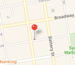
MapDisplays a map.
|
<maps:Map ItemsSource="{Binding Locations}" /> |
PathDisplay curves and complex shapes.
|
<Path Stroke="Black" |
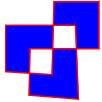
PolygonDisplay a polygon.
|
<Polygon Points="0 48, 0 144, 96 150, 100 0, 192 0, 192 96, |
PolylineDisplay a series of connected straight lines.
|
<Polyline Points="0,0 10,30, 15,0 18,60 23,30 35,30 40,0 |
RectangleDisplay a rectangle or square.
|
<Rectangle Fill="Red" |
WebViewDisplays Web pages or HTML content.
|
<WebView Source="https://learn.microsoft.com/xamarin/" |
Views that initiate commands
| View | Example |
|---|---|
ButtonDisplays text in a rectangular object.
|
<Button Text="Click Me!" |
ImageButtonDisplays an image in a rectangular object.
|
<ImageButton Source="XamarinLogo.png" |
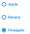
RadioButtonAllows the selection of one option from a set.
|
<RadioButton Text="Pineapple" |
RefreshViewProvides pull-to-refresh functionality for scrollable content.
|
<RefreshView IsRefreshing="{Binding IsRefreshing}" |
SearchBarAccepts user input that it uses to perform a search.
|
<SearchBar Placeholder="Enter search term" |
SwipeViewProvides context menu items that are revealed by a swipe gesture.
|
<SwipeView> |
Views for setting values
| View | Example |
|---|---|
CheckBoxAllows the selection of aboolean value.
|
<CheckBox IsChecked="true" |
SliderAllows the selection of adouble value from a continuous range.
|
<Slider Minimum="0" |
StepperAllows the selection of adouble value from an incremental range. API / Guide API / Guide |
<Stepper Minimum="0" |
SwitchAllows the selection of aboolean value.
|
<Switch IsToggled="false" |
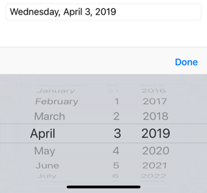
DatePickerAllows the selection of a date.
|
<DatePicker Format="D" |
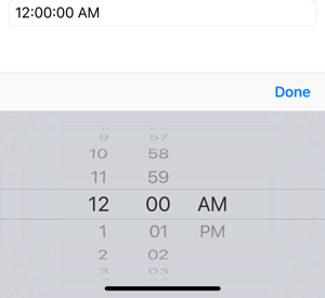
TimePickerAllows the selection of a time.
|
<TimePicker Format="T" |
Views for editing text
| View | Example |
|---|---|
EntryAllows a single line of text to be entered and edited.
|
<<Entry Keyboard="Email" |
EditorAllows multiple lines of text to be entered and edited.
|
<Editor VerticalOptions="FillAndExpand" /> |
Views to indicate activity
| View | Example |
|---|---|
ActivityIndicatorDisplays an animation to show that the application is engaged in a lengthy activity, without giving any indication of progress.
|
<ActivityIndicator IsRunning="True" |
ProgressBarDisplays an animation to show that the application is progressing through a lengthy activity.
|
<ProgressBar Progress=".5" |
Views that display collections
| View | Example |
|---|---|
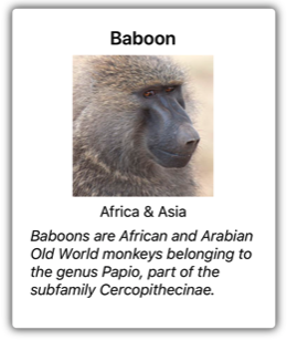
CarouselViewDisplays a scrollable list of data items.
|
<CarouselView ItemsSource="{Binding Monkeys}"> |
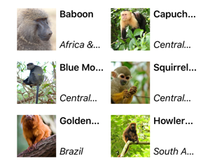
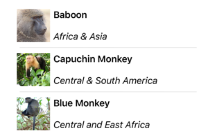
CollectionViewDisplays a scrollable list of selectable data items, using different layout specifications.
|
<CollectionView ItemsSource="{Binding Monkeys}"> |
IndicatorViewDisplays indicators that represent the number of items in aCarouselView.
|
<IndicatorView x:Name="indicatorView" |
ListViewDisplays a scrollable list of selectable data items.
|
<ListView ItemsSource="{Binding Monkeys}"> |
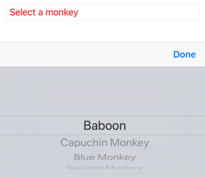
PickerDisplays a select item from a list of text strings.
|
<<Picker Title="Select a monkey" |
TableViewDisplays a list of interactive rows.
|
<TableView Intent="Settings"> |


