Xamarin.Forms DatePicker
A Xamarin.Forms view that allows the user to select a date.
The Xamarin.Forms DatePicker invokes the platform's date-picker control and allows the user to select a date. DatePicker defines eight properties:
MinimumDateof typeDateTime, which defaults to the first day of the year 1900.MaximumDateof typeDateTime, which defaults to the last day of the year 2100.Dateof typeDateTime, the selected date, which defaults to the valueDateTime.Today.Formatof typestring, a standard or custom .NET formatting string, which defaults to "D", the long date pattern.TextColorof typeColor, the color used to display the selected date, which defaults toColor.Default.FontAttributesof typeFontAttributes, which defaults toFontAtributes.None.FontFamilyof typestring, which defaults tonull.FontSizeof typedouble, which defaults to -1.0.CharacterSpacing, of typedouble, is the spacing between characters of theDatePickertext.
The DatePicker fires a DateSelected event when the user selects a date.
Warning
When setting MinimumDate and MaximumDate, make sure that MinimumDate is always less than or equal to MaximumDate. Otherwise, DatePicker will raise an exception.
Internally, the DatePicker ensures that Date is between MinimumDate and MaximumDate, inclusive. If MinimumDate or MaximumDate is set so that Date is not between them, DatePicker will adjust the value of Date.
All eight properties are backed by BindableProperty objects, which means that they can be styled, and the properties can be targets of data bindings. The Date property has a default binding mode of BindingMode.TwoWay, which means that it can be a target of a data binding in an application that uses the Model-View-ViewModel (MVVM) architecture.
Initializing the DateTime properties
In code, you can initialize the MinimumDate, MaximumDate, and Date properties to values of type DateTime:
DatePicker datePicker = new DatePicker
{
    MinimumDate = new DateTime(2018, 1, 1),
    MaximumDate = new DateTime(2018, 12, 31),
    Date = new DateTime(2018, 6, 21)
};
When a DateTime value is specified in XAML, the XAML parser uses the DateTime.Parse method with a CultureInfo.InvariantCulture argument to convert the string to a DateTime value. The dates must be specified in a precise format: two-digit months, two-digit days, and four-digit years separated by slashes:
<DatePicker MinimumDate="01/01/2018"
            MaximumDate="12/31/2018"
            Date="06/21/2018" />
If the BindingContext property of DatePicker is set to an instance of a viewmodel containing properties of type DateTime named MinDate, MaxDate, and SelectedDate (for example), you can instantiate the DatePicker like this:
<DatePicker MinimumDate="{Binding MinDate}"
            MaximumDate="{Binding MaxDate}"
            Date="{Binding SelectedDate}" />
In this example, all three properties are initialized to the corresponding properties in the viewmodel. Because the Date property has a binding mode of TwoWay, any new date that the user selects is automatically reflected in the viewmodel.
If the DatePicker does not contain a binding on its Date property, an application should attach a handler to the DateSelected event to be informed when the user selects a new date.
For information about setting font properties, see Fonts.
DatePicker and layout
It's possible to use an unconstrained horizontal layout option such as Center, Start, or End with DatePicker:
<DatePicker ···
            HorizontalOptions="Center"
            ··· />
However, this is not recommended. Depending on the setting of the Format property, selected dates might require different display widths. For example, the "D" format string causes DateTime to display dates in a long format, and "Wednesday, September 12, 2018" requires a greater display width than "Friday, May 4, 2018". Depending on the platform, this difference might cause the DateTime view to change width in layout, or for the display to be truncated.
Tip
It's best to use the default HorizontalOptions setting of Fill with DatePicker, and not to use a width of Auto when putting DatePicker in a Grid cell.
DatePicker in an application
The sample includes two DatePicker views on its page. These can be used to select two dates, and the program calculates the number of days between those dates. The program doesn't change the settings of the MinimumDate and MaximumDate properties, so the two dates must be between 1900 and 2100.
Here's the XAML file:
<?xml version="1.0" encoding="utf-8" ?>
<ContentPage xmlns="http://xamarin.com/schemas/2014/forms"
             xmlns:x="http://schemas.microsoft.com/winfx/2009/xaml"
             xmlns:local="clr-namespace:DaysBetweenDates"
             x:Class="DaysBetweenDates.MainPage">
    <ContentPage.Padding>
        <OnPlatform x:TypeArguments="Thickness">
            <On Platform="iOS" Value="0, 20, 0, 0" />
        </OnPlatform>
    </ContentPage.Padding>

    <StackLayout Margin="10">
        <Label Text="Days Between Dates"
               Style="{DynamicResource TitleStyle}"
               Margin="0, 20"
               HorizontalTextAlignment="Center" />

        <Label Text="Start Date:" />

        <DatePicker x:Name="startDatePicker"
                    Format="D"
                    Margin="30, 0, 0, 30"
                    DateSelected="OnDateSelected" />

        <Label Text="End Date:" />

        <DatePicker x:Name="endDatePicker"
                    MinimumDate="{Binding Source={x:Reference startDatePicker},
                                          Path=Date}"
                    Format="D"
                    Margin="30, 0, 0, 30"
                    DateSelected="OnDateSelected" />

        <StackLayout Orientation="Horizontal"
                     Margin="0, 0, 0, 30">
            <Label Text="Include both days in total: "
                   VerticalOptions="Center" />
            <Switch x:Name="includeSwitch"
                    Toggled="OnSwitchToggled" />
        </StackLayout>

        <Label x:Name="resultLabel"
               FontAttributes="Bold"
               HorizontalTextAlignment="Center" />

    </StackLayout>
</ContentPage>
Each DatePicker is assigned a Format property of "D" for a long date format. Notice also that the endDatePicker object has a binding that targets its MinimumDate property. The binding source is the selected Date property of the startDatePicker object. This ensures that the end date is always later than or equal to the start date. In addition to the two DatePicker objects, a Switch is labeled "Include both days in total".
The two DatePicker views have handlers attached to the DateSelected event, and the Switch has a handler attached to its Toggled event. These event handlers are in the code-behind file and trigger a new calculation of the days between the two dates:
public partial class MainPage : ContentPage
{
    public MainPage()
    {
        InitializeComponent();
    }

    void OnDateSelected(object sender, DateChangedEventArgs args)
    {
        Recalculate();
    }

    void OnSwitchToggled(object sender, ToggledEventArgs args)
    {
        Recalculate();
    }

    void Recalculate()
    {
        TimeSpan timeSpan = endDatePicker.Date - startDatePicker.Date +
            (includeSwitch.IsToggled ? TimeSpan.FromDays(1) : TimeSpan.Zero);

        resultLabel.Text = String.Format("{0} day{1} between dates",
                                            timeSpan.Days, timeSpan.Days == 1 ? "" : "s");
    }
}
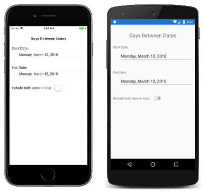
When the sample is first run, both DatePicker views are initialized to today's date. The following screenshot shows the program running on iOS and Android:
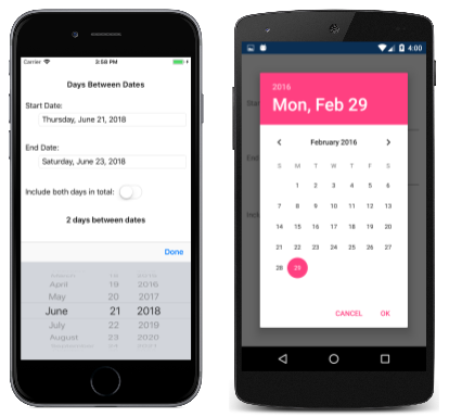
Tapping either of the DatePicker displays invokes the platform date picker. The platforms implement this date picker in very different ways, but each approach is familiar to users of that platform:
Tip
On Android, the DatePicker dialog can be customized by overriding the CreateDatePickerDialog method in a custom renderer. This allows, for example, additional buttons to be added to the dialog.
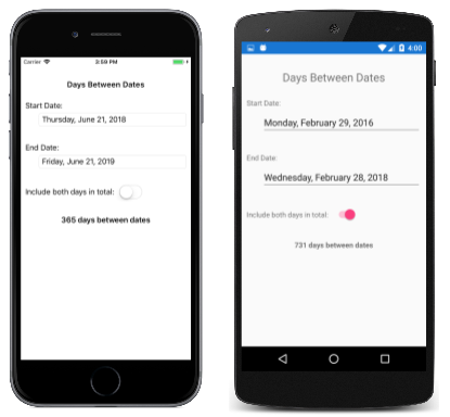
After two dates are selected, the application displays the number of days between those dates:


