Part 3. XAML Markup Extensions
XAML markup extensions constitute an important feature in XAML that allow properties to be set to objects or values that are referenced indirectly from other sources. XAML markup extensions are particularly important for sharing objects, and referencing constants used throughout an application, but they find their greatest utility in data bindings.
XAML Markup Extensions
In general, you use XAML to set properties of an object to explicit values, such as a string, a number, an enumeration member, or a string that is converted to a value behind the scenes.
Sometimes, however, properties must instead reference values defined somewhere else, or which might require a little processing by code at runtime. For these purposes, XAML markup extensions are available.
These XAML markup extensions are not extensions of XML. XAML is entirely legal XML. They’re called “extensions” because they are backed by code in classes that implement IMarkupExtension. You can write your own custom markup extensions.
In many cases, XAML markup extensions are instantly recognizable in XAML files because they appear as attribute settings delimited by curly braces: { and }, but sometimes markup extensions appear in markup as conventional elements.
Shared Resources
Some XAML pages contain several views with properties set to the same values. For example, many of the property settings for these Button objects are the same:
<ContentPage xmlns="http://xamarin.com/schemas/2014/forms"
             xmlns:x="http://schemas.microsoft.com/winfx/2009/xaml"
             x:Class="XamlSamples.SharedResourcesPage"
             Title="Shared Resources Page">

    <StackLayout>
        <Button Text="Do this!"
                HorizontalOptions="Center"
                VerticalOptions="CenterAndExpand"
                BorderWidth="3"
                Rotation="-15"
                TextColor="Red"
                FontSize="24" />

        <Button Text="Do that!"
                HorizontalOptions="Center"
                VerticalOptions="CenterAndExpand"
                BorderWidth="3"
                Rotation="-15"
                TextColor="Red"
                FontSize="24" />

        <Button Text="Do the other thing!"
                HorizontalOptions="Center"
                VerticalOptions="CenterAndExpand"
                BorderWidth="3"
                Rotation="-15"
                TextColor="Red"
                FontSize="24" />

    </StackLayout>
</ContentPage>
If one of these properties needs to be changed, you might prefer to make the change just once rather than three times. If this were code, you’d likely be using constants and static read-only objects to help keep such values consistent and easy to modify.
In XAML, one popular solution is to store such values or objects in a resource dictionary. The VisualElement class defines a property named Resources of type ResourceDictionary, which is a dictionary with keys of type string and values of type object. You can put objects into this dictionary and then reference them from markup, all in XAML.
To use a resource dictionary on a page, include a pair of Resources property-element tags. It’s most convenient to put these at the top of the page:
<ContentPage xmlns="http://xamarin.com/schemas/2014/forms"
             xmlns:x="http://schemas.microsoft.com/winfx/2009/xaml"
             x:Class="XamlSamples.SharedResourcesPage"
             Title="Shared Resources Page">

    <ContentPage.Resources>

    </ContentPage.Resources>
    ...
</ContentPage>
It’s also necessary to explicitly include ResourceDictionary tags:
<ContentPage xmlns="http://xamarin.com/schemas/2014/forms"
             xmlns:x="http://schemas.microsoft.com/winfx/2009/xaml"
             x:Class="XamlSamples.SharedResourcesPage"
             Title="Shared Resources Page">

    <ContentPage.Resources>
        <ResourceDictionary>

        </ResourceDictionary>
    </ContentPage.Resources>
    ...
</ContentPage>
Now objects and values of various types can be added to the resource dictionary. These types must be instantiable. They can’t be abstract classes, for example. These types must also have a public parameterless constructor. Each item requires a dictionary key specified with the x:Key attribute. For example:
<ContentPage xmlns="http://xamarin.com/schemas/2014/forms"
             xmlns:x="http://schemas.microsoft.com/winfx/2009/xaml"
             x:Class="XamlSamples.SharedResourcesPage"
             Title="Shared Resources Page">

    <ContentPage.Resources>
        <ResourceDictionary>
            <LayoutOptions x:Key="horzOptions"
                           Alignment="Center" />

            <LayoutOptions x:Key="vertOptions"
                           Alignment="Center"
                           Expands="True" />
        </ResourceDictionary>
    </ContentPage.Resources>
    ...
</ContentPage>
These two items are values of the structure type LayoutOptions, and each has a unique key and one or two properties set. In code and markup, it’s much more common to use the static fields of LayoutOptions, but here it’s more convenient to set the properties.
Now it’s necessary to set the HorizontalOptions and VerticalOptions properties of these buttons to these resources, and that’s done with the StaticResource XAML markup extension:
<Button Text="Do this!"
        HorizontalOptions="{StaticResource horzOptions}"
        VerticalOptions="{StaticResource vertOptions}"
        BorderWidth="3"
        Rotation="-15"
        TextColor="Red"
        FontSize="24" />
The StaticResource markup extension is always delimited with curly braces, and includes the dictionary key.
The name StaticResource distinguishes it from DynamicResource,
which Xamarin.Forms also supports. DynamicResource is for
dictionary keys associated with values that might change during
runtime, while StaticResource accesses elements from the
dictionary just once when the elements on the page are constructed.
For the BorderWidth property, it’s necessary to store a double in the dictionary. XAML conveniently defines tags for common data types like x:Double and x:Int32:
<ContentPage.Resources>
    <ResourceDictionary>
        <LayoutOptions x:Key="horzOptions"
                       Alignment="Center" />

        <LayoutOptions x:Key="vertOptions"
                       Alignment="Center"
                       Expands="True" />

        <x:Double x:Key="borderWidth">
            3
        </x:Double>
    </ResourceDictionary>
</ContentPage.Resources>
You don’t need to put it on three lines. This dictionary entry for this rotation angle only takes up one line:
<ContentPage.Resources>
    <ResourceDictionary>
        <LayoutOptions x:Key="horzOptions"
                       Alignment="Center" />

        <LayoutOptions x:Key="vertOptions"
                       Alignment="Center"
                       Expands="True" />

         <x:Double x:Key="borderWidth">
            3
         </x:Double>

        <x:Double x:Key="rotationAngle">-15</x:Double>
    </ResourceDictionary>
</ContentPage.Resources>
Those two resources can be referenced in the same way as the LayoutOptions values:
<Button Text="Do this!"
        HorizontalOptions="{StaticResource horzOptions}"
        VerticalOptions="{StaticResource vertOptions}"
        BorderWidth="{StaticResource borderWidth}"
        Rotation="{StaticResource rotationAngle}"
        TextColor="Red"
        FontSize="24" />
For resources of type Color, you can use the same string representations that you use when directly assigning attributes of these types. The type converters are invoked when the resource is created. Here's a resource of type Color:
<Color x:Key="textColor">Red</Color>
Often, programs set a FontSize property to a member of the NamedSize enumeration such as Large. The FontSizeConverter class works behind the scenes to convert it into a platform-dependent value using the Device.GetNamedSized method. However, when defining a font-size resource, it makes more sense to use a numeric value, shown here as an x:Double type:
<x:Double x:Key="fontSize">24</x:Double>
Now all the properties except Text are defined by resource settings:
<Button Text="Do this!"
        HorizontalOptions="{StaticResource horzOptions}"
        VerticalOptions="{StaticResource vertOptions}"
        BorderWidth="{StaticResource borderWidth}"
        Rotation="{StaticResource rotationAngle}"
        TextColor="{StaticResource textColor}"
        FontSize="{StaticResource fontSize}" />
It's also possible to use OnPlatform within the resource dictionary to define different values for the platforms. Here’s how an OnPlatform object can be part of the resource dictionary for different text colors:
<OnPlatform x:Key="textColor"
            x:TypeArguments="Color">
    <On Platform="iOS" Value="Red" />
    <On Platform="Android" Value="Aqua" />
    <On Platform="UWP" Value="#80FF80" />
</OnPlatform>
Notice that OnPlatform gets both an x:Key attribute because it’s an object in the dictionary and an x:TypeArguments attribute because it’s a generic class. The iOS, Android, and UWP attributes are converted to Color values when the object is initialized.
Here’s the final complete XAML file with three buttons accessing six shared values:
<ContentPage xmlns="http://xamarin.com/schemas/2014/forms"
             xmlns:x="http://schemas.microsoft.com/winfx/2009/xaml"
             x:Class="XamlSamples.SharedResourcesPage"
             Title="Shared Resources Page">

    <ContentPage.Resources>
        <ResourceDictionary>
            <LayoutOptions x:Key="horzOptions"
                           Alignment="Center" />

            <LayoutOptions x:Key="vertOptions"
                           Alignment="Center"
                           Expands="True" />

            <x:Double x:Key="borderWidth">3</x:Double>

            <x:Double x:Key="rotationAngle">-15</x:Double>

            <OnPlatform x:Key="textColor"
                        x:TypeArguments="Color">
                <On Platform="iOS" Value="Red" />
                <On Platform="Android" Value="Aqua" />
                <On Platform="UWP" Value="#80FF80" />
            </OnPlatform>

            <x:Double x:Key="fontSize">24</x:Double>
        </ResourceDictionary>
    </ContentPage.Resources>

    <StackLayout>
        <Button Text="Do this!"
                HorizontalOptions="{StaticResource horzOptions}"
                VerticalOptions="{StaticResource vertOptions}"
                BorderWidth="{StaticResource borderWidth}"
                Rotation="{StaticResource rotationAngle}"
                TextColor="{StaticResource textColor}"
                FontSize="{StaticResource fontSize}" />

        <Button Text="Do that!"
                HorizontalOptions="{StaticResource horzOptions}"
                VerticalOptions="{StaticResource vertOptions}"
                BorderWidth="{StaticResource borderWidth}"
                Rotation="{StaticResource rotationAngle}"
                TextColor="{StaticResource textColor}"
                FontSize="{StaticResource fontSize}" />

        <Button Text="Do the other thing!"
                HorizontalOptions="{StaticResource horzOptions}"
                VerticalOptions="{StaticResource vertOptions}"
                BorderWidth="{StaticResource borderWidth}"
                Rotation="{StaticResource rotationAngle}"
                TextColor="{StaticResource textColor}"
                FontSize="{StaticResource fontSize}" />

    </StackLayout>
</ContentPage>
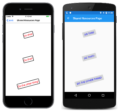
The screenshots verify the consistent styling, and the platform-dependent styling:
Although it is most common to define the Resources collection at the top of the page, keep in mind that the Resources property is defined by VisualElement, and you can have Resources collections on other elements on the page. For example, try adding one to the StackLayout in this example:
<StackLayout>
    <StackLayout.Resources>
        <ResourceDictionary>
            <Color x:Key="textColor">Blue</Color>
        </ResourceDictionary>
    </StackLayout.Resources>
    ...
</StackLayout>
You’ll discover that the text color of the buttons is now blue. Basically, whenever the XAML parser encounters a StaticResource markup extension, it searches up the visual tree and uses the first ResourceDictionary it encounters containing that key.
One of the most common types of objects stored in resource dictionaries is the Xamarin.Forms Style, which defines a collection of property settings. Styles are discussed in the article Styles.
Sometimes developers new to XAML wonder if they can put a visual element such as Label or Button in a ResourceDictionary. While it’s surely possible, it doesn’t make much sense. The purpose of the ResourceDictionary is to share objects. A visual element cannot be shared. The same instance cannot appear twice on a single page.
The x:Static Markup Extension
Despite the similarities of their names, x:Static and StaticResource are very different. StaticResource returns an object from a resource dictionary while x:Static accesses one of the following:
- a public static field
- a public static property
- a public constant field
- an enumeration member.
The StaticResource markup extension is supported by XAML implementations that define a resource dictionary, while x:Static is an intrinsic part of XAML, as the x prefix reveals.
Here are a few examples that demonstrate how x:Static can explicitly reference static fields and enumeration members:
<Label Text="Hello, XAML!"
       VerticalOptions="{x:Static LayoutOptions.Start}"
       HorizontalTextAlignment="{x:Static TextAlignment.Center}"
       TextColor="{x:Static Color.Aqua}" />
So far, this is not very impressive. But the x:Static markup extension can also reference static fields or properties from your own code. For example, here’s an AppConstants class that contains some static fields that you might want to use on multiple pages throughout an application:
using System;
using Xamarin.Forms;

namespace XamlSamples
{
    static class AppConstants
    {
        public static readonly Thickness PagePadding;

        public static readonly Font TitleFont;

        public static readonly Color BackgroundColor = Color.Aqua;

        public static readonly Color ForegroundColor = Color.Brown;

        static AppConstants()
        {
            switch (Device.RuntimePlatform)
            {
                case Device.iOS:
                    PagePadding = new Thickness(5, 20, 5, 0);
                    TitleFont = Font.SystemFontOfSize(35, FontAttributes.Bold);
                    break;

                case Device.Android:
                    PagePadding = new Thickness(5, 0, 5, 0);
                    TitleFont = Font.SystemFontOfSize(40, FontAttributes.Bold);
                    break;

                case Device.UWP:
                    PagePadding = new Thickness(5, 0, 5, 0);
                    TitleFont = Font.SystemFontOfSize(50, FontAttributes.Bold);
                    break;
            }
        }
    }
}
To reference the static fields of this class in the XAML file, you’ll need some way to indicate within the XAML file where this file is located. You do this with an XML namespace declaration.
Recall that the XAML files created as part of the standard Xamarin.Forms XAML template contain two XML namespace declarations: one for accessing Xamarin.Forms classes and another for referencing tags and attributes intrinsic to XAML:
xmlns="http://xamarin.com/schemas/2014/forms"
xmlns:x="http://schemas.microsoft.com/winfx/2009/xaml"
You’ll need additional XML namespace declarations to access other classes. Each additional XML namespace declaration defines a new prefix. To access classes local to the shared application .NET Standard library, such as AppConstants, XAML programmers often use the prefix local. The namespace declaration must indicate the CLR (Common Language Runtime) namespace name, also known as the .NET namespace name, which is the name that appears in a C# namespace definition or in a using directive:
xmlns:local="clr-namespace:XamlSamples"
You can also define XML namespace declarations for .NET namespaces in any assembly that the .NET Standard library references. For example, here’s a sys prefix for the standard .NET System namespace, which is in the netstandard assembly. Because this is another assembly, you must also specify the assembly name, in this case netstandard:
xmlns:sys="clr-namespace:System;assembly=netstandard"
Notice that the keyword clr-namespace is followed by a colon and then the .NET namespace name, followed by a semicolon, the keyword assembly, an equal sign, and the assembly name.
Yes, a colon follows clr-namespace but equal sign follows assembly. The syntax was defined in this way deliberately: Most XML namespace declarations reference a URI that begins a URI scheme name such as http, which is always followed by a colon. The clr-namespace part of this string is intended to mimic that convention.
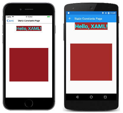
Both these namespace declarations are included in the StaticConstantsPage sample. Notice that the BoxView dimensions are set to Math.PI and Math.E, but scaled by a factor of 100:
<ContentPage xmlns="http://xamarin.com/schemas/2014/forms"
             xmlns:x="http://schemas.microsoft.com/winfx/2009/xaml"
             xmlns:local="clr-namespace:XamlSamples"
             xmlns:sys="clr-namespace:System;assembly=netstandard"
             x:Class="XamlSamples.StaticConstantsPage"
             Title="Static Constants Page"
             Padding="{x:Static local:AppConstants.PagePadding}">

    <StackLayout>
       <Label Text="Hello, XAML!"
              TextColor="{x:Static local:AppConstants.BackgroundColor}"
              BackgroundColor="{x:Static local:AppConstants.ForegroundColor}"
              Font="{x:Static local:AppConstants.TitleFont}"
              HorizontalOptions="Center" />

      <BoxView WidthRequest="{x:Static sys:Math.PI}"
               HeightRequest="{x:Static sys:Math.E}"
               Color="{x:Static local:AppConstants.ForegroundColor}"
               HorizontalOptions="Center"
               VerticalOptions="CenterAndExpand"
               Scale="100" />
    </StackLayout>
</ContentPage>
The size of the resultant BoxView relative to the screen is platform-dependent:
Other Standard Markup Extensions
Several markup extensions are intrinsic to XAML and supported in Xamarin.Forms XAML files. Some of these are not used very often but are essential when you need them:
- If a property has a non-
nullvalue by default but you want to set it tonull, set it to the{x:Null}markup extension. - If a property is of type
Type, you can assign it to aTypeobject using the markup extension{x:Type someClass}. - You can define arrays in XAML using the
x:Arraymarkup extension. This markup extension has a required attribute namedTypethat indicates the type of the elements in the array. - The
Bindingmarkup extension is discussed in Part 4. Data Binding Basics. - The
RelativeSourcemarkup extension is discussed in Relative Bindings.
The ConstraintExpression Markup Extension
Markup extensions can have properties, but they are not set like XML attributes. In a markup extension, property settings are separated by commas, and no quotation marks appear within the curly braces.
This can be illustrated with the Xamarin.Forms markup extension named ConstraintExpression, which is used with the RelativeLayout class. You can specify the location or size of a child view as a constant, or relative to a parent or other named view. The syntax of the ConstraintExpression allows you set the position or size of a view using a Factor times a property of another view, plus a Constant. Anything more complex than that requires code.
Here’s an example:
<ContentPage xmlns="http://xamarin.com/schemas/2014/forms"
             xmlns:x="http://schemas.microsoft.com/winfx/2009/xaml"
             x:Class="XamlSamples.RelativeLayoutPage"
             Title="RelativeLayout Page">

    <RelativeLayout>

        <!-- Upper left -->
        <BoxView Color="Red"
                 RelativeLayout.XConstraint=
                     "{ConstraintExpression Type=Constant,
                                            Constant=0}"
                 RelativeLayout.YConstraint=
                     "{ConstraintExpression Type=Constant,
                                            Constant=0}" />
        <!-- Upper right -->
        <BoxView Color="Green"
                 RelativeLayout.XConstraint=
                     "{ConstraintExpression Type=RelativeToParent,
                                            Property=Width,
                                            Factor=1,
                                            Constant=-40}"
                 RelativeLayout.YConstraint=
                     "{ConstraintExpression Type=Constant,
                                            Constant=0}" />
        <!-- Lower left -->
        <BoxView Color="Blue"
                 RelativeLayout.XConstraint=
                     "{ConstraintExpression Type=Constant,
                                            Constant=0}"
                 RelativeLayout.YConstraint=
                     "{ConstraintExpression Type=RelativeToParent,
                                            Property=Height,
                                            Factor=1,
                                            Constant=-40}" />
        <!-- Lower right -->
        <BoxView Color="Yellow"
                 RelativeLayout.XConstraint=
                     "{ConstraintExpression Type=RelativeToParent,
                                            Property=Width,
                                            Factor=1,
                                            Constant=-40}"
                 RelativeLayout.YConstraint=
                     "{ConstraintExpression Type=RelativeToParent,
                                            Property=Height,
                                            Factor=1,
                                            Constant=-40}" />

        <!-- Centered and 1/3 width and height of parent -->
        <BoxView x:Name="oneThird"
                 Color="Red"
                 RelativeLayout.XConstraint=
                     "{ConstraintExpression Type=RelativeToParent,
                                            Property=Width,
                                            Factor=0.33}"
                 RelativeLayout.YConstraint=
                     "{ConstraintExpression Type=RelativeToParent,
                                            Property=Height,
                                            Factor=0.33}"
                 RelativeLayout.WidthConstraint=
                     "{ConstraintExpression Type=RelativeToParent,
                                            Property=Width,
                                            Factor=0.33}"
                 RelativeLayout.HeightConstraint=
                     "{ConstraintExpression Type=RelativeToParent,
                                            Property=Height,
                                            Factor=0.33}"  />

        <!-- 1/3 width and height of previous -->
        <BoxView Color="Blue"
                 RelativeLayout.XConstraint=
                     "{ConstraintExpression Type=RelativeToView,
                                            ElementName=oneThird,
                                            Property=X}"
                 RelativeLayout.YConstraint=
                     "{ConstraintExpression Type=RelativeToView,
                                            ElementName=oneThird,
                                            Property=Y}"
                 RelativeLayout.WidthConstraint=
                     "{ConstraintExpression Type=RelativeToView,
                                            ElementName=oneThird,
                                            Property=Width,
                                            Factor=0.33}"
                 RelativeLayout.HeightConstraint=
                     "{ConstraintExpression Type=RelativeToView,
                                            ElementName=oneThird,
                                            Property=Height,
                                            Factor=0.33}"  />
    </RelativeLayout>
</ContentPage>
Perhaps the most important lesson you should take from this sample is the syntax of the markup extension: No quotation marks must appear within the curly braces of a markup extension. When typing the markup extension in a XAML file, it is natural to want to enclose the values of the properties in quotation marks. Resist the temptation!
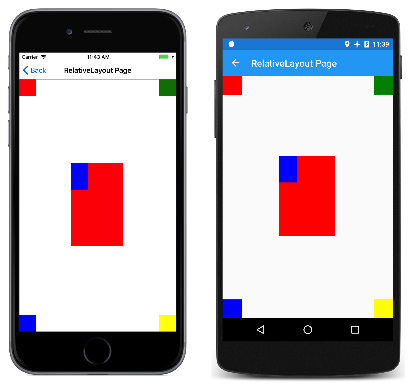
Here’s the program running:
Summary
The XAML markup extensions shown here provide important support for XAML files. But perhaps the most valuable XAML markup extension is Binding, which is covered in the next part of this series, Part 4. Data Binding Basics.


