Part 4. Data Binding Basics
Data bindings allow properties of two objects to be linked so that a change in one causes a change in the other. This is a very valuable tool, and while data bindings can be defined entirely in code, XAML provides shortcuts and convenience. Consequently, one of the most important markup extensions in Xamarin.Forms is Binding.
Data Bindings
Data bindings connect properties of two objects, called the source and the target. In code, two steps are required: The BindingContext property of the target object must be set to the source object, and the SetBinding method (often used in conjunction with the Binding class) must be called on the target object to bind a property of that object to a property of the source object.
The target property must be a bindable property, which means that the target object must derive from BindableObject. The online Xamarin.Forms documentation indicates which properties are bindable properties. A property of Label such as Text is associated with the bindable property TextProperty.
In markup, you must also perform the same two steps that are required in code, except that the Binding markup extension takes the place of the SetBinding call and the Binding class.
However, when you define data bindings in XAML, there are multiple ways to set the BindingContext of the target object. Sometimes it’s set from the code-behind file, sometimes using a StaticResource or x:Static markup extension, and sometimes as the content of BindingContext property-element tags.
Bindings are used most often to connect the visuals of a program with an underlying data model, usually in a realization of the MVVM (Model-View-ViewModel) application architecture, as discussed in Part 5. From Data Bindings to MVVM, but other scenarios are possible.
View-to-View Bindings
You can define data bindings to link properties of two views on the same page. In this case, you set the BindingContext of the target object using the x:Reference markup extension.
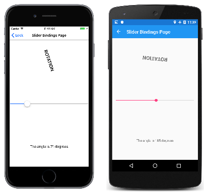
Here’s a XAML file that contains a Slider and two Label views, one of which is rotated by the Slider value and another which displays the Slider value:
<ContentPage xmlns="http://xamarin.com/schemas/2014/forms"
             xmlns:x="http://schemas.microsoft.com/winfx/2009/xaml"
             x:Class="XamlSamples.SliderBindingsPage"
             Title="Slider Bindings Page">

    <StackLayout>
        <Label Text="ROTATION"
               BindingContext="{x:Reference Name=slider}"
               Rotation="{Binding Path=Value}"
               FontAttributes="Bold"
               FontSize="Large"
               HorizontalOptions="Center"
               VerticalOptions="CenterAndExpand" />

        <Slider x:Name="slider"
                Maximum="360"
                VerticalOptions="CenterAndExpand" />

        <Label BindingContext="{x:Reference slider}"
               Text="{Binding Value, StringFormat='The angle is {0:F0} degrees'}"
               FontAttributes="Bold"
               FontSize="Large"
               HorizontalOptions="Center"
               VerticalOptions="CenterAndExpand" />
    </StackLayout>
</ContentPage>
The Slider contains an x:Name attribute that is referenced by the two Label views using the x:Reference markup extension.
The x:Reference binding extension defines a property named Name to set to the name of the referenced element, in this case slider. However, the ReferenceExtension class that defines the x:Reference markup extension also defines a ContentProperty attribute for Name, which means that it isn’t explicitly required. Just for variety, the first x:Reference includes “Name=” but the second does not:
BindingContext="{x:Reference Name=slider}"
…
BindingContext="{x:Reference slider}"
The Binding markup extension itself can have several properties, just like the BindingBase and Binding class. The ContentProperty for Binding is Path, but the “Path=” part of the markup extension can be omitted if the path is the first item in the Binding markup extension. The first example has “Path=” but the second example omits it:
Rotation="{Binding Path=Value}"
…
Text="{Binding Value, StringFormat='The angle is {0:F0} degrees'}"
The properties can all be on one line or separated into multiple lines:
Text="{Binding Value,
               StringFormat='The angle is {0:F0} degrees'}"
Do whatever is convenient.
Notice the StringFormat property in the second Binding markup extension. In Xamarin.Forms, bindings do not perform any implicit type conversions, and if you need to display a non-string object as a string you must provide a type converter or use StringFormat. Behind the scenes, the static String.Format method is used to implement StringFormat. That’s potentially a problem, because .NET formatting specifications involve curly braces, which are also used to delimit markup extensions. This creates a risk of confusing the XAML parser. To avoid that, put the entire formatting string in single quotation marks:
Text="{Binding Value, StringFormat='The angle is {0:F0} degrees'}"
Here’s the running program:
The Binding Mode
A single view can have data bindings on several of its properties. However, each view can have only one BindingContext, so multiple data bindings on that view must all reference properties of the same object.
The solution to this and other problems involves the Mode property, which is set to a member of the BindingMode enumeration:
DefaultOneWay— values are transferred from the source to the targetOneWayToSource— values are transferred from the target to the sourceTwoWay— values are transferred both ways between source and targetOneTime— data goes from source to target, but only when theBindingContextchanges
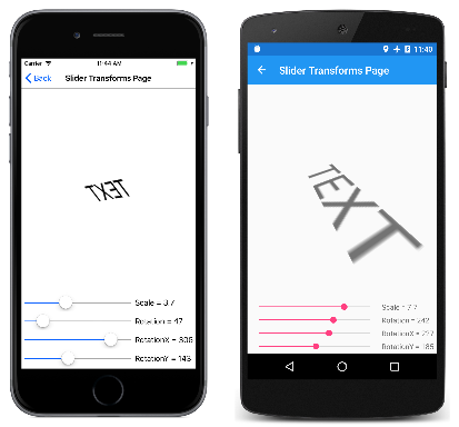
The following program demonstrates one common use of the OneWayToSource and TwoWay binding modes. Four Slider views are intended to control the Scale, Rotate, RotateX, and RotateY properties of a Label. At first, it seems as if these four properties of the Label should be data-binding targets because each is being set by a Slider. However, the BindingContext of Label can be only one object, and there are four different sliders.
For that reason, all the bindings are set in seemingly backwards ways: The BindingContext of each of the four sliders is set to the Label, and the bindings are set on the Value properties of the sliders. By using the OneWayToSource and TwoWay modes, these Value properties can set the source properties, which are the Scale, Rotate, RotateX, and RotateY properties of the Label:
<ContentPage xmlns="http://xamarin.com/schemas/2014/forms"
             xmlns:x="http://schemas.microsoft.com/winfx/2009/xaml"
             x:Class="XamlSamples.SliderTransformsPage"
             Padding="5"
             Title="Slider Transforms Page">
    <Grid>
        <Grid.RowDefinitions>
            <RowDefinition Height="*" />
            <RowDefinition Height="Auto" />
            <RowDefinition Height="Auto" />
            <RowDefinition Height="Auto" />
            <RowDefinition Height="Auto" />
        </Grid.RowDefinitions>

        <Grid.ColumnDefinitions>
            <ColumnDefinition Width="*" />
            <ColumnDefinition Width="Auto" />
        </Grid.ColumnDefinitions>

        <!-- Scaled and rotated Label -->
        <Label x:Name="label"
               Text="TEXT"
               HorizontalOptions="Center"
               VerticalOptions="CenterAndExpand" />

        <!-- Slider and identifying Label for Scale -->
        <Slider x:Name="scaleSlider"
                BindingContext="{x:Reference label}"
                Grid.Row="1" Grid.Column="0"
                Maximum="10"
                Value="{Binding Scale, Mode=TwoWay}" />

        <Label BindingContext="{x:Reference scaleSlider}"
               Text="{Binding Value, StringFormat='Scale = {0:F1}'}"
               Grid.Row="1" Grid.Column="1"
               VerticalTextAlignment="Center" />

        <!-- Slider and identifying Label for Rotation -->
        <Slider x:Name="rotationSlider"
                BindingContext="{x:Reference label}"
                Grid.Row="2" Grid.Column="0"
                Maximum="360"
                Value="{Binding Rotation, Mode=OneWayToSource}" />

        <Label BindingContext="{x:Reference rotationSlider}"
               Text="{Binding Value, StringFormat='Rotation = {0:F0}'}"
               Grid.Row="2" Grid.Column="1"
               VerticalTextAlignment="Center" />

        <!-- Slider and identifying Label for RotationX -->
        <Slider x:Name="rotationXSlider"
                BindingContext="{x:Reference label}"
                Grid.Row="3" Grid.Column="0"
                Maximum="360"
                Value="{Binding RotationX, Mode=OneWayToSource}" />

        <Label BindingContext="{x:Reference rotationXSlider}"
               Text="{Binding Value, StringFormat='RotationX = {0:F0}'}"
               Grid.Row="3" Grid.Column="1"
               VerticalTextAlignment="Center" />

        <!-- Slider and identifying Label for RotationY -->
        <Slider x:Name="rotationYSlider"
                BindingContext="{x:Reference label}"
                Grid.Row="4" Grid.Column="0"
                Maximum="360"
                Value="{Binding RotationY, Mode=OneWayToSource}" />

        <Label BindingContext="{x:Reference rotationYSlider}"
               Text="{Binding Value, StringFormat='RotationY = {0:F0}'}"
               Grid.Row="4" Grid.Column="1"
               VerticalTextAlignment="Center" />
    </Grid>
</ContentPage>
The bindings on three of the Slider views are OneWayToSource, meaning that the Slider value causes a change in the property of its BindingContext, which is the Label named label. These three Slider views cause changes to the Rotate, RotateX, and RotateY properties of the Label.
However, the binding for the Scale property is TwoWay. This is because the Scale property has a default value of 1, and using a TwoWay binding causes the Slider initial value to be set at 1 rather than 0. If that binding were OneWayToSource, the Scale property would initially be set to 0 from the Slider default value. The Label would not be visible, and that might cause some confusion to the user.
Note
The VisualElement class also has ScaleX and ScaleY properties, which scale the VisualElement on the x-axis and y-axis respectively.
Bindings and Collections
Nothing illustrates the power of XAML and data bindings better than a templated ListView.
ListView defines an ItemsSource property of type IEnumerable, and it displays the items in that collection. These items can be objects of any type. By default, ListView uses the ToString method of each item to display that item. Sometimes this is just what you want, but in many cases, ToString returns only the fully-qualified class name of the object.
However, the items in the ListView collection can be displayed any way you want through the use of a template, which involves a class that derives from Cell. The template is cloned for every item in the ListView, and data bindings that have been set on the template are transferred to the individual clones.
Very often, you’ll want to create a custom cell for these items using the ViewCell class. This process is somewhat messy in code, but in XAML it becomes very straightforward.
Included in the XamlSamples project is a class called NamedColor. Each NamedColor object has Name and FriendlyName properties of type string, and a Color property of type Color. In addition, NamedColor has 141 static read-only fields of type Color corresponding to the colors defined in the Xamarin.Forms Color class. A static constructor creates an IEnumerable<NamedColor> collection that contains NamedColor objects corresponding to these static fields, and assigns it to its public static All property.
Setting the static NamedColor.All property to the ItemsSource of a ListView is easy using the x:Static markup extension:
<ContentPage xmlns="http://xamarin.com/schemas/2014/forms"
             xmlns:x="http://schemas.microsoft.com/winfx/2009/xaml"
             xmlns:local="clr-namespace:XamlSamples;assembly=XamlSamples"
             x:Class="XamlSamples.ListViewDemoPage"
             Title="ListView Demo Page">

    <ListView ItemsSource="{x:Static local:NamedColor.All}" />

</ContentPage>
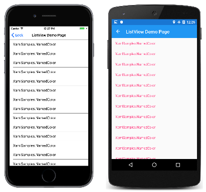
The resultant display establishes that the items are truly of type XamlSamples.NamedColor:
It’s not much information, but the ListView is scrollable and selectable.
To define a template for the items, you’ll want to break out the ItemTemplate property as a property element, and set it to a DataTemplate, which then references a ViewCell. To the View property of the ViewCell you can define a layout of one or more views to display each item. Here’s a simple example:
<ListView ItemsSource="{x:Static local:NamedColor.All}">
    <ListView.ItemTemplate>
        <DataTemplate>
            <ViewCell>
                <ViewCell.View>
                    <Label Text="{Binding FriendlyName}" />
                </ViewCell.View>
            </ViewCell>
        </DataTemplate>
    </ListView.ItemTemplate>
</ListView>
Note
The binding source for cells, and children of cells, is the ListView.ItemsSource collection.
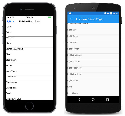
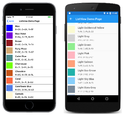
The Label element is set to the View property of the ViewCell. (The ViewCell.View tags are not needed because the View property is the content property of ViewCell.) This markup displays the FriendlyName property of each NamedColor object:
Much better. Now all that’s needed is to spruce up the item template with more information and the actual color. To support this template, some values and objects have been defined in the page’s resource dictionary:
<ContentPage xmlns="http://xamarin.com/schemas/2014/forms"
             xmlns:x="http://schemas.microsoft.com/winfx/2009/xaml"
             xmlns:local="clr-namespace:XamlSamples"
             x:Class="XamlSamples.ListViewDemoPage"
             Title="ListView Demo Page">

    <ContentPage.Resources>
        <ResourceDictionary>
            <OnPlatform x:Key="boxSize"
                        x:TypeArguments="x:Double">
                <On Platform="iOS, Android, UWP" Value="50" />
            </OnPlatform>

            <OnPlatform x:Key="rowHeight"
                        x:TypeArguments="x:Int32">
                <On Platform="iOS, Android, UWP" Value="60" />
            </OnPlatform>

            <local:DoubleToIntConverter x:Key="intConverter" />

        </ResourceDictionary>
    </ContentPage.Resources>

    <ListView ItemsSource="{x:Static local:NamedColor.All}"
              RowHeight="{StaticResource rowHeight}">
        <ListView.ItemTemplate>
            <DataTemplate>
                <ViewCell>
                    <StackLayout Padding="5, 5, 0, 5"
                                 Orientation="Horizontal"
                                 Spacing="15">

                        <BoxView WidthRequest="{StaticResource boxSize}"
                                 HeightRequest="{StaticResource boxSize}"
                                 Color="{Binding Color}" />

                        <StackLayout Padding="5, 0, 0, 0"
                                     VerticalOptions="Center">

                            <Label Text="{Binding FriendlyName}"
                                   FontAttributes="Bold"
                                   FontSize="Medium" />

                            <StackLayout Orientation="Horizontal"
                                         Spacing="0">
                                <Label Text="{Binding Color.R,
                                       Converter={StaticResource intConverter},
                                       ConverterParameter=255,
                                       StringFormat='R={0:X2}'}" />

                                <Label Text="{Binding Color.G,
                                       Converter={StaticResource intConverter},
                                       ConverterParameter=255,
                                       StringFormat=', G={0:X2}'}" />

                                <Label Text="{Binding Color.B,
                                       Converter={StaticResource intConverter},
                                       ConverterParameter=255,
                                       StringFormat=', B={0:X2}'}" />
                            </StackLayout>
                        </StackLayout>
                    </StackLayout>
                </ViewCell>
            </DataTemplate>
        </ListView.ItemTemplate>
    </ListView>
</ContentPage>
Notice the use of OnPlatform to define the size of a BoxView and the height of the ListView rows. Although the values for all the platforms are the same, the markup could easily be adapted for other values to fine-tune the display.
Binding Value Converters
The previous ListView Demo XAML file displays the individual R, G, and B properties of the Xamarin.Forms Color structure. These properties are of type double and range from 0 to 1. If you want to display the hexadecimal values, you can’t simply use StringFormat with an “X2” formatting specification. That only works for integers and besides, the double values need to be multiplied by 255.
This little problem was solved with a value converter, also called a binding converter. This is a class that implements the IValueConverter interface, which means it has two methods named Convert and ConvertBack. The Convert method is called when a value is transferred from source to target; the ConvertBack method is called for transfers from target to source in OneWayToSource or TwoWay bindings:
using System;
using System.Globalization;
using Xamarin.Forms;

namespace XamlSamples
{
    class DoubleToIntConverter : IValueConverter
    {
        public object Convert(object value, Type targetType,
                              object parameter, CultureInfo culture)
        {
            double multiplier;

            if (!Double.TryParse(parameter as string, out multiplier))
                multiplier = 1;

            return (int)Math.Round(multiplier * (double)value);
        }

        public object ConvertBack(object value, Type targetType,
                                  object parameter, CultureInfo culture)
        {
            double divider;

            if (!Double.TryParse(parameter as string, out divider))
                divider = 1;

            return ((double)(int)value) / divider;
        }
    }
}
The ConvertBack method does not play a role in this program because the bindings are only one way from source to target.
A binding references a binding converter with the Converter property. A binding converter can also accept a parameter specified with the ConverterParameter property. For some versatility, this is how the multiplier is specified. The binding converter checks the converter parameter for a valid double value.
The converter is instantiated in the resource dictionary so it can be shared among multiple bindings:
<local:DoubleToIntConverter x:Key="intConverter" />
Three data bindings reference this single instance. Notice that the Binding markup extension contains an embedded StaticResource markup extension:
<Label Text="{Binding Color.R,
                      Converter={StaticResource intConverter},
                      ConverterParameter=255,
                      StringFormat='R={0:X2}'}" />
Here’s the result:
The ListView is quite sophisticated in handling changes that might dynamically occur in the underlying data, but only if you take certain steps. If the collection of items assigned to the ItemsSource property of the ListView changes during runtime—that is, if items can be added to or removed from the collection—use an ObservableCollection class for these items. ObservableCollection implements the INotifyCollectionChanged interface, and ListView will install a handler for the CollectionChanged event.
If properties of the items themselves change during runtime, then the items in the collection should implement the INotifyPropertyChanged interface and signal changes to property values using the PropertyChanged event. This is demonstrated in the next part of this series, Part 5. From Data Binding to MVVM.
Summary
Data bindings provide a powerful mechanism for linking properties between two objects within a page, or between visual objects and underlying data. But when the application begins working with data sources, a popular application architectural pattern begins to emerge as a useful paradigm. This is covered in Part 5. From Data Bindings to MVVM.
