Xamarin.Forms Views
Xamarin.Forms views are the building blocks of cross-platform mobile user interfaces.
Views are user-interface objects such as labels, buttons, and sliders that are commonly known as controls or widgets in other graphical programming environments. The views supported by Xamarin.Forms all derive from the View class. They can be divided into several categories:
Views for presentation
| Type | Description | Appearance |
|---|---|---|
BoxView |
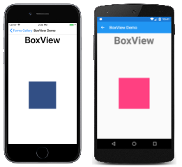
BoxView displays a solid rectangle colored by the Color property. BoxView has a default size request of 40x40. For other sizes, assign the WidthRequest and HeightRequest properties.API Documentation / Guide |
 C# code for this page / XAML page |
Ellipse |
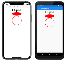
Ellipse displays an ellipse or circle of size WidthRequest x HeightRequest. To paint the inside of the ellipse, set its Fill property to a Color. To give the ellipse an outline, set its Stroke property to a Color.API Documentation / Guide |
 C# code for this page / XAML page |
Label |
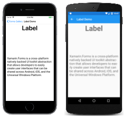
Label displays single-line text strings or multi-line blocks of text, either with constant or variable formatting. Set the Text property to a string for constant formatting, or set the FormattedText property to a FormattedString object for variable formatting.API Documentation / Guide |
 C# code for this page / XAML page |
Line |
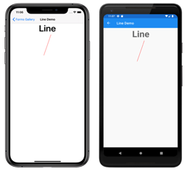
Line displays a line from a start point to an end point. The start point is represented by the X1 and Y1 properties, while the end point is represented by the X2 and Y2 properties. To color the line, set its Stroke property to a Color.API Documentation / Guide |
 C# code for this page / XAML page |
Image |
Image displays a bitmap. Bitmaps can be downloaded over the Web, embedded as resources in the common project or platform projects, or created using a .NET Stream object.API Documentation / Guide |
 C# code for this page / XAML page |
Map |
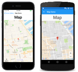
Map displays a map. The Xamarin.Forms.Maps NuGet package must be installed. Android and Universal Windows Platform require a map authorization key.API Documentation / Guide |
 C# code for this page / XAML page |
OpenGLView |
OpenGLView displays OpenGL graphics in iOS and Android projects. There is no support for the Universal Windows Platform. The iOS and Android projects require a reference to the OpenTK-1.0 assembly or the OpenTK version 1.0.0.0 assembly. OpenGLView is easier to use in a Shared Project; if used in a .NET Standard library, then a Dependency Service will also be required (as shown in the sample code).This is the only graphics facility that is built into Xamarin.Forms, but a Xamarin.Forms application can also render graphics using SkiaSharp, or UrhoSharp.API Documentation |
 C# code for this page / XAML page with code-behind |
Path |
Path displays curves and complex shapes. The Data property specifies the shape to be drawn. To color the shape, set its Stroke property to a Color.API Documentation / Guide |
 C# code for this page / XAML page |
Polygon |
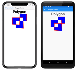
Polygon displays a polygon. The Points property specifies the vertex points of the polygon, while the FillRule property specifies how the interior fill of the polygon is determined. To paint the inside of the polygon, set its Fill property to a Color. To give the polygon an outline, set its Stroke property to a Color.API Documentation / Guide |
 C# code for this page / XAML page |
Polyline |
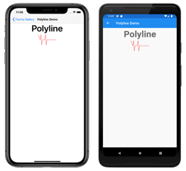
Polyline displays a series of connected straight lines. The Points property specifies the vertex points of the polyline, while the FillRule property specifies how the interior fill of the polyline is determined. To paint the inside of the polyline, set its Fill property to a Color. To give the polyline an outline, set its Stroke property to a Color.API Documentation / Guide |
 C# code for this page / XAML page |
Rectangle |
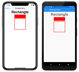
Rectangle displays a rectangle or square. To paint the inside of the rectangle, set its Fill property to a Color. To give the rectangle an outline, set its Stroke property to a Color.API Documentation / Guide |
 C# code for this page / XAML page |
WebView |
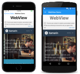
WebView displays Web pages or HTML content, based on whether the Source property is set to a UriWebViewSource or an HtmlWebViewSource object.API Documentation / Guide |
 C# code for this page / XAML page |
Views that initiate commands
| Type | Description | Appearance |
|---|---|---|
Button |
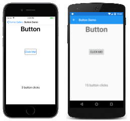
Button is a rectangular object that displays text, and which fires a Clicked event when it's been pressed.API Documentation / Guide |
 C# code for this page / XAML page with code-behind |
ImageButton |
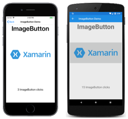
ImageButton is a rectangular object that displays an image, and which fires a Clicked event when it's been pressed.API Documentation / Guide |
 C# code for this page / XAML page with code-behind |
RadioButton |
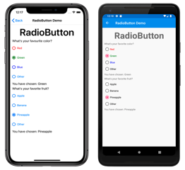
RadioButton allows the selection of one option from a set, and fires a CheckedChanged event when selection occurs.API Documentation / Guide |
 C# code for this page / XAML page with code-behind |
RefreshView |
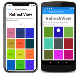
RefreshView is a container control that provides pull-to-refresh functionality for scrollable content. The ICommand defined by the Command property is executed when a refresh is triggered, and the IsRefreshing property indicates the current state of the control.API Documentation / Guide |
 C# code for this page / XAML page with code-behind |
SearchBar |
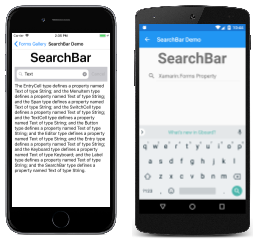
SearchBar displays an area for the user to type a text string, and a button (or a keyboard key) that signals the application to perform a search. The Text property provides access to the text, and the SearchButtonPressed event indicates that the button has been pressed.API Documentation / Guide |
 C# code for this page / XAML page with code-behind |
SwipeView |
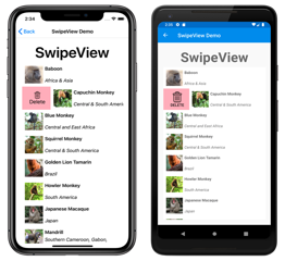
SwipeView is a container control that wraps around an item of content, and provides context menu items that are revealed by a swipe gesture. Each menu item is represented by a SwipeItem, which has a Command property that executes an ICommand when the item is tapped.API Documentation / Guide |
 C# code for this page / XAML page with code-behind |
Views for setting values
| Type | Description | Appearance |
|---|---|---|
CheckBox |
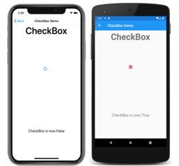
CheckBox allows the user to select a Boolean value using a type of button that can either be checked or empty. The IsChecked property is the state of the CheckBox, and the CheckedChanged event is fired when the state changes.API Documentation / Guide |
 C# code for this page / XAML page |
Slider |
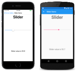
Slider allows the user to select a double value from a continuous range specified with the Minimum and Maximum properties.API Documentation / Guide |
 C# code for this page / XAML page |
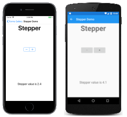
Stepper |
Stepper allows the user to select a double value from a range of incremental values specified with the Minimum, Maximum, and Increment properties.API Documentation / Guide |
 C# code for this page / XAML page |
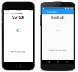
Switch |
Switch takes the form of an on/off switch to allow the user to select a Boolean value. The IsToggled property is the state of the switch, and the Toggled event is fired when the state changes.API Documentation / Guide |
 C# code for this page / XAML page |
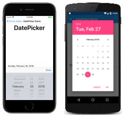
DatePicker |
DatePicker allows the user to select a date with the platform date picker. Set a range of allowable dates with the MinimumDate and MaximumDate properties. The Date property is the selected date, and the DateSelected event is fired when that property changes.API Documentation / Guide |
 C# code for this page / XAML page |
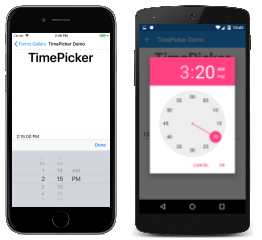
TimePicker |
TimePicker allows the user to select a time with the platform time picker. The Time property is the selected time. An application can monitor changes in the Time property by installing a handler for the PropertyChanged event.API Documentation / Guide |
 C# code for this page / XAML page |
Views for editing text
These two classes derive from the InputView class, which defines the Keyboard property:
| Type | Description | Appearance |
|---|---|---|
Entry |
Entry allows the user to enter and edit a single line of text. The text is available as the Text property, and the TextChanged and Completed events are fired when the text changes or the user signals completion by tapping the enter key.Use an Editor for entering and editing multiple lines of text.API Documentation / Guide |
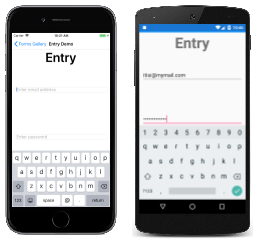 C# code for this page / XAML page |
Editor |
Editor allows the user to enter and edit multiple lines of text. The text is available as the Text property, and the TextChanged and Completed events are fired when the text changes or the user signals completion.Use an Entry view for entering and editing a single line of text.API Documentation / Guide |
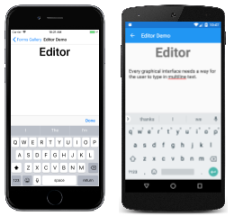 C# code for this page / XAML page |
Views to indicate activity
| Type | Description | Appearance |
|---|---|---|
ActivityIndicator |
ActivityIndicator uses an animation to show that the application is engaged in a lengthy activity without giving any indication of progress. The IsRunning property controls the animation.If the activity's progress is known, use a ProgressBar instead.API Documentation / Guide |
 C# code for this page / XAML page |
ProgressBar |
ProgressBar uses an animation to show that the application is progressing through a lengthy activity. Set the Progress property to values between 0 and 1 to indicate the progress.If the activity's progress is not known, use an ActivityIndicator instead.API Documentation / Guide |
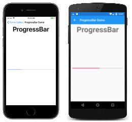 C# code for this page / XAML page with code-behind |
Views that display collections
| Type | Description | Appearance |
|---|---|---|
CarouselView |
CarouselView displays a scrollable list of data items. Set the ItemsSource property to a collection of objects, and set the ItemTemplate property to a DataTemplate object describing how the items are to be formatted. The CurrentItemChanged event signals that the currently displayed item has changed, which is available as the CurrentItem property.Guide |
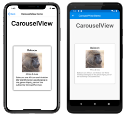 C# code for this page / XAML page |
CollectionView |
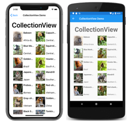
CollectionView displays a scrollable list of selectable data items, using different layout specifications. It aims to provide a more flexible, and performant alternative to ListView. Set the ItemsSource property to a collection of objects, and set the ItemTemplate property to a DataTemplate object describing how the items are to be formatted. The SelectionChanged event signals that a selection has been made, which is available as the SelectedItem property.Guide |
 C# code for this page / XAML page |
IndicatorView |
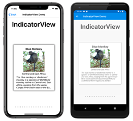
IndicatorView displays indicators that represent the number of items in a CarouselView. Set the CarouselView.IndicatorView property to the IndicatorView object to display indicators for the CarouselView.API Documentation / Guide |
 C# code for this page / XAML page |
ListView |
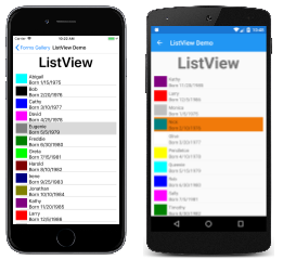
ListView derives from ItemsView and displays a scrollable list of selectable data items. Set the ItemsSource property to a collection of objects, and set the ItemTemplate property to a DataTemplate object describing how the items are to be formatted. The ItemSelected event signals that a selection has been made, which is available as the SelectedItem property.API Documentation / Guide |
 C# code for this page / XAML page |
Picker |
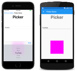
Picker displays a selected item from a list of text strings, and allows selecting that item when the view is tapped. Set the Items property to a list of strings, or the ItemsSource property to a collection of objects. The SelectedIndexChanged event is fired when an item is selected.The Picker displays the list of items only when it's selected. Use a ListView or TableView for a scrollable list that remains on the page.API Documentation / Guide |
 C# code for this page / XAML page with code-behind |
TableView |
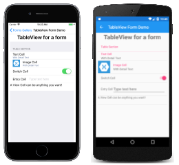
TableView displays a list of rows of type Cell with optional headers and subheaders. Set the Root property to an object of type TableRoot, and add TableSection objects to that TableRoot. Each TableSection is a collection of Cell objects.API Documentation / Guide |
 C# code for this page / XAML page |