Working with watchOS Layout in Xamarin
Designing layouts for the Apple Watch screen sizes presents unique challenges.
Design Tips
The key point is: make your user interface readable and useable on a small watch screen, with a large finger. Don't fall into the trap of designing for the iOS Simulator (which appears very large) and a mouse pointer (which works with tiny touch targets)!
Use a black background - it creates the illusion of a larger screen with the watch's black bezel.
Do not pad around your screen layout - the bezel forms a natural visual padding.
Focus on readability. Use font sizes and colors judiciously to ensure text is readable. Use the built-in text styles to get automatic Dynamic Type support.
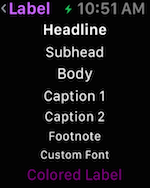
Focus on touch target sizes. Buttons/tappable table rows with text labels should span the whole screen. Apple says "never place more than three items side-by-side", and if you do use icons and not text labels.
Use the
Menucontrol to expose less-frequently used functionality to keep your app design clear and concise.
Implementation
Watch Kit includes the following controls to help you build attractive watch app layouts:
Interface Controller
The WKInterfaceController is the base class all
of your scenes.
The design surface for the interface controller behaves like a vertical Group: you can drag other controls onto the interface controller and they will be automatically laid-out one above the other:
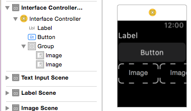
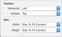
You can set the Position and Size properties on each control to control their appearance:
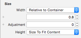
When the size is set to Relative to Container you can provide a proportional value and an offset adjustment. This screenshot shows a button that has been set to use 80% of the watch screen's width (0.8):
Group
WKInterfaceGroup is a simple layout container that
can be configured to stack controls vertically or
horizontally. It includes spacing between each control
by default, but you can modify the spacing (and insets)
in the Attributes inspector.
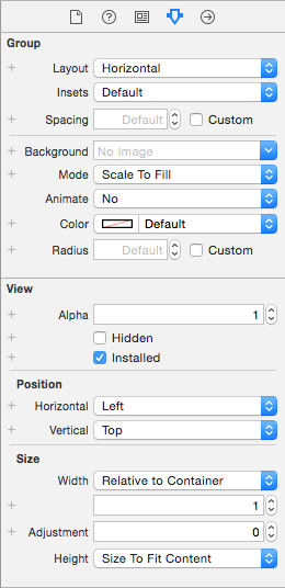
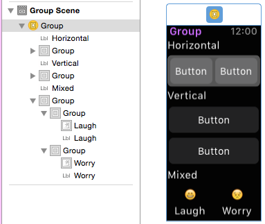
Groups can themselves be sized and positioned relative to the controls around them, and groups can be nested to create complex layouts.
Separator
The separator control is intended to help provide visual guidance in your layout. Use separators (or background colors or images) to help the user understand which content is related on your screen.
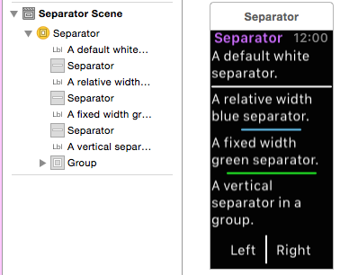
Note the blue and green separators that don't use the full width of the screen have been configured with either Fixed or Relative to Container sizes.
Content Controls
No layout would be complete without the Label, Image,
Button, Switch, Slider, Map, and
other controls.
These can be positioned in your layouts using Groups
or the position and size settings on each control.