ScrollView
The .NET Multi-platform App UI (.NET MAUI) ScrollView is a view that's capable of scrolling its content. By default, ScrollView scrolls its content vertically. A ScrollView can only have a single child, although this can be other layouts.
ScrollView defines the following properties:
Content, of type View, represents the content to display in the ScrollView.ContentSize, of typeSize, represents the size of the content. This is a read-only property.HorizontalScrollBarVisibility, of typeScrollBarVisibility, represents when the horizontal scroll bar is visible.Orientation, of typeScrollOrientation, represents the scrolling direction of the ScrollView. The default value of this property isVertical.ScrollX, of typedouble, indicates the current X scroll position. The default value of this read-only property is 0.ScrollY, of typedouble, indicates the current Y scroll position. The default value of this read-only property is 0.VerticalScrollBarVisibility, of typeScrollBarVisibility, represents when the vertical scroll bar is visible.
These properties are backed by BindableProperty objects, with the exception of the Content property, which means that they can be targets of data bindings and styled.
The Content property is the ContentProperty of the ScrollView class, and therefore does not need to be explicitly set from XAML.
Warning
ScrollView objects should not be nested. In addition, ScrollView objects should not be nested with other controls that provide scrolling, such as CollectionView, ListView, and WebView.
ScrollView as a root layout
A ScrollView can only have a single child, which can be other layouts. It's therefore common for a ScrollView to be the root layout on a page. To scroll its child content, ScrollView computes the difference between the height of its content and its own height. That difference is the amount that the ScrollView can scroll its content.
A StackLayout will often be the child of a ScrollView. In this scenario, the ScrollView causes the StackLayout to be as tall as the sum of the heights of its children. Then the ScrollView can determine the amount that its content can be scrolled. For more information about the StackLayout, see StackLayout.
Caution
In a vertical ScrollView, avoid setting the VerticalOptions property to Start, Center, or End. Doing so tells the ScrollView to be only as tall as it needs to be, which could be zero. While .NET MAUI protects against this eventuality, it's best to avoid code that suggests something you don't want to happen.
The following XAML example has a ScrollView as a root layout on a page:
<ContentPage xmlns="http://schemas.microsoft.com/dotnet/2021/maui"
             xmlns:x="http://schemas.microsoft.com/winfx/2009/xaml"
             xmlns:local="clr-namespace:ScrollViewDemos"
             x:Class="ScrollViewDemos.Views.XAML.ColorListPage"
             Title="ScrollView demo">
    <ScrollView Margin="20">
        <StackLayout BindableLayout.ItemsSource="{x:Static local:NamedColor.All}">
            <BindableLayout.ItemTemplate>
                <DataTemplate>
                    <StackLayout Orientation="Horizontal">
                        <BoxView Color="{Binding Color}"
                                 HeightRequest="32"
                                 WidthRequest="32"
                                 VerticalOptions="Center" />
                        <Label Text="{Binding FriendlyName}"
                               FontSize="24"
                               VerticalOptions="Center" />
                    </StackLayout>
                </DataTemplate>
            </BindableLayout.ItemTemplate>
        </StackLayout>
    </ScrollView>
</ContentPage>
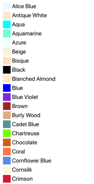
In this example, the ScrollView has its content set to a StackLayout that uses a bindable layout to display the Colors fields defined by .NET MAUI. By default, a ScrollView scrolls vertically, which reveals more content:

The equivalent C# code is:
public class ColorListPage : ContentPage
{
    public ColorListPage()
    {
        DataTemplate dataTemplate = new DataTemplate(() =>
        {
            BoxView boxView = new BoxView
            {
                HeightRequest = 32,
                WidthRequest = 32,
                VerticalOptions = LayoutOptions.Center
            };
            boxView.SetBinding(BoxView.ColorProperty, "Color");

            Label label = new Label
            {
                FontSize = 24,
                VerticalOptions = LayoutOptions.Center
            };
            label.SetBinding(Label.TextProperty, "FriendlyName");

            StackLayout horizontalStackLayout = new StackLayout
            {
                Orientation = StackOrientation.Horizontal
            };
            horizontalStackLayout.Add(boxView);
            horizontalStackLayout.Add(label);

            return horizontalStackLayout;
        });

        StackLayout stackLayout = new StackLayout();
        BindableLayout.SetItemsSource(stackLayout, NamedColor.All);
        BindableLayout.SetItemTemplate(stackLayout, dataTemplate);

        ScrollView scrollView = new ScrollView
        {
            Margin = new Thickness(20),
            Content = stackLayout
        };

        Title = "ScrollView demo";
        Content = scrollView;
    }
}
For more information about bindable layouts, see BindableLayout.
ScrollView as a child layout
A ScrollView can be a child layout to a different parent layout.
A ScrollView will often be the child of a Grid. A ScrollView requires a specific height to compute the difference between the height of its content and its own height, with the difference being the amount that the ScrollView can scroll its content. When a ScrollView is the child of a Grid, it doesn't receive a specific height. The Grid wants the ScrollView to be as short as possible, which is either the height of the ScrollView contents or zero. To handle this scenario, the RowDefinition of the Grid row that contains the ScrollView should be set to *. This will cause the Grid to give the ScrollView all the extra space not required by the other children, and the ScrollView will then have a specific height.
The following XAML example has a ScrollView as a child layout to a Grid:
<ContentPage xmlns="http://schemas.microsoft.com/dotnet/2021/maui"
             xmlns:x="http://schemas.microsoft.com/winfx/2009/xaml"
             x:Class="ScrollViewDemos.Views.XAML.BlackCatPage"
             Title="ScrollView as a child layout demo">
    <Grid Margin="20"
          RowDefinitions="Auto,*,Auto">
        <Label Text="THE BLACK CAT by Edgar Allan Poe"
               FontSize="14"
               FontAttributes="Bold"
               HorizontalOptions="Center" />
        <ScrollView x:Name="scrollView"
                    Grid.Row="1"
                    VerticalOptions="FillAndExpand"
                    Scrolled="OnScrollViewScrolled">
            <StackLayout>
                <Label Text="FOR the most wild, yet most homely narrative which I am about to pen, I neither expect nor solicit belief. Mad indeed would I be to expect it, in a case where my very senses reject their own evidence. Yet, mad am I not -- and very surely do I not dream. But to-morrow I die, and to-day I would unburthen my soul. My immediate purpose is to place before the world, plainly, succinctly, and without comment, a series of mere household events. In their consequences, these events have terrified -- have tortured -- have destroyed me. Yet I will not attempt to expound them. To me, they have presented little but Horror -- to many they will seem less terrible than barroques. Hereafter, perhaps, some intellect may be found which will reduce my phantasm to the common-place -- some intellect more calm, more logical, and far less excitable than my own, which will perceive, in the circumstances I detail with awe, nothing more than an ordinary succession of very natural causes and effects." />
                <!-- More Label objects go here -->
            </StackLayout>
        </ScrollView>
        <Button Grid.Row="2"
                Text="Scroll to end"
                Clicked="OnButtonClicked" />
    </Grid>
</ContentPage>
In this example, the root layout is a Grid that has a Label, ScrollView, and Button as its children. The ScrollView has a StackLayout as its content, with the StackLayout containing multiple Label objects. This arrangement ensures that the first Label is always on-screen, while text displayed by the other Label objects can be scrolled:

The equivalent C# code is:
public class BlackCatPage : ContentPage
{
    public BlackCatPage()
    {
        Label titleLabel = new Label
        {
            Text = "THE BLACK CAT by Edgar Allan Poe",
            // More properties set here to define the Label appearance
        };

        StackLayout stackLayout = new StackLayout();
        stackLayout.Add(new Label { Text = "FOR the most wild, yet most homely narrative which I am about to pen, I neither expect nor solicit belief. Mad indeed would I be to expect it, in a case where my very senses reject their own evidence. Yet, mad am I not -- and very surely do I not dream. But to-morrow I die, and to-day I would unburthen my soul. My immediate purpose is to place before the world, plainly, succinctly, and without comment, a series of mere household events. In their consequences, these events have terrified -- have tortured -- have destroyed me. Yet I will not attempt to expound them. To me, they have presented little but Horror -- to many they will seem less terrible than barroques. Hereafter, perhaps, some intellect may be found which will reduce my phantasm to the common-place -- some intellect more calm, more logical, and far less excitable than my own, which will perceive, in the circumstances I detail with awe, nothing more than an ordinary succession of very natural causes and effects." });
        // More Label objects go here

        ScrollView scrollView = new ScrollView();
        scrollView.Content = stackLayout;
        // ...

        Title = "ScrollView as a child layout demo";
        Grid grid = new Grid
        {
            Margin = new Thickness(20),
            RowDefinitions =
            {
                new RowDefinition { Height = new GridLength(0, GridUnitType.Auto) },
                new RowDefinition { Height = new GridLength(1, GridUnitType.Star) },
                new RowDefinition { Height = new GridLength(0, GridUnitType.Auto) }
            }
        };
        grid.Add(titleLabel);
        grid.Add(scrollView, 0, 1);
        grid.Add(button, 0, 2);

        Content = grid;
    }
}
Orientation
ScrollView has an Orientation property, which represents the scrolling direction of the ScrollView. This property is of type ScrollOrientation, which defines the following members:
Verticalindicates that the ScrollView will scroll vertically. This member is the default value of theOrientationproperty.Horizontalindicates that the ScrollView will scroll horizontally.Bothindicates that the ScrollView will scroll horizontally and vertically.Neitherindicates that the ScrollView won't scroll.
Tip
Scrolling can be disabled by setting the Orientation property to Neither.
Detect scrolling
ScrollView defines a Scrolled event that's raised to indicate that scrolling occurred. The ScrolledEventArgs object that accompanies the Scrolled event has ScrollX and ScrollY properties, both of type double.
Important
The ScrolledEventArgs.ScrollX and ScrolledEventArgs.ScrollY properties can have negative values, due to the bounce effect that occurs when scrolling back to the start of a ScrollView.
The following XAML example shows a ScrollView that sets an event handler for the Scrolled event:
<ScrollView Scrolled="OnScrollViewScrolled">
    ...
</ScrollView>
The equivalent C# code is:
ScrollView scrollView = new ScrollView();
scrollView.Scrolled += OnScrollViewScrolled;
In this example, the OnScrollViewScrolled event handler is executed when the Scrolled event fires:
void OnScrollViewScrolled(object sender, ScrolledEventArgs e)
{
    Console.WriteLine($"ScrollX: {e.ScrollX}, ScrollY: {e.ScrollY}");
}
In this example, the OnScrollViewScrolled event handler outputs the values of the ScrolledEventArgs object that accompanies the event.
Note
The Scrolled event is raised for user initiated scrolls, and for programmatic scrolls.
Scroll programmatically
ScrollView defines two ScrollToAsync methods, that asynchronously scroll the ScrollView. One of the overloads scrolls to a specified position in the ScrollView, while the other scrolls a specified element into view. Both overloads have an additional argument that can be used to indicate whether to animate the scroll.
Important
The ScrollToAsync methods will not result in scrolling when the ScrollView.Orientation property is set to Neither.
Scroll a position into view
A position within a ScrollView can be scrolled to with the ScrollToAsync method that accepts double x and y arguments. Given a vertical ScrollView object named scrollView, the following example shows how to scroll to 150 device-independent units from the top of the ScrollView:
await scrollView.ScrollToAsync(0, 150, true);
The third argument to the ScrollToAsync is the animated argument, which determines whether a scrolling animation is displayed when programmatically scrolling a ScrollView.
Scroll an element into view
An element within a ScrollView can be scrolled into view with the ScrollToAsync method that accepts Element and ScrollToPosition arguments. Given a vertical ScrollView named scrollView, and a Label named label, the following example shows how to scroll an element into view:
await scrollView.ScrollToAsync(label, ScrollToPosition.End, true);
The third argument to the ScrollToAsync is the animated argument, which determines whether a scrolling animation is displayed when programmatically scrolling a ScrollView.
When scrolling an element into view, the exact position of the element after the scroll has completed can be set with the second argument, position, of the ScrollToAsync method. This argument accepts a ScrollToPosition enumeration member:
MakeVisibleindicates that the element should be scrolled until it's visible in the ScrollView.Startindicates that the element should be scrolled to the start of the ScrollView.Centerindicates that the element should be scrolled to the center of the ScrollView.Endindicates that the element should be scrolled to the end of the ScrollView.
Scroll bar visibility
ScrollView defines HorizontalScrollBarVisibility and VerticalScrollBarVisibility properties, which are backed by bindable properties. These properties get or set a ScrollBarVisibility enumeration value that represents whether the horizontal, or vertical, scroll bar is visible. The ScrollBarVisibility enumeration defines the following members:
Defaultindicates the default scroll bar behavior for the platform, and is the default value of theHorizontalScrollBarVisibilityandVerticalScrollBarVisibilityproperties.Alwaysindicates that scroll bars will be visible, even when the content fits in the view.Neverindicates that scroll bars will not be visible, even if the content doesn't fit in the view.
 Browse the sample