Prise en charge de la section arrière-plans
À compter de SharePoint Framework v1.8, les composants WebPart peuvent être informés des arrière-plans de section et utiliser ces couleurs pour améliorer l’apparence d’un composant WebPart lorsqu’il est hébergé dans une section avec un arrière-plan différent.
Configuration de votre section pour utiliser un autre arrière-plan
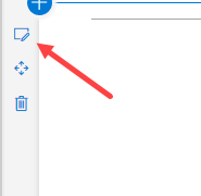
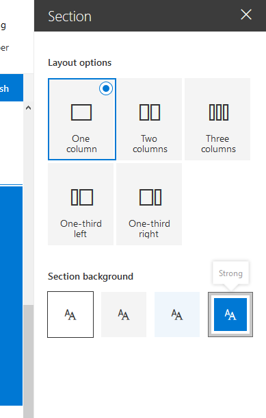
La couleur d’arrière-plan de la section que vous pouvez définir est basée sur la couleur principale du thème que vous avez appliqué. Pour définir l’arrière-plan d’une section, ouvrez ses propriétés :
Dans les propriétés, vous pouvez définir le type d’arrière-plan de section que vous souhaitez définir :
Prise en compte du thème de votre composant WebPart
Mise à jour du manifeste
Vous devez ajouter une supportsThemeVariants propriété au manifeste de votre composant WebPart et définir sa valeur sur true:
{
  // ...

  "supportsThemeVariants": true,

  "version": "*",
  "manifestVersion": 2,

  "requiresCustomScript": false,

  "preconfiguredEntries": [{
    // ...
  }]
}
Utiliser la reconnaissance des couleurs d’arrière-plan dans les composants WebPart non React
Pour que le composant WebPart soit informé des modifications apportées au thème, vous devez implémenter la prise en charge du ThemeProvider service qui déclenchera un événement en cas de modification du thème.
import {
  ThemeProvider,
  ThemeChangedEventArgs,
  IReadonlyTheme,
  ISemanticColors
} from '@microsoft/sp-component-base';

...

private _themeProvider: ThemeProvider;
private _themeVariant: IReadonlyTheme | undefined;

protected onInit(): Promise<void> {
  // Consume the new ThemeProvider service
  this._themeProvider = this.context.serviceScope.consume(ThemeProvider.serviceKey);

  // If it exists, get the theme variant
  this._themeVariant = this._themeProvider.tryGetTheme();

  // Register a handler to be notified if the theme variant changes
  this._themeProvider.themeChangedEvent.add(this, this._handleThemeChangedEvent);

  return super.onInit();
}

/**
 * Update the current theme variant reference and re-render.
 *
 * @param args The new theme
 */
private _handleThemeChangedEvent(args: ThemeChangedEventArgs): void {
  this._themeVariant = args.theme;
  this.render();
}
À l’aide du ThemeProvider , nous pouvons maintenant récupérer la couleur de corps de texte correcte :
public render(): void {
  const semanticColors: Readonly<ISemanticColors> | undefined = this._themeVariant && this._themeVariant.semanticColors;

  const style: string = ` style="background-color:${semanticColors.bodyBackground}"`;

  this.domElement.innerHTML = `<p${'' || (this._themeProvider && style)}>this is a demo</p>`;
}
Utiliser la reconnaissance des couleurs d’arrière-plan dans les composants WebPart basés sur React
Pour un composant WebPart basé sur React, vous devez implémenter du code pour consommer le ThemeProvider, comme avec un composant WebPart de base :
import {
  ThemeProvider,
  ThemeChangedEventArgs,
  IReadonlyTheme
} from '@microsoft/sp-component-base';
...

private _themeProvider: ThemeProvider;
private _themeVariant: IReadonlyTheme | undefined;

protected onInit(): Promise<void> {
  // Consume the new ThemeProvider service
  this._themeProvider = this.context.serviceScope.consume(ThemeProvider.serviceKey);

  // If it exists, get the theme variant
  this._themeVariant = this._themeProvider.tryGetTheme();

  // Register a handler to be notified if the theme variant changes
  this._themeProvider.themeChangedEvent.add(this, this._handleThemeChangedEvent);

  return super.onInit();
}

/**
 * Update the current theme variant reference and re-render.
 *
 * @param args The new theme
 */
private _handleThemeChangedEvent(args: ThemeChangedEventArgs): void {
  this._themeVariant = args.theme;
  this.render();
}
Maintenant, pour utiliser la variante de thème dans votre composant, vous devez envoyer la variante de thème à votre composant dans la render() méthode :
public render(): void {
  const element: React.ReactElement<IBasicSectionBackgroundExampleProps > = React.createElement(
    BasicSectionBackgroundExample,
    {
      themeVariant: this._themeVariant
    }
  );

  ReactDom.render(element, this.domElement);
}
Pour utiliser cette propriété dans votre composant, vous devez l’ajouter à votre définition d’interface de propriétés, qui dans ce cas est appelée IBasicSectionBackgroundExampleProps:
import { IReadonlyTheme } from '@microsoft/sp-component-base';

export interface IBasicSectionBackgroundExampleProps {
  themeVariant: IReadonlyTheme | undefined;
}
Ensuite, dans la méthode de rendu du composant, vous pouvez récupérer les couleurs correctes comme suit :
public render(): React.ReactElement<IBasicSectionBackgroundExampleProps> {

  const { semanticColors }: IReadonlyTheme = this.props.themeVariant;

  return (
    <div style={{backgroundColor: semanticColors.bodyBackground}}>
      <p>This React web part has support for section backgrounds and will inherit its background from the section</p>
    </div>
  );
}