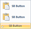
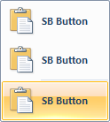
MenuGroup element
Represents a container of controls to display in a gallery, menu, or toolbar.
Usage
<MenuGroup
  Class = "xs:string"
  CommandName = "xs:positiveInteger or xs:string">
  child elements
</MenuGroup>
Attributes
| Attribute | Type | Required | Description |
|---|---|---|---|
| Class |
xs:string |
No |
Specifies the size and layout style for elements in the menu UI. An image resource can be supplied in two sizes (large and small) and associated with the element in markup using the Command.LargeImages and Command.SmallImages property elements. If only one image is supplied, the framework resizes it as necessary. Restricted to one of the following values: Style: small image and de-emphasized text.  Note:
|
| CommandName |
xs:positiveInteger or xs:string |
No |
Associates the element with a Command. The value must be unique within the Ribbon XML document. Maximum length: 100 characters. |
Child elements
| Element | Description |
|---|---|
| Button |
May occur one or more times |
| CheckBox |
May occur one or more times |
| ComboBox |
May occur one or more times |
| DropDownButton |
May occur one or more times |
| DropDownColorPicker |
May occur one or more times |
| DropDownGallery |
May occur one or more times |
| FontControl |
May occur at most once |
| SplitButton |
May occur one or more times |
| SplitButtonGallery |
May occur one or more times |
| ToggleButton |
May occur one or more times |
Parent elements
| Element |
|---|
| ApplicationMenu |
| ContextMenu |
| DropDownButton |
| DropDownGallery.MenuGroups |
| InRibbonGallery.MenuGroups |
| MiniToolbar |
| SplitButton.MenuGroups |
| SplitButtonGallery.MenuGroups |
Remarks
Required.
Must occur at least once for each ApplicationMenu, ContextMenu, DropDownButton, DropDownGallery.MenuGroups, InRibbonGallery.MenuGroups, SplitButton.MenuGroups, MiniToolbar, or SplitButtonGallery.MenuGroups element.
If ApplicationMenu is the parent element then MenuGroup is constrained to the following child elements: Button, DropDownButton, DropDownGallery, SplitButton, or SplitButtonGallery.
If ContextMenu, DropDownButton, DropDownGallery.MenuGroups, InRibbonGallery.MenuGroups, SplitButton.MenuGroups, or SplitButtonGallery.MenuGroups is the parent element then MenuGroup is constrained to the following child elements: Button, CheckBox, DropDownButton, DropDownColorPicker, DropDownGallery, SplitButton, SplitButtonGallery, or ToggleButton.
If MiniToolbar is the parent element then MenuGroup is constrained to the following child elements: Button, CheckBox, ComboBox, DropDownButton, DropDownColorPicker, DropDownGallery, FontControl, Spinner, SplitButton, SplitButtonGallery, or ToggleButton.
The Class attribute is not required when ApplicationMenu is the parent element. The framework enforces a value of MajorItems for the Class attribute.
When ApplicationMenu is the parent element the Class attribute is not required.
Examples
The following example demonstrates the basic markup for the SplitButton with a MenuGroup element.
This section of code shows the SplitButton and MenuGroup Command declarations with a large and a small image resource. An associated Group that acts as the parent container for the SplitButton element is also declared.
<!-- SplitButton -->
<Command Name="cmdSplitButtonGroup"
         Symbol="cmdSplitButtonGroup"
         Comment="SplitButton Group"
         LabelTitle="SplitButton"/>
<Command Name="cmdSplitButton"
         Symbol="cmdSplitButton"
         Comment="SplitButton"
         LabelTitle="SplitButton"/>
<Command Name="cmdSBButtonItem"
         Symbol="cmdSBButtonItem"
         Comment="SBButtonItem"
         LabelTitle="SB ButtonItem"/>
<Command Name="cmdSBButton1"
         Symbol="cmdSBButton1"
         Comment="SBButton1"
         LabelTitle="SB Button">
  <Command.LargeImages>
    <Image Source="res/copyL_32.bmp"/>
  </Command.LargeImages>
  <Command.SmallImages>
    <Image Source="res/copyS_16.bmp"/>
  </Command.SmallImages>
  <Command.LargeHighContrastImages>
    <Image Source="res/copyLHC_32.bmp"/>
  </Command.LargeHighContrastImages>
  <Command.SmallHighContrastImages>
    <Image Source="res/copySHC_16.bmp"/>
  </Command.SmallHighContrastImages>
</Command>
<Command Name="cmdSBMajorItems"
         Comment="Major Items Category"
         LabelTitle="Major Items"/>
<Command Name="cmdSBStandardItems"
         Comment="Standard Items Category"
         LabelTitle="Standard Items"/>
This section of code shows the SplitButton and MenuGroup control declarations with both StandardItems and MajorItems.
<Group CommandName="cmdSplitButtonGroup">
  <SplitButton CommandName="cmdSplitButton">
    <SplitButton.ButtonItem>
      <Button CommandName="cmdSBButtonItem"/>
    </SplitButton.ButtonItem>
    <SplitButton.MenuGroups>
      <MenuGroup CommandName="cmdSBMajorItems"
                 Class="MajorItems">
        <Button CommandName="cmdSBButton1"/>
        <Button CommandName="cmdSBButton1"/>
      </MenuGroup>
      <MenuGroup CommandName="cmdSBStandardItems"
                 Class="StandardItems">
        <Button CommandName="cmdSBButton1"/>
        <Button CommandName="cmdSBButton1"/>
      </MenuGroup>
      <MenuGroup Class="StandardItems">
        <Button CommandName="cmdSBButton1"/>
        <Button CommandName="cmdSBButton1"/>
      </MenuGroup>
    </SplitButton.MenuGroups>
  </SplitButton>
</Group>
Element information
- Minimum supported system: Windows 7
- Can be empty: No
