Drop-Down Color Picker
The Windows Ribbon framework provides a specialized Drop-Down Color Picker control that exposes a variety of color settings through a split button and customizable drop-down color selector.
Introduction
By emulating the appearance and functionality of the Microsoft Office color picker, the Ribbon framework is able to both benefit from, and contribute to, consistency and familiarity across a wide range of applications.
Markup
Like all Ribbon controls, the Drop-Down Color Picker is easily implemented and customized through markup. The framework provides a number of element attributes for the Drop-Down Color Picker to expose various levels of functionality. The following table lists the Drop-Down Color Picker attributes.
| Attribute | Description |
|---|---|
| ColorTemplate | Layout templates that specify the type of Drop-Down Color Picker. There are three templates, each of which specifies a control layout and default values for associated attributes and property keys.
|
| ChipSize | The size of each color chip (or swatch).
|
| Columns | The number of color chip (or swatch) columns. |
| CommandName | The name of the associated Command declaration. |
| IsAutomaticColorButtonVisible | Displays (or hides) the Automatic button. Valid only when ColorTemplate has a value of ThemeColors or StandardColors. |
| IsNoColorButtonVisible | Displays (or hides) the No color button. Valid for all ColorTemplate values. |
| RecentColorGridRows | The number of color chip (or swatch) rows in the Recent colors area. Valid only when ColorTemplate has a value of ThemeColors. |
| StandardColorGridRows | The number of color chip (or swatch) rows in the Standard colors area. |
| ThemeColorGridRows | The number of color chip (or swatch) rows in the Theme colors area. Valid only when ColorTemplate has a value of ThemeColors. |
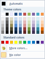
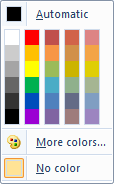
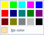
The following screen shots illustrate the default Drop-Down Color Picker layouts for the three color templates.
ThemeColors:[newline]  [newline] [newline] |
standardcolors:[newline]  [newline] [newline] |
highlightcolors:[newline]  |
The basic markup required for each Drop-Down Color Picker type is demonstrated in the following examples:
Note
The Drop-Down Color Picker is a valid Button control in a SizeDefinition template.
<!-- DropDownColorPickers -->
<Command Name="cmdDropDownColorPickerGroup"
         Symbol="cmdDropDownColorPickerGroup"
         Comment="DropDownColorPicker Group"
         Id="55000"/>
<Command Name="cmdDropDownColorPickerThemeColors"
         Symbol="cmdDropDownColorPickerThemeColors"
         Comment="DropDownColorPicker ThemeColors"
         Id="55010"
         LabelTitle="ThemeColors"
         LabelDescription="ThemeColors\ndescription."/>
<Command Name="cmdDropDownColorPickerStandardColors"
         Symbol="cmdDropDownColorPickerStandardColors"
         Comment="DropDownColorPicker StandardColors"
         Id="55011"
         LabelTitle="StandardColors"/>
<Command Name="cmdDropDownColorPickerHighlightColors"
         Symbol="cmdDropDownColorPickerHighlightColors"
         Comment="DropDownColorPicker HighlightColors"
         Id="55012"
         LabelTitle="HighlightColors"/>
<Group CommandName="cmdDropDownColorPickerGroup"
SizeDefinition="ThreeButtons">
<DropDownColorPicker
CommandName="cmdDropDownColorPickerThemeColors"
ColorTemplate="ThemeColors"/>
<DropDownColorPicker
CommandName="cmdDropDownColorPickerStandardColors"
ColorTemplate="StandardColors"/>
<DropDownColorPicker
CommandName="cmdDropDownColorPickerHighlightColors"
ColorTemplate="HighlightColors"
StandardColorGridRows="1"/>
</Group>
Code
As a specialized control that supports customization, any implemention of the Drop-Down Color Picker that takes advantage of these capabilities requires specialized application code to manage properties and handle any Commands issued by the control.
Properties
The Ribbon framework defines a collection of property keys for the Drop-Down Color Picker control.
Typically, a Drop-Down Color Picker property is updated in the ribbon UI by invalidating the Command associated with the control through a call to the IUIFramework::InvalidateUICommand method. The invalidation event is handled, and the property updates defined, by the IUICommandHandler::UpdateProperty callback method.
The IUICommandHandler::UpdateProperty callback method is not executed, and the application queried for an updated property value, until the property is required by the framework. For example, when a tab is activated and a control revealed in the ribbon UI, or when a tooltip is displayed.
Note
In some cases, a property can be retrieved through the IUIFramework::GetUICommandProperty method and set with the IUIFramework::SetUICommandProperty method.
The following table lists the property keys that are associated with the Drop-Down Color Picker control.
| Property Key | Description | Notes |
|---|---|---|
| UI_PKEY_AutomaticColorLabel | Defines the label for the Automatic color button. Only valid when ColorTemplate has a value of ThemeColors or StandardColors. |
Supports IUIFramework::GetUICommandProperty and IUIFramework::SetUICommandProperty. |
| UI_PKEY_Color | Defines the selected color value as a COLORREF. Only valid when UI_PKEY_ColorType has a value of UI_SWATCHCOLORTYPE_RGB. |
Supports IUIFramework::GetUICommandProperty and IUIFramework::SetUICommandProperty. |
| UI_PKEY_ColorType | Defines the selected color type. |
Supports IUIFramework::GetUICommandProperty and IUIFramework::SetUICommandProperty. |
| UI_PKEY_Enabled | Defines the ability for a control to respond to user interaction. |
Supports IUIFramework::GetUICommandProperty and IUIFramework::SetUICommandProperty. |
| UI_PKEY_Keytip | Can only be updated through invalidation. | |
| UI_PKEY_Label | Defines the character string for a control label. |
Can only be updated through invalidation. |
| UI_PKEY_LargeHighContrastImage | Defines the large high-contrast image to display for a control. |
Can only be updated through invalidation. For more information on image formats, see Specifying Ribbon Image Resources. |
| UI_PKEY_LargeImage | Defines the large image to display for a control. |
Can only be updated through invalidation. For more information on image formats, see Specifying Ribbon Image Resources. |
| UI_PKEY_MoreColorsLabel | Defines the label for the More colors... button. Only valid when ColorTemplate has a value of ThemeColors or StandardColors. |
Supports IUIFramework::GetUICommandProperty and IUIFramework::SetUICommandProperty. |
| UI_PKEY_NoColorLabel | Defines the label for the No color button. Valid for all ColorTemplate values. |
Supports IUIFramework::GetUICommandProperty and IUIFramework::SetUICommandProperty. |
| UI_PKEY_RecentColorsCategoryLabel | Defines the label for the Recent colors category. Only valid when ColorTemplate has a value of ThemeColors. This is the only template that contains labeled categories. |
Supports IUIFramework::GetUICommandProperty and IUIFramework::SetUICommandProperty. |
| UI_PKEY_SmallHighContrastImage | Defines the small high-contrast image to display for a control. |
Can only be updated through invalidation. For more information on image formats, see Specifying Ribbon Image Resources. |
| UI_PKEY_SmallImage | Defines the small image to display for a control. |
Can only be updated through invalidation. For more information on image formats, see Specifying Ribbon Image Resources. |
| UI_PKEY_StandardColors | Defines an array of COLORREF values for the swatches of a Drop-Down Color Picker. Each Drop-Down Color Picker ColorTemplate contains a StandardColors grid. Note: The COLORREF values from the initial StandardColorGridRows x Columns of the array are displayed. If the array defines fewer colors than the number of StandardColors swatches declared in markup, empty spaces are displayed for the missing chips. |
Supports IUIFramework::GetUICommandProperty and IUIFramework::SetUICommandProperty. |
| UI_PKEY_StandardColorsCategoryLabel | Defines the label for the Standard colors category. Only valid when ColorTemplate has a value of ThemeColors. This is the only template that contains labeled categories. |
Supports IUIFramework::GetUICommandProperty and IUIFramework::SetUICommandProperty. |
| UI_PKEY_StandardColorsTooltips | Defines a string array of color swatch tooltips for the StandardColors grid.Each Drop-Down Color Picker ColorTemplate contains a StandardColors grid. Note: Only those tool tips required to label the color swatches displayed in the StandardColors grid are used. If fewer labels are supplied than the number of swatches in the StandardColors grid, a default is provided for the remainining swatches. |
Supports IUIFramework::GetUICommandProperty and IUIFramework::SetUICommandProperty. |
| UI_PKEY_ThemeColors | Defines an array of COLORREF values for the swatches of a Drop-Down Color Picker. Only valid when ColorTemplate has a value of ThemeColors. Note: The COLORREF values from the initial ThemeColorGridRows x Columns of the array are displayed. If the array defines fewer colors than the number of ThemeColors swatches declared in markup, empty spaces are displayed for the missing chips. |
Supports IUIFramework::GetUICommandProperty and IUIFramework::SetUICommandProperty. |
| UI_PKEY_ThemeColorsTooltips | Defines the string array of color swatch tooltips for the ThemeColors grid.Only valid when ColorTemplate has a value of ThemeColors. Note: Only those tool tips required to label the color swatches displayed in the ThemeColors grid are used. If fewer labels are supplied than the number of swatches in the ThemeColors grid, a default is provided for the remainining swatches. |
Supports IUIFramework::GetUICommandProperty and IUIFramework::SetUICommandProperty. |
| UI_PKEY_ThemeColorsCategoryLabel | Defines the label for the Theme colors category. Only valid when ColorTemplate has a value of ThemeColors. This is the only template that contains labeled categories. |
Supports IUIFramework::GetUICommandProperty and IUIFramework::SetUICommandProperty. |
| UI_PKEY_TooltipDescription | Defines the character string for a tooltip description associated with a UI_PKEY_TooltipTitle. |
Can only be updated through invalidation. |
| UI_PKEY_TooltipTitle | Defines the character string for a Command tooltip. |
Can only be updated through invalidation. |
Command handlers
The IUICommandHandler::UpdateProperty method is used to customize a Drop-Down Color Picker through the property keys listed above. The following example demonstrates how to set the color swatches of a Drop-Down Color Picker, based on a custom style preference or a custom swatch grid that is declared in markup.
STDMETHODIMP DropDownColorPickerHandler::UpdateProperty(
              UINT nCmdID,
              __in REFPROPERTYKEY key,
              __in_opt const PROPVARIANT* ppropvarCurrentValue,
              __out PROPVARIANT* ppropvarNewValue)
{
  HRESULT hr = E_NOTIMPL;
  if (key == UI_PKEY_ThemeColors)
  {
    COLORREF rThemeColors[TOT_THEME_COLORS];
    for (LONG i = 0; i < ARRAYSIZE(rThemeColors); i++)
    {
      // any COLORREF
      rThemeColors[i] = RGB(0, 255, 0);
    }
    hr = InitPropVariantFromUInt32Vector(
           &rThemeColors, ARRAYSIZE(rThemeColors), ppropvarNewValue);
  }

  else if (key == UI_PKEY_StandardColors)
  {
    ULONG rStandardColors[TOT_STANDARD_COLORS];
    for (LONG i = 0; i < ARRAYSIZE(rStandardColors); i++)
    {
      // any COLORREF
      rStandardColors[i] = RGB(255, 0, 0);
    }
    hr = InitPropVariantFromUInt32Vector(
           &rStandardColors, ARRAYSIZE(rStandardColors),ppropvarNewValue);
  }

  else if (key == UI_PKEY_ThemeColorsTooltips)
  {
    BSTR rThemeTooltips[TOT_THEME_COLORS];
    for (LONG i = 0; i < ARRAYSIZE(rThemeTooltips); i++)
    {
      // any constant character string
      rThemeTooltips[i] = L"Green";
    }
    hr = InitPropVariantFromStringVector((PCWSTR *)&rThemeTooltips, 50, ppropvarNewValue);
  }
  else if (key == UI_PKEY_StandardColorsTooltips)
  {
    static BSTR rStandardTooltips[TOT_STANDARD_COLORS];
    for (LONG i = 0; i < ARRAYSize(rStandardTooltips); i++)
    {
      // any constant character string
      rStandardTooltips[i] = L"Red";
    }
    hr = InitPropVariantFromStringVector(
           (PCWSTR *)&rStandardTooltips, 20, ppropvarNewValue);
  }
  return hr;
}
The following example demonstrates an implementation of the IUICommandHandler::Execute method that exposes the Drop-Down Color Picker swatch colors to the Ribbon application.
STDMETHODIMP DropDownColorPickerHandler::Execute(
                 UINT nCmdID,
                 UI_EXECUTIONVERB verb,
                 __in_opt const PROPERTYKEY* key,
                 __in_opt const PROPVARIANT* ppropvarValue,
                 __in_opt IUISimplePropertySet* pCommandExecutionProperties)
{
  HRESULT hr = E_NOTIMPL;
  if (*key == UI_PKEY_ColorType)
  {
    UI_SWATCHCOLORTYPE uType =
      (UI_SWATCHCOLORTYPE)PropVariantToUInt32WithDefault(
        *ppropvarValue,
        UI_SWATCHCOLORTYPE_NOCOLOR);

    COLORREF color;
    switch(uType)
    {
      case UI_SWATCHCOLORTYPE_RGB:
        PROPVARIANT var;
        pCommandExecutionProperties->GetValue(UI_PKEY_Color, &var);
        color = PropVariantToUInt32WithDefault(var, 0);
        break;
      case UI_SWATCHCOLORTYPE_AUTOMATIC:
        color = COLOR_WINDOWTEXT;
        break;
      case UI_SWATCHCOLORTYPE_NOCOLOR:
        color = MSONoFill;
        break;
    }

    // do with your color what you will...
    gInternalColor = color;
    hr = S_OK;
  }
  return hr;
}