Flyout Class
Definition
Important
Some information relates to prerelease product that may be substantially modified before it’s released. Microsoft makes no warranties, express or implied, with respect to the information provided here.
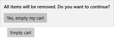
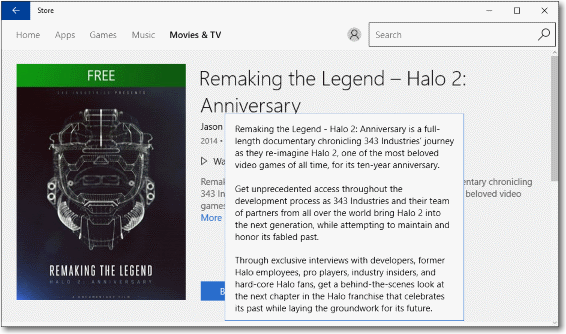
Represents a control that displays lightweight UI that is either information, or requires user interaction. Unlike a dialog, a Flyout can be light dismissed by clicking or tapping outside of it, pressing the device's back button, or pressing the 'Esc' key.
/// [Windows.Foundation.Metadata.ContractVersion(Windows.Foundation.UniversalApiContract, 65536)]
/// [Windows.Foundation.Metadata.MarshalingBehavior(Windows.Foundation.Metadata.MarshalingType.Agile)]
/// [Windows.Foundation.Metadata.Threading(Windows.Foundation.Metadata.ThreadingModel.Both)]
/// [Windows.UI.Xaml.Markup.ContentProperty(Name="Content")]
class Flyout : FlyoutBase
[Windows.Foundation.Metadata.ContractVersion(typeof(Windows.Foundation.UniversalApiContract), 65536)]
[Windows.Foundation.Metadata.MarshalingBehavior(Windows.Foundation.Metadata.MarshalingType.Agile)]
[Windows.Foundation.Metadata.Threading(Windows.Foundation.Metadata.ThreadingModel.Both)]
[Windows.UI.Xaml.Markup.ContentProperty(Name="Content")]
public class Flyout : FlyoutBasePublic Class Flyout
Inherits FlyoutBase<Flyout>
singleUIElement
</Flyout>
- Inheritance
- Attributes
Windows requirements
| Device family |
Windows 10 (introduced in 10.0.10240.0)
|
| API contract |
Windows.Foundation.UniversalApiContract (introduced in v1.0)
|
Examples
Tip
For more info, design guidance, and code examples, see Flyouts.
The WinUI 2 Gallery app includes interactive examples of most WinUI 2 controls, features, and functionality. Get the app from the Microsoft Store or get the source code on GitHub.
Remarks
A Flyout displays a message that requires user interaction.

Use a Flyout control for collecting information, for displaying more info, or for warnings and confirmations. Unlike a dialog, a Flyout does not create a separate window, and does not block other user interaction. To show a menu of items, use a MenuFlyout instead. For more info, including XAML and code examples, see Quickstart: Adding a Flyout.
A Flyout control (or MenuFlyout) is used as the value of the Button.Flyout property. This is usually set in XAML as part of a UI definition of the page. Button is the only control that has a dedicated Flyout property. To associate a Flyout with other controls, use the FlyoutBase.AttachedFlyout attached property. When set as Button.Flyout, the Flyout displays when the button is tapped or otherwise invoked. When a Flyout is assigned to other UI elements using FlyoutBase.AttachedFlyout, you must call either the ShowAt method or the static ShowAttachedFlyout method to display the flyout.
In addition to the members listed in this reference topic, there are other members of the base class FlyoutBase that are often used in typical Flyout scenarios:
- FlyoutBase.AttachedFlyout: an attached property that associates a Flyout with a particular UI element (this can be any FrameworkElement derived class).
- ShowAttachedFlyout: a static method that can determine whether a flyout is already associated with a UI element through a FlyoutBase.AttachedFlyout assignment. If so, the method calls ShowAt internally, using the FrameworkElement that you specified.
Accessibility
If you use a Flyout with no focusable content-for example, with only text, as shown here-you should take some additional steps to ensure that your content is accessible. Specifically, you need to ensure that Windows Narrator or other screen readers can read the flyout's content.

By default, there are properties set on the FlyoutPresenter that prevent it from receiving focus. This is the desired behavior when content inside the Flyout can receive focus. However, if the content inside the Flyout can't receive focus, you should update to the FlyoutPresenterStyle to let the FlyoutPresenter receive focus instead. To do this, set IsTabStop to true and TabNavigation to Cycle on the flyout presenter style.
This example shows how to let the FlyoutPresenter receive focus so that the content is accessible.
<Grid Background="{ThemeResource ApplicationPageBackgroundThemeBrush}">
    <Button VerticalAlignment="Center" HorizontalAlignment="Center"
            Content="Open flyout">
        <Button.Flyout>
            <Flyout>
                <Flyout.FlyoutPresenterStyle>
                    <Style TargetType="FlyoutPresenter">
                        <Setter Property="ScrollViewer.HorizontalScrollMode" Value="Disabled"/>
                        <Setter Property="ScrollViewer.HorizontalScrollBarVisibility" Value="Disabled"/>
                        <Setter Property="IsTabStop" Value="True"/>
                        <Setter Property="TabNavigation" Value="Cycle"/>
                    </Style>
                </Flyout.FlyoutPresenterStyle>
                <TextBlock TextWrapping="Wrap" Text="This is some text in a flyout."/>
            </Flyout>
        </Button.Flyout>
    </Button>
</Grid>
Constructors
| Flyout() |
Initializes a new instance of the Flyout class. |
Properties
| AllowFocusOnInteraction |
Gets or sets a value that indicates whether the element automatically gets focus when the user interacts with it. (Inherited from FlyoutBase) |
| AllowFocusWhenDisabled |
Gets or sets a value that specifies whether the control can receive focus when it's disabled. (Inherited from FlyoutBase) |
| AreOpenCloseAnimationsEnabled |
Gets or sets a value that indicates whether animations are played when the flyout is opened or closed. (Inherited from FlyoutBase) |
| Content |
Gets or sets the content of the Flyout. |
| ContentProperty |
Gets the identifier for the Content dependency property. |
| Dispatcher |
Gets the CoreDispatcher that this object is associated with. The CoreDispatcher represents a facility that can access the DependencyObject on the UI thread even if the code is initiated by a non-UI thread. (Inherited from DependencyObject) |
| ElementSoundMode |
Gets or sets a value that specifies the control's preference for whether it plays sounds. (Inherited from FlyoutBase) |
| FlyoutPresenterStyle | |
| FlyoutPresenterStyleProperty |
Gets the identifier for the FlyoutPresenterStyle dependency property. |
| InputDevicePrefersPrimaryCommands |
Gets a value that indicates whether the input device used to open the flyout does not easily open the secondary commands. (Inherited from FlyoutBase) |
| IsConstrainedToRootBounds |
Gets a value that indicates whether the flyout is shown within the bounds of the XAML root. (Inherited from FlyoutBase) |
| IsOpen |
Gets a value that indicates whether the flyout is open. (Inherited from FlyoutBase) |
| LightDismissOverlayMode |
Gets or sets a value that specifies whether the area outside of a light-dismiss UI is darkened. (Inherited from FlyoutBase) |
| OverlayInputPassThroughElement |
Gets or sets an element that should receive pointer input events even when underneath the flyout's overlay. (Inherited from FlyoutBase) |
| Placement |
Gets or sets the default placement to be used for the flyout, in relation to its placement target. (Inherited from FlyoutBase) |
| ShouldConstrainToRootBounds |
Gets or sets a value that indicates whether the flyout should be shown within the bounds of the XAML root. (Inherited from FlyoutBase) |
| ShowMode |
Gets or sets a value that indicates how a flyout behaves when shown. (Inherited from FlyoutBase) |
| Target |
Gets the element to use as the flyout's placement target. (Inherited from FlyoutBase) |
| XamlRoot |
Gets or sets the XamlRoot in which this flyout is being viewed. (Inherited from FlyoutBase) |
Methods
| ClearValue(DependencyProperty) |
Clears the local value of a dependency property. (Inherited from DependencyObject) |
| CreatePresenter() |
When overridden in a derived class, initializes a control to show the flyout content as appropriate for the derived control. Note: This method has no base class implementation and must be overridden in a derived class. (Inherited from FlyoutBase) |
| GetAnimationBaseValue(DependencyProperty) |
Returns any base value established for a dependency property, which would apply in cases where an animation is not active. (Inherited from DependencyObject) |
| GetValue(DependencyProperty) |
Returns the current effective value of a dependency property from a DependencyObject. (Inherited from DependencyObject) |
| Hide() |
Closes the flyout. (Inherited from FlyoutBase) |
| OnProcessKeyboardAccelerators(ProcessKeyboardAcceleratorEventArgs) |
Called just before a keyboard shortcut (accelerator) is processed in your app. Invoked whenever application code or internal processes call ProcessKeyboardAccelerators. Override this method to influence the default accelerator handling. (Inherited from FlyoutBase) |
| ReadLocalValue(DependencyProperty) |
Returns the local value of a dependency property, if a local value is set. (Inherited from DependencyObject) |
| RegisterPropertyChangedCallback(DependencyProperty, DependencyPropertyChangedCallback) |
Registers a notification function for listening to changes to a specific DependencyProperty on this DependencyObject instance. (Inherited from DependencyObject) |
| SetValue(DependencyProperty, Object) |
Sets the local value of a dependency property on a DependencyObject. (Inherited from DependencyObject) |
| ShowAt(DependencyObject, FlyoutShowOptions) |
Shows the flyout placed in relation to the specified element using the specified options. (Inherited from FlyoutBase) |
| ShowAt(FrameworkElement) |
Shows the flyout placed in relation to the specified element. (Inherited from FlyoutBase) |
| TryInvokeKeyboardAccelerator(ProcessKeyboardAcceleratorEventArgs) |
Attempts to invoke a keyboard shortcut (accelerator). (Inherited from FlyoutBase) |
| UnregisterPropertyChangedCallback(DependencyProperty, Int64) |
Cancels a change notification that was previously registered by calling RegisterPropertyChangedCallback. (Inherited from DependencyObject) |
Events
| Closed |
Occurs when the flyout is hidden. (Inherited from FlyoutBase) |
| Closing |
Occurs when the flyout starts to be hidden. (Inherited from FlyoutBase) |
| Opened |
Occurs when the flyout is shown. (Inherited from FlyoutBase) |
| Opening |
Occurs before the flyout is shown. (Inherited from FlyoutBase) |