Adding a Second Toolbar
Overview
The Toolbar can do more than replace the action bar – it can be
used multiple times within an Activity, it can be customized for
placement anywhere on the screen, and it can be configured to span only
a partial width of the screen. The examples below illustrate how to
create a second Toolbar and place it at the bottom of the screen.
This Toolbar implements Copy, Cut, and Paste menu items.
Define the Second Toolbar
Edit the layout file Main.axml and replace its contents with with the following XML:
<?xml version="1.0" encoding="utf-8"?>
<RelativeLayout xmlns:android="http://schemas.android.com/apk/res/android"
    android:layout_width="match_parent"
    android:layout_height="match_parent">
    <include
        android:id="@+id/toolbar"
        layout="@layout/toolbar" />
    <LinearLayout
        android:orientation="vertical"
        android:layout_width="fill_parent"
        android:layout_height="fill_parent"
        android:id="@+id/main_content"
        android:layout_below="@id/toolbar">
      <ImageView
          android:layout_width="fill_parent"
          android:layout_height="0dp"
          android:layout_weight="1" />
      <Toolbar
          android:id="@+id/edit_toolbar"
          android:minHeight="?android:attr/actionBarSize"
          android:background="?android:attr/colorAccent"
          android:theme="@android:style/ThemeOverlay.Material.Dark.ActionBar"
          android:layout_width="match_parent"
          android:layout_height="wrap_content" />
    </LinearLayout>
</RelativeLayout>
This XML adds a second Toolbar to the bottom of the screen with an
empty ImageView filling the middle of the screen. The height of this
Toolbar is set to the height of an action bar:
android:minHeight="?android:attr/actionBarSize"
The background color of this Toolbar is set to an accent color that
will be defined next:
android:background="?android:attr/colorAccent
Notice that this Toolbar is based on a different theme
(ThemeOverlay.Material.Dark.ActionBar) than that used by the
Toolbar created in
Replacing the Action Bar
– it isn't bound to the Activity's window decor or to the theme
used in the first Toolbar.
Edit Resources/values/styles.xml and add the following accent color to the style definition:
<item name="android:colorAccent">#C7A935</item>
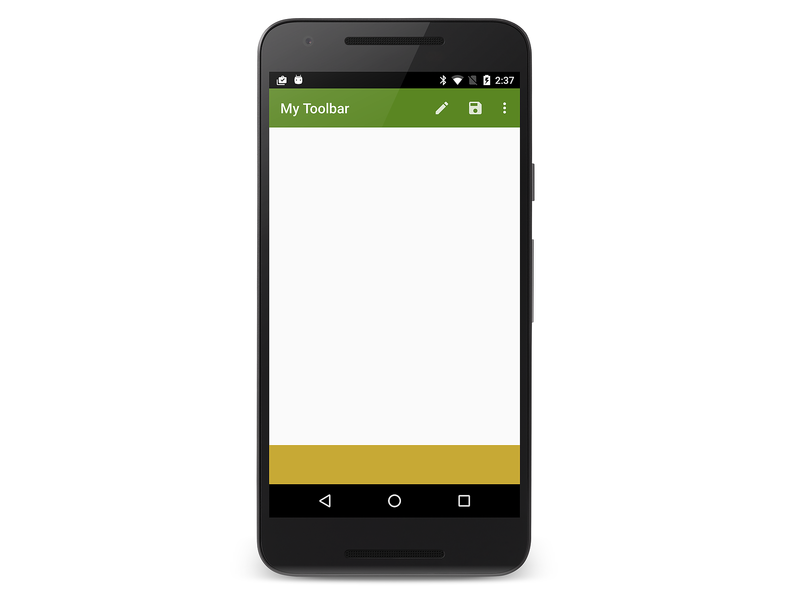
This gives the bottom toolbar a dark amber color. Building and running the app displays a blank second toolbar at the bottom of the screen:
Add Edit Menu Items
This section explains how to add edit menu items to the bottom
Toolbar.
To add menu items to a secondary Toolbar:
Add menu icons to the
mipmap-folders of the app project (if required).Define the contents of the menu items by adding an additional menu resource file to Resources/menu.
In the Activity's
OnCreatemethod, find theToolbar(by callingFindViewById) and inflate theToolbar's menus.Implement a click handler in
OnCreatefor the new menu items.
The following sections demonstrate this process in detail: Cut,
Copy, and Paste menu items are added to the bottom Toolbar.
Define the Edit Menu Resource
In the Resources/menu subdirectory, create a new XML file called edit_menus.xml and replace the contents with the following XML:
<?xml version="1.0" encoding="utf-8" ?>
<menu xmlns:android="http://schemas.android.com/apk/res/android">
  <item
       android:id="@+id/menu_cut"
       android:icon="@mipmap/ic_menu_cut_holo_dark"
       android:showAsAction="ifRoom"
       android:title="Cut" />
  <item
       android:id="@+id/menu_copy"
       android:icon="@mipmap/ic_menu_copy_holo_dark"
       android:showAsAction="ifRoom"
       android:title="Copy" />
  <item
       android:id="@+id/menu_paste"
       android:icon="@mipmap/ic_menu_paste_holo_dark"
       android:showAsAction="ifRoom"
       android:title="Paste" />
</menu>
This XML creates the Cut, Copy, and Paste menu items (using
icons that were added to the mipmap- folders in
Replacing the Action Bar).
Inflate the Menus
At the end of the OnCreate method in MainActivity.cs, add the
following lines of code:
var editToolbar = FindViewById<Toolbar>(Resource.Id.edit_toolbar);
editToolbar.Title = "Editing";
editToolbar.InflateMenu (Resource.Menu.edit_menus);
editToolbar.MenuItemClick += (sender, e) => {
    Toast.MakeText(this, "Bottom toolbar tapped: " + e.Item.TitleFormatted, ToastLength.Short).Show();
};
This code locates the edit_toolbar view defined in Main.axml,
sets its title to Editing, and inflates its menu items (defined in
edit_menus.xml). It defines a menu click handler that displays a
toast to indicate which editing icon was tapped.
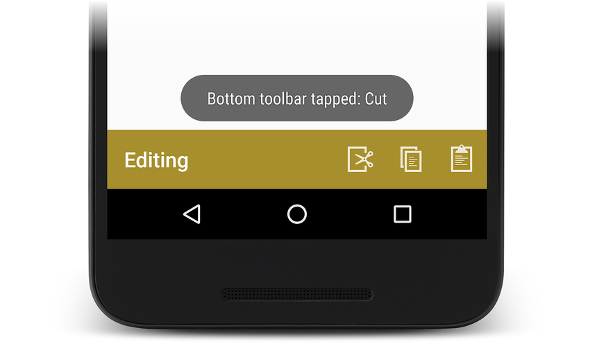
Build and run the app. When the app runs, the text and icons added above will appear as shown here:
Tapping the Cut menu icon causes the following toast to be displayed:
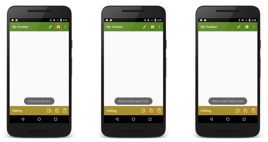
Tapping menu items on either toolbar displays the resulting toasts:
The Up Button
Most Android apps rely on the Back button for app navigation; pressing the Back button takes the user to the previous screen. However, you may also want to provide an Up button that makes it easy for users to navigate "up" to the app's main screen. When the user selects the Up button, the user moves up to a higher level in the app hierarchy – that is, the app pops the user back multiple activities in the back stack rather than popping back to the previously-visited Activity.
To enable the Up button in a second activity that uses a Toolbar
as its action bar, call the SetDisplayHomeAsUpEnabled and
SetHomeButtonEnabled methods in the second activity's OnCreate
method:
SetActionBar (toolbar);
...
ActionBar.SetDisplayHomeAsUpEnabled (true);
ActionBar.SetHomeButtonEnabled (true);


