StackLayout
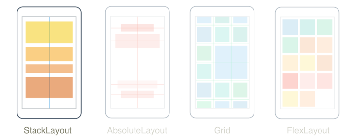
The .NET Multi-platform App UI (.NET MAUI) StackLayout organizes child views in a one-dimensional stack, either horizontally or vertically. By default, a StackLayout is oriented vertically. In addition, a StackLayout can be used as a parent layout that contains other child layouts.
The StackLayout class defines the following properties:
Orientation, of typeStackOrientation, represents the direction in which child views are positioned. The default value of this property isVertical.Spacing, of typedouble, indicates the amount of space between each child view. The default value of this property is 0.
These properties are backed by BindableProperty objects, which means that the properties can be targets of data bindings and styled.
Vertical orientation
The following XAML shows how to create a vertically oriented StackLayout that contains different child views:
<ContentPage xmlns="http://schemas.microsoft.com/dotnet/2021/maui"
             xmlns:x="http://schemas.microsoft.com/winfx/2009/xaml"
             x:Class="StackLayoutDemos.Views.XAML.VerticalStackLayoutPage"
             Title="Vertical StackLayout demo">
    <StackLayout Margin="20">
        <Label Text="Primary colors" />
        <BoxView Color="Red"
                 HeightRequest="40" />
        <BoxView Color="Yellow"
                 HeightRequest="40" />
        <BoxView Color="Blue"
                 HeightRequest="40" />
        <Label Text="Secondary colors" />
        <BoxView Color="Green"
                 HeightRequest="40" />
        <BoxView Color="Orange"
                 HeightRequest="40" />
        <BoxView Color="Purple"
                 HeightRequest="40" />
    </StackLayout>
</ContentPage>
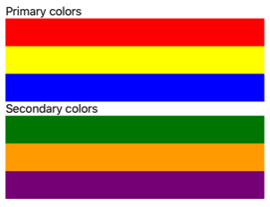
This example creates a vertical StackLayout containing Label and BoxView objects. By default, there's no space between the child views:
The equivalent C# code is:
public class VerticalStackLayoutPage : ContentPage
{
    public VerticalStackLayoutPage()
    {
        Title = "Vertical StackLayout demo";

        StackLayout stackLayout = new StackLayout { Margin = new Thickness(20) };

        stackLayout.Add(new Label { Text = "Primary colors" });
        stackLayout.Add(new BoxView { Color = Colors.Red, HeightRequest = 40 });
        stackLayout.Add(new BoxView { Color = Colors.Yellow, HeightRequest = 40 });
        stackLayout.Add(new BoxView { Color = Colors.Blue, HeightRequest = 40 });
        stackLayout.Add(new Label { Text = "Secondary colors" });
        stackLayout.Add(new BoxView { Color = Colors.Green, HeightRequest = 40 });
        stackLayout.Add(new BoxView { Color = Colors.Orange, HeightRequest = 40 });
        stackLayout.Add(new BoxView { Color = Colors.Purple, HeightRequest = 40 });

        Content = stackLayout;
    }
}
Note
The value of the Margin property represents the distance between an element and its adjacent elements. For more information, see Position controls.
Horizontal orientation
The following XAML shows how to create a horizontally oriented StackLayout by setting its Orientation property to Horizontal:
<ContentPage xmlns="http://schemas.microsoft.com/dotnet/2021/maui"
             xmlns:x="http://schemas.microsoft.com/winfx/2009/xaml"
             x:Class="StackLayoutDemos.Views.XAML.HorizontalStackLayoutPage"
             Title="Horizontal StackLayout demo">
    <StackLayout Margin="20"
                 Orientation="Horizontal"
                 HorizontalOptions="Center">
        <BoxView Color="Red"
                 WidthRequest="40" />
        <BoxView Color="Yellow"
                 WidthRequest="40" />
        <BoxView Color="Blue"
                 WidthRequest="40" />
        <BoxView Color="Green"
                 WidthRequest="40" />
        <BoxView Color="Orange"
                 WidthRequest="40" />
        <BoxView Color="Purple"
                 WidthRequest="40" />
    </StackLayout>
</ContentPage>
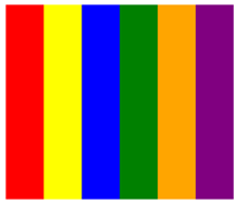
This example creates a horizontal StackLayout containing BoxView objects, with no space between the child views:
The equivalent C# code is:
public class HorizontalStackLayoutPage : ContentPage
{
    public HorizontalStackLayoutPage()
    {
        Title = "Horizontal StackLayout demo";

        StackLayout stackLayout = new StackLayout
        {
            Margin = new Thickness(20),
            Orientation = StackOrientation.Horizontal,
            HorizontalOptions = LayoutOptions.Center
        };

        stackLayout.Add(new BoxView { Color = Colors.Red, WidthRequest = 40 });
        stackLayout.Add(new BoxView { Color = Colors.Yellow, WidthRequest = 40 });
        stackLayout.Add(new BoxView { Color = Colors.Blue, WidthRequest = 40 });
        stackLayout.Add(new BoxView { Color = Colors.Green, WidthRequest = 40 });
        stackLayout.Add(new BoxView { Color = Colors.Orange, WidthRequest = 40 });
        stackLayout.Add(new BoxView { Color = Colors.Purple, WidthRequest = 40 });

        Content = stackLayout;
    }
}
Space between child views
The spacing between child views in a StackLayout can be changed by setting the Spacing property to a double value:
<ContentPage xmlns="http://schemas.microsoft.com/dotnet/2021/maui"
             xmlns:x="http://schemas.microsoft.com/winfx/2009/xaml"
             x:Class="StackLayoutDemos.Views.XAML.StackLayoutSpacingPage"
             Title="StackLayout Spacing demo">
    <StackLayout Margin="20"
                 Spacing="6">
        <Label Text="Primary colors" />
        <BoxView Color="Red"
                 HeightRequest="40" />
        <BoxView Color="Yellow"
                 HeightRequest="40" />
        <BoxView Color="Blue"
                 HeightRequest="40" />
        <Label Text="Secondary colors" />
        <BoxView Color="Green"
                 HeightRequest="40" />
        <BoxView Color="Orange"
                 HeightRequest="40" />
        <BoxView Color="Purple"
                 HeightRequest="40" />
    </StackLayout>
</ContentPage>
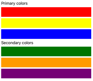
This example creates a vertical StackLayout containing Label and BoxView objects that have six device-independent units of vertical space between them:
Tip
The Spacing property can be set to negative values to make child views overlap.
The equivalent C# code is:
public class StackLayoutSpacingPage : ContentPage
{
    public StackLayoutSpacingPage()
    {
        Title = "StackLayout Spacing demo";

        StackLayout stackLayout = new StackLayout
        {
            Margin = new Thickness(20),
            Spacing = 6
        };

        stackLayout.Add(new Label { Text = "Primary colors" });
        stackLayout.Add(new BoxView { Color = Colors.Red, HeightRequest = 40 });
        stackLayout.Add(new BoxView { Color = Colors.Yellow, HeightRequest = 40 });
        stackLayout.Add(new BoxView { Color = Colors.Blue, HeightRequest = 40 });
        stackLayout.Add(new Label { Text = "Secondary colors" });
        stackLayout.Add(new BoxView { Color = Colors.Green, HeightRequest = 40 });
        stackLayout.Add(new BoxView { Color = Colors.Orange, HeightRequest = 40 });
        stackLayout.Add(new BoxView { Color = Colors.Purple, HeightRequest = 40 });

        Content = stackLayout;
    }
}
Position and size of child views
The size and position of child views within a StackLayout depends upon the values of the child views' HeightRequest and WidthRequest properties, and the values of their HorizontalOptions and VerticalOptions properties. In a vertical StackLayout, child views expand to fill the available width when their size isn't explicitly set. Similarly, in a horizontal StackLayout, child views expand to fill the available height when their size isn't explicitly set.
The HorizontalOptions and VerticalOptions properties of a StackLayout, and its child views, can be set to fields from the LayoutOptions struct, which encapsulates an alignment layout preference. This layout preference determines the position and size of a child view within its parent layout.
The following XAML example sets alignment preferences on each child view in the StackLayout:
<ContentPage xmlns="http://schemas.microsoft.com/dotnet/2021/maui"
             xmlns:x="http://schemas.microsoft.com/winfx/2009/xaml"
             x:Class="StackLayoutDemos.Views.XAML.AlignmentPage"
             Title="Alignment demo">
    <StackLayout Margin="20"
                 Spacing="6">
        <Label Text="Start"
               BackgroundColor="Gray"
               HorizontalOptions="Start" />
        <Label Text="Center"
               BackgroundColor="Gray"
               HorizontalOptions="Center" />
        <Label Text="End"
               BackgroundColor="Gray"
               HorizontalOptions="End" />
        <Label Text="Fill"
               BackgroundColor="Gray"
               HorizontalOptions="Fill" />
    </StackLayout>
</ContentPage>
In this example, alignment preferences are set on the Label objects to control their position within the StackLayout. The Start, Center, End, and Fill fields are used to define the alignment of the Label objects within the parent StackLayout:

A StackLayout only respects the alignment preferences on child views that are in the opposite direction to the StackLayout orientation. Therefore, the Label child views within the vertically oriented StackLayout set their HorizontalOptions properties to one of the alignment fields:
Start, which positions the Label on the left-hand side of the StackLayout.Center, which centers the Label in the StackLayout.End, which positions the Label on the right-hand side of the StackLayout.Fill, which ensures that the Label fills the width of the StackLayout.
The equivalent C# code is:
public class AlignmentPage : ContentPage
{
    public AlignmentPage()
    {
        Title = "Alignment demo";

        StackLayout stackLayout = new StackLayout
        {
            Margin = new Thickness(20),
            Spacing = 6
        };

        stackLayout.Add(new Label { Text = "Start", BackgroundColor = Colors.Gray, HorizontalOptions = LayoutOptions.Start });
        stackLayout.Add(new Label { Text = "Center", BackgroundColor = Colors.Gray, HorizontalOptions = LayoutOptions.Center });
        stackLayout.Add(new Label { Text = "End", BackgroundColor = Colors.Gray, HorizontalOptions = LayoutOptions.End });
        stackLayout.Add(new Label { Text = "Fill", BackgroundColor = Colors.Gray, HorizontalOptions = LayoutOptions.Fill });

        Content = stackLayout;
    }
}
For more information about alignment, see Align views in layouts.
Nested StackLayout objects
A StackLayout can be used as a parent layout that contains nested child StackLayout objects, or other child layouts.
The following XAML shows an example of nesting StackLayout objects:
<ContentPage xmlns="http://schemas.microsoft.com/dotnet/2021/maui"
             xmlns:x="http://schemas.microsoft.com/winfx/2009/xaml"
             x:Class="StackLayoutDemos.Views.XAML.CombinedStackLayoutPage"
             Title="Combined StackLayouts demo">
    <StackLayout Margin="20">
        ...
        <Border Stroke="Black"
                Padding="5">
            <StackLayout Orientation="Horizontal"
                         Spacing="15">
                <BoxView Color="Red"
                         WidthRequest="40" />
                <Label Text="Red"
                       FontSize="18"
                       VerticalOptions="Center" />
            </StackLayout>
        </Border>
        <Border Stroke="Black"
                Padding="5">
            <StackLayout Orientation="Horizontal"
                         Spacing="15">
                <BoxView Color="Yellow"
                         WidthRequest="40" />
                <Label Text="Yellow"
                       FontSize="18"
                       VerticalOptions="Center" />
            </StackLayout>
        </Border>
        <Border Stroke="Black"
                Padding="5">
            <StackLayout Orientation="Horizontal"
                         Spacing="15">
                <BoxView Color="Blue"
                         WidthRequest="40" />
                <Label Text="Blue"
                       FontSize="18"
                       VerticalOptions="Center" />
            </StackLayout>
        </Border>
        ...
    </StackLayout>
</ContentPage>
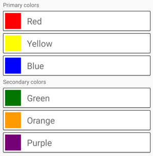
In this example, the parent StackLayout contains nested StackLayout objects inside Border objects. The parent StackLayout is oriented vertically, while the child StackLayout objects are oriented horizontally:
Important
The deeper you nest StackLayout objects and other layouts, the more layout calculations will be performed which may impact performance. For more information, see Choose the correct layout.
The equivalent C# code is:
public class CombinedStackLayoutPage : ContentPage
{
    public CombinedStackLayoutPage()
    {
        Title = "Combined StackLayouts demo";

        Border border1 = new Border
        {
            Stroke = Colors.Black,
            Padding = new Thickness(5)
        };
        StackLayout border1StackLayout = new StackLayout
        {
            Orientation = StackOrientation.Horizontal,
            Spacing = 15
        };
        border1StackLayout.Add(new BoxView { Color = Colors.Red, WidthRequest = 40 });
        border1StackLayout.Add(new Label { Text = "Red", FontSize = 20, VerticalOptions = LayoutOptions.Center });
        border1.Content = border1StackLayout;

        Border border2 = new Border
        {
            Stroke = Colors.Black,
            Padding = new Thickness(5)
        };
        StackLayout border2StackLayout = new StackLayout
        {
            Orientation = StackOrientation.Horizontal,
            Spacing = 15
        };
        border2StackLayout.Add(new BoxView { Color = Colors.Yellow, WidthRequest = 40 });
        border2StackLayout.Add(new Label { Text = "Yellow", FontSize =  20, VerticalOptions = LayoutOptions.Center });
        border2.Content = border2StackLayout;

        Border border3 = new Border
        {
            Stroke = Colors.Black,
            Padding = new Thickness(5)
        };
        StackLayout border3StackLayout = new StackLayout
        {
            Orientation = StackOrientation.Horizontal,
            Spacing = 15
        };
        border3StackLayout.Add(new BoxView { Color = Colors.Blue, WidthRequest = 40 });
        border3StackLayout.Add(new Label { Text = "Blue", FontSize = 20, VerticalOptions = LayoutOptions.Center });
        border3.Content = border3StackLayout;

        ...

        StackLayout stackLayout = new StackLayout { Margin = new Thickness(20) };
        stackLayout.Add(new Label { Text = "Primary colors" });
        stackLayout.Add(border1);
        stackLayout.Add(border2);
        stackLayout.Add(border3);
        stackLayout.Add(new Label { Text = "Secondary colors" });
        stackLayout.Add(border4);
        stackLayout.Add(border5);
        stackLayout.Add(border6);

        Content = stackLayout;
    }
}
 Browse the sample