Align and position .NET MAUI controls
Every .NET Multi-platform App UI (.NET MAUI) control that derives from View, which includes views and layouts, has HorizontalOptions and VerticalOptions properties, of type LayoutOptions. The LayoutOptions structure encapsulates a view's preferred alignment, which determines its position and size within its parent layout when the parent layout contains unused space (that is, the parent layout is larger than the combined size of all its children).
In addition, the Margin and Padding properties position controls relative to adjacent, or child controls. For more information, see Position controls.
Align views in layouts
The alignment of a View, relative to its parent, can be controlled by setting the HorizontalOptions or VerticalOptions property of the View to one of the public fields from the LayoutOptions structure. The public fields are Start, Center, End, and Fill.
The Start, Center, End, and Fill fields are used to define the view's alignment within the parent layout:
- For horizontal alignment,
Startpositions the View on the left hand side of the parent layout, and for vertical alignment, it positions the View at the top of the parent layout. - For horizontal and vertical alignment,
Centerhorizontally or vertically centers the View. - For horizontal alignment,
Endpositions the View on the right hand side of the parent layout, and for vertical alignment, it positions the View at the bottom of the parent layout. - For horizontal alignment,
Fillensures that the View fills the width of the parent layout, and for vertical alignment, it ensures that the View fills the height of the parent layout.
Note
The default value of a view's HorizontalOptions and VerticalOptions properties is LayoutOptions.Fill.
A StackLayout only respects the Start, Center, End, and Fill LayoutOptions fields on child views that are in the opposite direction to the StackLayout orientation. Therefore, child views within a vertically oriented StackLayout can set their HorizontalOptions properties to one of the Start, Center, End, or Fill fields. Similarly, child views within a horizontally oriented StackLayout can set their VerticalOptions properties to one of the Start, Center, End, or Fill fields.
A StackLayout does not respect the Start, Center, End, and Fill LayoutOptions fields on child views that are in the same direction as the StackLayout orientation. Therefore, a vertically oriented StackLayout ignores the Start, Center, End, or Fill fields if they are set on the VerticalOptions properties of child views. Similarly, a horizontally oriented StackLayout ignores the Start, Center, End, or Fill fields if they are set on the HorizontalOptions properties of child views.
Important
LayoutOptions.Fill generally overrides size requests specified using the HeightRequest and WidthRequest properties.
The following XAML example demonstrates a vertically oriented StackLayout where each child Label sets its HorizontalOptions property to one of the four alignment fields from the LayoutOptions structure:
<StackLayout>
  ...
  <Label Text="Start" BackgroundColor="Gray" HorizontalOptions="Start" />
  <Label Text="Center" BackgroundColor="Gray" HorizontalOptions="Center" />
  <Label Text="End" BackgroundColor="Gray" HorizontalOptions="End" />
  <Label Text="Fill" BackgroundColor="Gray" HorizontalOptions="Fill" />
</StackLayout>
The following screenshot shows the resulting alignment of each Label:

Position controls
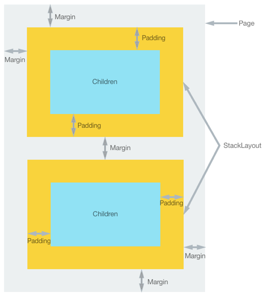
The Margin and Padding properties position controls relative to adjacent, or child controls. Margin and padding are related layout concepts:
- The
Marginproperty represents the distance between an element and its adjacent elements, and is used to control the element's rendering position, and the rendering position of its neighbors.Marginvalues can be specified on layouts and views. - The
Paddingproperty represents the distance between an element and its child elements, and is used to separate the control from its own content.Paddingvalues can be specified on pages, layouts, and views.
The following diagram illustrates the two concepts:

Note
Margin values are additive. Therefore, if two adjacent elements specify a margin of 20 device-independent units, the distance between the elements will be 40 device-independent units. In addition, margin and padding values are additive when both are applied, in that the distance between an element and any content will be the margin plus padding.
The Margin and Padding properties are both of type Thickness. There are three possibilities when creating a Thickness structure:
- Create a
Thicknessstructure defined by a single uniform value. The single value is applied to the left, top, right, and bottom sides of the element. - Create a
Thicknessstructure defined by horizontal and vertical values. The horizontal value is symmetrically applied to the left and right sides of the element, with the vertical value being symmetrically applied to the top and bottom sides of the element. - Create a
Thicknessstructure defined by four distinct values that are applied to the left, top, right, and bottom sides of the element.
The following XAML example shows all three possibilities:
<StackLayout Padding="0,20,0,0">
  <!-- Margin defined by a single uniform value. -->
  <Label Text=".NET MAUI" Margin="20" />
  <!-- Margin defined by horizontal and vertical values. -->
  <Label Text=".NET for iOS" Margin="10,15" />
  <!-- Margin defined by four distinct values that are applied to the left, top, right, and bottom. -->
  <Label Text=".NET for Android" Margin="0,20,15,5" />
</StackLayout>
The equivalent C# code is:
StackLayout stackLayout = new StackLayout
{
  Padding = new Thickness(0,20,0,0)
};
// Margin defined by a single uniform value.
stackLayout.Add(new Label { Text = ".NET MAUI", Margin = new Thickness(20) });
// Margin defined by horizontal and vertical values.
stackLayout.Add(new Label { Text = ".NET for iOS", Margin = new Thickness(10,25) });
// Margin defined by four distinct values that are applied to the left, top, right, and bottom.
stackLayout.Add(new Label { Text = ".NET for Android", Margin = new Thickness(0,20,15,5) });
Note
Thickness values can be negative, which typically clips or overdraws the content.
