Soporte para fondos de sección
A partir de SharePoint Framework v1.8, los elementos web se pueden conocer en cualquier fondo de sección y usar estos colores para mejorar la apariencia de un elemento web cuando se hospedan en una sección con un fondo diferente.
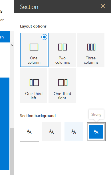
Configuración de la sección para usar un fondo diferente
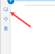
El color de fondo de sección que puede establecer se basa en el color principal del tema que aplicó. Para establecer el fondo de una sección, abra sus propiedades:
En las propiedades puede definir qué tipo de fondo de sección desea establecer:
Reconocimiento del tema del elemento web
Actualizar el manifiesto
Debe agregar una supportsThemeVariants propiedad al manifiesto del elemento web y establecer su valor en true:
{
  // ...

  "supportsThemeVariants": true,

  "version": "*",
  "manifestVersion": 2,

  "requiresCustomScript": false,

  "preconfiguredEntries": [{
    // ...
  }]
}
Uso del reconocimiento del color de fondo en elementos web que no son React
Para que el elemento web tenga en cuenta los cambios de tema, debe implementar la compatibilidad con el ThemeProvider servicio que generará un evento en caso de que se produzca un cambio de tema.
import {
  ThemeProvider,
  ThemeChangedEventArgs,
  IReadonlyTheme,
  ISemanticColors
} from '@microsoft/sp-component-base';

...

private _themeProvider: ThemeProvider;
private _themeVariant: IReadonlyTheme | undefined;

protected onInit(): Promise<void> {
  // Consume the new ThemeProvider service
  this._themeProvider = this.context.serviceScope.consume(ThemeProvider.serviceKey);

  // If it exists, get the theme variant
  this._themeVariant = this._themeProvider.tryGetTheme();

  // Register a handler to be notified if the theme variant changes
  this._themeProvider.themeChangedEvent.add(this, this._handleThemeChangedEvent);

  return super.onInit();
}

/**
 * Update the current theme variant reference and re-render.
 *
 * @param args The new theme
 */
private _handleThemeChangedEvent(args: ThemeChangedEventArgs): void {
  this._themeVariant = args.theme;
  this.render();
}
Con ahora ThemeProvider podemos recuperar el color de texto del cuerpo correcto:
public render(): void {
  const semanticColors: Readonly<ISemanticColors> | undefined = this._themeVariant && this._themeVariant.semanticColors;

  const style: string = ` style="background-color:${semanticColors.bodyBackground}"`;

  this.domElement.innerHTML = `<p${'' || (this._themeProvider && style)}>this is a demo</p>`;
}
Uso del reconocimiento del color de fondo en elementos web basados en React
Para un elemento web basado en React, tendrá que implementar código para consumir , ThemeProvideral igual que con un elemento web básico:
import {
  ThemeProvider,
  ThemeChangedEventArgs,
  IReadonlyTheme
} from '@microsoft/sp-component-base';
...

private _themeProvider: ThemeProvider;
private _themeVariant: IReadonlyTheme | undefined;

protected onInit(): Promise<void> {
  // Consume the new ThemeProvider service
  this._themeProvider = this.context.serviceScope.consume(ThemeProvider.serviceKey);

  // If it exists, get the theme variant
  this._themeVariant = this._themeProvider.tryGetTheme();

  // Register a handler to be notified if the theme variant changes
  this._themeProvider.themeChangedEvent.add(this, this._handleThemeChangedEvent);

  return super.onInit();
}

/**
 * Update the current theme variant reference and re-render.
 *
 * @param args The new theme
 */
private _handleThemeChangedEvent(args: ThemeChangedEventArgs): void {
  this._themeVariant = args.theme;
  this.render();
}
Ahora, para usar la variante de tema en el componente, tendrá que enviar la variante de tema al componente en el render() método :
public render(): void {
  const element: React.ReactElement<IBasicSectionBackgroundExampleProps > = React.createElement(
    BasicSectionBackgroundExample,
    {
      themeVariant: this._themeVariant
    }
  );

  ReactDom.render(element, this.domElement);
}
Para usar esa propiedad en el componente, tendrá que agregarla a la definición de la interfaz de propiedades, que en este caso se denomina IBasicSectionBackgroundExampleProps:
import { IReadonlyTheme } from '@microsoft/sp-component-base';

export interface IBasicSectionBackgroundExampleProps {
  themeVariant: IReadonlyTheme | undefined;
}
A continuación, en el método de representación del componente puede recuperar los colores correctos de la siguiente manera:
public render(): React.ReactElement<IBasicSectionBackgroundExampleProps> {

  const { semanticColors }: IReadonlyTheme = this.props.themeVariant;

  return (
    <div style={{backgroundColor: semanticColors.bodyBackground}}>
      <p>This React web part has support for section backgrounds and will inherit its background from the section</p>
    </div>
  );
}