Customize themes in Unified Service Desk
Themes in Unified Service Desk define the look and feel of the agent application. A theme in Unified Service Desk consists of an XAML resource library, and can be placed on any web server and referenced via URL, or can be compiled into .NET assemblies (DLLs) and distributed with the agent applications.
Predefined theme available in Unified Service Desk
Unified Service Desk includes two predefined themes.
Air theme
This is the predefined theme for Unified Service Desk if you're using the Web Client.
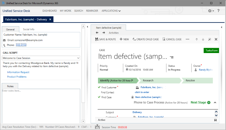
The Air theme supports the high-contrast mode. When you turn on the high-contrast mode on your computer and are using the Air theme, the Unified Service Desk client will automatically switch to the high-contrast mode. Similarly, disabling the high-contrast mode on your computer will cause the Unified Service Desk client to automatically switch to the normal display mode.
The automatic switching between normal and high-contrast modes in the Unified Service Desk client is supported only for the predefined Air theme. If you're using custom themes or custom hosted controls that support high-contrast mode, the switching happens only after you restart the Unified Service Desk client after switching to normal or high-contrast modes on your computer. More information: High-contrast mode support for custom themes
Caution
You might face issues when you switch to the Air theme in Unified Interface apps because the Air theme is applicable only to the Web Client.
Set a predefined theme
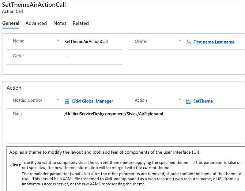
The SetTheme action for the Global Manager hosted control lets you set a theme in Unified Service Desk. You can create an action call to the SetTheme action, and pass the predefined theme call in the Data field using the following syntax to set one of the predefined themes:
/UnifiedServiceDesk;component/Styles/<Theme_Style>.xaml
The following table provides the syntax for the Data field in your action call to set a predefined theme:
| Theme | Syntax for the Data field |
|---|---|
| Air | /UnifiedServiceDesk;component/Styles/AirStyle.xaml |
| Blue | /UnifiedServiceDesk;component/Styles/BlueStyle.xaml |
| Style | /UnifiedServiceDesk;component/Styles/Style.xaml |
In the sample Unified Service Desk client application, agents can set theme by selecting the down arrow next to the settings icon at the top-right corner, and then selecting a predefined theme from the Set Theme submenu.
Selecting a theme in the Set Theme submenu makes an action call to the SetTheme action with the appropriate syntax in the Data field as mentioned earlier. For example, this is the action call definition for the Air style:
Customize themes in Unified Service Desk
Apart from being able to choose from various predefined themes, you can customize a theme in Unified Service Desk. This is done by updating selective controls and then merging it with the existing theme in Unified Service Desk to customize the appearance. Unified Service Desk provides a default style (XAML file) and a bunch of XAML brush resources that you can use to understand the various WPF controls and layout that define the appearance of your agent application. You can find the default style for Unified Service Desk application, DefaultStyle.xaml, along with other XAML brush resources in the User Interface Integration SDK download package. Download the package, and extract it to view the file and its contents under the "UII\USD Developer Assets\USD Layout and Style Sheet" directory.
Note
WPF and XAML scripting are essential skills required for customizing the display of your agent applications by manipulating controls in a XAML file.
Use the SetTheme action for the Global Manager hosted application to customize the default style of the agent application. Unified Service Desk supports merging of your customizations with the existing theme or display style of the agent application. This effectively means that you just need to specify the controls or areas that you want to be changed along with the ResourceDictionary reference block to customize an existing display style. For general information about ResourceDictionary, select ResourceDictionary and XAML resource references.
Let us create an action call to change the text in the title and the skin color of the agent application to Yellow. Make sure you have the DefaultStyle.xaml file ready.
Sign in to Unified Service Desk Administrator.
Select Action Calls under Basic Settings.
Select New to create an action call.
On the New Action Call page, set the general properties:
In the Name field, type Action Call for Custom Display.
In the Hosted Control field, select CRM Global Manager. If you have a different name for your Global Manager hosted control type, specify that name instead.
In the Action field, select SetTheme.
Now, we will set the parameter for customizing the display. In the Data field, copy the following ResourceDictionary reference:
<ResourceDictionary xmlns="https://schemas.microsoft.com/winfx/2006/xaml/presentation"
     xmlns:x="https://schemas.microsoft.com/winfx/2006/xaml"
     xmlns:Microsoft_Windows_Themes="clr-namespace:Microsoft.Windows.Themes;assembly=PresentationFramework.Classic"
     xmlns:themes="clr-namespace:Microsoft.Windows.Themes;assembly=PresentationFramework.Luna"
     xmlns:ribbon="clr-namespace:Microsoft.Windows.Controls.Ribbon;assembly=RibbonControlsLibrary"
     xmlns:classic="clr-namespace:Microsoft.Windows.Themes;assembly=PresentationFramework.Classic"
     xmlns:shell="clr-namespace:Microsoft.Windows.Shell;assembly=Microsoft.Windows.Shell"
     xmlns:system="clr-namespace:System;assembly=mscorlib">
Important
This
ResourceDictionaryreference must be included in every action call that you use to customize the default style.Copy the following command in the Data field after the ResourceDictionary reference that you copied earlier.
<SolidColorBrush x:Key="WindowBackgroundStyle" Color="Yellow"/>This will change the skin of the agent application to Yellow. You will find this command to set the background color in the
<!-- Region General -->section in theDefaultStyle.xamlfile.Copy the following command after the command that you copied in the previous step:
<Style x:Key="MainWindow" TargetType="{x:Type Window}" BasedOn="{StaticResource {x:Type Window}}">
    <Setter Property="Title" Value="CUSTOM TITLE: Agent Application for CONTOSO INC."/>
    <Setter Property="Icon" Value="/UnifiedServiceDesk;component/imageResources/dynamics16-32-48-256.ico"/>
    <Setter Property="FontFamily" Value="Segoe UI" />
</Style>
This will change the text in the title bar to “CUSTOM TITLE: Agent Application for CONTOSO INC.”. You will find this command to set the Window title in the
<!-- Region Window --> section in the DefaultStyle.xaml file.Close the ResourceDictionary tag by adding the following at the end of the Data field:
</ResourceDictionary>This is how your action call definition looks like:
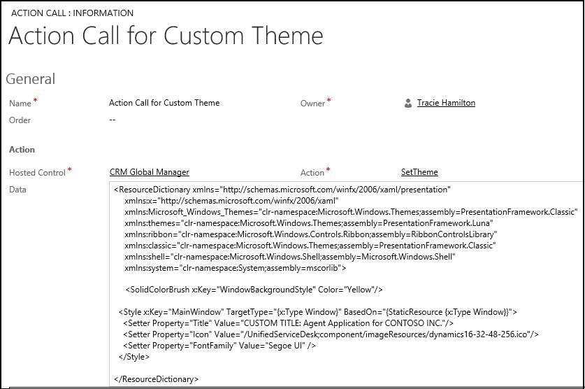
Select Save.
You are done, and now ready to test the action call in the agent application.
Test the action call for customizing your display
You can call this action call by creating a toolbar button, and then attaching the action call to it. For the sake of brevity, we will use the Debugger hosted application to test the action call.
Start Unified Service Desk client application, and sign in to your Dynamics 365 instance.
In the client application, start Debugger by selecting down arrow next to the settings menu in the top-right corner, and select Debug.
In Debugger, select the down arrow above the Action Calls tab to display the area where you can test action calls and UII actions.
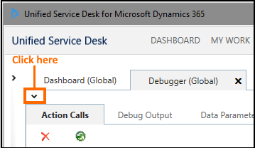
From the Action Calls drop-down list, select Action Call for Custom Theme, and select the Run Action Call icon (
 ). The text in the title bar and skin color of the agent application change.
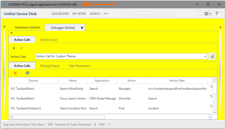
To undo the changes, select one of the predefined themes in the client application.
High-contrast mode support for custom themes
Unified Service Desk internally uses normal and high-contrast mode XAML brush resources to display its UI elements depending on the high-contrast mode setting on your computer. You can find the XAML brush resources in the User Interface Integration SDK download package. Download the package, and extract it to view the file and its contents under the "UII\USD Developer Assets\USD Layout and Style Sheet" directory.
To support high-contrast mode in your custom themes, consider the following:
Create two action calls for setting a custom theme: one for the normal mode and the other for the high-contrast mode. For example, while defining the color property of a XAML brush, use:
One of the predefined colors as defined in the Colors class for the normal mode:
<SolidColorBrush x:Key="WindowBackgroundStyle" Color="Yellow"/>One of the system colors as defined in the SystemColors class for the high-contrast mode:
<SolidColorBrush x:Key="WindowBackgroundStyle" Color="{x:Static SystemColors.WindowColor}"/>
Use the new
$SystemParameters.HighContrastreplacement parameter in each of your action call definitions as a condition to ensure that an action call is fired appropriately. For example, in the action call definition for setting custom theme for:For the normal mode, use the following in the Condition field to check that the high-contrast mode is not set on your computer:
"[[$SystemParameters.HighContrast]g]"=="False"For the high-contrast mode, use the following in the Condition field to check that the high-contrast mode is set on your computer:
"[[$SystemParameters.HighContrast]g]"=="True"
See also
Unified Service Desk configuration walkthroughs
Use themes to customize the appearance of your application
Hosted control types and action/event reference