Create and configure buttons in Power BI reports
APPLIES TO:
Power BI Desktop
Power BI service
With buttons in Power BI, you can create reports that behave similarly to apps, and create an environment that gives users opportunities to further interact with Power BI content. When you share your reports in the Power BI service, buttons provide an app-like experience. The article Identify and use buttons in the Power BI service describes how readers experience buttons in your reports.
This article explains how to add buttons to reports in Power BI Desktop and in the Power BI service. It also covers button states and actions, and shows you how to configure them in Power BI.
Note
Creating a button requires Edit permission to the report. Sharing a report requires a Power BI Pro or PPU license or for the report to be saved in Premium capacity. For more information, see Which license do I have and What is Premium.
Create buttons in reports
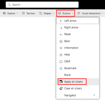
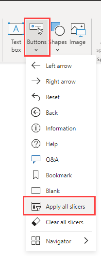
In Power BI Desktop, on the Insert ribbon, select Buttons to reveal a dropdown menu, where you can select the button you want from a collection of options.
Customize a button
Whether you create a button in Power BI Desktop or the Power BI service, the rest of the process is the same. When you select a button on the report canvas, the Format button pane shows you the many ways you can customize the button to fit your requirements. For example, you can customize the shape of a button, or add a border and background. For more information, see Customize buttons in Power BI reports.
Button states
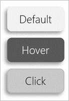
Buttons in Power BI have four possible states:
- Default: How buttons appear when not hovered over or selected.
- On hover: How buttons appear when hovered over.
- On press: How buttons appear when selected.
- Disabled: How buttons appear when they can't be selected.
You can modify many of the cards in the Format button pane individually, based on these four states, which provides plenty of flexibility for customizing your buttons.
The following cards in the Format button pane let you adjust formatting of a button for each of its four states:
- Shape
- Style
- Rotation (applies to all states automatically)
To select how a button should appear for each state:
In the Format button pane, select the Button tab, and then expand the Shape or Style card.
Select State under Apply settings to at the top of the card, and then select the settings you want to use for that state.
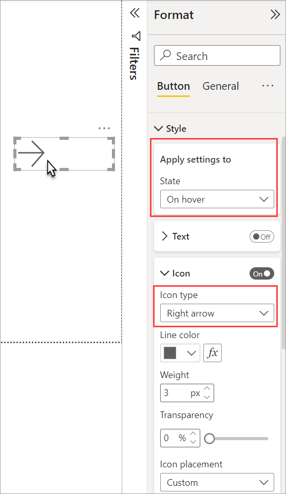
In the following image, you see the Style card and Icon expanded. The State is On hover, and the Icon type is Right arrow.
Select the action for a button
You can select which action is taken when a user selects a button in Power BI.
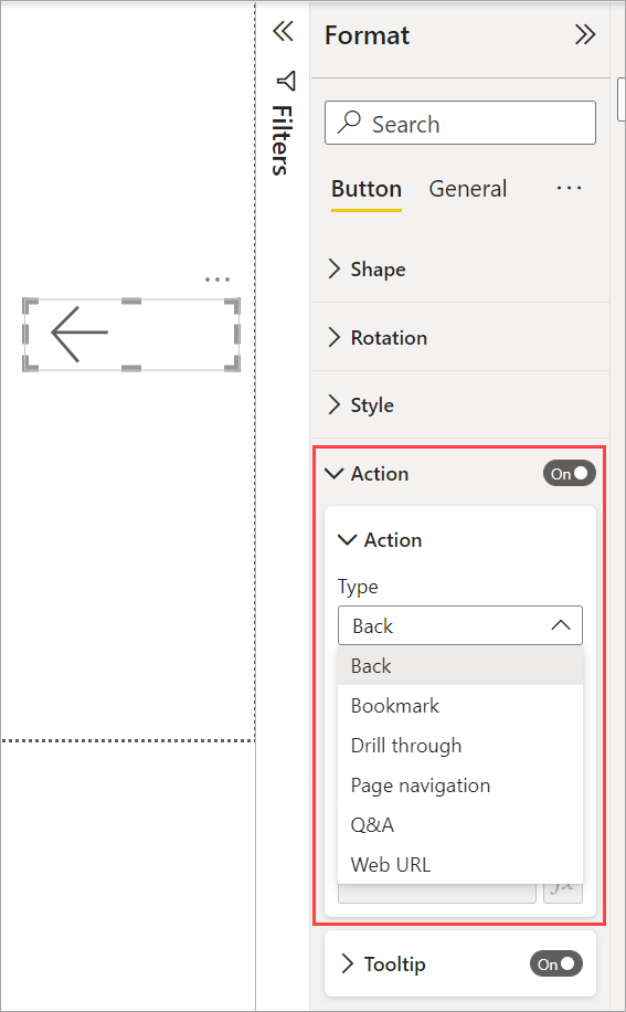
Here are the options for button actions:
- Back returns the user to the previous page of the report. This action is useful for drillthrough pages.
- Bookmark presents the report page that's associated with a bookmark that is defined for the current report. Learn more about bookmarks in Power BI.
- Drillthrough navigates the user to a drillthrough page filtered to their selection, without using bookmarks. Learn more about drillthrough buttons in reports.
- Page navigation navigates the user to a different page within the report, also without using bookmarks. See Create page and bookmark navigators for details.
- Bookmark navigation navigates the user to a different state in the report, either on the same or a different page, by using bookmarks. See Create page and bookmark navigators for details.
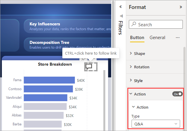
- Q&A opens a Q&A Explorer window. When your report readers select a Q&A button, the Q&A Explorer opens, and they can ask natural-language questions about your data.
- Apply all slicers and Clear all slicers buttons apply all the slicers or clear all the slicers on a page. See Create Apply all slicers and Clear all slicers buttons in reports for details.
- Web URL opens a web page in a browser.
Certain buttons have a default action that's selected automatically. For example, the Q&A button type automatically selects Q&A as the default action.
Note
An action can't have a numeric measure as the value of any of its fields.
To select a button action:
On the Button tab of the Format button pane, turn the Action to On, and then expand the card.
Expand Action, and then select the Type of button action.
Test the buttons you create for your report by selecting Ctrl and the button.
Create page navigation
With the Type of Action set to Page navigation, you can create a button that links to another page in your report, without creating a bookmark.
Tip
If you want to build an entire navigation experience for the report, without having to save or manage any bookmarks, create page and bookmark navigators instead of individual buttons.
To set up a single-page navigation button:
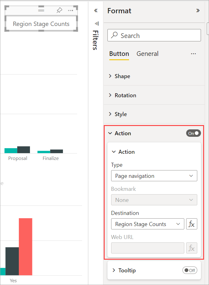
Create a button with Page navigation as the Type of Action, then select a page for the Destination.
Optionally, you can conditionally format the Tooltip under Action as you can do with other button types.
Note
If the text content of the tooltip matches the button text content, the tooltips are hidden to enhance the readability for accessibility tools.
If you want a custom navigation pane, create page and bookmark navigators instead of individual buttons.
Shapes and images for navigation
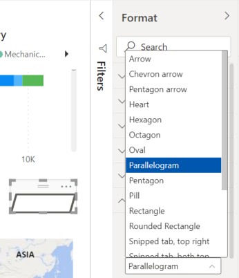
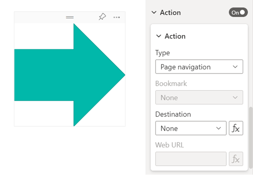
Page navigation action is also supported for shapes and images, not just buttons. Here’s an example using one of the built-in shapes:
Buttons support fill images
Power BI buttons support fill images. With fill images, you can customize the look and feel of your button, combined with the built-in button states: default, on hover, on press, and disabled (for drillthrough).
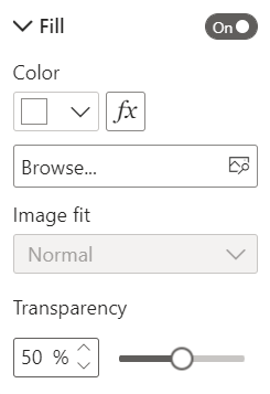
Under Style, set Fill to On, and then Browse for an image for each style state.
Related content
For more information about features that are similar or interact with buttons, take a look at the following articles:
