How does usage data improve the Office User Experience?
Hello, my name is Tim Briggs – I am a user experience (UX) Researcher in the Office Design Group (ODG). Usage data is one of the important feedback mechanisms we look at to understand how Office is being used in the real world. Answering questions like “how frequently is a command used?” and “how many files contain this feature?” are critical parts of our entire engineering process.
Today, I’d like to give you a better sense of how we collect, interpret, and design based on usage data. To get the most out of this discussion, some background might be helpful to you. I encourage you to check out Shawn’s post on Designing with Customers in Mind post—it will give you an idea of our research and design process. I’ll also point you to Peter’s post on Data Driven Engineering—it introduces the Customer Experience Improvement Program (CEIP), which is the source of the usage data I’ll discuss.
What types of usage data do we collect?
We collect two main types of usage data: command usage and feature usage. Each gives us a different perspective but the goal of analyzing both is to find patterns of usage in customer data. It’s also important to note that because the data are coming from CEIP, they are anonymous and contain nothing that can identify individuals or their content. But seen in aggregate, general patterns of usage emerge that help us explore, confirm, or challenge our understanding of how all of the Office applications and services are being used.
How do we use Command Usage data?
Command usage data (aka “click data”) tell us how a specific command is used. For instance, take the example of the Paste command. If we combine all of the clicks on Paste, we can mine that data to get a better understanding of:
- How frequently is it used—should we make it more or less prominent?
- How many people use it—what’s the impact of improving the experience?
- What’s the most frequent way of accessing this command—can we make it easier?
- Does this command occur as part of a clear workflow—how do we better support that?
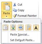
The Paste command in Word 2010 – command usage data helps us understand how it’s used
Command usage data also tells us about how different parts of the user interface are being used.
- Within a ribbon tab, what are the most used commands—should we rearrange them?
- Across tabs, what commands cause the most tab switches—where should the command live?
- How and when do people use right-click contextual menus—how can we improve that mechanism?
The Home tab in Word 2010 – the arrangement and size of buttons is informed by command usage data
This is basic but super useful information…and a bit daunting. Did you know that in Word alone there are over 2,000 commands? Want to know the most common Word command operating on text? Paste.
How do we use Feature Usage data?
Feature usage datais a little more difficult to describe. Let me try. Think of a “feature” as a general capability of Office, like Tables in Word. There might be many commands associated with using tables (e.g., Insert Table, Delete Row, Move Column…). While we might be interested in each of those commands, often we want to understand use of the feature at a higher level. This requires feature usage data—counters that we build into the feature to answer specific, predicted questions:
- How many files contain a Table—what is the impact of improving the Table feature?
- How big is the average Table—should we focus on improving large or small Tables?
- What are the most frequently used Table styles—what design choices should we provide?
- What other features are used in files containing Tables—how can we improve the interaction of different document parts?
If you want an interesting exercise, think of an idea you have for improving Office. First, use Send-A-Smile to tell us about it. :) Then, think about what information you would need to know about how that feature is used in order to create and validate your design for all of the users that will be impacted. That’s your feature usage data. And here’s a tip we use with all of our teams: sketch out the graph of the data which you expect to see once implemented—this helps you think about the form of the data to collect and sets your expectations for the final data to help you spot errors in your initial assumptions.
This is just a sampling to give you an idea of the breadth and depth of typical usage data we use across our engineering stages, from initial ‘what-ifs’ to late stage ‘Beta use is showing we have to change this.’
The Story of Paste and Usage Data
Let’s look at an example. Usage data tells us that Paste is the most frequent editing operation (for instance, it’s used almost two times more frequently than Bold). We also know from our other research methods (field visits, usability labs, focus groups, Send-A-Smile, etc.) that sometimes reformatting pasted content can be painful. We feel it ourselves—it can be hard to get the new content to look right.
As we began working on Office 2010, we wanted to improve the Paste experience. In order to do that we needed to understand more about how Paste is used. We looked to the usage data to provide some context. Below is an example of some of the ways usage data informed the engineering of what would eventually become the Paste Options gallery, which Mirko explains in his post on Live Preview Paste.
Question |
Data used |
Results |
How many users would this impact? |
Command Usage:
|
Paste is used by almost every user in almost every session of Word. In fact, it occurs more frequently per session than other related commands…like Cut or Copy. |
How are Paste and Paste Recovery being used? |
Feature Usage:
|
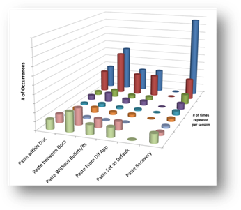
The result was the chart above. Note how frequently content is pasted from a different document or different application—those sources probably have different formatting, explaining the need for the additional formatting options provided by Paste Recovery. |
How do users get to the commands? |
Command Usage:
|
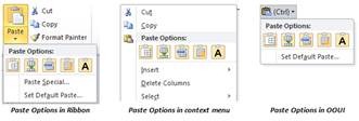
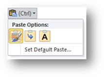
Predictably in Word, the most frequent is Ctrl-V by a wide margin, with the right-mouse menu next. We used this data to explore 1) improving the ease of access, the contents, and the interaction model of the Paste Recovery widget for keyboard users; 2) putting the Paste options directly in the right-mouse menu, for those users who are accustomed to pasting via the context menu; and 3) we also thought about how we can expose the improved Paste experience in the Ribbon. After iterating on several designs in the usability lab, you can see the result in the Office 2010 Ribbon, right-mouse context menu, and the Paste Recovery OOUI widget: |
What do people do after they paste? |
Command Usage:
|
Other than continuing to type, the most frequent commands relate to formatting (changing font size, color, appearance). The next most frequent are another Paste or an Undo. We used this data to understand what options needed to be available in the Paste Recovery options. It also clearly signaled that people are not satisfied with Paste results since they were often making “manual” formatting changes (or undoing the action) immediately after pasting. |
Which Paste Recovery options are most used? Do we have the right defaults? |
Feature Usage:
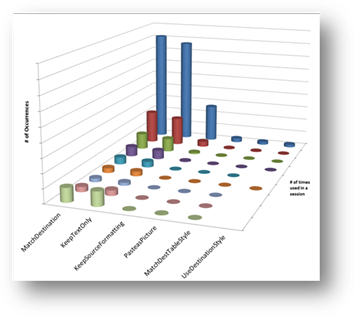
|
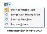
The result was the chart above. It shows how frequently each Paste Recovery option is used. KeepSourceFormatting is the default and comparing that to the number of times Paste is used versus number of times Paste Recovery is used, we have the right default. Note that the other options in the Paste Recovery widget are arranged in order by frequency: |
Armed with the usage data above, we explored different designs, iterated on them, and arrived at the current design that Mirko explains in his post. And now, as we receive usage data from the Office 2010 Beta releases, we continue to analyze the usage of this and the other significant improvements we made this version.
So, I hope this discussion has given you a sense of how we use usage data to improve the Office user experience. It’s been a game-changer for us…thank you for providing us the data.
Tim Briggs, UX Researcher, Office Design Group
Comments
Anonymous
January 01, 2003
John Wildes: Yes, Office is working on an update to the royalty free license and user interface guidelines that will include the Office 2010 improvements. This will be made available about the same time the product is released. Thanks for your interest!Anonymous
February 09, 2010
i have 2 points:
- Paste Recovery, i turn this off as soon as possible, just annoys me whenever i paste something in excel.
- i completely overhauled the ribbons in excel and outlook. do you get this data?
Anonymous
February 09, 2010
why did Microsoft spend so much time on the ribbon? And if paste is so popular, why did Microsoft make something of a mess of improving it in Office 2010?Anonymous
February 10, 2010
I was wondering if there is an Office 2010 UI Guidelines document similar to the one created for licensing of the 2007 Ribbon? Will similar licensing requirements be allowed for developing applications using the 2010 style of ribbon?Anonymous
February 11, 2010
The comment has been removedAnonymous
February 14, 2010
Again a classic example of how little MS understands "real" users and How DDE can lead to disasters If I want to do a paste special Values, then formats and column widths I have to repeat the paste special operation 3 times. If instead of radio buttons you had given check boxes, i could have done this in one operationAnonymous
February 15, 2010
The comment has been removedAnonymous
February 15, 2010
The comment has been removedAnonymous
February 15, 2010
Lastly, in Paint and WordPad, clicking Alt+F opens the File button equivalent but pressing Alt makes the menu go away. Now we must press one key combo (Alt+F) to enter backstage view, then hit another key (Esc) to exit it. Remember Office team, usability reigns supreme. Usability is what made Windows XP so successful.Anonymous
February 15, 2010
Or at least make the right mouse button close Backstage view. Currently the right mouse button is unused in Backstage view, how about clicking it anywhere closes Backstage view. It is really getting difficult to enter and exit Backstage view. It is a step back from 2007 orb in terms of usability at the expense of packing in more features, extensiblity and eye-candy.Anonymous
February 16, 2010
I have sent many smilies and frowns. Hope these are taken care in later editions. As this blog talks about Paste, I would like to mention that the Options (OOUI) is very handy when I take an Excel table/Chart to Powerpoint.Anonymous
February 19, 2010
Question: Technical question (probably best suited for a programming forum): Does the VSTO API expose any methods to capture Command Usage Data (example below)? I’m able to recreate a thesaurus with a macro and I’m also able to create a custom button event in VSTO that calls and captures the user’s word selection from a custom list, but I’m not able to capture the existing event when a user’s right click context menu Synonym selection event occurs. Do you have any suggestions or know if the option to capture this data is available to developers (outside of MS HQ)?Anonymous
March 04, 2010
How about all of the companies that are still using Windows XP or maybe vista with Office 2003 because
- it works
- it costs money and lots of lost time and productivity to upgrade to a product of questionable added value
- the ribbon is stupid, but completely removing the classic ui as an option makes my blood boil. why in the heck would you completely remove the menus, which were compact, non-intrusive, fairly well organized, constant accross systems and screen size, and most importantly - familiar; and replace it with something that is none of these things, imposes a huge learning curve (that is worst for your core longtime users), and takes more mousing and searching for once simple operations. The fact that most of my key commands no longer work (including the ability to access the classic menus by keyboard using 3rd party addins to the ribbon) is sand in my eyes. I wish I could use openoffice at work now, but we're locked into and even like some of the custom VBA and spreadsheets that rely on office. I haven't tried 2010 tech preview yet, so i apologize for my rant if this has been addressed, but as a recent (forced) switcher to multiple apps with ribbons, i have nothing but anger and pain in my heart the last couple months
Anonymous
March 23, 2010
Rangood, a way in which you can accomplish this is to rely on the context menu extensibility model (http://msdn.microsoft.com/en-us/library/ee691832(office.14).aspx) - you should hide the built-in control whose usage you want to track and add a custom control that exactly looks and works like the hidden built-in control. In addition to replicating the functionality of the built-in button (via CommandBars.ExecuteMso method) that the custom control mimics, you can also record and collect click data in the OnAction callback for the custom control. If you decide to this, you should make sure to have customer consent, though; your customers should be able to opt-out of this type of usage data collection and should certainly be aware of your planned utilization of that data.Anonymous
March 28, 2010
Just a question... when will you re-introduce menus and customizable toolbars? For now I'll stay on Office 2003 or an "open Office" Usability: fullfil expecations, productivity (e. g. using shortcuts), readability (assistive technologies), an consistent UI (e.g. classic windows -> classic office), customization (let the user decide if he/she want to use gimmicks (ribbon) or a productive UI (menus/ toolbars)...Anonymous
March 29, 2010
why not use the idea that Disappointed stated; it would be more effective ( I believe!)Anonymous
April 02, 2010
I HATE the new paste icons. I have no idea why someone thought this would be good to change. How would moving from text to icons help with anything??? What is the benefit, except for saving space. There was never a problem with the lack of space in this particular menu! Why change it! At first sight there is no way I can know what they do. I find myself looking at this menu for more than 5 seconds trying to remember what does what. I often find myself recalling what the text used to say, and basing my decision on the ordering of these icons. I find it hard to believe Microsoft actually test this new functionality with an accurate sample of actual users who actually use this command.Anonymous
April 02, 2010
I wonder what success rate you guys would have if you got a random sample of Office users, and got them to tell you what they think the new paste icons mean? I can't see any logical thought process to determine what function they perform. Perhaps this should be a question to ask in one of their famous Microsoft Interviews.
