Interview: Creating attractive PowerPoint presentations
Geetesh Bajaj, PowerPoint MVP, designs and sells high-quality PowerPoint templates on his Internet site, Ppted.com . He also provides in-depth how-to information on his other site, Indezine.com , as well as writing the Microsoft Office PowerPoint 2007 Complete Makeover Kit . Geetesh graciously took some time to answer a few questions from the Visual Communication and Design blog.
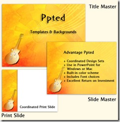
All images in this post are taken from Ppted.com .
When you begin creating a PowerPoint presentation, do you decide upon the graphic design and visual appeal first, or do you organize the content and information first?
One of the first steps to creating a presentation is applying a template (see my previous post about “discovering” the right template). There’s a common factor that binds the template and the presentation. First, they are both part of a unified scheme. Then, they both have to work towards the same goal of creating simplicity and balance of design.
For most presentations, I assume that such a template is already in place. If there’s no such template available, I might have an idea about the design at the back of my head – something I would call inspiration.
In a presentation, the most significant part is content, and I don’t start looking at the visual parts consciously until I have the outline of the presentation in place. By ‘outline’, I don’t just mean the content in PowerPoint’s outline pane, but rather three related concepts:
· Actual text content, pruned and edited
· A story that evolves, and visual content that supports the story
· The flow from slide to slide – no assumptions and no flashbacks!
Would you agree with the statement that “animation distracts the audience from a presentation”? When would (or wouldn’t) you use animation?
 To a certain extent, I would agree but I would not use that as an irrevocable mantra – a better statement would be:
“Animation that does not have a purpose is distraction. Animation that emphasizes the important is enhancement.”
What is your favorite, new, graphic design feature in PowerPoint 2010?
I love the new Artistic Effects in the Picture Tools – these are so amazing!
Comments
- Anonymous
March 27, 2010
nice tips from the MVP... Check this site for more themes appropriate for your presentation, http://www.free-power-point-templates.com...
