Interview: Designing PowerPoint templates and images
Geetesh Bajaj, PowerPoint MVP, designs and sells high-quality PowerPoint templates on his Internet site, Ppted.com . He also provides in-depth how-to information on his other site, Indezine.com , as well as writing the Microsoft Office PowerPoint 2007 Complete Makeover Kit . Geetesh graciously took some time to answer a few questions from the Visual Communication and Design blog.
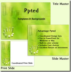
All images in this post are taken from Ppted.com .
When you begin creating a template, do you decide upon the graphic design and visual appeal first, or do you organize the content and information first? 
For a PowerPoint template, I look at three areas:
1. Explore the type of slides that a client or prospective user normally creates, or use a generic set of slides if there is no client involved
2. Play with and adapt to the slide layouts based on the exploration in the preceding step, and
3. Create a typical presentation that is more representative of the content researched.
Then I explore the design factor by looking at it in terms of a grid, colors, and different content types. This will ultimately lead me to discovering the right template. The important part here is “discover.”
Your templates on Ppted.com are so detailed and rich – how do you envision that people use them?
Ppted has detailed and rich templates simply because I love color and texture! Unfortunately, no one else creates templates of that kind – and in a strange way, that’s very fortunate for us.
We also work hard to retain the same saturation and contrast values in a design. Every Ppted design has a background that works because you can read all the text and see any foreground elements.
We test every design to ensure that they work with four accepted color harmonies:
· Monochromatic
· Analogous
· Split Contemporary
· Double Contemporary
In addition, we provide all designs as wide screen variations, along with coordinated transparent graphics – and we test them too. The resultant designs look brilliant when projected as well as looking attractive and understated at the same time.
Also, PowerPoint 2010 has a great “Save As” movie feature and several of our users have been playing with creating presentations that contain our backgrounds as movie backdrops!
I notice that several of your templates feature static images in the background that fade gradually from left to right (example). What intrigues you about this effect?
I like this effect because it allows us to create designs that use color and texture effectively. If there’s some foreground content like a detailed table or chart, then the presentation designer can actually use the faded area of the slide rather than the saturated parts.
In addition, each design includes variations with large white areas and more variations with semi-transparent, solid box areas so that you can use them in all sorts of slides and layouts.
Comments
Anonymous
March 27, 2010
Good advices from a PowerPoint MVP... Check out this site for more cool and unique powerpoint backgrounds and themes, http://www.free-power-point-templates.com...Anonymous
October 27, 2010
It's always a good idea to present your logo and identity design pasted on objects.We created a large portion of Animation Factory’s PowerPoint templates and 3D animations.It has evolved as a site that provides only the highest quality PowerPoint templates. <a href=www.free-power-point-templates.com/>powerpoint templates</a>
