ContentControl.Content Property
Definition
Important
Some information relates to prerelease product that may be substantially modified before it’s released. Microsoft makes no warranties, express or implied, with respect to the information provided here.
Gets or sets the content of a ContentControl.
public:
 property System::Object ^ Content { System::Object ^ get(); void set(System::Object ^ value); };
[System.ComponentModel.Bindable(true)]
public object Content { get; set; }[<System.ComponentModel.Bindable(true)>]
member this.Content : obj with get, setPublic Property Content As ObjectProperty Value
An object that contains the control's content. The default value is null.
- Attributes
Examples
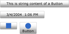
The following example demonstrates how to create four Button controls with Content set to one of the following:
Note
Although the Extensible Application Markup Language (XAML) version of the example could use the <Button.Content> tags around the content of each button, it is not necessary. For more information, see XAML Overview (WPF).
<!--Create a Button with a string as its content.-->
<Button>This is string content of a Button</Button>

<!--Create a Button with a DateTime object as its content.-->
<Button xmlns:sys="clr-namespace:System;assembly=mscorlib">
  <sys:DateTime>2004/3/4 13:6:55</sys:DateTime>
</Button>

<!--Create a Button with a single UIElement as its content.-->
<Button>
  <Rectangle Height="40" Width="40" Fill="Blue"/>
</Button>

<!--Create a Button with a panel that contains multiple objects
as its content.-->
<Button>
  <StackPanel>
    <Ellipse Height="40" Width="40" Fill="Blue"/>
    <TextBlock TextAlignment="Center">Button</TextBlock>
  </StackPanel>
</Button>
// Create a Button with a string as its content.
Button stringContent = new Button();
stringContent.Content = "This is string content of a Button";

// Create a Button with a DateTime object as its content.
Button objectContent = new Button();
DateTime dateTime1 = new DateTime(2004, 3, 4, 13, 6, 55);

objectContent.Content = dateTime1;

// Create a Button with a single UIElement as its content.
Button uiElementContent = new Button();

Rectangle rect1 = new Rectangle();
rect1.Width = 40;
rect1.Height = 40;
rect1.Fill = Brushes.Blue;
uiElementContent.Content = rect1;

// Create a Button with a panel that contains multiple objects
// as its content.
Button panelContent = new Button();
StackPanel stackPanel1 = new StackPanel();
Ellipse ellipse1 = new Ellipse();
TextBlock textBlock1 = new TextBlock();

ellipse1.Width = 40;
ellipse1.Height = 40;
ellipse1.Fill = Brushes.Blue;

textBlock1.TextAlignment = TextAlignment.Center;
textBlock1.Text = "Button";

stackPanel1.Children.Add(ellipse1);
stackPanel1.Children.Add(textBlock1);

panelContent.Content = stackPanel1;
' Add a string to a button.
Dim stringContent As New Button()
stringContent.Content = "This is string content of a Button"

' Add a DateTime object to a button.
Dim objectContent As New Button()
Dim dateTime1 As New DateTime(2004, 3, 4, 13, 6, 55)

objectContent.Content = dateTime1

' Add a single UIElement to a button.
Dim uiElementContent As New Button()

Dim rect1 As New Rectangle()
rect1.Width = 40
rect1.Height = 40
rect1.Fill = Brushes.Blue
uiElementContent.Content = rect1

' Add a panel that contains multpile objects to a button.
Dim panelContent As New Button()
Dim stackPanel1 As New StackPanel()
Dim ellipse1 As New Ellipse()
Dim textBlock1 As New TextBlock()

ellipse1.Width = 40
ellipse1.Height = 40
ellipse1.Fill = Brushes.Blue

textBlock1.TextAlignment = TextAlignment.Center
textBlock1.Text = "Button"

stackPanel1.Children.Add(ellipse1)
stackPanel1.Children.Add(textBlock1)

panelContent.Content = stackPanel1
The following illustration shows the four buttons created in the previous example.

Remarks
Because the Content property is of type Object, there are no restrictions on what you can put in a ContentControl. The Content is displayed by a ContentPresenter, which is in the ControlTemplate of the ContentControl. Every ContentControl type in WPF has a ContentPresenter in its default ControlTemplate. For more information about how the ContentPresenter displays Content, see ContentPresenter.
Dependency Property Information
| Item | Value |
|---|---|
| Identifier field | ContentProperty |
Metadata properties set to true |
None |
XAML Attribute Usage
<object Content="content"/>
XAML Property Element Usage
<object> content</object>
XAML Values
Content
Text or a single object.
