New look for MSDN
Beth’s blog has some really good discussion about the new look for MSDN just around the corner… the Visual Basic Developer Centre is a good preview of what’s to come...
The current look:
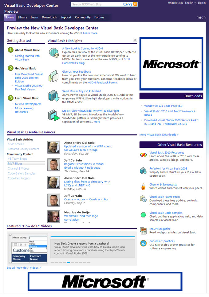
What’s new?
- New colour – from red to blue…
- Better layout on the home page for easier navigation.
- Essential resources are centred right in the middle with a rotator of sorts that allows you to pick a tab on the left to hone in on the content you want on the right.
- You’ll see featured articles and library content, VB team and MVP blog posts, our Channel 9 videos, and VB samples & projects on Code Gallery and Codeplex all right there in the middle of the page.
Beth also blogged that we added ratings and comments on the videos a while back + a video scroller that lets you browse the most popular videos with ease.
I received a lot of feedback from TechEd Australia about finding the right information and how to engage with communities… there’s a lot in the pipeline but please give us your feedback in the MSDN feedback forum where folks from MSDN will be participating. Of course, you can always tell me your thoughts here as well.

