A New Look is Coming to MSDN – See a Preview on the VB Dev Center
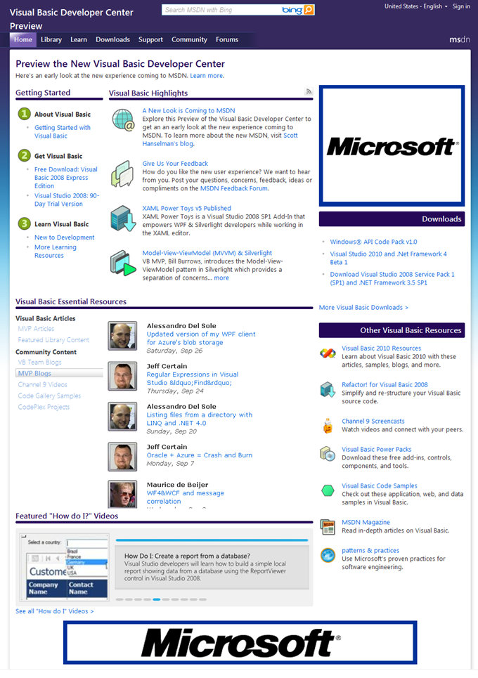
Today MSDN released a preview of what’s to come later this month on the Visual Basic Developer Center. You should notice an URL at the top that directs you to check out the preview:
Besides the cool colors you’ll see a better layout on the home page for easier navigation. Essential resources are centered right in the middle with a rotator of sorts that allows you to pick a tab on the left to hone in on the content you want on the right. You’ll see featured articles and library content, VB team and MVP blog posts, our Channel 9 videos, and VB samples & projects on Code Gallery and Codeplex all right there in the middle of the page.
Of course, content is king, and you’ll still be seeing great Visual Basic content rolling out here on the Dev Center. We’ve got a lot of cool stuff in our pipeline! Stay tuned for more awesome “How Do I” Videos!
I mentioned that we added ratings and comments on the videos a while back (and I’ve been keeping up with them ;-)), but now we also have a video scroller that lets you browse the most popular videos with ease. You’ll see this control on the home page (at the bottom) as well as the learn page and soon we’ll also be able to see the ratings and views right here as well.
There’s a lot more coming on MSDN but take a look at the site and give us your feedback in the MSDN feedback forum where folks from MSDN will be participating. Of course, you can always tell me your thoughts here as well and I’ll get them back to the right folks.
Enjoy!
Comments
Anonymous
October 07, 2009
What I like the most besides the new outfit is the essential resources section. It is good to see that refreshing the whole page to update a portion of it is gone for good (I guess thanks to AJAX technology). Furthermore, the silverlight based amazing featured Videos list keeps me busy by clicking the below tabs to see the animation effect :-)Anonymous
October 08, 2009
What I would like to see is for MSDN to get smart and start profiling my activity so that it can then prioritize the content that is displayed for me. The amount of content is both an advantage and disadvantage. I want MSDN to learn about me based upon my searches and navigation so that it can prioritize the information displayed to be more specific to what I do. For example if I am an ASP.Net developer that uses VB.Net, MSDN should know that and give content in these areas higher priority. Also if I am looking at WCF, LINQ, and TFS for eample these technologies should get weighted into the decision as to what information is displayed in the navegation options. Also, it would be nice if I could create web slices based upon my profile so that I get notified of new related content. Perhaps work with the Bing folks to incorporate decision intelligence into to MSDN.Anonymous
October 08, 2009
Hi Beth, The overall design is good with lots emphasis on the available content. However, the use of motion graphics on the pages is a very bad choice. It makes it tough to view for those of us with vertigo. Please tell them not to make anything move, blur, or wipe except when the user makes it happen with a click. KenAnonymous
October 08, 2009
Waleed - LOL. Thanks for the feedback. Michael - I totaly agree with you and longer term that is the plan; to have an integrated user profile across forums, galleries and the dev centers so you can do exactly that. Ken- (Hi!) are you referring to the center of the page? I'll send them your feedback about that. I think the blury text is definitely an issue, but I think the rotation could be helpful for first time users so they could be aware of all the content underneath. I agree that once you're familiar with the page it could cause headaches.Anonymous
October 09, 2009
I guess Michael wants the behavior already implemented by Google (Google Analytics). In my humble opinion, although I totally agree with him that it makes the website smarter, it has its side effect on speed of navigation and perhaps privacy of data collection. I have no doubt that we all agree to request from Beth to comeback to Windows Forms Development after this journey VSTO. Otherwise, my colleagues and I shall migrate to Office Development and become an MS Office Boys :-) Have a wonderful day.Anonymous
October 13, 2009
Hi Beth, I love the new look. It gives me ideas about things to try on my site (although mine is still asp classic - I'm having a hard time learning asp.net >.< I know it's likely a really small thing, but I've just found a typo on the following page: Visual Basic Developer Center > Learn > New to Development (URL): http://msdn.microsoft.com/en-us/vbpreview/ms789097.aspx On the last link under Development Concepts, "Language" is missing an E at the end of the word. Enjoy your day :)Anonymous
October 14, 2009
The main reason I hit MSDN is to get to the documentation section. What I'd like is something like a Search bar for the MSDN Library, with autocomplete for objects/methods/etc. So I can start typing System.Web. ... and in an Intellisense-type way, the members are listed. Also, where I don't know the full namespace for an object (e.g. SqlRoleProvider), I could type SqlRoleProvider and have it autocomplete to the full namespace.

