Monitor Office compatibility and deployments by using Office Telemetry Dashboard
Applies to: Office 2019, Office 2016
Important
- Office Telemetry Dashboard is no longer supported in Microsoft 365 Apps for enterprise (as of Version 2208), and is removed in Version 2301 (and later).
- For more information, see Removal of Office Telemetry Dashboard from Microsoft 365 Apps for enterprise.
After you deploy the components of Office Telemetry Dashboard and the agents have collected data, you can use Office Telemetry Dashboard to investigate stability issues for Office documents and Office solutions. You can also use Office Telemetry Dashboard to see the status of Office deployments. This article guides you through navigating the worksheets in Office Telemetry Dashboard. It explains how to use filters to adjust data display, and covers troubleshooting common error messages in Office Telemetry Dashboard.
Important
- Office Telemetry Dashboard is an on-premises tool that collects inventory, usage, and health data about the Office documents and solutions, such as add-ins, used in your organization. The data is primarily designed to help your organization with application compatibility testing.
- Data collected for Office Telemetry Dashboard is stored in a SQL Server database controlled by your organization and the data collected is not sent to Microsoft. For more information, see Data collected by the agent for Office Telemetry Dashboard.
- Data collected for Office Telemetry Dashboard is different than Office diagnostic data, which can be sent to Microsoft. For more information about Office diagnostic data, see Overview of privacy controls for Microsoft 365 Apps.
- Settings used to manage Office Telemetry Dashboard have no impact on Office diagnostic data and vice versa. For more information about managing Office diagnostic data, see Use policy settings to manage privacy controls for Microsoft 365 Apps.
Open Office Telemetry Dashboard and connect to the database
After the Office Telemetry Dashboard components are deployed, you're ready to start Office Telemetry Dashboard and connect to the database.
To help you get started, view this short video called *Quick tips for Office Telemetry Dashboard navigation.
Short video about Office Telemetry Dashboard navigation
Although this video is for an earlier version of Office, the information also applies to newer versions of Office.
The way you start Office Telemetry Dashboard depends on the operating system you're using. The following table lists and describes the procedures for each supported operating system:
To start Office Telemetry Dashboard
| Operating system | How to start Office Telemetry Dashboard |
|---|---|
| Windows 10, Windows 7, or Windows Server 2008 R2 |
From the Start menu, choose All Programs, then Microsoft Office 2016 Tools, then Telemetry Dashboard for Office 2016. |
| Windows 8.1 |
On the Start screen, right-click the background or swipe in from the top or bottom to display the app bar, select All apps, and then select Telemetry Dashboard for Office 2016. |
| Windows Server 2012 or Windows Server 2012 R2 |
Swipe in from the right edge to show the charms and then select Search to see all the apps that are installed on the computer. Next, choose Telemetry Dashboard for Office 2016. |
For Office 2019, look for Telemetry Dashboard for Office under Microsoft Office Tools.
Note
- Support for Windows 7 and Windows Server 2008 R2 ended on January 14, 2020.
- Support for Windows 8.1 ended on January 10, 2023.
To connect to the database
On the Getting started worksheet, choose Connect to Database.
In the Data connection settings dialog box, enter the name of the SQL Server server and database where data is stored, and then choose OK.
After you connect Office Telemetry Dashboard to the database, new worksheets are added to display information about Office documents, solutions, and other information. If you haven't yet deployed Office Telemetry Dashboard components, or if data isn't populating the dashboard as expected, see Deploy Office Telemetry Dashboard.
Navigating in Office Telemetry Dashboard
After deploying all components and connecting Office Telemetry Dashboard to the database, new worksheets display information about documents, solutions, and other data. The navigation pane on the left side of the Office Telemetry Dashboard window is the primary way to navigate through the worksheets in the dashboard. You can also use the navigation pane to change the data range and label filters.
To learn more about the worksheets in Office Telemetry Dashboard, visit these resources:
This article includes a brief overview of the worksheets and how to use them in Learn about the Office Telemetry Dashboard worksheets. The rest of this article tells you how to adjust filters, how to determine overall Office stability, and how to investigate unstable documents and solutions.
You can dig deeper by reading Office Telemetry Dashboard worksheets that describes every worksheet in Office Telemetry Dashboard in detail. This is helpful if you want more information about the columns and data shown in a worksheet.
Custom reporting and database schema reference for Office Telemetry Dashboard helps you create custom reports in Office Telemetry Dashboard using a PivotTable report. Custom reports can help you customize how data is displayed for different business purposes. For example, you can view all Warning errors for Excel in a certain business group, create a list of all solutions that use unregistered ActiveX controls, and more.
Learn about the Office Telemetry Dashboard worksheets
The following table briefly describes the primary worksheets in Office Telemetry Dashboard. For more detailed information about the worksheets, see Office Telemetry Dashboard worksheets.
Overview of Office Telemetry Dashboard worksheets
| Worksheet name | Purpose |
|---|---|
| Overview |
Provides a quick view of the health of Office documents and solutions and a view of deployment trends. The links on this worksheet help you investigate Office compatibility and stability issues in your organization. |
| Documents |
Helps you investigate which Office documents are the most heavily used and identify documents that are experiencing issues. This worksheet displays Office documents detected in the Most Recently Used (MRU) files in the local registry of monitored clients running Office and earlier supported versions. The list also contains load events for monitored clients that run Office. Select any of the value links to open a worksheet that provides more detail. For example, in the Total Users column, you can select any number to view the users who have that file in their MRU list. |
| Solutions |
Shows details about solutions, such as COM add-ins, that were detected on monitored computers. This worksheet also shows data about load events on monitored client computers that run Office. Check the Critical column for a count of the number of unique users who have hit critical errors that the solutions are causing on Office clients. By reviewing critical errors and the number of users affected, you can decide whether to forcibly block add-ins that are crashing for many users. To do so, choose the Add-in management mode link at the top of the worksheet. You can also investigate performance issues that might be causing a solution to take a longer time to load than expected on some computers. The load time values that are displayed in this worksheet are statistical averages. Select on of the value links to see individual user load times for a particular document. |
| Telemetry Processor |
Lists the servers that run a processor, the number of users and computers that are monitored, and the date and time of the last update. |
| Deployments |
Lists the versions of Office that are detected and other details, such as architecture type and number of unique instances of each version. |
| Custom report |
Helps you to create a PivotTable report so that you can customize how you view the data in Office Telemetry Dashboard. Create a custom report if the Documents and Solutions worksheets don't display data in the way that you want to view it. To learn more, see Custom reporting and database schema reference for Office Telemetry Dashboard. |
| Getting started |
Provides step-by-step guidance to deploy Office Telemetry Dashboard components. |
| Office Telemetry Dashboard guide |
Provides a brief tutorial on Office Telemetry Dashboard concepts. |
Use filters to adjust what's shown in an Office Telemetry Dashboard worksheet
In the navigation pane on the left side of the dashboard, there are filters called Label1, Label2, Label3, Label4, Date range, and View. You can use these filters to change the scope of the data that is shown in a worksheet. Any time that you change a filter, you must select the Refresh button
![]() to refresh the data in the content pane. The Refresh button is located in the upper-right corner of most worksheets. When you refresh the data, the sorting order is automatically reset. You can verify when the content pane was last updated by referring to the time stamp that is located below the Refresh button on the navigation pane.
to refresh the data in the content pane. The Refresh button is located in the upper-right corner of most worksheets. When you refresh the data, the sorting order is automatically reset. You can verify when the content pane was last updated by referring to the time stamp that is located below the Refresh button on the navigation pane.
Label filters
- Use the Label filters to filter data by department, location, or deployment group. These filters are available for most worksheets.
- The Label filters are populated by data that is specified in the <TAG> fields when you deploy the agent on client computers. For more information on how to set these fields, see Office Telemetry Agent.

Date range filter
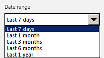
- Use the Date range filter to choose the date range for the data that you want to view. This helps you watch trends over longer periods of time, or drill down and find more recent data for analysis.
- The graphs on the Overview worksheet, such as Documents and Solutions stability and Office deployment trend, show data that extends back to four times the selected date range in the navigation pane. This provides better context when you graphically display the data and trends for analysis. For longer date ranges, there might be a small delay before the results are displayed in the content pane.
- The Overview worksheet supports changing the date range to Last 7 days, Last 1 month, or Last 3 months. A snapshot of the database is taken every evening at midnight (local server time). It's used to compose the graphs and data that are shown on the Overview worksheet. Therefore, the Overview worksheet isn't real-time, but is, instead, based on nightly snapshots.
View filter
- The View filter on the Documents and Solutions worksheets allows you to select prescoped views that help you analyze data. Here are the options that you can choose from:
- Frequently used displays all documents or solutions that were used within the selected date range, sorted by total number of users.
- Frequently used by Office 2016 and later displays all documents or solutions that were used by Office within the selected range, sorted by total number of users of Office.
- Attention items displays all documents or solutions that have critical issues that were found within the selected date range.
- Stability - Top 400/100 displays the documents (up to 400) or solutions (up to 100) that have success rates that are less than the target threshold (95% for documents, 99.9% for solutions).
Determine the overall stability of Office documents and solutions throughout your organization
The Overview worksheet allows you to quickly understand how your critical documents and solutions (add-ins) are behaving on users' computers. Instead of browsing the Documents and Solutions worksheets, which show you item-by-item status, you can open and refresh the Overview worksheet to see a high-level view of document and solution stability.
The following screenshot shows the Overview worksheet.
The Overview worksheet in Office Telemetry Dashboard
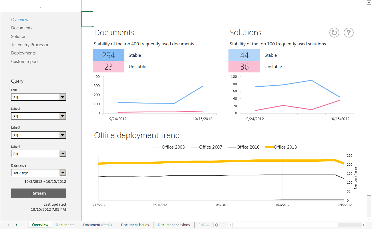
The four numbers that are highlighted at the top of the content pane show the number of stable and unstable documents and solutions. If you see a high unstable count, you should investigate to find out what is occurring.
The metrics for stable versus unstable are calculated by determining whether the documents or solutions have success rates that meet the following thresholds:
95% for documents
99.9% for solutions
If a document or solution meets these thresholds, they're considered stable. If they don't meet these thresholds, they're considered unstable. The success rate is determined by the percentage of sessions where the document or solution operated without encountering a critical issue. The critical issues that are tracked by Office Telemetry include application crashes, Office object model calls that would definitively fail for compatibility reasons, and more. A session is defined by the opening of a document or solution or an elapsed 24-hour period where the document is open.
You can use the filters in the navigation pane to focus on specific business groups in your organization or customized date ranges. For example, you might want to know how well the new Sales reporting solutions for Office are performing since their deployment last month. You can select the Last 1 month date range, and the appropriate Label for the Sales team's computers. After you select Refresh, the Overview worksheet view shows you a high-level view of document and solution stability for the Sales team's Office deployments. From there, you can decide your next steps.
In addition, the Overview worksheet view provides a summary of the top 400 frequently used documents and the top 100 frequently used solutions. Research indicates that these numbers represent the average number of documents and solutions in any given enterprise department that are frequently used.
Note
Built-in documents and solutions that are provided by Microsoft aren't included in the top documents and solutions counts that are displayed on the Overview worksheet.
Drill down to investigate unstable documents or solutions that require your attention
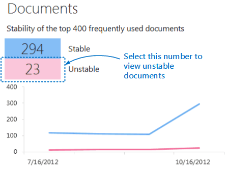
After you know the number of unstable documents and solutions, you can drill into the details. On the Overview worksheet, select a value to see a detailed list of stable or unstable documents or solutions. The following graphic shows how to view the unstable documents by selecting the corresponding value ( 23) on the Overview worksheet.
How to choose a value on the Overview worksheet to see unstable documents
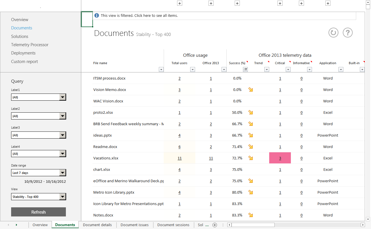
After you select the link for unstable documents, the Documents worksheet appears. The worksheet is filtered to show the 23 unstable documents. The following screenshot shows an example of this filtered view. Although it isn't obvious in the screenshot, only 23 documents are listed, sorted by most unstable.
Unstable documents that are shown in the Documents worksheet
Important
Remember that when you select a link on the Overview worksheet to see details about documents or solutions, the contents pane displays a filtered view. Select the message bar at the top of the header pane to see the full list of all items for that worksheet.
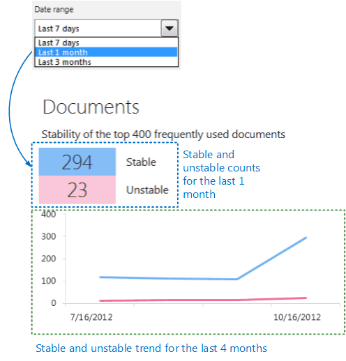
Back on the Overview worksheet, under the stable and unstable counts, you can see the trend charts that show how these counts increased or decreased over past periods. If you see the trend line pointing down to indicate a decline in stability, this indicates that recent changes are triggering issues for your documents and solutions. As shown in the following screenshot, the date range that is displayed in the trend chart shows an expanded range that is four times longer than the selected date range. This provides better context to view the overall trend data.
How trend data is illustrated on the Overview worksheet
View the progress of Office deployments in your organization
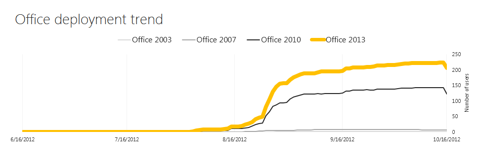
You can track your overall Office deployment progress by looking at the chart at the lower part of the Overview worksheet. This shows the number of users who are running each Office version and how the Office deployments have changed over time. By using this chart, you can quickly check the deployment status and share progress with your stakeholders.
Note
The date range that is displayed in the deployment trend chart shows an expanded range that is four times longer than the selected date range. This provides better context to view the overall trend data.
The following image shows an example of the Office deployment trend chart on the Overview worksheet.
Office deployment trend chart on the Overview worksheet
Troubleshoot error messages that are shown in Office Telemetry Dashboard
As you use Office Telemetry Dashboard, you might notice error messages that are shown in yellow banners at the top of the dashboard. The following sections describe common error messages.
You see the error message "The Telemetry Dashboard COM add-in isn't enabled or installed."
When you view a worksheet in Office Telemetry Dashboard, you might see the following message:
COM add-in error message

To resolve this issue, enable the Office Telemetry Dashboard COM add-in that is available in Office Professional Plus 2019, Office Professional Plus 2016, or Office Standard 2016.
To enable the Office Telemetry Dashboard COM add-in
Start Office Telemetry Dashboard by choosing Telemetry Dashboard for Office 2016 in the All Apps page in Windows 8.1, or by choosing Telemetry Dashboard for Office 2016 from the Start menu under Microsoft Office 2016 Tools in Windows 10 or Windows 7. For Office 2019, look for Telemetry Dashboard for Office under Microsoft Office Tools.
Select the Let's get started button.
In the Getting Started worksheet, select the Click here to use saved copies of Telemetry Dashboard banner that is shown in the following screenshot.
Message that enables saved copies of Telemetry Dashboard

Reopen the Office Telemetry Dashboard Excel worksheet that had the error message.
You see the error message "Telemetry Processor service(s) have errors."
When you view a worksheet in Office Telemetry Dashboard, you might see the following message:
Office Telemetry Processor error message

This error message is displayed when no agents have reported any data to the dashboard, or if the processor hasn't inserted any data to the database for a day.
For more information, see the log file (%windows%\ServiceProfiles\NetworkService\AppData\Local\Temp\dperrorlog.txt on the computer where processor is running).
In addition, do the following:
Verify the network connection between the processor and the Office Telemetry Dashboard is working as expected.
In Service in Control Panel, verify that the Office Telemetry Processor service is running.
Verify that the SQL Server server is running correctly.
Verify that the data in the shared folder that was reported back from the agent was processed correctly. If there are many folders and files in the shared folder that weren't processed for more than 2 hours, the processor isn't working correctly.
For more information about how to troubleshoot the processor, see Troubleshooting Office Telemetry Dashboard deployments.