Reveal Focus
Reveal Focus is a lighting effect for 10-foot experiences, such as game consoles on television screens. It animates the border of focusable elements, such as buttons, when the user moves gamepad or keyboard focus to them. It's turned off by default, but it's simple to enable.
Important APIs: Application.FocusVisualKind property, FocusVisualKind enum, Control.UseSystemFocusVisuals property
How it works
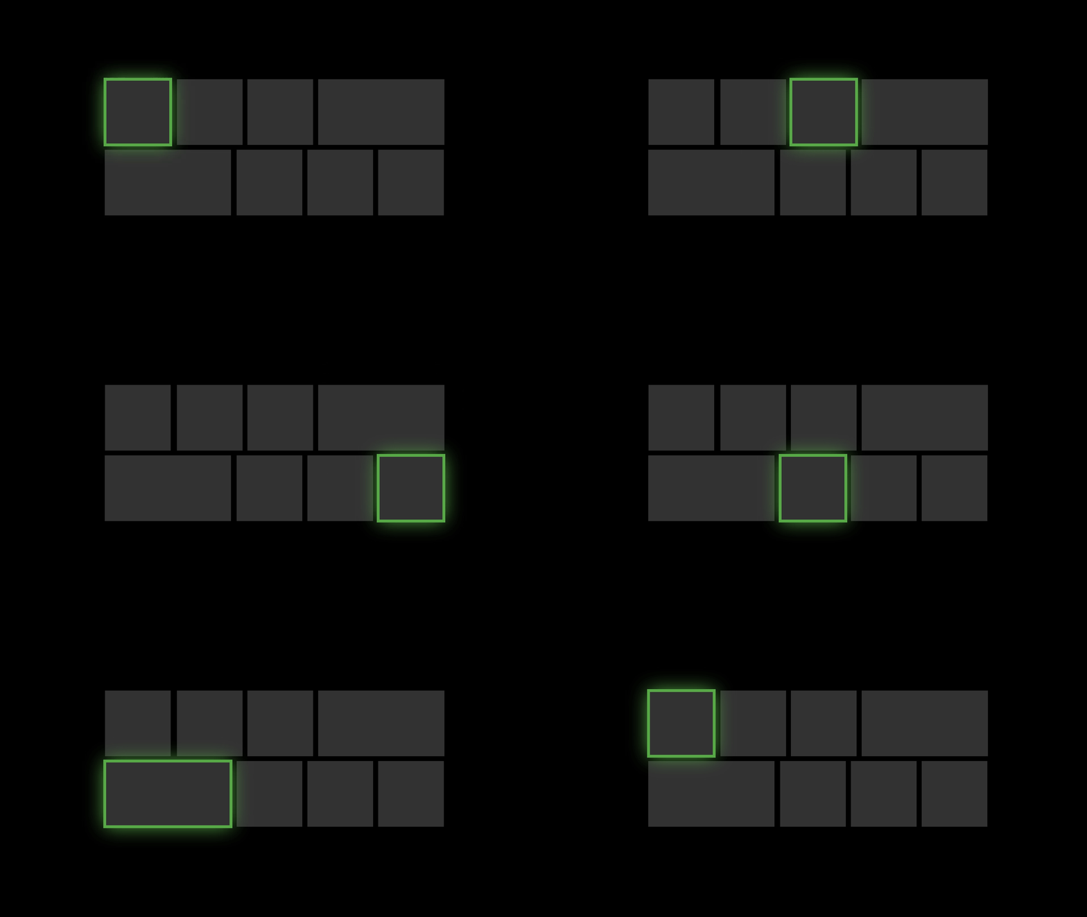
Reveal Focus calls attention to focused elements by adding an animated glow around the element's border:

This is especially helpful in 10-foot scenarios where the user might not be paying full attention to the entire TV screen.
Examples
The WinUI 2 Gallery app includes interactive examples of most WinUI 2 controls, features, and functionality. Get the app from the Microsoft Store or get the source code on GitHub.
How to use it
Reveal Focus is off by default. To enable it:
- In your app's constructor, call the AnalyticsInfo.VersionInfo.DeviceFamily property and check whether the current device family is
Windows.Xbox. - If the device family is
Windows.Xbox, set the Application.FocusVisualKind property toFocusVisualKind.Reveal.
    if(AnalyticsInfo.VersionInfo.DeviceFamily == "Windows.Xbox")
    {
        this.FocusVisualKind = FocusVisualKind.Reveal;
    }
After you set the FocusVisualKind property, the system automatically applies the Reveal Focus effect to all controls whose UseSystemFocusVisuals property is set to True (the default value for most controls).
Why isn't Reveal Focus on by default?
As you can see, it's fairly easy to turn on Reveal Focus when the app detects it's running on an Xbox. So, why doesn't the system just turn it on for you? Because Reveal Focus increases the size of the focus visual, which might cause issues with your UI layout. In some cases, you'll want to customize the Reveal Focus effect to optimize it for your app.
Customizing Reveal Focus
You can customize the Reveal Focus effect by modifying the focus visual properties for each control: FocusVisualPrimaryThickness, FocusVisualSecondaryThickness, FocusVisualPrimaryBrush, and FocusVisualSecondaryBrush. These properties let you customize the color and thickness of the focus rectangle. (They're the same properties you use for creating High Visibility focus visuals.)
But before you start customizing it, it's helpful to know a little more about the components that make up Reveal Focus.
There are three parts to the default Reveal Focus visuals: the primary border, the secondary border and the Reveal glow. The primary border is 2px thick, and runs around the outside of the secondary border. The secondary border is 1px thick and runs around the inside of the primary border. The Reveal Focus glow has a thickness proportional to the thickness of the primary border and runs around the outside of the primary border.
In addition to the static elements, Reveal Focus visuals feature an animated light that pulsates when at rests and moves in the direction of focus when moving focus.
Customize the border thickness
To change the thickness of the border types of a control, use these properties:
| Border type | Property |
|---|---|
| Primary, Glow | FocusVisualPrimaryThickness (Changing the primary border changes the thickness of the glow proportionately.) |
| Secondary | FocusVisualSecondaryThickness |
This example changes the border thickness of a button's focus visual:
<Button FocusVisualPrimaryThickness="2" FocusVisualSecondaryThickness="1"/>
Customize the margin
The margin is the space between the control's visual bounds and the start of the focus visuals secondary border. The default margin is 1px away from the control bounds. You can edit this margin on a per-control basis by changing the FocusVisualMargin property:
<Button FocusVisualPrimaryThickness="2" FocusVisualSecondaryThickness="1" FocusVisualMargin="-3"/>
A negative margin pushes the border away from the center of the control, and a positive margin moves the border closer to the center of the control.
Customize the color
To change color of the Reveal Focus visual, use the FocusVisualPrimaryBrush and FocusVisualSecondaryBrush properties.
| Property | Default resource | Default resource value |
|---|---|---|
| FocusVisualPrimaryBrush | SystemControlRevealFocusVisualBrush | SystemAccentColor |
| FocusVisualSecondaryBrush | SystemControlFocusVisualSecondaryBrush | SystemAltMediumColor |
(The FocusPrimaryBrush property only defaults to the SystemControlRevealFocusVisualBrush resources when FocusVisualKind is set to Reveal. Otherwise, it uses SystemControlFocusVisualPrimaryBrush.)
To change the color of the focus visual of an individual control, set the properties directly on the control. This example overrides the focus visual colors of a button.
<!-- Specifying a color directly -->
<Button
    FocusVisualPrimaryBrush="DarkRed"
    FocusVisualSecondaryBrush="Pink"/>

<!-- Using theme resources -->
<Button
    FocusVisualPrimaryBrush="{ThemeResource SystemBaseHighColor}"
    FocusVisualSecondaryBrush="{ThemeResource SystemAccentColor}"/>
To change the color of all focus visuals in your entire app, override the SystemControlRevealFocusVisualBrush and SystemControlFocusVisualSecondaryBrush resources with your own definition:
<!-- App.xaml -->
<Application.Resources>

    <!-- Override Reveal Focus default resources. -->
    <SolidColorBrush x:Key="SystemControlRevealFocusVisualBrush" Color="{ThemeResource SystemBaseHighColor}"/>
    <SolidColorBrush x:Key="SystemControlFocusVisualSecondaryBrush" Color="{ThemeResource SystemAccentColor}"/>
</Application.Resources>
For more information on modifying the focus visual's color, see Color Branding & Customizing.
Show just the glow
If you'd like to use only the glow without the primary or secondary focus visual, simply set the control's FocusVisualPrimaryBrush property to Transparent and the FocusVisualSecondaryThickness to 0. In this case, the glow will adopt the color of the control background to provide a borderless feel. You can modify the thickness of the glow using FocusVisualPrimaryThickness.
<!-- Show just the glow -->
<Button
    FocusVisualPrimaryBrush="Transparent"
    FocusVisualSecondaryThickness="0" />
Use your own focus visuals
Another way to customize Reveal Focus is to opt out of the system-provided focus visuals by drawing your own using visual states. To learn more, see the Focus visuals sample.