Adding support for web part Top Actions
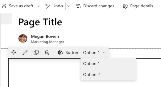
Top Actions provide an alternative and more end user friendlier way to expose the different options and configuration capabilities for web parts in edit mode. You can use Top Actions to surface most common configurations from the web part property panel directly in web part toolbar, which is exposed when the page is in edit mode.

Important
Web part Top Actions were introduced in the SharePoint Framework (SPFx) v1.17 release.
Getting started
To add Top Actions to a web part, you'll implement two things:
- return a collection of Top Actions to display at the top of the web part when the page is in edit mode
- implement a handler that's called by SPFx when the Top Action is selected
Both of these steps are accomplished by providing a configuration object of type ITopActions to the SPFx.
Tip
These instructions assume you know how to create a hello world web part.
Define a Top Action configuration
Adding Top Actions to a web part follows a similar pattern to configuring the web part property pane.
To add Top Actions to a web part, implement the getTopActionsConfiguration() member that returns an object of type ITopActions:
// existing imports omitted for brevity
import {
  ITopActions,
  ITopActionsField
} from '@microsoft/sp-top-actions';

export default class HelloWorldWebPart extends BaseClientSideWebPart<IHelloWorldWebPartProps> {

  // existing web part members omitted for brevity

  public getTopActionsConfiguration(): ITopActions | undefined {
    return {
      topActions: [],
      onExecute: (actionName: string, newValue: any): void { }
    };
  }

}
Notice the returned object has two properties:
topActions: this contains an array of supported Top Action controls that are rendered in the web part's toolbar when the page is in edit modeonExecute: this handler is called when one of the Top Actions is selected
Define the Top Actions user interface
The topActions array is an ordered list of controls, or fields of type ITopActionsField, to render in the web part toolbar. You can choose from two types of user interface elements:
- button
- dropdown list
All controls must have the following properties defined:
type: this is the type of the control - button (TopActionsFieldType.Button) or dropdown list (`TopActionsFieldType.Dropdown)targetProperty: this is the name of the Top Actionproperties: properties unique to the type of Top Action control
You can optionally specify a title which is used as the tooltip & value for an aria-label property, and the Boolean shouldFocus flag to indicate if the control should be focused.
Define the Top Actions button field
The following code defines a button Top Action control:
import {
  ITopActions,
  TopActionsFieldType
} from '@microsoft/sp-top-actions';

return {
  topActions: [
    {
      targetProperty: 'button',
      type: TopActionsFieldType.Button,
      title: 'Button',
      properties: {
        text: 'Button',
        icon: 'SharePointLogo'
      }
    }
  ],
  onExecute: (actionName: string, newValue: any): void { }
}
The properties for a button control are defined in the ITopActionsButtonProps interface.
Define the Top Actions dropdown field
The following code defines a dropdown Top Action control:
import {
  ITopActions,
  TopActionsFieldType
} from '@microsoft/sp-top-actions';

return {
  topActions: [
    {
      targetProperty: 'dropdown',
      type: TopActionsFieldType.Dropdown,
      title: 'Dropdown',
      properties: {
        options: [{
          key: '1',
          text: 'Option 1'
        }, {
          key: '2',
          text: 'Option 2'
        }]
      }
    }
  ],
  onExecute: (actionName: string, newValue: any): void { }
}
The properties for a dropdown control are defined in the ITopActionsButtonProps interface.
Define the handler when controls are selected
The last step is to implement the handler when Top Action controls are selected. This is done by implementing the onExecute() method on the ITopActions interface.
The onExecute() handler passes two arguments in that you can handle:
actionName: maps to thetargetPropertyof the Top Action control that triggered this handler to be calledupdatedValue: when the Top Action is of type dropdown, this is thekeyproperty of the selected dropdown option; otherwise when the Top Action is of type button, the value of this property istrue
public getTopActionsConfiguration(): ITopActions | undefined {
  return {
    topActions: [{
      type: TopActionsFieldType.Button,
      title: 'Button',
      targetProperty: 'button',
      properties: {
        text: 'Button',
        icon: 'SharePointLogo'
      }
    }, {
      type: TopActionsFieldType.Dropdown,
      title: 'Dropdown',
      targetProperty: 'dropdown',
      properties: {
        options: [{
          key: '1',
          text: 'Option 1'
        }, {
          key: '2',
          text: 'Option 2'
        }]
      }
    }],
    onExecute(actionName, updatedValue) {
      console.log('onExecute', actionName, updatedValue);
    }
  }
}
Testing & debugging Top Actions
Similar to the different types of SPFx extensions, Top Actions must be tested in a live SharePoint modern page. They won't render on the SharePoint hosted workbench.