Make your SharePoint client-side web part configurable
The property pane allows end users to configure the web part with several properties. The article Build your first web part describes how the property pane is defined in the HelloWorldWebPart class. The property pane properties are defined in propertyPaneSettings.
A property pane has three key metadata: a page, an optional header, and at least one group.
- Pages provide you the flexibility to separate complex interactions and put them into one or more pages. Pages contain a header and groups.
- Headers allow you to define the title of the property pane.
- Groups allow you to define the various sections or fields for the property pane through which you want to group your field sets.
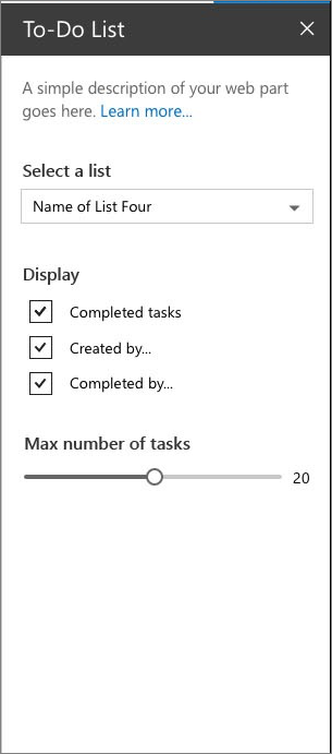
The following figure shows an example of a property pane in SharePoint.

Configure the property pane
The following code example initializes and configures the property pane in your web part. You override the getPropertyPaneConfiguration() method and return a collection of property pane page(s).
protected getPropertyPaneConfiguration(): IPropertyPaneConfiguration {
  return {
    pages: [
      {
        header: {
          description: strings.PropertyPaneDescription
        },
        groups: [
          {
            groupName: strings.BasicGroupName,
            groupFields: [
              PropertyPaneTextField('description', {
                label: strings.DescriptionFieldLabel
              })
            ]
          }
        ]
      }
    ]
  };
}
Property pane fields
The following field types are supported:
- Button
- Checkbox
- Choice group
- Dropdown
- Horizontal rule
- Label
- Link
- Slider
- Textbox
- Multi-line Textbox
- Toggle
- Custom
The field types are available as modules in @microsoft/sp-property-pane. You need to import the objects into a module before you can use them in your web parts:
import {
  PropertyPaneTextField,
  PropertyPaneCheckbox,
  PropertyPaneLabel,
  PropertyPaneLink,
  PropertyPaneSlider,
  PropertyPaneToggle,
  PropertyPaneDropdown
} from '@microsoft/sp-property-pane';
Note
The property pane objects were split out into their own module, @microsoft/sp-property-pane, in the SharePoint Framework v1.9 release. Prior to this, they were included in the @microsoft/sp-webpart-base module.
Every field type method is defined as follows, taking PropertyPaneTextField as an example:
PropertyPaneTextField('targetProperty',{
  //field properties are defined here
})
The targetProperty defines the associated public property on the web part for that field type and is also defined in the props interface in your web part.
To assign types to these properties, define an interface in your web part class that includes one or more target properties.
export interface IHelloWorldWebPartProps {
  targetProperty: string
}
This is then available in your web part by using this.properties.targetProperty.
<p class="ms-font-l ms-fontColor-white">${escape(this.properties.targetProperty)}</p>
When the properties are defined, you can access them in your web part by using the this.properties.[property-name]. For more information, see Build a HelloWorld web part: Web part render() method.
Handle field changes
The property pane has two interaction modes:
- Reactive
- Non-reactive
In reactive mode, on every change on a field control in the property pane triggers the change event. The reactive behavior automatically updates the web part's property with the new values. The reactive mode is the default mode for web parts.
While reactive mode is sufficient for many scenarios, at times you need non-reactive behavior. Non-reactive doesn't update the web part automatically unless the user confirms the changes.
To turn on the non-reactive mode, add the following code in your web part:
protected get disableReactivePropertyChanges(): boolean {
  return true;
}
Custom property pane controls
SharePoint Framework contains a set of standard controls for the property pane. But sometimes you need additional functionality beyond the basic controls. SharePoint Framework allows you to build custom controls to deliver the required functionality. To learn more, read the Build custom controls for the property pane guide.