SharePoint Framework v1.18 release notes
This release focuses on new features within the Viva Connections side and evolving existing capabilities within the other areas on building Microsoft 365 solutions with SharePoint Framework.
Released: September 12, 2023
Important
This page addresses details related to a specific SPFx release version. This page doesn't include additional SPFx prerequisites that must be installed in order to develop SPFx solutions, including Node.js, Yeoman, and other tools.
To learn more about these prerequisites, see Set up your SharePoint Framework development environment.
Install the latest version
Install the latest official release of the SharePoint Framework (SPFx) by using the @latest tag
npm install @microsoft/generator-sharepoint@latest --global
Upgrading projects from v1.17 to v1.18
In the project's package.json file, identify all SPFx v1.17.x packages. For each SPFx package:
Uninstall the existing v1.17.x package:
npm uninstall @microsoft/{spfx-package-name}@1.17.xInstall the new v1.18 package:
npm install @microsoft/{spfx-package-name}@latest --save --save-exact
Tip
The CLI for Microsoft 365 provides an easy step-by-step guidance to upgrade your solutions to latest SharePoint Framework version.
New features and capabilities
Related updated documentation for the 1.18 release:
- Designing Viva Connections custom cards for your dashboard
- Migrate Adaptive Card Extensions to SharePoint Framework 1.18
- Tutorial - Create a People Search Adaptive Card Extension
New samples showcasing the new Viva Connections features:
- Start a Chat Text Box input Adaptive Card Extension
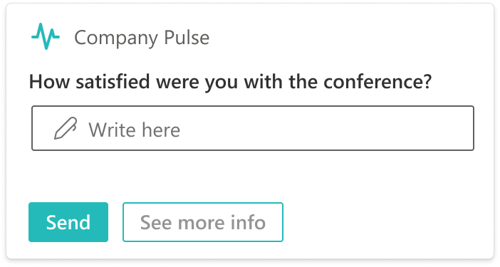
- Prompt Survey Adaptive Card Extension
- People Search Adaptive Card Extension
Video in YouTube showcasing the new template options for Viva Connections
- Introduction to new features and capabilities within SPFx 1.18
- Introducing new Microsoft Viva Connection card layouts in the SharePoint Framework 1.18
NodeJS v18 support
SharePoint Framework solutions now support NodeJS v18 as the default version.
Support for Execute Action in Adaptive Card Extensions
Developers can use Execute action for both Card View and Quick View actions.
BaseComponentsCardView as a new default Card View for Adaptive Card Extensions
We introduce new default class for Adaptive Card Extensions Card Views. With these new class developers can specify a set of components that is rendered in a Card View.
For more information on the new designs, see Designing Viva Connections custom cards for your dashboard.
export abstract class BaseComponentsCardView<TProperties = {}, TState = {}, TParameters extends ComponentsCardViewParameters = ITextCardViewParameters> extends BaseCardView<TProperties, TState> {
    abstract get cardViewParameters(): TParameters;
}
Example usage:
export class CardView extends BaseComponentsCardView<
  IHelloWorldAdaptiveCardExtensionProps,
  IHelloWorldAdaptiveCardExtensionState,
  ComponentsCardViewParameters
  > {
  public get cardViewParameters(): ComponentsCardViewParameters {

    return BasicCardView({
      cardBar: {
        componentName: 'cardBar',
        title: this.properties.title,
        icon: {
          url: this.properties.iconProperty
        }
      },
      header: {
        componentName: 'text',
        text: 'Hello world!'
      },
      footer: {
        componentName: 'cardButton',
        title: 'Quick View',
        action: {
          type: 'QuickView',
          parameters: {
            view: QUICK_VIEW_REGISTRY_ID,
          },
        },
      },
    });
  }
}
Adaptive Card Extensions flexible Card Views
With this release, we introduce more flexible way to configure Card Views for Adaptive Card Extensions. Developers can now "mix and match" components in a Card View configuration based on allowed set of variations.
Use new Generic Card Template in the generator to get started. Migration guide for existing projects is available here.
Ability to use text input in Adaptive Card Extensions' Card Views
Developers can now use text input component in a body or footer of a Card View. For more information on the layout options, see Designing Viva Connections custom cards for your dashboard.
Note
The text input component is fully supported in the browser and in Teams desktop. Full support for Viva Connections mobile will be enabled later.


New Search Card Template for Adaptive Card Extensions
We introduce a new search Card View for Adaptive Card Extensions that is intended to be used for search scenarios. Use new Search Card Template in the generator to get started.
Note
The text input component is fully supported in the browser and in Teams desktop. Full support for Viva Connections mobile will be enabled later.

Support onChange event for ACE TextInput and SearchBox
Developers can now use onChange event for TextInput and SearchBox components in Adaptive Card Extensions.
/**
 * Text change event handler.
 */
onChange?: (newValue?: string) => void;
Note
The onChange event for TextInput and SearchBox is fully supported in the browser and in Teams desktop. Full support for Viva Connections mobile will be enabled later.
Ability to detect host's theme for Viva Connections Mobile
Starting with this version, developers have access to hostContext in the AdaptiveCardExtensionContext object. This property allows to detect host's theme.
export type HostTheme = 'light' | 'dark' | undefined;

export interface IHostContext {
  /**
 *
 * theme is used to define what the the current colour scheme for the VCM app. It has currently 2 values
      light: If VCM is in light mode, we use the theme 'light',
      dark: If VCM is in dark mode, we use the theme 'dark'
 */
  theme: HostTheme;
}
Fluent UI React v8 support
Starting from this version, React templates use Fluent UI React v8 instead of v7.
Transparent outline icon for Teams-hosted web parts
The default outline icon for Microsoft Teams hosted web parts is now transparent. This ensures that the default icon meets the Microsoft Teams design requirements for application.
TypeScript v4.7 Support
SPFx solutions now support TypeScript v4.7.
Deprecations
BaseAdaptiveCardView- useBaseAdaptiveCardQuickViewinsteadtemplateproperty inBaseTemplateCardViewand its descendants
Fixed Issues
- #9010 - Placeholder
{tenantDomain}isn't replaced withSPFX_SERVE_TENANT_DOMAIN.
Feedback and issues
We're interested on your feedback around the release. Do let us know any findings or other feedback using the SPFx issue list.
Happy coding! Sharing is caring! 🧡