List layout customizations
Apply conditional classes on rows
You can use additionalRowClass to apply one or more classes to the entire list row depending on the value of one or more fields in the row. These examples leave the content and structure of list rows intact.
For a list of recommended classes to use inside view formats, please see the Style guidelines in the Use column formatting to customize SharePoint.
Tip
Using the additionalRowClass property to apply classes to list rows will leave the formatting of individual columns in place. This allows you to combine view formats with column formatting for some powerful visualizations.
Example: Conditional classes based on a date field
The following image shows a list layout with a class applied based on the value of a date column:
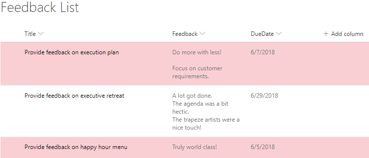
This example applies the class sp-field-severity--severeWarning to a list row when the item's DueDate is before the current date/time:
{
  "$schema": "https://developer.microsoft.com/json-schemas/sp/view-formatting.schema.json",
  "additionalRowClass": "=if([$DueDate] <= @now, 'sp-field-severity--severeWarning', '')"
}
Example: Conditional classes based on the value in a text or choice field
This example was adopted from a column formatting example, Conditional formatting based on the value in a text or choice field, with some important differences to apply the concept to list rows. The column formatting example applies both an icon and a class to a column based on the value of @currentField. The additionalRowClass attribute in view formatting, however, only allows you to specify a class and not an icon. Additionally, since @currentField always resolves to the value of the Title field when referenced inside a view format, this sample refers to the Status field directly (by using the [$Field] syntax inside the additionalRowClass property to determine which class to apply to the row).
{
  "$schema": "https://developer.microsoft.com/json-schemas/sp/view-formatting.schema.json",
  "additionalRowClass": "=if([$Status] == 'Done', 'sp-field-severity--good', if([$Status] == 'In progress', 'sp-field-severity--low' ,if([$Status] == 'In review','sp-field-severity--warning', if([$Status] == 'Has issues','sp-field-severity--blocked', ''))))"
}
You can find this sample with additional details here: Conditional formatting based on choice field
Example: Alternate Row Formatting based on Modulus
This example applies % (Mod) to a list row with alternate coloring the rows:
{
  "$schema": "https://developer.microsoft.com/json-schemas/sp/view-formatting.schema.json",
  "additionalRowClass": "=if(@rowIndex%2==0,'ms-bgColor-themeLight','')"
}
Build custom list rows
You can use rowFormatter to define a totally custom layout of field values inside a row using the same syntax used in Column Formatting.
Example: Multi-line view style
The following image shows a list with a custom multi-line view style applied:
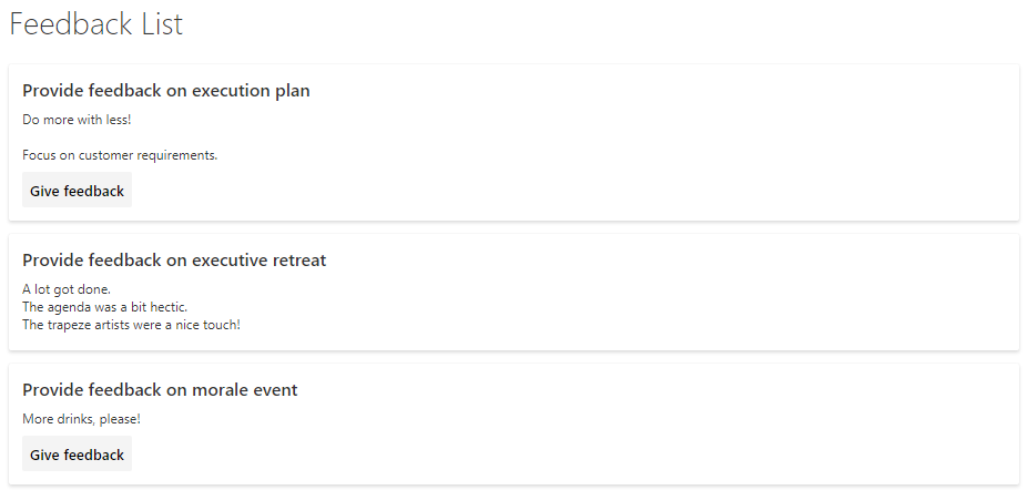
This example uses the rowFormatter element, which totally overrides the rendering of a list row. The rowFormatter in this example creates a bounding <div /> box for every list row. Inside this bounding box, the $Title and $Feedback fields are displayed on separate lines. Under those fields, a button element is displayed that, when clicked, does the same thing as clicking the list row in an uncustomized view, which is opening the property form for the item. This button is displayed conditionally, when the value of the $Assigned_x0020_To field (assumed to be a person/group field) matches the current signed-in user:
{
  "$schema": "https://developer.microsoft.com/json-schemas/sp/v2/row-formatting.schema.json",
  "hideSelection": true,
  "hideColumnHeader": true,
  "rowFormatter": {
    "elmType": "div",
    "attributes": {
      "class": "sp-row-card"
    },
    "children": [
      {
        "elmType": "div",
        "style": {
          "text-align": "left"
        },
        "children": [
          {
            "elmType": "div",
            "attributes": {
              "class": "sp-row-title"
            },
            "txtContent": "[$Title]"
          },
          {
            "elmType": "div",
            "attributes": {
              "class": "sp-row-listPadding"
            },
            "txtContent": "[$Feedback]"
          },
          {
            "elmType": "button",
            "customRowAction": {
              "action": "defaultClick"
            },
            "txtContent": "Give feedback",
            "attributes": {
              "class": "sp-row-button"
            },
            "style": {
              "display": {
                "operator": "?",
                "operands": [
                  {
                    "operator": "==",
                    "operands": [
                      "@me",
                      "[$Assigned_x0020_To.email]"
                    ]
                  },
                  "",
                  "none"
                ]
              }
            }
          }
        ]
      }
    ]
  }
}
You can find this sample with additional details here: Multi-line view rendering
Build custom group headers and footers
You can use groupProps to format group headers with flexibility to add grouped column's data, display name and item count. You can also add group aggregates in the group headers or format it directly in the group footers.
Example: Color coded group header
In the example below we have list with group headers formatted according to column metadata.
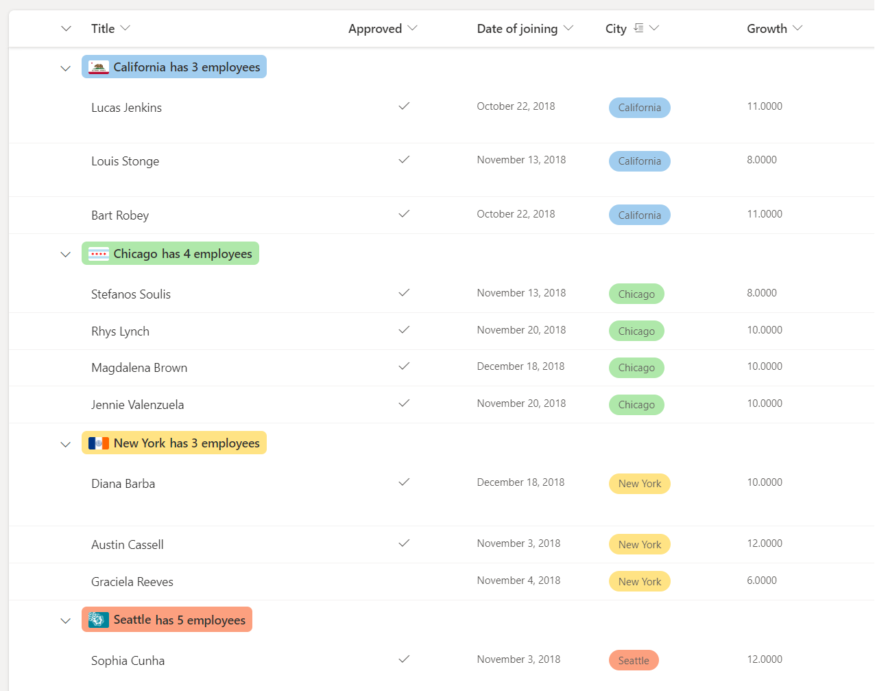
In this example below, the headerFormatter for groupProps is used to format the group header and the @group is used to access group info.
Note
The JSON below contains line breaks. These have been added to improve the readability of the code.
{
  "$schema": "https://developer.microsoft.com/json-schemas/sp/v2/row-formatting.schema.json",
  "groupProps": {
    "headerFormatter": {
      "elmType": "div",
      "style": {
        "flex-wrap": "wrap",
        "display": "flex",
        "box-sizing": "border-box",
        "padding": "4px 8px 5px 8px",
        "border-radius": "6px",
        "align-items": "center",
        "white-space": "nowrap",
        "overflow": "hidden",
        "margin": "1px 4px 4px 1px"
      },
      "attributes": {
        "class": "=if(@group.fieldData == 'California', 'sp-css-backgroundColor-blueBackground37',
                   if(@group.fieldData == 'Chicago', 'sp-css-backgroundColor-successBackground50',
                   if(@group.fieldData == 'New York', 'sp-css-backgroundColor-warningBackground50',
                   if(@group.fieldData == 'Seattle', 'sp-css-backgroundColor-blockingBackground50',
                   if(@group.fieldData == 'Washington DC', 'sp-css-backgroundColor-errorBackground50',
                   'sp-field-borderAllRegular sp-field-borderAllSolid sp-css-borderColor-neutralSecondary')))))"
      },
      "children": [
        {
          "elmType": "img",
          "attributes": {
            "src": "=if(@group.fieldData == 'California', 'https://upload.wikimedia.org/wikipedia/commons/thumb/0/01/Flag_of_California.svg/1920px-Flag_of_California.svg.png',
                     if(@group.fieldData == 'Chicago', 'https://upload.wikimedia.org/wikipedia/commons/thumb/9/9b/Flag_of_Chicago%2C_Illinois.svg/1920px-Flag_of_Chicago%2C_Illinois.svg.png',
                     if(@group.fieldData == 'New York', 'https://upload.wikimedia.org/wikipedia/commons/thumb/b/ba/Flag_of_New_York_City.svg/2560px-Flag_of_New_York_City.svg.png',
                     if(@group.fieldData == 'Seattle', 'https://upload.wikimedia.org/wikipedia/en/thumb/6/6d/Flag_of_Seattle.svg/1920px-Flag_of_Seattle.svg.png',
                     if(@group.fieldData == 'Washington DC', 'https://upload.wikimedia.org/wikipedia/commons/thumb/d/d4/Flag_of_the_District_of_Columbia.svg/2560px-Flag_of_the_District_of_Columbia.svg.png', '')))))"
          },
          "style": {
            "max-width": "24px",
            "max-height": "24px",
            "margin-top": "2px",
            "border-radius": "2px"
          }
        },
        {
          "elmType": "div",
          "children": [
            {
              "elmType": "span",
              "style": {
                "padding": "5px 5px 5px 5px",
                "font-weight": "500"
              },
              "txtContent": "@group.fieldData.displayValue"
            }
          ]
        },
        {
          "elmType": "div",
          "children": [
            {
              "elmType": "div",
              "style": {
                "display": "flex",
                "flex-direction": "row",
                "justify-content": "center"
              },
              "children": [
                {
                  "elmType": "div",
                  "txtContent": "='has ' + @group.count + if(@group.count > '1', ' employees', ' employee')",
                  "style": {
                    "font-weight": "500"
                  }
                }
              ]
            }
          ]
        }
      ]
    }
  }
}
Example: Color coded group header with aggregate
In the example below we have list with group headers formatted with group aggregates.
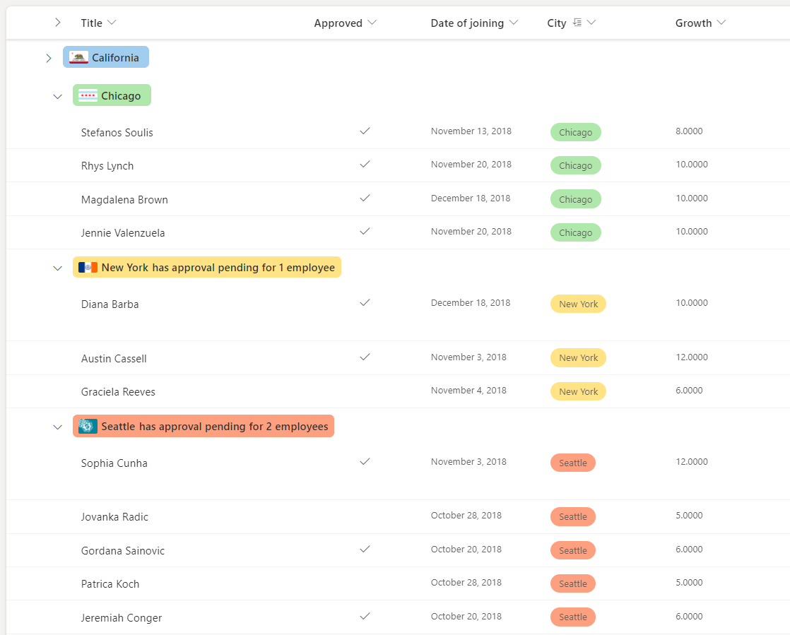
In this example the hideFooter for groupProps is set to true - to hide the group footer and the @aggregates array is used to display a summary in the group header.
Note
The JSON below contains line breaks. These have been added to improve the readability of the code.
{
  "$schema": "https://developer.microsoft.com/json-schemas/sp/v2/row-formatting.schema.json",
  "groupProps": {
    "hideFooter": true,
    "headerFormatter": {
      "elmType": "div",
      "style": {
        "flex-wrap": "wrap",
        "display": "flex",
        "box-sizing": "border-box",
        "padding": "4px 8px 5px 8px",
        "border-radius": "6px",
        "align-items": "center",
        "white-space": "nowrap",
        "overflow": "hidden",
        "margin": "1px 4px 4px 1px"
      },
      "attributes": {
        "class": "=if(@group.fieldData == 'California', 'sp-css-backgroundColor-blueBackground37',
                   if(@group.fieldData == 'Chicago', 'sp-css-backgroundColor-successBackground50',
                   if(@group.fieldData == 'New York', 'sp-css-backgroundColor-warningBackground50',
                   if(@group.fieldData == 'Seattle', 'sp-css-backgroundColor-blockingBackground50',
                   if(@group.fieldData == 'Washington DC', 'sp-css-backgroundColor-errorBackground50',
                   'sp-field-borderAllRegular sp-field-borderAllSolid sp-css-borderColor-neutralSecondary')))))"
      },
      "children": [
        {
          "elmType": "img",
          "attributes": {
            "src": "=if(@group.fieldData == 'California', 'https://upload.wikimedia.org/wikipedia/commons/thumb/0/01/Flag_of_California.svg/1920px-Flag_of_California.svg.png',
                     if(@group.fieldData == 'Chicago', 'https://upload.wikimedia.org/wikipedia/commons/thumb/9/9b/Flag_of_Chicago%2C_Illinois.svg/1920px-Flag_of_Chicago%2C_Illinois.svg.png',
                     if(@group.fieldData == 'New York', 'https://upload.wikimedia.org/wikipedia/commons/thumb/b/ba/Flag_of_New_York_City.svg/2560px-Flag_of_New_York_City.svg.png',
                     if(@group.fieldData == 'Seattle', 'https://upload.wikimedia.org/wikipedia/en/thumb/6/6d/Flag_of_Seattle.svg/1920px-Flag_of_Seattle.svg.png',
                     if(@group.fieldData == 'Washington DC', 'https://upload.wikimedia.org/wikipedia/commons/thumb/d/d4/Flag_of_the_District_of_Columbia.svg/2560px-Flag_of_the_District_of_Columbia.svg.png', '')))))"
          },
          "style": {
            "max-width": "24px",
            "max-height": "24px",
            "margin-top": "2px",
            "border-radius": "2px"
          }
        },
        {
          "elmType": "div",
          "children": [
            {
              "elmType": "span",
              "style": {
                "padding": "5px 5px 5px 5px",
                "font-weight": "500"
              },
              "txtContent": "@group.fieldData.displayValue"
            }
          ]
        },
        {
          "elmType": "div",
          "forEach": "aggregate in @aggregates",
          "children": [
            {
              "elmType": "div",
              "style": {
                "display": "=if([$aggregate.columnDisplayName] == 'Approved' && Number([$aggregate.value]) < @group.count, 'flex', 'none')",
                "flex-direction": "row",
                "justify-content": "center"
              },
              "children": [
                {
                  "elmType": "div",
                  "txtContent": "='has approval pending for ' + Number(@group.count - Number([$aggregate.value])) + if(@group.count - Number([$aggregate.value]) > 1 , ' employees', ' employee')",
                  "style": {
                    "font-weight": "500"
                  }
                }
              ]
            }
          ]
        }
      ]
    }
  }
}
Example: Custom group footer
In the example below we have list with group footer formatted according to aggregate value.
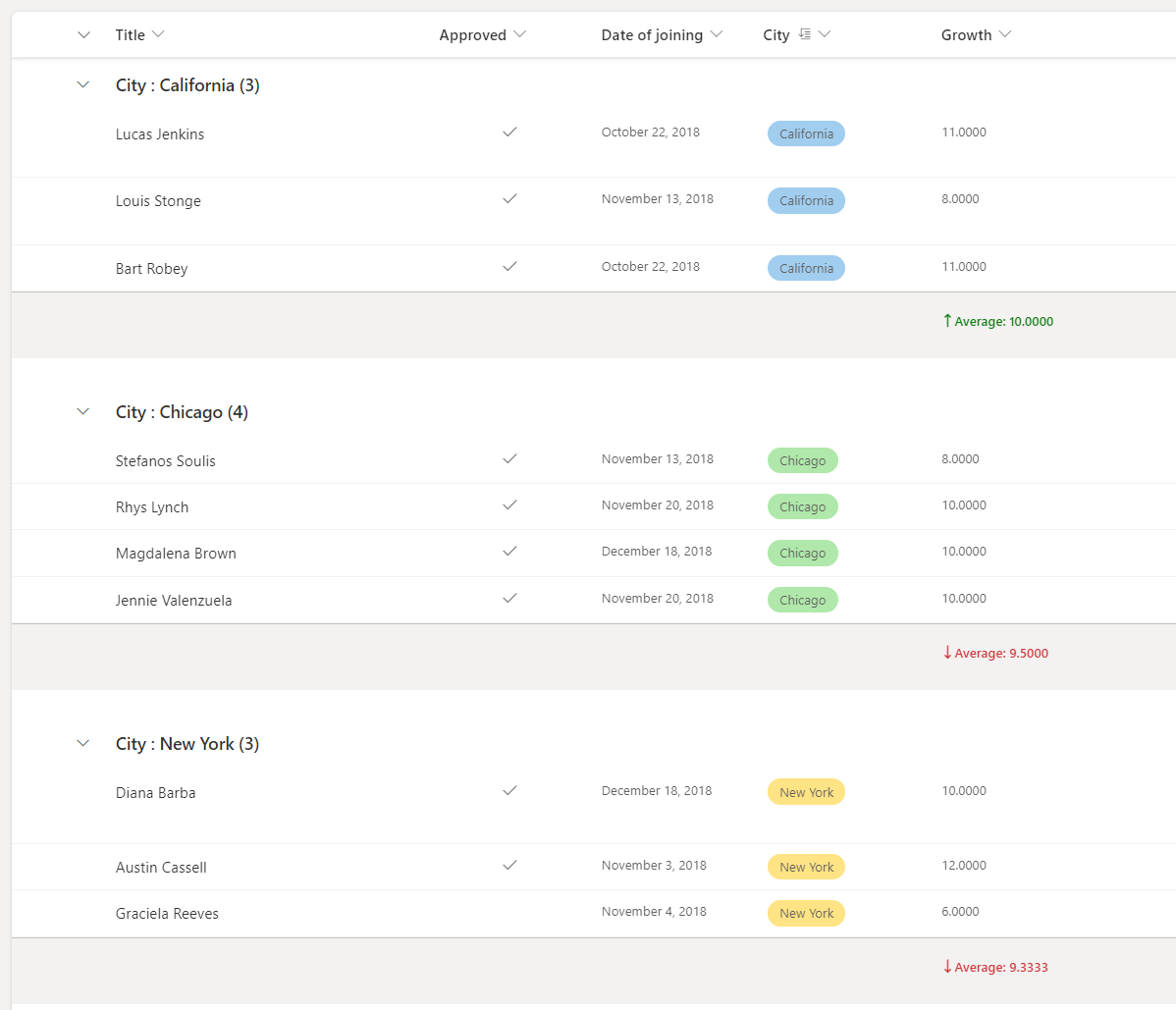
In this example the footerFormatter for groupProps are used to format the group footer and the @columnAggregate is used to access column aggregate.
{
  "$schema": "https://developer.microsoft.com/json-schemas/sp/v2/row-formatting.schema.json",
  "groupProps": {
    "hideFooter": false,
    "footerFormatter": {
      "elmType": "div",
      "children": [
        {
          "elmType": "div",
          "attributes": {
            "iconName": "=if(@columnAggregate.type == 'Average' && @columnAggregate.value < 10, 'SortDown', 'SortUp')"
          },
          "style": {
            "color": "=if(@columnAggregate.type == 'Average' && @columnAggregate.value < 10, '#d13438', '#107c10')",
            "font-weight": "600",
            "margin-top": "10px"
          }
        },
        {
          "elmType": "div",
          "style": {
            "color": "=if(@columnAggregate.type == 'Average' && @columnAggregate.value < 10, '#d13438', '#107c10')",
            "font-weight": "600",
            "margin-top": "10px",
            "font-family": "Segoe UI"
          },
          "txtContent": "=@columnAggregate.type + ': ' + @columnAggregate.value"
        }
      ]
    }
  }
}
Build custom list footers
You can use footerFormatter to format list footer with access to column aggregates.
Example: Custom list footer
In the example below we have list with formatted footer as per the aggregate value.
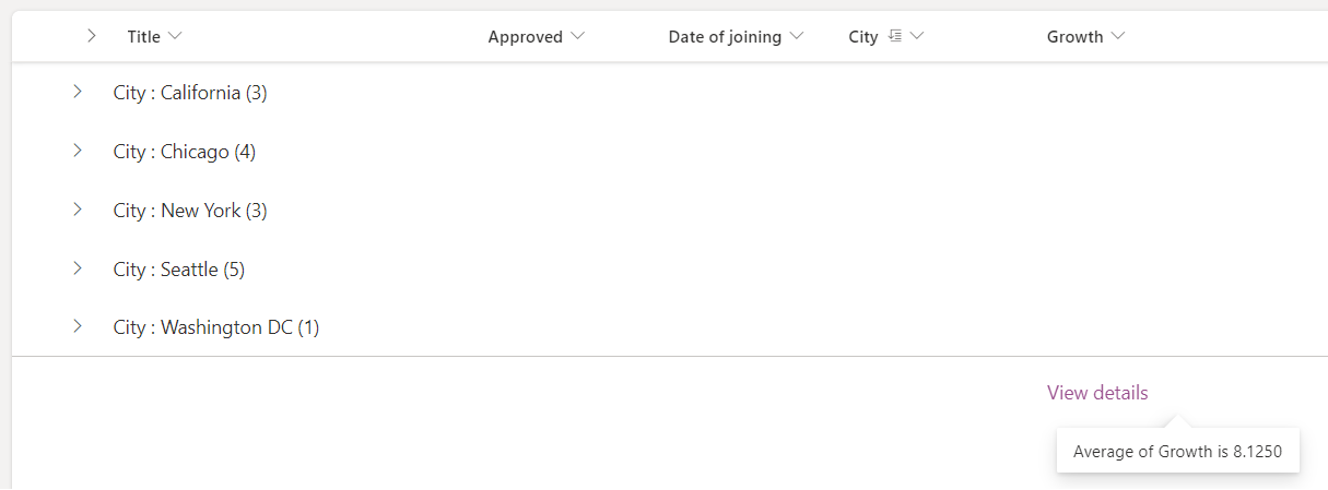
In this example the footerFormatter is set to format the list footer and the @columnAggregate is used to access column aggregate.
{
  "$schema": "https://developer.microsoft.com/json-schemas/sp/v2/row-formatting.schema.json",
  "hideFooter": false,
  "footerFormatter": {
    "elmType": "div",
    "attributes": {
      "class": "ms-fontColor-themePrimary"
    },
    "customCardProps": {
      "formatter": {
        "elmType": "div",
        "children": [
          {
            "elmType": "div",
            "style": {
              "display": "flex"
            },
            "txtContent": "=@columnAggregate.type + ' of ' + @columnAggregate.columnDisplayName + ' is ' + @columnAggregate.value"
          }
        ],
        "style": {
          "height": "10px",
          "width": "auto",
          "cursor": "pointer",
          "font-size": "14px",
          "padding": "14px"
        }
      },
      "openOnEvent": "hover",
      "directionalHint": "bottomCenter",
      "isBeakVisible": true,
      "beakStyle": {
        "backgroundColor": "white"
      }
    },
    "txtContent": "View details",
    "style": {
      "text-decoration": "none",
      "cursor": "pointer",
      "font-size": "16px",
      "margin-top": "10px"
    }
  }
}
Detailed syntax reference
rowFormatter
Optional element. Specifies a JSON object that describes a list row format. The schema of this JSON object is identical to the schema of a column format. For details on this schema and its capabilities, see Formatting syntax reference.
Note
Using the rowFormatter property will override anything specified in the additionalRowClass property. They are mutually exclusive.
Differences in behavior between the rowFormatter element and column formatting
Despite sharing the same schema, there are some differences in behavior between elements inside a rowFormatter element and those same elements in a column formatting object.
@currentFieldalways resolves to the value of theTitlefield inside arowFormatter.
additionalRowClass
Optional element. Specifies a CSS class(es) that is applied to the entire row. Supports expressions.
additionalRowClass only takes effect when there is no rowFormatter element specified. If a rowFormatter is specified, then additionalRowClass is ignored.
hideSelection
Optional element. Specifies whether the ability to select rows in the view is disabled or not. false is the default behavior inside a list view (meaning selection is visible and enabled). true means that users will not be able to select list items.
hideColumnHeader
Optional element. Specifies whether the column headers in the view are hidden or not. false is the default behavior inside a list view (meaning column headers will be visible). true means that the view will not display column headers.
groupProps
Groups the group related customization options. For details on groupProps, see Group Customization syntax reference
commandBarProps
Groups the command bar customization options. For details on commandBarProps, see Command bar customization syntax reference