Navigation patterns
The main features of an add-in are accessed through specific command types and limited screen area. It's important that navigation is intuitive, provides context, and allows the user to move easily throughout the add-in.
Best practices
| Do | Don't |
|---|---|
| Ensure the user has a clearly visible navigation option. | Don't complicate the navigation process by using non-standard UI. |
| Utilize the following components as applicable to allow users to navigate through your add-in. | Don't make it difficult for the user to understand their current place or context within the add-in |
Command Bar
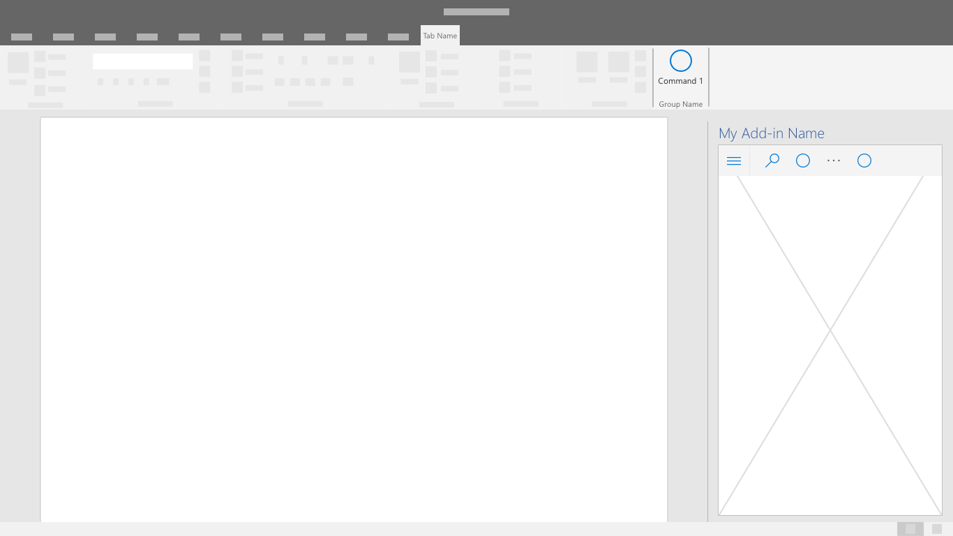
The CommandBar is a surface within the task pane that houses commands that operate on the content of the window, panel, or parent region it resides above. Optional features include a hamburger menu access point, search, and side commands.

Tab Bar
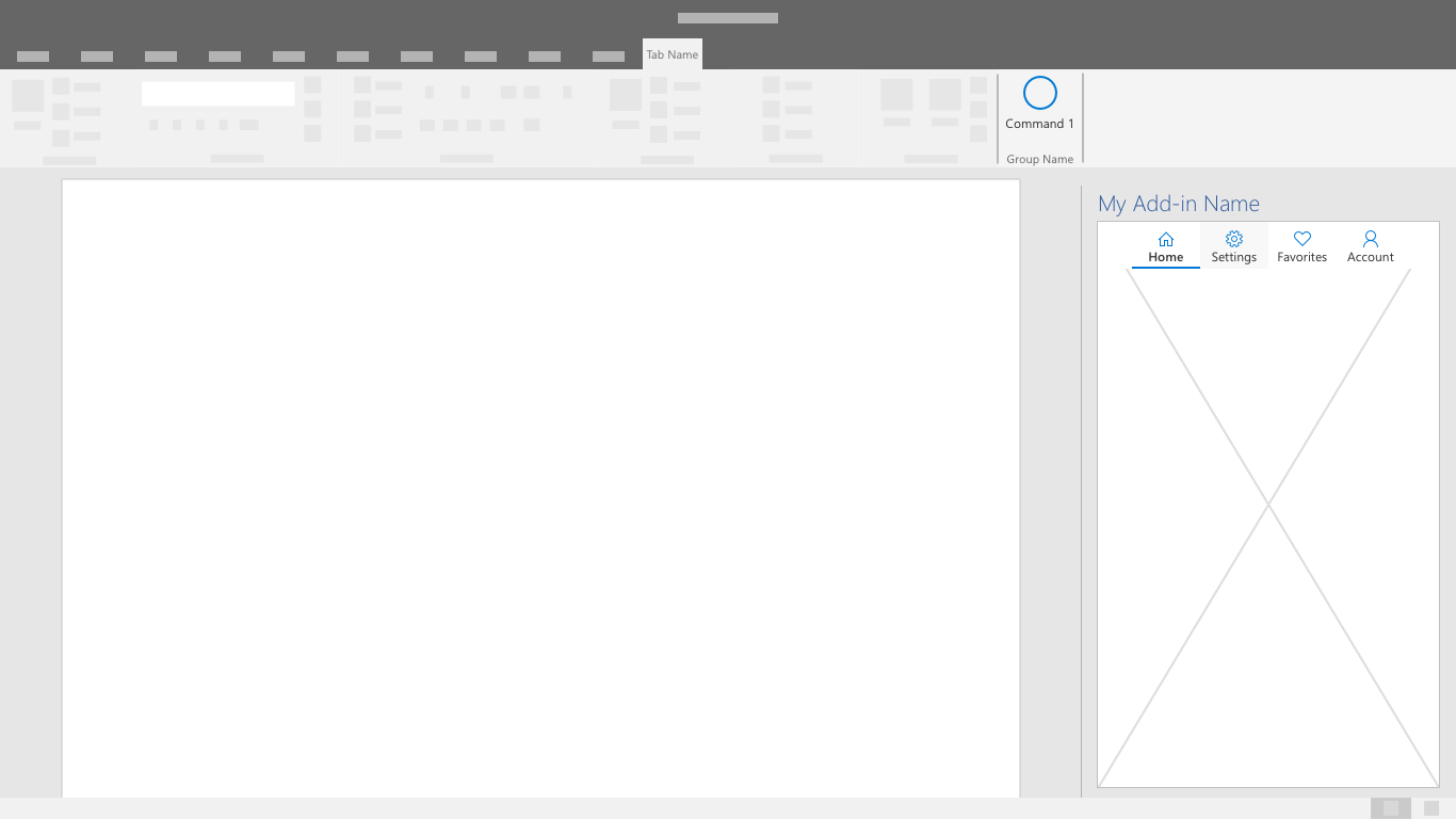
The tab bar shows navigation using buttons with vertically stacked text and icons. Use the tab bar to provide navigation using tabs with short and descriptive titles.

Back Button
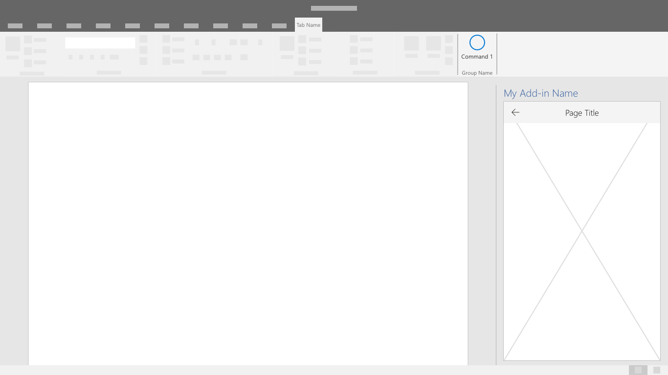
The back button allows users to recover from a drill-down navigational action. This pattern helps ensure users follow an ordered series of steps.
