Arcade Buttons
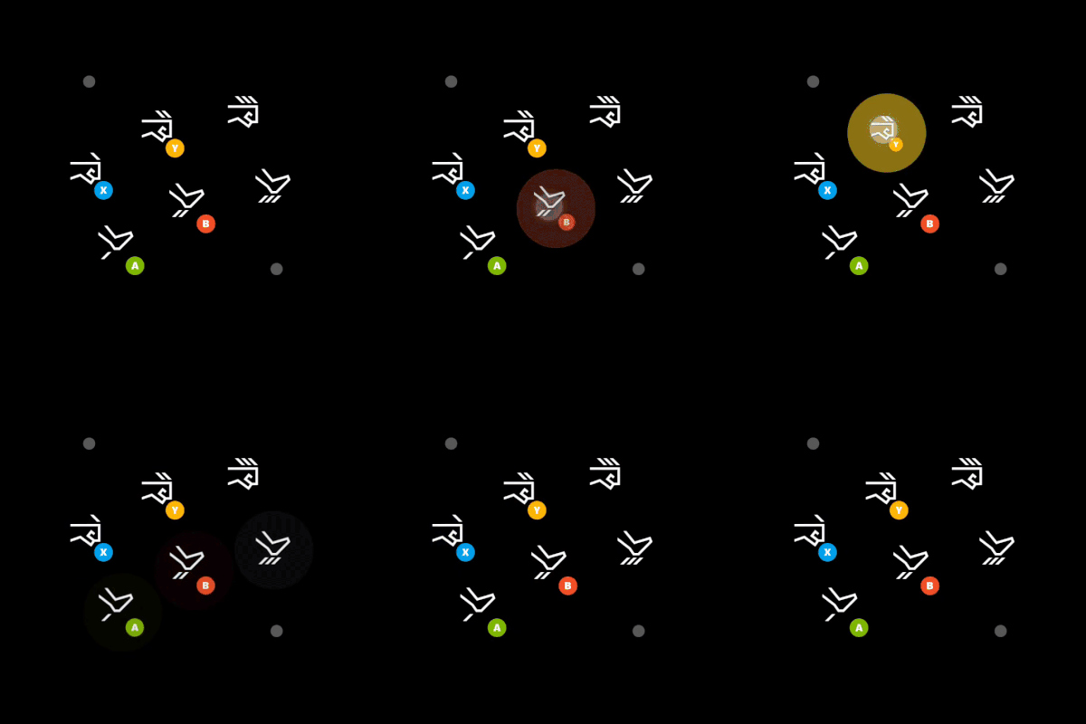
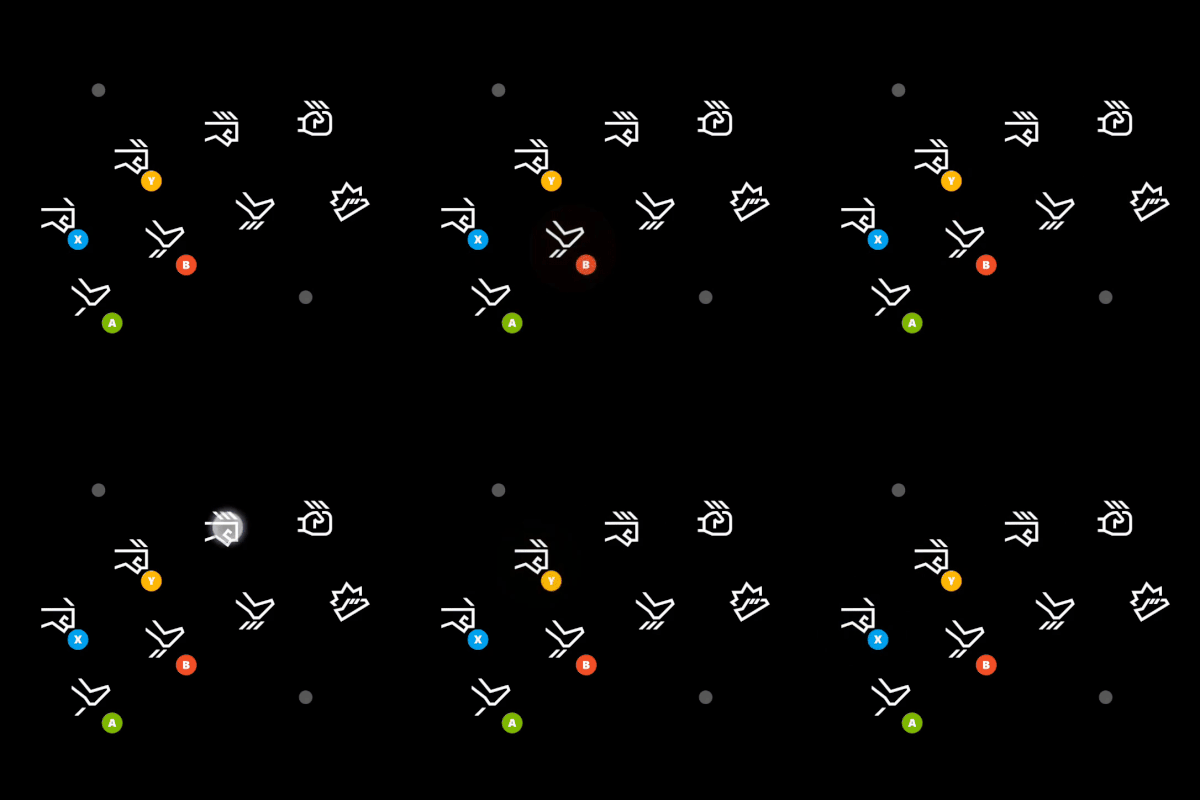
Arcade buttons allow a collection of 6 or 8 buttons laid out in an arc, in the style of arcade cabinets. Most commonly used for fighting games.
Properties
type - "arcadeButtons"
lightKick - object. The button for a small kick.
mediumKick - object. The button for a medium kick.
heavyKick - object. The button for a large kick.
specialKick - object, optional. The button for a special kick.
lightPunch - object. The button for a small punch.
mediumPunch - object. The button for a medium punch.
heavyPunch - object. The button for a large punch.
specialPunch - object, optional. The button for a special punch.
Each object above describes a button with the following properties:
action - string. Action(s) to be invoked when a player touches the button.
enabled - boolean, optional. Defaults to true. Sets the visual state of the control to enabled/disabled. A disabled control will still receive input from the player, but NOT change the visual style based on the input.
toggle - boolean, optional. Defaults to false.
- If
false, input for the button will be sent when pressed and not when not pressed. - If
true, each press of the button will switch whether input is being sent or not for the correspondinging action(s) .
visible - boolean, optional. Defaults to true. Determines whether the control is displayed to the player to interact with. To change during game play see [Changing touch layouts using game state(game-streaming-touch-changing-layouts-game-state.md#change_state).
styles - object, optional. Customization of the visual representation of the control. The styles are represented as an object per state that can be styled.
The button control can have the following states styled:
default- The base style.disabled- The style when the control is disabled. If not specfied, then when the control is disabled, a transformation will be applied to the default style to make it appear disabled.idle- Applied when the player is NOT interacting with the control.activated- Applied when the player is touching the button.
Styling properties per state
opacity - number, optional. The opacity to be applied to the control. Defaults to 1.0 for all states but disabled.
faceImage - object, optional. Can either be an icon or image asset.
background - object, optional. Can either be a color or image asset. Is not visible in idle and disabled states.
Asset dimensions
For each of the style objects that accept image assets, a given asset must be provided in five DPI levels: @1.0x, @1.5x, @2.0x, @3.0x, and @4.0x. The resolution of an image at a given dpi level must be less or equal to the following maximum resolutions:
| Object | @1.0x | @1.5x | @2.0x | @3.0x | @4.0x |
|---|---|---|---|---|---|
| faceImage | 60x60 | 90x90 | 120x120 | 180x180 | 240x240 |
| background | 60x60 | 90x90 | 120x120 | 180x180 | 240x240 |
Remarks
arcadebuttons allows you to arrange a set of buttons in a group of six or eight that is similar to an arcade cabinet. This is optimized for fighting games.
There is also an indicator for the player to press that maps to all of the punch or kick buttons getting pressed together.
The arcadebuttons takes more space and you should be careful with other controls that are placed around it.
Styling remarks
When in the activated state, the faceImage is displayed 25% smaller.
There are labels and default styling for the background color for buttons that do not use custom assets and have a single action of gamepadX, gamepadY, gamepadA, or gamepadB.
Samples
Example 1: Arcade button - six buttons
Figure 1. Arcade Buttons

{
    "type": "arcadeButtons",
    "lightPunch": {
        "action": "gamepadX",
        "styles": {
            "default" : {
                "faceImage" : {
                    "type": "icon",
                    "value": "lightPunch"
                }
            }
        }
    },
    "mediumPunch": {
        "action": "gamepadY",
        "styles": {
            "default" : {
                "faceImage" : {
                    "type": "icon",
                    "value": "mediumPunch"
                }
            }
        }
    },
    "heavyPunch": {
        "action": "rightBumper",
        "styles": {
            "default" : {
                "faceImage" : {
                    "type": "icon",
                    "value": "heavyPunch"
                }
            }
        }
    },
    "lightKick": {
        "action": "gamepadA",
        "styles": {
            "default" : {
                "faceImage" : {
                    "type": "icon",
                    "value": "lightKick"
                }
            }
        }
    },
    "mediumKick": {
        "action": "gamepadB",
        "styles": {
            "default" : {
                "faceImage" : {
                    "type": "icon",
                    "value": "mediumKick"
                }
            }
        }
    },
    "heavyKick": {
        "action": "leftBumper",
        "styles": {
            "default" : {
                "faceImage" : {
                    "type": "icon",
                    "value": "heavyKick"
                }
            }
        }
    }
}
Example 2: Arcade button - eight buttons
Figure 1. Eight Item Arcade Buttons

{
    "type": "arcadeButtons",
    "lightPunch": {
        "action": "gamepadX",
        "styles": {
            "default" : {
                "faceImage" : {
                    "type": "icon",
                    "value": "lightPunch"
                }
            }
        }
    },
    "mediumPunch": {
        "action": "gamepadY",
        "styles": {
            "default" : {
                "faceImage" : {
                    "type": "icon",
                    "value": "mediumPunch"
                }
            }
        }
    },
    "heavyPunch": {
        "action": "rightBumper",
        "styles": {
            "default" : {
                "faceImage" : {
                    "type": "icon",
                    "value": "heavyPunch"
                }
            }
        }
    },
    "specialPunch": {
        "action": "rightTrigger",
        "styles": {
            "default" : {
                "faceImage" : {
                    "type": "icon",
                    "value": "heavyPunch2"
                }
            }
        }
    },
    "lightKick": {
        "action": "gamepadA",
        "styles": {
            "default" : {
                "faceImage" : {
                    "type": "icon",
                    "value": "lightKick"
                }
            }
        }
    },
    "mediumKick": {
        "action": "gamepadB",
        "styles": {
            "default" : {
                "faceImage" : {
                    "type": "icon",
                    "value": "mediumKick"
                }
            }
        }
    },
    "heavyKick": {
        "action": "rightTrigger",
        "styles": {
            "default" : {
                "faceImage" : {
                    "type": "icon",
                    "value": "heavyKick"
                }
            }
        }
    },
    "specialKick": {
        "action": "leftBumper",
        "styles": {
            "default" : {
                "faceImage" : {
                    "type": "icon",
                    "value": "heavyKick2"
                }
            }
        }
    }
}
Requirements
Layout Version: 1.0+ (Styling available from layout version 3.0+)