Configure theme style presets
This article explains how to add style variables that are known as style presets to custom themes in Microsoft Dynamics 365 Commerce site builder.
A style preset is a stored set of all authorable style values across a site theme. Style presets can be used to immediately change the look of a site from within site builder. Style presets let site builder authors quickly change, preview, and activate a set of style values across their site, without having to use Cascading Style Sheets (CSS) or deploy new themes. Font styles, button styles, and site colors are typical examples of style variables that can be managed through style presets.
For more information about how style presets work in site builder, see Work with style presets.
Default style presets
Themes that have authorable style presets must have a default style preset. They can also have additional optional preset settings that are known as preset instances. For example, a theme that has a default "modern light" style might also have optional preset instances such as "modern dark" and "vintage dark."
Style preset definition files
Each theme contains a style presets definition file that provides metadata for site builder, such as the friendly name and description of the style preset. This definition file also includes the global and module-specific styles that will be available for customization in site builder.
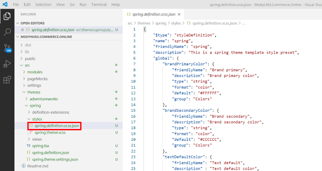
When the add-theme command line interface (CLI) command is used to create a theme, a style preset definition file is automatically created under the theme's styles directory. The naming convention for the definition file is THEME_NAME.definition.scss.json.
The following illustration shows an example (in Visual Studio Code) of a theme style definition file that was created by using the add-theme CLI command.

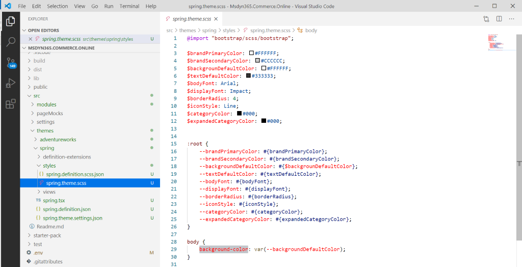
Each style that is defined under the global and module sections should also be defined in the theme's Sassy CSS (SCSS) file. The naming convention for that file is THEME_NAME.scss
In the example in the following illustration, SCSS variables have been defined for brandPrimaryColor in the theme.scss file. The default color is #FFFFFF. When the style preset is turned on, the color value is replaced with the default color value that is defined in the style preset definition file. Although both colors happen to be the same in this example, a site builder author can choose to override this property with any color. Modules that use this global SCSS variable will then automatically pick up the color change when the user applies the setting from within site builder.

Style preset definition schema
The following style preset definition schema is used for top-level section properties in the style presets definition file:
- $type - The type of definition file. The value of this property must be "styleDefinition".
- name – The name of the theme. This property must match the theme name in the theme definition file.
- friendlyName – The friendly name of the style preset. This name is shown in site builder when style presets are configured. The minimum length is three characters.
- description – The description of the style preset. The description provides a friendly string that is shown in site builder when style presets are configured.
- global – The global section is used to add style presets that are globally scoped across the theme. CSS property names are used as children of this node to define styles for the CSS style.
- module – The module section is used to add style presets for specific modules. Module names are used as children of this node to define module-specific style presets.
Style preset property schema
The following style preset property schema is used for each style property that is defined in the global and module sections of the style presets definition file:
- friendlyName – The friendly name of the individual style preset property. This name is shown in site builder when style presets are configured. The minimum length is three characters.
- description – The description of the style preset property. The description provides a friendly string that is shown in site builder when style presets are configured.
- type – This property is used as metadata for site builder. The only supported value is "string".
- format – This property provides extra metadata to site builder, so that it can present specific user experience (UX) configuration scenarios. This property is optional and currently supports only the value "color", which is used to open the color picker in site builder.
- default – The default CSS style value that is set for this property.
- group – This property is used to group similar properties in site builder.
- enum – This property is optional and provides a set of hard-coded values that site builder authors can select among.
Style preset instances
Together with the default style preset settings, a theme can contain one or more optional style preset instances. To create a preset instance file, you must manually create additional style preset definition files under the styles directory. The contents of these style preset definition files resemble the contents of the default style preset definition file. However, the default values for the properties in the global and module sections typically differ. The naming convention for the preset instance file is PRESET_INSTANCE_NAME.scss.json.
The following example shows a style preset instance file for a dark theme. The file name is modern-dark.scss.json.
Note
The value of the name property must be unique. It must differ from the name of the default theme and other style preset instances.
{
    "$type": "styleDefinition",
    "name": "modern-dark",
    "friendlyName": "modern dark",
    "description": "This is a spring modern dark theme template style preset",
    "global": {
        "brandPrimaryColor": "#AAAAAA",
        "brandSecondaryColor": "#606060",
        "borderRadius": "0"
    },
    "modules": {
        "header": {
            "categoryColor": "#000",
            "expandedCategoryColor": "#000"
        }
    }
}
Localize style preset names and descriptions
Property names and descriptions for the style preset and style preset instance files can be localized by using the themes node in the global.json file. The process resembles the process for localizing the module config properties. For more information, see Localize a module.
The following example shows a global.json file that sets various localized style preset properties.
{
    "settings" : {...},
    "modules" : {...},
    "themes" : {
        "spring": {
            "friendlyName": {
                "value": "Spring",
                "_value.comment": "Spring theme name"
            },
            "description": {
                "value": "This is the spring theme.",
                "_value.comment": "Spring theme description"
            },
            "styles": {
                "definition": {
                    "description": {
                        "value": "This is the Spring theme style preset",
                        "_value.comment": ""
                    },
                    "global": {
                        "brandPrimaryColor": {
                            "friendlyName": {
                                "value": "Primary brand color",
                                "_value.comment": ""
                            },
                            "description": {
                                "value": "The primary brand color used across the site.",
                                "_value.comment": ""
                            },
                            "group": {
                                "value": "Colors",
                                "_value.comment": ""
                            }
                        },
                        "HeaderFontSize": {
                            "friendlyName": "Header text size",
                            "description": "This is the text default size for header elements",
                            "type": "string",
                            "enum":{
                                "5px": "Small",
                                "10px": "Medium",
                                "15px": "Large"
                            },
                            "group": "Typography"
                        }
                    },
                    "modules"
                        "header": {
                            "categoryColor" : {
                                "friendlyName": {
                                    "value": "Header background",
                                    "_value.comment": ""
                                },
                                "description": {
                                    "value": "This is the background color for the module",
                                    "_value.comment": ""
                                },
                                "group": {
                                    "value": "Color",
                                    "_value.comment": ""
                                }
                            }
                        }
                    }
                },
                "presets":  {
                    "dark-theme": {
                        "description": {
                            "value": "This is the dark theme style preset",
                            "_value.comment": ""
                        }
                    },
                    "light-theme": {
                        "description": {
                            "value": "This is the dark theme style preset",
                            "_value.comment": ""
                        }
                    }
                }
            }
        }
    }
}
Additional resources
Extend a theme to add module extensions
Override a module library component in a theme