ContentView
 瀏覽範例
瀏覽範例.NET 多平臺應用程式 UI (.NET MAUI) ContentView 是一個控件,可讓您建立自定義、可重複使用的控件。
ContentView 類別會定義類型為 View的 Content 屬性,代表 ContentView的內容。 這個屬性是由 BindableProperty 物件所支援,這表示它可以是數據系結的目標,並設定樣式。
ContentView 類別衍生自 TemplatedView 類別,該類別會定義類型為 ControlTemplate的 ControlTemplate 可系結屬性,該屬性會定義控件的外觀。 如需 ControlTemplate 屬性的詳細資訊,請參閱使用 ControlTemplate 自定義外觀 。
注意
ContentView 只能包含單一子系。
建立自定義控件
ContentView 類別本身提供很少的功能,但可用來建立自定義控件。 建立自訂控制項的程式是:
- 建立衍生自 ContentView 類別的類別。
- 在自定義控件的程式代碼後置檔案中定義任何控件屬性或事件。
- 定義自定義控制件的UI。
本文示範如何建立 CardView 控件,這是在類似卡片配置中顯示影像、標題和描述的UI元素。
建立 ContentView 衍生類別
您可以使用 Visual Studio 中的 ContentView 專案範本來建立 ContentView衍生類別。 此範本會建立 XAML 檔案,其中可以定義自定義控件的 UI,以及定義任何控件屬性、事件和其他邏輯的程式代碼後置檔案。
定義控件屬性
任何控件屬性、事件和其他邏輯都應該定義在 ContentView衍生類別的程式代碼後置檔案中。
CardView 自定義控制項會定義下列屬性:
-
CardTitle類型為string,代表卡片上顯示的標題。 -
CardDescription類型為string,代表卡片上顯示的描述。 -
IconImageSource類型為 ImageSource,代表卡片上顯示的影像。 -
IconBackgroundColor類型為 Color,代表卡片上顯示之影像的背景色彩。 -
BorderColor類型為 Color,代表卡片框線、影像框線和分隔線的色彩。 -
CardColor為 Color類型,表示卡片的背景色彩。
每個屬性都由 BindableProperty 實例支援。
下列範例顯示 CardView 類別之程式代碼後置檔案中的 CardTitle 可繫結屬性:
public partial class CardView : ContentView
{
    public static readonly BindableProperty CardTitleProperty = BindableProperty.Create(nameof(CardTitle), typeof(string), typeof(CardView), string.Empty);

    public string CardTitle
    {
        get => (string)GetValue(CardView.CardTitleProperty);
        set => SetValue(CardView.CardTitleProperty, value);
    }
    // ...

    public CardView()
    {
        InitializeComponent();
    }
}
如需 BindableProperty 物件的詳細資訊,請參閱 Bindable 屬性。
定義UI
自定義控件UI可以在 ContentView衍生類別的 XAML 檔案中定義,該類別會使用 ContentView 做為控件的根元素:
<ContentView ...
             xmlns:local="clr-namespace:CardViewDemo.Controls"
             x:Name="this"
             x:Class="CardViewDemo.Controls.CardView"
             x:DataType="local:CardView">
    <Border BindingContext="{x:Reference this}"
            BackgroundColor="{Binding CardColor}"
            Stroke="{Binding BorderColor}"
            ...>
        <Grid>
            ...
            <Border Stroke="{Binding BorderColor, FallbackValue='Black'}"
                    BackgroundColor="{Binding IconBackgroundColor, FallbackValue='Grey'}"
                   ...>
                <Image Source="{Binding IconImageSource}"
                       .. />
            </Border>
            <Label Text="{Binding CardTitle, FallbackValue='Card Title'}"
                   ... />
            <BoxView BackgroundColor="{Binding BorderColor, FallbackValue='Black'}"
                     ... />
            <Label Text="{Binding CardDescription, FallbackValue='Card description text.'}"
                   ... />
        </Grid>
    </Border>
</ContentView>
ContentView 元素會將 x:Name 屬性設定為 this,可用來存取系結至 CardView 實例的物件。 版面配置中的元素會將其屬性上的系結設定為系結物件上定義的值。 如需資料系結的詳細資訊,請參閱 資料系結。
注意
Binding 表示式中的 FallbackValue 屬性會提供預設值,以防系結 null。
具現化自定義控制件
自定義控件命名空間的參考必須加入至具現化自定義控件的頁面。 加入參考之後,就可以具現化 CardView,並定義其屬性:
<ContentPage xmlns="http://schemas.microsoft.com/dotnet/2021/maui"
             xmlns:x="http://schemas.microsoft.com/winfx/2009/xaml"
             xmlns:controls="clr-namespace:CardViewDemo.Controls"
             x:Class="CardViewDemo.CardViewXamlPage">
   <ScrollView>
       <StackLayout>
           <controls:CardView BorderColor="DarkGray"
                              CardTitle="Slavko Vlasic"
                              CardDescription="Lorem ipsum dolor sit amet, consectetur adipiscing elit. Nulla elit dolor, convallis non interdum."
                              IconBackgroundColor="SlateGray"
                              IconImageSource="user.png" />
            <!-- More CardView objects -->
       </StackLayout>
   </ScrollView>
</ContentPage>
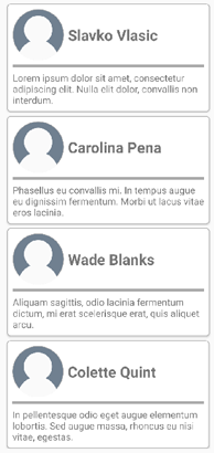
下列螢幕快照顯示多個 CardView 物件:
使用 ControlTemplate 自定義外觀
衍生自 ContentView 類別的自定義控件可以使用 XAML 或程式代碼來定義其 UI,或完全不能定義其 UI。 不論該外觀如何定義,ControlTemplate 都可以用來覆寫控件的外觀。
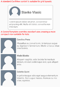
例如,某些使用案例中,CardView 配置可能會佔用太多空間。
ControlTemplate 可用來覆蓋 CardView 版面配置,以提供較精簡的檢視,適合用於簡化清單。
<ContentPage.Resources>
    <ResourceDictionary>
        <ControlTemplate x:Key="CardViewCompressed">
            <Grid>
                <Grid.RowDefinitions>
                    <RowDefinition Height="100" />
                </Grid.RowDefinitions>
                <Grid.ColumnDefinitions>
                    <ColumnDefinition Width="100" />
                    <ColumnDefinition Width="100*" />
                </Grid.ColumnDefinitions>
                <Image Source="{TemplateBinding IconImageSource}"
                       BackgroundColor="{TemplateBinding IconBackgroundColor}"
                       WidthRequest="100"
                       HeightRequest="100"
                       Aspect="AspectFill"
                       HorizontalOptions="Center"
                       VerticalOptions="Center" />
                <StackLayout Grid.Column="1">
                    <Label Text="{TemplateBinding CardTitle}"
                           FontAttributes="Bold" />
                    <Label Text="{TemplateBinding CardDescription}" />
                </StackLayout>
            </Grid>
        </ControlTemplate>
    </ResourceDictionary>
</ContentPage.Resources>
ControlTemplate 中的數據系結會使用 TemplateBinding 標記延伸來指定系結。 然後,可以使用 x:Key 值,將 ControlTemplate 屬性設定為定義的 ControlTemplate 物件。 下列範例示範在 CardView 實例上設定的 ControlTemplate 屬性:
<controls:CardView ControlTemplate="{StaticResource CardViewCompressed}" />
下列螢幕快照顯示標準 CardView 實例,以及數個已覆寫控制項模板的 CardView 實例:
如需控件範本的詳細資訊,請參閱