Expander 概觀
Expander 控制項提供一個在可展開的區域中提供內容的方式,這個可展開區域類似於視窗並且包含標頭。
建立簡單的展開器
下列範例顯示如何建立簡單的 Expander 控制項。 此範例會建立一個與上圖類似的 Expander。
<Expander Name="myExpander" Background="Tan"
          HorizontalAlignment="Left" Header="My Expander"
          ExpandDirection="Down" IsExpanded="True" Width="100">
  <TextBlock TextWrapping="Wrap">
    Lorem ipsum dolor sit amet, consectetur
    adipisicing elit, sed do eiusmod tempor incididunt ut
    labore et dolore magna aliqua
  </TextBlock>
</Expander>
Expander 的 Content 和 Header 也可以包含複雜的內容,例如 RadioButton 和 Image 物件。
設定展開內容區域的方向
您可以使用 ExpandDirection 屬性,將 Expander 控制項的內容區域設定為以四個方向 (Down、Up、Left 或 Right) 之一展開。 當內容區域摺疊時,只會顯示 ExpanderHeader 及其切換按鈕。 顯示方向箭頭的 Button 控制項用於作為切換按鈕,以展開或摺疊內容區域。 展開時,Expander 會嘗試在類似視窗的區域中顯示其所有內容。
控制面板中展開器的大小
如果 Expander 控制項位於繼承自 Panel 的版面配置控制項內,例如 StackPanel,則當 ExpandDirection 屬性設定為 Down 或 Up 時,請勿在 Expander 上指定 Height。 同樣地,當 ExpandDirection 屬性設定為 Left 或 Right 時,請勿在 Expander 上指定 Width。
當您在 Expander 控制項上以顯示展開內容的方向設定大小維度時,Expander 會掌控內容所使用的區域並顯示其周圍的框線。 該框線即使在內容摺疊時也會顯示。 若要設定展開的內容區域大小,請在 Expander 的內容上設定大小維度,或如果您想要捲動功能,請在包括內容的 ScrollViewer 上設定大小維度。
當 Expander 控制項是 DockPanel 中的最後一個元素時,Windows Presentation Foundation (WPF) 會自動將 Expander 維度設定為等於 DockPanel 的其餘區域。 若要防止此預設行為,請將 DockPanel 物件的 LastChildFill 屬性設定為 false,或確定 Expander 不是 DockPanel 中的最後一個元素。
建立可捲動的內容
如果對內容區域的大小而言內容太大,您可以在 ScrollViewer 中包裝 Expander 的內容,以便提供可捲動的內容。 Expander 控制項不會自動提供捲動功能。 下圖顯示包含 ScrollViewer 控制項的 Expander 控制項。
ScrollViewer 中的展開器
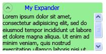 此螢幕擷取畫面顯示有捲軸的展開工具。
當您將 Expander 控制項放在 ScrollViewer 時,請設定 ScrollViewer 維度屬性,該屬性對應至 Expander 內容開啟至 Expander 內容區域大小的方向。 例如,如果您將 Expander 上的 ExpandDirection 屬性設定為 Down (內容區域向下開啟),請將 ScrollViewer 控制項上的 Height 屬性設定為內容區域所需的高度。 如果您改為在內容本身設定高度維度,ScrollViewer 將無法辨識此設定,因此也就無法提供可捲動的內容。
下列範例示範如何建立具有複雜內容以及包含 ScrollViewer 控制項的 Expander 控制項。 此範例會建立 Expander,就像本節開頭的圖例一樣。
void MakeExpander()
{
  //Create containing stack panel and assign to Grid row/col
  StackPanel sp = new StackPanel();
  Grid.SetRow(sp, 0);
  Grid.SetColumn(sp, 1);
  sp.Background = Brushes.LightSalmon;

  //Create column title
  TextBlock colTitle = new TextBlock();
  colTitle.Text = "EXPANDER CREATED FROM CODE";
  colTitle.HorizontalAlignment= HorizontalAlignment.Center;
  colTitle.Margin.Bottom.Equals(20);
  sp.Children.Add(colTitle);

  //Create Expander object
  Expander exp = new Expander();

  //Create Bullet Panel for Expander Header
  BulletDecorator bp = new BulletDecorator();
  Image i = new Image();
  BitmapImage bi= new BitmapImage();
  bi.UriSource = new Uri(@"pack://application:,,/images/icon.jpg");
  i.Source = bi;
  i.Width = 10;
  bp.Bullet = i;
  TextBlock tb = new TextBlock();
  tb.Text = "My Expander";
  tb.Margin = new Thickness(20,0,0,0);
  bp.Child = tb;
  exp.Header = bp;

  //Create TextBlock with ScrollViewer for Expander Content
  StackPanel spScroll = new StackPanel();
  TextBlock tbc = new TextBlock();
  tbc.Text =
          "Lorem ipsum dolor sit amet, consectetur adipisicing elit," +
          "sed do eiusmod tempor incididunt ut labore et dolore magna" +
          "aliqua. Ut enim ad minim veniam, quis nostrud exercitation" +
          "ullamco laboris nisi ut aliquip ex ea commodo consequat." +
          "Duis aute irure dolor in reprehenderit in voluptate velit" +
          "esse cillum dolore eu fugiat nulla pariatur. Excepteur sint" +
          "occaecat cupidatat non proident, sunt in culpa qui officia" +
          "deserunt mollit anim id est laborum.";
  tbc.TextWrapping = TextWrapping.Wrap;

  spScroll.Children.Add(tbc);
  ScrollViewer scr = new ScrollViewer();
  scr.Content = spScroll;
  scr.Height = 50;
  exp.Content = scr;

  exp.Width=200;
  exp.HorizontalContentAlignment= HorizontalAlignment.Stretch;
  //Insert Expander into the StackPanel and add it to the
  //Grid
  sp.Children.Add(exp);
  myGrid.Children.Add(sp);
}
Sub MakeExpander()

    'Create containing stack panel and assign to Grid row/col
    Dim sp As StackPanel = New StackPanel()
    Grid.SetRow(sp, 0)
    Grid.SetColumn(sp, 1)
    sp.Background = Brushes.LightSalmon

    'Create column title
    Dim colTitle As TextBlock = New TextBlock()
    colTitle.Text = "EXPANDER CREATED FROM CODE"
    colTitle.HorizontalAlignment = HorizontalAlignment.Center
    colTitle.Margin.Bottom.Equals(20)
    sp.Children.Add(colTitle)

    'Create Expander object
    Dim exp As Expander = New Expander()

    'Create Bullet Panel for Expander Header
    Dim bp As BulletDecorator = New BulletDecorator()
    Dim i As Image = New Image()
    Dim bi As BitmapImage = New BitmapImage()
    bi.UriSource = New Uri("pack://application:,,./images/icon.jpg")
    i.Source = bi
    i.Width = 10
    bp.Bullet = i
    Dim tb As TextBlock = New TextBlock()
    tb.Text = "My Expander"
    tb.Margin = New Thickness(20, 0, 0, 0)
    bp.Child = tb
    exp.Header = bp

    'Create TextBlock with ScrollViewer for Expander Content
    Dim spScroll As StackPanel = New StackPanel()
    Dim tbc As TextBlock = New TextBlock()
    tbc.Text = _
            "Lorem ipsum dolor sit amet, consectetur adipisicing elit," + _
            "sed do eiusmod tempor incididunt ut labore et dolore magna" + _
            "aliqua. Ut enim ad minim veniam, quis nostrud exercitation" + _
            "ullamco laboris nisi ut aliquip ex ea commodo consequat." + _
            "Duis aute irure dolor in reprehenderit in voluptate velit" + _
            "esse cillum dolore eu fugiat nulla pariatur. Excepteur sint" + _
            "occaecat cupidatat non proident, sunt in culpa qui officia" + _
            "deserunt mollit anim id est laborum."
    tbc.TextWrapping = TextWrapping.Wrap

    spScroll.Children.Add(tbc)
    Dim scr As ScrollViewer = New ScrollViewer()
    scr.Content = spScroll
    scr.Height = 50
    exp.Content = scr

    'Insert Expander into the StackPanel and add it to the
    'Grid
    exp.Width = 200
    exp.HorizontalContentAlignment = HorizontalAlignment.Stretch
    sp.Children.Add(exp)
    myGrid.Children.Add(sp)
End Sub
<Expander Width="200" HorizontalContentAlignment="Stretch">
   <Expander.Header>
     <BulletDecorator>
       <BulletDecorator.Bullet>
         <Image Width="10" Source="images\icon.jpg"/>
       </BulletDecorator.Bullet>
       <TextBlock Margin="20,0,0,0">My Expander</TextBlock>
     </BulletDecorator>
   </Expander.Header>
   <Expander.Content>
     <ScrollViewer Height="50">
       <TextBlock TextWrapping="Wrap">
         Lorem ipsum dolor sit amet, consectetur adipisicing elit,
         sed do eiusmod tempor incididunt ut labore et dolore magna
         aliqua. Ut enim ad minim veniam, quis nostrud exercitation
         ullamco laboris nisi ut aliquip ex ea commodo consequat.
         Duis aute irure dolor in reprehenderit in voluptate velit
         esse cillum dolore eu fugiat nulla pariatur. Excepteur sint
         occaecat cupidatat non proident, sunt in culpa qui officia
         deserunt mollit anim id est laborum.
       </TextBlock>
     </ScrollViewer>
   </Expander.Content>
 </Expander>
使用對齊屬性
您可以在 Expander 控制項上設定 HorizontalContentAlignment 和 VerticalContentAlignment 屬性,以對齊內容。 當您設定這些屬性時,對齊方式會套用到標頭,也會套用到所展開的內容。