Selection Brush
The default visual appearance of most objects in WPF can be easily tweaked, if not swapped out for a completely different visual tree. This provides developers far greater power over the visual look of an application than ever before. Facilitating the creation of highly customized apps has become a major adoption point for WPF. Despite WPF’s extensibility, the color of selection in text boxes and document viewers was originally baked into the framework. With the release of WPF 4.0, developers can now control the text selection color in their applications.
Selection Brush API
The properties SelectionBrush and SelectionOpacity are now available for use on TextBox, RichTextBox, FlowDocumentPageViewer, FlowDocumentScrollViewer, FlowDocumentReader and PasswordBox.
· SelectionBrush - The brush assigned to this property will be used to draw the selection overlay for text.
· SelectionOpacity - The opacity for the selection overlay. Note that if this value is set to 1 and the brush being used does not have some transparency specified in the alpha channel, selected text will be obscured by the selection overlay. In general, you don’t worry about setting the SelectionOpacity. It defaults to a value of .6.
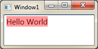
<TextBox SelectionBrush="Red" FontSize="12pt"/>
TextBox created with the above XAML. Notice that the red selection gets rendered as a pink due to the default value of SelectionOpacity.
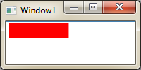
<TextBox SelectionBrush="Red" SelectionOpacity="1" FontSize="12pt"/>
SelectionBrush FAIL. The text is obscured by the selection overlay because the SelectionBrush is not transparent and the SelectionOpacity has been set to 1.
Selection Brush Usage
We have added this feature to complement your creativity. SelectionBrush can be used whether you want to completely customize your application or just add a little flair to text selection. When using this feature, remember that SelectionOpacity effects the color of the selection drawn to the screen. If the rendered color of your selection is not the exact color of the SelectionBrush, it is probably due to the interaction of SelectionOpacity and SelectionBrush. If the selection is obscuring you text, remember to tweak SelectionOpacity or give SelectionBrush some transparency.
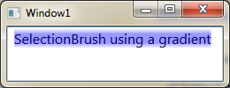
Below is a slightly more interesting application of SelectionBrush using a GradientBrush.
<TextBox FontSize="12pt">
<TextBox.SelectionBrush>
<LinearGradientBrush StartPoint="0.5,0" EndPoint="0.5,1">
<GradientStop Color="Transparent" Offset="-.2" />
<GradientStop Color="Blue" Offset="0.25" />
<GradientStop Color="Blue" Offset="0.75" />
<GradientStop Color="Transparent" Offset="1.2" />
</LinearGradientBrush>
</TextBox.SelectionBrush>
</TextBox>
- Chipalo
Comments
- Anonymous
August 31, 2009
The comment has been removed - Anonymous
September 01, 2009
The comment has been removed


